


"City of Letters" by Marianna Pawłusiów from the Academy of Fine Arts in Gdansk, is an activating book for children about typography in the city. The author's goal was to create a book that would introduce the youngest to the world of typography in a simple and clear way, encourage reading and sensitize them to the presence of letters and their diversity in public space.
The City of Letters is a city where letters, people and animals live. All letters want to be seen. Sometimes they form only words, and sometimes they form whole sentences. They inform us about many things, places and decorate our cities.
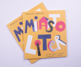
Marianna Pawłusiów, "City of Letters"
Publisher: Publishing House of the Academy of Fine Arts in Gdansk

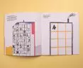
there are many tasks in the book, children can draw, search and compare
© Marianna Pawłusiów
An activating book for the youngest
Preparing for the project work, Marianna Pawlusiów conducted activities with children, through which she tested the book's assumptions in practice. The author decided that the book on typography would be aimed at children beginning to read - aged 4 to 6.

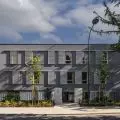
The Neon Museum is one of the inspirations
© Marianna Pawlusiów
I made an attempt to classify typography in the urban area in which children move. Through the various tasks proposed in my book, I encourage children to pay attention to different aspects of typography in the city. I hope that through this book there will be increased interest and awareness of aesthetics and typography in the city, and children will be encouraged to create their own creative solutions," says Marianna.
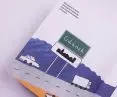
The book uses the realizations (murals and signs) of the Traffic Design association from Gdynia: the mural by Jan Bajtlik, the Plastic Shop by Marta Przeciszewska and the Sewing Machines by Typy Studio project. Their photographs were taken by Rafał Kołsut.

Jan Bajtlik's mural was the inspiration for the following illustration
© Marianna Pawłusiów
interview with Marianna Pawłusiów
Dobrawa Bies: Where did the idea for "City of Letters" come from and why typography?
Marianna Pawłusiów: The idea for the book was born thanks to my fascination with typography in public space. I pay attention to the beauty hidden in old signs, rubbed letters on the walls of buildings - I delight in their shapes and forms. I wondered how to present the variety of letters and sensitize the child to their presence, not only in books, in a way that is attractive to young audiences. I think that the preschool age is the right stage of a child's development, when he begins to be interested in reading and learns to distinguish letters, so I already knew that the book would be aimed at this audience.

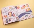
map inside the book
© Marianna Pawlusiów
Dobrawa: You are the author not only of the illustrations, but also of the texts in the book. Please tell us how you work on such a comprehensive project.
Marianna: Comprehensive project work occurs naturally - sometimes I start with the content, then in my head I see the image I would like to present. Sometimes quite the opposite, I start with a sketch of the illustration and think about what content to add to make it harmonize with the image. In the case of "City of Letters," I first found typography in the city, and then arranged tasks to encourage children to be active in the book.
Dobrawa: How did you choose such aesthetics and colors? Did you have any inspiration?
Marianna: The aesthetics I used are reminiscent of children's drawings, they are simplified and contain elements of collage, so the illustrations fit into the character of the book. The color scheme is based on warm colors, positively influencing the appearance of the cityscape I created. Direct inspiration came from places I visited in the Tri-City, but also from the Neon Museum in Warsaw.

The aesthetics refers to children's drawings, is simplified and contains elements of collage
© Marianna Pawłusiów
Dobrawa: The recipients of the book are preschool children (4 to 6 years old), beginning to learn to read. What were their reactions to City of Letters and the tasks you proposed?
Marianna: The children showed great interest, drew, completed the tasks. They often initiated conversations about the places they recognized. They found creative solutions that I hadn't thought of myself!
Dobrawa: We have been observing a positive change on the Polish publishing market for some time - more and more interesting, educational books for children are appearing. Your book was also published this year by the Publishing House of the Academy of Fine Arts in Gdansk. What are your further plans?
Marianna: I would like to devote my time to illustrating children's books, because I feel it gives me joy. With my books, I would like to encourage children to talk to each other, to visit places - to arouse curiosity about the world. Seeing the needs of children, I would like to respond to them with books, and I hope that in the future I will have the opportunity to create and publish more publications.
Dobrawa: Thank you for the interview.


"City of Letters" was published by the Publishing House of the Academy of Fine Arts in Gdansk.
© Marianna Pawłusiów
"City of Letters" was created as an undergraduate thesis in 2019. It was created in the Book Design Propedeutics Studio of the Academy of Fine Arts in Gdansk, led by Dr. Anita Wasik and Patrick Hardziej.
Thebook was published in January 2022 by the Publishing House of the Academy of Fine Arts in Gdansk, which since 2021 has expanded its formula - publishing publications promoting its students. "City of Letters" can be purchased from the online store of the Gdansk Academy of Fine Arts.