


A {tag:studenci} from the Faculty of Interior Design at the Jan Matejko Academy of Fine Arts in Cracow has taken up the topic of designing spaces for visually impaired people. His proposal is the interior of the new dormitory of the Special School and Educational Center for Blind and Visually Impaired Children in Cracow. The author focused on multisensory spaces, tactile contrasts and details to facilitate orientation and use of the building.
The presented work "(In)visible. Interior architecture towards the senses. Interior design of the Special School and Educational Center for Blind and Visually Impaired Children in Krakow" was created as a master's degree under the direction of Professor Beata Gibała-Kapecka and assistant Kaja Czajczyk.


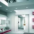
Interior design of the dormitory makes it easier for the visually impaired and blind to orient themselves
© Maciej Szlachta
The project is an attempt to polemicize with the hypervisual trend present in architecture, in which the hegemony of the sense of sight dominates the others and leads to a shallowing of the cognitive image. It was born out of the conviction that a multisensory experience is needed to truly recognize the surrounding environment, the creation of which is directly influenced by architects and architects. Moreover, I recognize that the process of seeing itself does not necessarily have to begin in the eye, and non-visual images are possible. Using the example of an audience group for whom receiving (in)visible stimuli is an everyday occurrence - people with visual dysfunctions, the concept of an interior that facilitates orientation was created, which directly translates into a sense of comfort and security. (In)visible is that which remains in the non-visual world and at the same time is directly perceived by the senses. (In)visible properties are there, in the surfaces, you just have to reach for them. The only condition is not to reach with the eyes," the author says about the design concept.


The author proposed a new dormitory of the Special School and Educational Center for Blind and Visually Impaired Children in Cracow
© Maciej Szlachta
new boarding school for blind and visually impaired children
The project developed by Maciej Szlachta focuses on selected spaces of the Special School and Educational Center for Blind and Visually Impaired Children in Krakow. According to the author, these spaces are the most private ones, which, due to the lack of a direct educational function, have not been adapted to the needs of visually impaired people.


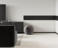
The contrast of black and white makes it easier for people who do not see colors or see out of focus
© Maciej Szlachta
When designing the interiors, the Academy of Fine Arts graduate relied on the popular contrast of black and white as a convenience for people who can't see colors or see out of focus. Choosing this contrast also helped to highlight black information on a light background and make the space intuitive. Black electrical outlets against a white wall, a black skirting board defining the edge of the room, or a dark chair standing out against a white microcement floor realize the author's design intent.

plan of level 0 of the boarding house
© Maciej Szlachta
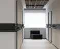
contrasts that make life easier
In addition to the contrasts of black and white, Maciej Szlachta also used tactile contrasts in the building - in particular, cold and warm. During discussions with the designer, the Center's alumni pointed to this contrast as the strongest. Based on this, the author proposed a special handrail in the common areas of the new dormitory. The handrail emphasizes the tactile contrast by combining a rounded, lacquered, smooth and wooden hilt with a contrasting cold, metal and unpleasant knob located on the outer edge of the module.


A special handrail and tactile tiles were designed
© Maciej Szlachta
While moving around the Center, a person supported by the guidance of the handrail will read out information about a potential danger, such as a door or staircase, in places requiring special attention, through a tactile signal caused by touching the cold surface, explains Maciej.
details matter
For visually impaired people, order is especially important because it allows them to orient themselves and the items they need. The designer eschewed ornamentation in favor of details that serve specific functions. For example, the milled handles of the furniture fronts were developed so that by their form they clearly define the direction in which the cabinet fronts open. Each cabinet opens perpendicular to the edge of the milling.


The milled handle of the kitchen front clearly defines the direction of opening of the cabinet
© Maciej Szlachta
When using traditional knobs or handles, the direction of opening is unclear and can lead to potentially dangerous situations. Focusing on the details, it is also every small design choice that made up the presented design. Such a choice, for example, is the cooktop, which was equipped with knobs. The most popular ones, ironically called tactile, are unreadable to people who use mainly the sense of touch. In the case of a hob equipped with knobs, it is not a problem for a person who cannot see to select the right power, the author explains.


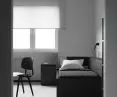
Noise-reducing lamps have been used in the rooms, as well as roller blinds on the windows
© Maciej Szlachta
appropriate materials
In the parts with increased traffic to improve acoustic conditions, the designer proposed noise-dampening lamps. The lamps owe their shape to the thermoforming technique, the same one used to make the tactile tiles placed on the room handles. The tiles bear information written in Braille.
Fabric-covered doors and walls with upholstered panels further soundproof the corridor and common room. Glass curtains in the corridor made in a frosted finish made it possible to simultaneously illuminate the interiors for the visually impaired and eliminate glare. The windows were fitted with blinds, and any material proposed in the design is not highly reflective.


windows
© Maciej Szlachta
Taking a different perspective allowed me to see completely new everyday problems that accompany visually impaired people. Their recognition made it easier for me to create a study that realizes the most essential aspect of designers' work - the ethical aspect. It is hard to find a more responsible task than the one in which it comes to face the design of the world around us. So ordinary for some, and unfortunately inaccessible for others. The presentproject fights against the barriers that accompany visually impaired people, while at the same time realizing that the essence of interior design is not only the creation of things and places that are pretty," concludes Maciej Szlachta.