


A {tag:studenci} from the Jan Matejko Academy of Fine Arts in Cracow decided to transform the interior of one of the forgotten restaurants, located in a tenement near the market square in Wadowice. By proposing a new functional layout, dividing the premises into three zones using light and colors, the designer created a modern, inviting space.
The design for the restaurant in Wadowice was created as an undergraduate thesis at the Interior Design Department under the direction of Dr. Małgorzata Zbroińska-Piątek. The restaurant, located in an old Wadowice tenement, is currently not making the most of its assets.

entrance to the restaurant's breakfast area from the side of the arcade
© Kinga Garus
The entrance to the premises is somewhat hidden from potential customers, being located in the passage that cuts through the tenements. The unclear route of access and the poor arrangement of the various zones of the restaurant is the main problem of using the facility. Dark and gloomy colors and lack of adequate light, do not improve the current image of the place, says the author.
solving the problems
So the main design goal of the architecture student was to solve the traffic problems and create a new functional layout of the entire restaurant space.

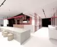
bar area in the annex
© Kinga Garus
Currently, customers of the restaurant have a problem finding the entrance to the restaurant - the author decided to remedy this by taking advantage of the passage space and creating visual accents to encourage people to visit the premises. Another idea was to use as much natural light as possible, as well as to diversify the interior and create a climate with colors and light.

Open kitchen in the breakfast area
© Kinga Garus
In the current situation, this is one of the most important problems. Unattractive colors that instead of brightening and optically enlarging the space - depress. Lack of adequate lighting makes us feel badly in a given space," adds the designer.
zoning
The designer focused on a new arrangement of the bar and toilets, as well as good communication with the kitchen, which will facilitate the work of waiters. The opening and relocation of the kitchen, which became one of the inviting elements of the premises, was also an important procedure.

ground and first floor plans
© Kinga Garus
An important stage of the project was to divide the restaurant into three zones - breakfast zone, quick service zone and restaurant zone, The restaurant zone with a large bar makes it possible to separate the room for special events, and intended for evening meetings in a climatic outbuilding. The designer also included a division into a light - open and dark - semi-private zone, thus giving restaurant customers the choice of the space in which they feel most comfortable.
Inspired by sketches
The next stage of the design work was the creation of conceptual sketches, which gave an introduction to further work on the project.

design sketches
© Kinga Garus
Size, color, rhythm, texture, plane, line - these are the main of the elements appearing in the drawings. Juxtaposing them allowed me to create a kind of relationship. There is a completely different feeling when looking at a black plane, and another when juxtaposing thin lines of different colors. Due to the division of the restaurant into three different zones, I made an attempt to connect these spaces. The interpenetration of the planes and the overlapping of the lines were intended to create an interpenetrating effect," says the author.
Each of the designed zones is distinguished by its color, while the element that connects them all is red, found in the form of hanging lamps.
breakfast zone
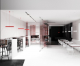
The first of the restaurant's separate spaces is the breakfast zone, full of white and vibrant colors. The space is meant to energize and stimulate.


The breakfast zone is located on the first floor
© Kinga Garus
The zone is located on the first floor of the restaurant, and its entrance has been situated towards Kosciuszko Square, where a lot of people move during the day. On the other hand, the opening of the space from the side of the walkway was intended to let in as much light as possible and invite people inside. Those in the breakfast area have the option of using a large table that is set up for work. The main, central element is highlighted by color and enclosed in a black boxed bar. This box extends through the walkway all the way to the kitchen, connecting the spaces together.

The most important part is the restaurant area
© Kinga Garus
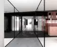
restaurant zone
The restaurant zone is the main part of the project. It is dominated by white and black, and accented by a maroon shade found on the fronts of the cabinets. This color is highlighted by pink and maroon glass, which, combined with natural and artificial light, creates many different colored reflections in the space.
Thanks to the use of slides, we have the possibility to modify the layout of the glass walls. One option is to separate the space for special events. The use of double-bonded glass provides security and gives the possibility to create transparent walls. Hidden in the floor and ceiling, the slides allowed us to create the illusion of emerging planes. They perform a very important function, but also create a line in the space," Kinga explains.

The opening of the ceiling above the stairs unifies the space of the premises
© Kinga Garus
Referring to the line of the guides, the author used rails to illuminate the space. The opening of the ceiling over the stairs connected the two zones (breakfast and restaurant). The same treatment was used by the designer over the passageway that leads from the staff room to the floor. As a result, the proportions of the entire space have been altered and aligned in relation to the width, combining the two levels into a single unit. The materials used on the walls are on two floors, giving the illusion of interpenetrating solids with an open ceiling.


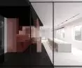
The bar area is dominated by black and red
© Kinga Garus
bar area
For evening meetings, the author intended a bar area with atmospheric light. Separating the lodge allowed the designer to create semi-private zones.

dark bar area
© Kinga Garus
The main element of this space is the bar, which stands apart against the solid color of the floor and ceiling. The floor also overlooks the walkway area. Large window openings let in just the right amount of light, and the dominant black was accentuated by the colorful glass walls as well as the warm color found in the fixtures.