


From extreme to extreme - this is how to describe the direction in which the color scheme of Polish cities is heading. After years of fighting pastelosis, investors and designers are increasingly opting for subdued, neutral colors. However, they often take on a caricatured form, and elevations flooded with gray, which were never like this in the original, lose their tectonics and chiaroscuro, absorbed by unattractive colors. Why do architects love gray?
pastelosis
They say: "gray blocks"? Where the fuck are the gray blocks?
Here everything mottled - babies, types and yorkies
"Polish Tango," by Taco Hemingway
As Taco Hemingway rightly pointed out, the colloquial term for gray apartment blocks has little to do with reality. Over the years, Polish block housing estates have been covered with a tight coating of Styrofoam and acrylic plaster, on which patterns in all the colors of the palette shimmer. Each block on a housing estate not only has a different color scheme, but also the arrangement of colors and drawing on the facade. In a complete departure from the architecture of the buildings, their walls are decorated with suns and trees, rainbows and pyramids.


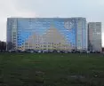
Retkinia housing estate in Lodz
photo by Kacper Kepinski
Destruction of valuable examples of architecture, alteration of the urban skyline and problems with orientation in space are the most visible problems generated by hastily made thermo-modernization. The pastelosis devastating the landscape of Polish cities has been pointed out for years by urban activists, specialists and architects - and it seems that their message has reached the mainstream.
For it is increasingly rare to hear voices about the need to "unwind the gray of communist Poland" precisely on the walls of buildings. This is also influenced by the growing appreciation of Polish socmodernism, which has become fashionable not only among architecture lovers.
unwinding
Recently, there have been more and more positive examples of renovation of apartment blocks or individual buildings. Subdued colors, emphasized facade drawing and divisions, elegant form - it seems that these are the qualities that investors rely on nowadays. Examples of such actions can be multiplied, some of the most interesting realizations include the "White Blocks" designed by Traffic Design in Gdynia (more in the article). Their concept does not misrepresent the architecture, but brings out the strengths of large-panel architecture in a minimalist and aesthetically pleasing way.

Photo: Traffic Design
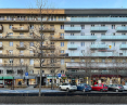
However, not every project is prepared with such care. The buildings, which were insulated a dozen or even more than twenty years ago, are already in need of renewed renovation. Often their color scheme changes in the process. Pastel patterns are replaced by gray stripes and geometric designs. There would be nothing wrong with this if it weren't for the scale of the changes, the still inappropriate selection of shades or the complete disregard of the original facade disposition. The gray blocks don't sting the eye with intrusive colors, but they don't contribute much to the urban landscape. Sometimes they are successful background architecture (much needed), but sometimes they turn into grayish blocks without a shred of chiaroscuro, killed by inadequate color. Often the interiors of loggias are also painted in dark colors, which one can only sympathize with the residents of such shaded premises.


Blocks that were never like this before are becoming gray
Photo: mônsterior / skyscrapercty, Kacper Kepinski
The problem, then, is not so much the color, but the attention to detail and the three-dimensionality of the building, as well as the sense in choosing the right shades. In a country where a large part of the year is not blessed with sunny days, the last point is particularly important, which can dramatically change the aesthetic perception of the entire neighborhood - especially if there are many blocks painted the same color next to each other.
Unfortunately, changing the color scheme most often does not involve restoring architectural details "drowned" in layers of Styrofoam. If any attempt is already made in this direction - it is rather flat with patterns painted on the facade, which often gives a caricatured effect. It is also worth remembering that modernism was by no means black and white, and colorful accents, mosaics and architectural detailing were also a constant feature of large housing estates. After years of unwinding the grayness of communist Poland, are we in for a pastelosis? Let's hope not.


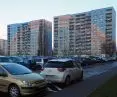
Colorful stripes won't replace facade tectonics
photo by Kacper Kepinski
gentrification grey
However, the problem with the flooding of urban space with gray paint is not only about block housing, nor only about Poland. It is also a noticeable spatial symbol of the gentrification going on in the neighborhood. Gray, dark gray (one of the favorite colors of architects called "anthracite") is becoming urban furniture, lamp posts, pavements. They are supposed to give a modern and "timeless" style, a new elegance. This phenomenon has been most widely observed and described in San Francisco, famous for its colorful buildings made up of small houses.
Increasingly, a striking juxtaposition is seen among the pastels and gold ornaments: 125-year-old houses painted in the tones of a Cold War-era nuclear warhead or mountains of volcanic cinders. In neighborhoods like the Mission and Haight, the phenomenon has been interpreted by some residents as an erasure of the Latino community's identity or a progressive counterculture.

Photo by Franco Folini
Colorful SF is turning into a graveyard - at least that's what local community representatives say. The popularity of gray came from unified tastes promoted by mass media, decorating programs or those pointing out how to profitably sell an apartment renovated at cost. Such houses are "fashionable", "neutral" and fit in with most people's tastes and trends. Unfortunately, they often have nothing to do with the history of the place, the building and the local community. For residents of San Francisco, which is one of the most expensive cities in the world to live in, the process of building uniformity is clearly associated with gentrification, which is devastating to the city's climate, hencethe term gentrification gray.

Photo by Kacper Kepinski
disharmony
A similar thing is happening in our region, where architects are standing on their heads to design in their favorite colors regardless of the context. Although there is so much talk about aesthetic chaos and ruined landscape, at the same time there are realizations that unequivocally cut themselves off from the harmonized surroundings, and the only purpose of such action is to stand out and try to realize the ambitions of the architect. In order not to fall into the opposite of pastelosis we need moderation, reflection and respect for the design decisions of one's predecessors and the context in which we design. Rehashing pastelosis with gentrification greyness will only make us struggle with the same problems again in a decade.


The only house with a gray roof on the picturesque Kamenna colony in Brno belongs to architects
Photo by Kacper Kepinski


