


 We would like to invite Architecture students to participate in a new A&B series - project consultations with famous Polish architects in the pages of our magazine.
Would you like to get advice on your project? For more information, visit www.architekturaibiznes.pl/konsultacje.
"Wesoła - Factory of Senses (ear)" - a project created at the Faculty of Architecture, Krakow University of Technology,
academic year: 2020/2021 semester VII
Author: Kamila Lorenc-Kozik
subject leader: dr. hab. Piotr Gajewski, prof. PK
group leader: Dr. Lukas Olma, MA arch.
The author about the project
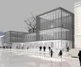
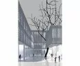
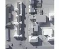
The concept is located in the very center of Krakow, in the Wesoła district. The plot has a strong architectural context of surrounding townhouses, hospitals and the Opera House. The location is also influenced by the natural context, including the Botanical Garden and the existing trees on the plot. The project presents a concept for a Music Gallery. Its main idea was to fit the block into the surrounding architecture, nature, to create a friendly place.


situation
© Kamila Lorenc-Kozik
The center of the gallery is a three-story high music box topped by a canopy with natural ventilation. The space at different heights is connected by mezzanines. The open space area is prepared for a variety of functional purposes.
The idea accompanying the design is characterized by lightness, transparency and connection with nature. Through the use of simple procedures, the building "floats above the terrain". It retreats into the mass, and the glazed first floor gives it lightness. Thanks to the grading of the boxes, the building rises, corresponding in height with the neighboring townhouses. The gradation was achieved by adjusting the heights to the functions. The body was post-zoned according to the boxes, which dictate the location of functions, segregate them and make them more legible.


visualization
© Kamila Lorenc-Kozik
The auditorium has a stage and an inclined auditorium; the area below it has been given a space that opens upward with mezzanines. This makes it possible to create various arrangements, organize concerts, shows or exhibitions. The space of this zone is multifunctional.
{Image@url=https://cdn.architekturaibiznes.pl/upload/galerie/52456/images/original/3a785d3d577ca554c79b67f764dcf49c.jpg,alt=przekroje A-A and B-B,title=sections A-A and B-B}
cross-sections A-A and B-B
© Kamila Lorenc-Kozik
Prefabricated sheet metal was used on the boxes, with embossed openings of different sizes. This gives the building three-dimensionality, layering and different transparency. At the same time, the material lets sunlight into the interior, which provides natural lighting and an interesting shadow play effect.
Kamila LORENC-KOZIK


west and south elevations
© Kamila Lorenc-Kozik
author's questions
1. is the use of one material in different variations to create "layering" and "three-dimensionality" of the elevation a good solution?
2. do "mock-up" visualizations positively affect the perception of the project?
3. is adjusting the height to the zone in the facility a good option?
4. is creating a conference room that creates open space a good solution?
5. is planning garbage rooms on level -1 a good functional solution?
6. what is the material of the future when it comes to functional architecture?


first floor plan
© Kamila Lorenc-Kozik
architectural consultation
Let me start from the end. In answering the question of what is the material of the future, I would tend to think first about what is the thinking of the future.
Alejandro Aravena at one of his lectures talked about the Anacleto Angelini Innovation Center project. He then raised an interesting point that we can easily relate to our realities. He showed a typical office and commercial building in Chile. A glass facade and a huge number of air conditioners that have to work 24/7 to make it possible to stand in this building. Plus the second skin of the building, which must additionally protect from the sun. In our country, too, there is a fashion for "glass houses," increasingly taller windows, which are extremely expensive to use and build. Expensive in terms of economy, ecology and energy.

Anacleto Angelini Innovation Center, Santiago de Chile, design: Alejandro Aravena
Photo: Vmorande © Wikimedia Commons | CC BY-SA 4.0
In this lecture, Aravena showed how, starting from thinking about the problem, the concept for his project was created. Wanting to reduce energy losses, he proposed windows in places where they are actually needed. He created a massive block that consciously solved the problem, defied the trend, looks unconventional, and he received the Pritzker Prize shortly after this lecture. Aravena continued the same idea when he designed the Novartis Campus in Shanghai. The way to create the façade in the submitted project should be similar thinking. For example, an inspiring building with small windows is the CINiBA building in Katowice, Poland, designed by the HS99 studio.


Scientific Information Center and Academic Library, Katowice, proj.: HS99
Photo: Zpz © Wikimedia Commons | CC BY-SA 3.0
More interaction with the surrounding architecture could become an additional value of the project. If so, how about assuming that the window openings in the designed building would be the same size as those in the surrounding buildings? Or were they a smaller/larger multiple of that dimension? Think "sophisticated play" like HS99 in Katowice, Poland, or mass-to-opening ratio like Aravena's.
Total glazing of the first floor may seem like a given, but take a look at the glass walls of office buildings. The glass during the day is not transparent as in the visualizations. In perception, it is such a kind of mirrored, somewhat transparent wall. The glass seems more transparent when it contrasts with the wall. I would just like to signal that glazing everything is not the universal answer to getting a building open in perception.
In my opinion, openness is close to the word legibility. Looking at a public building, a person should immediately read where one enters it. I wonder what the argument is behind the two main entrances to the building. Looking at the projection, I don't see any objection to enlarging the café by the reception area and introducing one main entrance. So that when going to a seemingly insignificant conference, ordering a coffee on the way, hooking up with an exhibition, only to be a moment late for the event, you meet the love of your life. And it's all thanks to a good building.
"Mock-up" visualizations are a very good direction, because they faithfully reflect reality, without the popular embellishments. The only misrepresentation is the burning light inside the building during the day. This treatment unnecessarily distracts us from the real challenge of achieving an open building.
Placing trash cans on level -1 is asking for trouble. I would move away from complete glazing of the first floor, and focus on the open/closed game. This open should be the main entrance area of the building, and we will get the waste areas by getting rid of the second entrance area.
The conference room embedded in the open space is a slogan that raises several key questions with regard to the project. The very idea of having additional space underneath the hall, for example for exhibitions, is interesting. But what about the current exhibition-corridor space? Does the building need to have such a disjointed form on a floor plan similar to the letter "S"? I wonder if the whole building should not have a homogeneous form on a rectangular plan (with a proposed cutout for existing trees). So as to simplify internal communication as much as possible. Thus, it would take up less space, and the saved space could be used for a park. The conscious decision to build a simpler building, but with it a park is also a kind of modern thinking. Existing trees encroaching on the edge of the rectangular projection could initiate an interesting interaction between the park and the building.
Two days before my thesis defense, the dean approached me and gave me one pointed piece of advice about the project. Significant for such a not-so-distant time to hand in the thesis. She was right, so I immediately changed everything. Later she admitted to me that it was a test, because according to her we are ready to be architects when we are ready to change. We don't fall in love with our own designs. After several years of work, I can see how valuable this lesson was. We are constantly put in the situation of unplanned changes, but projects withstand them when their guiding idea is strong enough. I think the submitted project is solid, but has a chance to go to the next level when the author thinks about it in the way Aravena talked about.
Since I started from the end, I'll end at the beginning, which is the intriguing theme of the work "Merry - a factory of senses (ear)". The expanded metal is not very sensual. Could the building soothingly hum in the wind? Or should it absorb sound, since we actually need silence more?
Boris WRZESZCZ
 Boris Wrzeszcz
He completed his undergraduate studies at Poznan University of Technology, during which he studied under Vasa Perović in Ljubljana, Slovenia, as an exchange student. In turn, he undertook his master's studies at the Royal Danish Academy of Fine Arts in Copenhagen. As part of the university's exchange program, he spent six months in the Chilean capital. His time in Santiago inspired him to create, as his master's thesis, a project to prevent the polarization of Chilean society. This project won an award for one of the best diplomas defended at Copenhagen University in 2015. After graduating, the architect returned to Poznan, where he forms the Wrzeszcz Architects studio together with his dad, Mariusz Wrzeszcz.