


After the intensity of summer and landscapes abounding in vibrant colors, autumn brings a pleasant reprieve in a slightly nostalgic atmosphere. It's a return to naturalness, an understanding of cyclicality and transience, surrounded by colors that heighten the impression of softness, coziness and warmth.
Although the approaching season is most often associated with cool tones and earthy colors, it does not have to mean dull and dark interiors at all. This year's autumn is not just about soft beiges or muted browns. Among the latest color trends, defined by the Pantone Color Institute for the autumn-winter 2021/2022 season, we will also find intense green, purple, red, exclusive gold and even pastel pink, although there will be caramel and dark brown shades. In the collections of Tubądzin Ceramics, the autumn accent is visible both in the colors of the tiles - strong or melancholy fuzzy hues, but also in interesting patterns, textures and unique surfaces, which create an unusual decoration.
Characteristic geometry in earthy colors
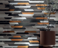
In the Brainstorm collection we find a color palette inspired by nature and stone, but also shades of copper and patina, all surrounded by trendy geometric decors. This is a collection with a very expressive design and a strong color scheme - black meets deep gray, gold and silver here. The tones of the tiles perfectly reflect the character of the inspiration - the intense energy and phenomenal beauty of the storm, which is an inseparable element of the autumn aura. The shimmering wall decor is a way not only to create a modern and impressive arrangement in timeless gold, but also a distinctive accent that introduces an element of movement and liveliness, as well as an amazing play of light. It doesn't need too many accessories, as it creates a dynamic, original surface all by itself.

Grunge collection
Photo: © Tubądzin
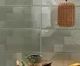
Trendy browns, which perfectly match the colors of autumn, do not have to appear in the form of a uniform, smooth surface. In the Grunge collection they resound as a compilation of various textures and patterns, in tones set in the fashionable color taupe - between beige and gray. Grunge Taupe tile brings to mind not only the art déco style, but also its emanation on old townhouses or murals, which we can still admire today. The severity of the form here harmonizes perfectly with the harmonious composition of colors, and the whole gives the impression of an exceptionally designer background. Wanting to emphasize the contemporary character of the arrangement, it is good to bet on simple, uncomplicated accessories in copper and gold, which will brighten up the interior.
Mirrored brilliance of subtle patterns
TheBrass collection is set in olive hues, white and gray, which are among the basic color classics in the autumn season. The subtle tones of the tiles highlight the delicate, even scratches and directional abrasions, which reflect the dynamics and movement of air, its lightness, changeability and transience. The pattern embedded in the glass is a capture of the non-uniform nature of wind. It's a moment that lasts longer - a captured moment in which one can feel the pure expression of movement. The shimmering decorations reflect the light beautifully, adding spaciousness and brightening the interior. They go well with beige and light browns, as well as wood, wicker or warm mustard colors. These additions will intensify the impression of gentleness and allow you to create a calm composition that will calm you down and allow you to disconnect from an excess of stimuli.

Brass collection
Photo: © Tubądzin
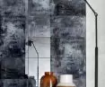
Glass decorative tiles, which perfectly match this year's color trends, can also be found in the Grunge collection. This time, however, instead of delicate pastels, we are dealing with many shades of gray and the fashionable blue color, against which white abrasions and artistic dots in intense red appear. It's a design that resembles an autumnal, nostalgic mosaic - a painterly palette on which the collection's designers spread all the colors of the collection and mixed them freely, like a painter before applying paint to canvas. Surrounded by expressive colors and expressive drawing, simple ceramic accessories in a deep shade of brown or furniture with golden accents look very stylish.

Grunge collection
Photo: © Tubądzin
Melancholic blurs in pastels
Inspired by the wabi-sabi style, the Interval collection captures the beauty of the passing of time and the natural aging process of things. The surface of the Interval Carpet wall tile resembles a decorative fabric, with delicate but stately ornamentation. The color scheme of the collection is based on subtle, slightly fuzzy shades of brown, beige and blue, which sometimes falls into light purple. This is a suggestion for a warm and cozy interior with a rustic touch, with a unique and somewhat mysterious design, which is associated with slightly misty landscapes. Wanting to maintain stylistic consistency, it is worth betting on natural accessories that will not overwhelm the arrangement. Clay or ceramic vases and dried flowers will be a soothing complement to the composition, further emphasizing the essence of the passage of time.

Interval collection
Photo: © Tubądzin
Painterly blurs in the style of Impressionist paintings can also be seen in the Colour collection. And while pastel pink may be more associated with spring lightness, it is one of the more prominent colors in current trends for the fall season. The Colour Pink collection presents a romantic take on pink, which appears here juxtaposed with soft gray and brown. The subtly smudged patterns are reminiscent of autumn sunsets - colors that relax, calm and allow for contemplation. The satin surface of the decorative tile gives the impression of a pleasant, soft-to-the-touch plane. In such an environment, oval pouffes, designer pillows and warm blankets will be indispensable, which will not only create a color-coherent arrangement, but also make many an autumn evening pleasant.

Colour Pink collection
photo: © Tubądzin
For more information, visit the company's Tubądzin Management Group page on the A&B portal.