


Architectural design usually begins with constraints. In the case of Ice Cream, the architects at Paradox studio faced a particularly difficult corner lot, which they wanted to make the most of.
Lodowato is a café and ice cream parlor for which Paradox studio was responsible for the architectural design. The interior design was developed by musk kolektyw studio. A corner plot adjacent to a residential development in close proximity to Lake Paprocany in Tychy. On the plot, the architects tried to maximize the use of space, create an interesting play of solids and rationally organize the space outside the building.

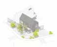
axonometric projection
© Paradox Studio
Szymon Borczyk and Dawid Marszolik – architects from the Paradox studio – talk about how the Icehouse project was created, what was a problem when designing on a narrow plot with an unusual shape, and how they managed to reconcile all the required functions.
Wiktor Bochenek: How did the plot influence the design of the building? What had to be reconciled in its shape?
Szymon Borczyk: The plot that the investor had at his disposal was quite small, with an irregular plan, resembling the letter L. What's more, in the decision establishing the conditions of development, an impassable building line was drawn on the side of the road, entering into the depth of the plot for almost five meters, consistently offsetting the newly designed development, referring to the neighboring existing buildings. This resulted in a really small area to operate, in the space of which we had to place production, offices and sales, i.e. all the investor's requirements for the function of the building.
Dawid Marszolik: We knew that the possible abandonment of any of the functions would significantly reduce the functioning of the others, and the investment in such a case would not make sense. So we „poured” the building into a very limited space and thus it fills it almost one hundred percent. We could afford a little extravagance only on the eastern side, because only there we managed to find more space for tables and deck chairs. This was not without special solutions, we had to undercut the block in this place and overhang the floor storey. In this way we also naturally created a canopy over the entrance. After analysis, it is safe to say that it was the plot and the impassable building line that designed the projection of the building for us.

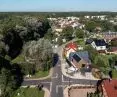
The building was integrated into the difficult space surrounding Lake Paprocany
© Pracownia Paradox
Wiktor: How did the immediate surroundings of Lake Paprocany and the development of single-family houses influence the body of the building?
Dawid: Watching the area with the investors, we realized that we could work here in two ways. Following the example of neighboring developments, including the competition, we could design something peculiar, not quite matching the immediate surroundings, but instead fitting the context of function and location. Such a path on the surface seemed the most logical, given the multitude of functions and the sizable size of the building in relation to the building plot. The second way, however, was to try to fit into the neighborhood while taking into account the potential scale of the building and its purpose.
Szymon: We realized that we were primarily designing in a residential, single-family neighborhood, and it was already enough of an intrusion to inject another function into it, despite the fact that it was the edge of that development. Ultimately, we did not want to go the way of neighboring developments, which have already begun aggressively taking over and appropriating space. The immediate surroundings of Lake Paprocany is a wonderful space, which, thanks to the efforts of officials, has not become a colorful fair with multicolored booths and tents of various purposes, but with a single purpose — to take as much as possible and give as little as possible. Such spaces like a cancer spill over many tourist destinations, poisoning the space visually and acoustically, only to collapse into a dingy, OSB-killed slumber in the off-season. Of course, we have nothing against the commercialization of such spaces, but we always rejoice when we see that someone has put in, at least a little work, effort, attention and, above all, resources, to give this space something as well, and we are happy to have been able to design in such an environment. We believe that ultimately such architecture, designed with respect for the place, will defend itself over the years and perhaps become an inspiration for others.

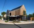
The architects tried to maximize the use of space and create an interesting play of building masses.
© Paradox Studio
Wiktor: What influenced this solution of the facade?
Szymon: Here again, it was not just one factor. We had quite a few ideas and requirements that we set for ourselves for this building. The investor also expected its appropriate quality. We used two completely different materials on the barns also in terms of color and texture. We deliberately wanted to further distinguish them from each other and make their functions visible. We clad the barn where the warehouses, production and basically all the facilities are located with sheet metal, thus giving it a neutral look. We clad the barn where the office and customer space is located entirely with wooden slats. In this case, in addition, the slats also cover the window, giving a sense of privacy while not obstructing the view of the lake. In addition, this solution improved the composition of the facade and unified it somewhat.


The interior was designed by Musk Kolektyw studio
© Paradox Studio
The solution of covering the first floor elevation with expanded metal panels came about almost spontaneously. Due to the accompanying function of manufacturing and the associated undesirable elements related to the handling of deliveries and transportation of production materials that appear in the surroundings of such buildings, the issue of covering up the entire background was an obvious one. We used mesh because we didn't want to put up walls, but rather full-blown obscurations that would completely separate the spaces. The mesh allows light into the production room, also allowing a very subtle view of what's going on behind it, but without distracting from the space in front. The panels add a three-dimensional effect and obliterate the resulting outline of the first floor walls, visually blurring the full walls of the building to the point where it's not quite clear where they actually end.

The plot and impassable building line influenced the shape and arrangement of functions in the building.
© Paradox Studio
Wiktor: How was the outdoor space designed? Didn't you think about more greenery?
Dawid: Due to the fact that we had really little free space left to develop, we decided on moderate solutions with the main focus on sustainability. We knew from other locations of the investor's ice cream parlors that there are customary queues in front of his establishments due to high demand, and this zone will be really heavily used. Unfortunately, this is not conducive to arranging and, above all, caring for the greenery, which over time will probably be trampled most simply. We took the liberty of only acting pointwise, clearly defining in the pavement the spaces that were intended to be planted with plants. These spaces, referring to the investor's characteristic logo, we created in the form of circular cutouts in the uniform pavement. We repeated these shapes with the outlines of the terraces, composing all these elements in such a way as to best direct the client to the entrances of the premises.
Wiktor: Thank you for the interview.

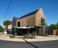
The facade of the building was designed using different materials and textures to distinguish the different parts of the building.
© Paradox Studio


