


Chapter III
Analysis of selected interiors of buildings
related to health care.
I realize that it is impossible to unambiguously assign a building to a group of bad or good designs. The impossibility of this decision is compounded by the complexity of the architecture and the differences in the tastes of the audience. The goal I set for myself in this chapter was to consider the choice of materials, the way they are displayed, the lighting and the impression achieved by the whole of these elements.
The first example of contemporary healthcare building architecture is the Maggie's Centre Foundation building in the UK city of Oldham. Designers from dRMM Architects similarly to the modernist thought of Le Corbusier raised the building to the level of the first floor, leaving the first floor green. At the same time, through this procedure, the visual optics of the users changed. In the middle of the building, free space was left. This action allowed the introduction of greenery of the building's interior. The entire building was made mostly from a single raw material - American tulipwood. This wood forms both the structure and the interior finishing material. It was not chosen at random - the architects relied on a 2015 Planer Ark report titled "Wood - Housing, Helath, Humanity," which proves that it has the best effect on us compared to other materials. For example, it lowers blood pressure and slows the heart rate. Because of the raw material used, the object was considered revolutionary:
The material was chosen for its unparalleled properties - strength, lightness, durability and stability. Its use also allows for increased production rates. American tulipwood is 70% more resistant to bending than any standard glued-laminated softwood species18.
© dRMM Architects Studio
When designing the foundation's welcoming interior, the architects matched the tulip tree's color with a uniform floor in a warm yellow shade. The whole space was complemented by home lighting in the form of pendant lamps and pleasant upholstered furniture. In addition, the user has the option of dividing the space with fabrics to achieve greater privacy.
In the concept by Japan's 1-1 Architects, the designers pay attention to the way daylight enters the rooms. The NK Clinic facility was completed in 2018 in the city of Aichi, Japan. The designed building is a dental clinic. The space of 22 rooms covers an area of more than 800 square meters. The size and layout of the rooms are variable and dependent on function. In the interiors, the role of vegetation, located behind sizable glazing and the daylight that penetrates through it, is clearly emphasized. It was important to the architects that the changing greenery outside the building would result in different feelings for the viewer inside. The classrooms were oriented on either side of a narrow, high corridor, the ceiling of which was entirely glazed.
© __arkat
This space and the transparent door panels, housed in metal frames, seem to be disturbing to look at. Complementing the overall design is a neutral color scheme and wooden elements19. In the above concepts, we can certainly see an attempt to integrate the viewer with the outside world, as called for by Juhani Pallasmaa.
Warm Clinic, made in 2015 in the city of Tianjin, China. The space of nine offices, an entrance area and a waiting room covers an area of 250 m². Architects from RIGI design office also decided to design a clinic that contrasts with the interiors of most traditional hospitals. This treatment was intended to put the patient at ease and to offset the fear that thoughts of visiting a dental surgery clinic usually cause. Elements of the building's façade were repeated in the interiors, which ensured consistency of concept.
© rigi_design
According to the designers, an important issue was the rearrangement of the waiting room. Usually in rooms associated with waiting chairs are aligned, this increases anxiety. The designers' answer is a table in a room that resembles dining rooms. They decided to look for appropriate solutions to the problems found in the space, rather than use ready-made solutions, which was also called for by the architects I mentioned in the previous chapter. The unconventional layout, contemporary furniture, shelves filled with books, plants or the possibility to prepare tea on one's own were intended to create a pleasant, home-like atmosphere. The interior was finished with wood, a light color scheme was proposed, and some of the walls were curved. Information graphics are also original, room numbers were painted on the floor20. A special room dedicated to children has also been set aside.
Architects from NORD Architects completed the Cancer Treatment Center located in Copenhagen in 2011, covering an area of 1,800 m². The goal in this project was to offer a space that suits people of all age groups. The designers based their design on achieving a human scale and a welcoming atmosphere.
Photo credit: Adam Mørk
The hospital does not resemble traditional medical facilities, with this design they wanted to counter the exclusion of patients. The original structure of the building, reminiscent of Japanese orgies, is reflected in the shape of the interiors. The overall design is complemented by white walls, wood and metal elements. These materials are consistent for the interior and exterior of the building. The architects tried to introduce as much greenery as possible into the interiors through large glazing. At the entrance to the hospital, we find ourselves in the living room, and from here we can go to the following zones, which include a communal kitchen, exercise rooms, a conference room or offices, among others. In this building, the very way of welcoming a patient changes, there is no traditional reception desk, and volunteers provide assistance. An additional advantage is the inner courtyard, which provides light to the rooms21.
Another project I would like to cite is the Therapeutic and Diagnostic Hospital, designed by the Slovenian architect Stanko Kristla. In his studies, the designer boldly calls for building human-scale, user-friendly architecture. Kristl's concepts are based on research on psychology and sociology. The healthcare facility he designed is located in the center of Slovenia's capital, Ljubljana, and was opened in 1975. The assumptions of the project, the ideas are no different from the examples I previously described.
© Husistein & Partner AG
Stanko Kristl designed the grand entrance area, which features an interesting ceiling made of circular metal elements. The space is certainly not reminiscent of a hospital however, through the use of metal, the space does not seem pleasant to look at. The project should be appreciated for the organization of the space. The concept provides for the shortest possible vertical communication. Analysis of emergency situations seems to be crucial when designing a building with such a purpose. The architect also set aside spaces for vegetation, which we can see in archival photos documenting the unit's beginnings. Of course, my goal is not to compare this building to previous examples that do not have such seniority. However, it is puzzling why, after more than 40 years, it has not been possible to maintain the quality of interior architecture called for by the designer. Especially, as we can see in contemporary projects, the assumptions still remain the same. Kristl's analysis is carried out on many levels, he takes into account technical factors as well as sociological or psychological factors of the building22. Currently, in the entrance area of the hospital there is an exhibition comparing archival photos with photographs of the current state of the building.
The project by Japanese office Hkl studio - Ashicho Clinic was built in the city of Chiba, a district largely populated by the elderly. It is for them that the 310 m² facility was dedicated. The building was constructed in 2015. In order to maximize space, the development adopted an L-shape.
© Shinkenchiku-sha
A dynamic facade with several offsets results in additional interior light. At the same time, niches were obtained and used for patient seating areas. The concept involves a dialogue between the external environment and the interior space. Similar to the previously presented examples, the minimalist interior in light colors is complemented by wooden elements of movable equipment. Some of the walls are finished with concrete slabs23.
Montalba Architects ' proposal for the design of the dental studio was to combine the historic fabric of the building with a modern aesthetic. Completed in 2017, the building occupies an area of just 160 m², which includes a waiting room, five offices, a restroom and a utility room. The space has been divided using wooden vertical modules. The elements are movable and lighting was placed behind them. Inside, it was decided to use contrasting materials - wood and concrete. The entire interior is complemented by white elements, which brighten up the studio24.
© MONTALBA ARCHITECTS
Maggie's Centre, which is located in London, was designed by Steven Holl Architects in 2017. The building directly adjoins the courtyard of the 12th century St. Bartholomew's Hospital, occupying three floors with a total area of 607 sqm. The functions have been distributed against an open staircase. On the first floor a common area with a kitchenette has been located, while the first floor is occupied by a reading room and conversation rooms. On the top floor there is a terrace and an exercise room. The facade is translucent glass with colorful accents. The divisions of the facade are 90 cm wide stripes, mimicking the geometry of the staircase. The exterior surface of the building is the dominant element of the interior. Interior and exterior are as if separated, the interior structure is covered with bamboo wood25.
Photo credit: Iwan Baan
Another project is also a dental clinic. The interior of the Australian clinic was designed by Pedra Silva Architects in 2014. The design is a sterile white room, complemented by a bold wooden installation. The function of the structure is to divide two waiting rooms. The project was divided into two parts the floor and part of the walls were left in white, the ceiling and openwork elements were made of wood26.
© Design Inspirations
A different architect is responsible for each Maggie's Center. Although the premise is similar, no two facilities were created the same. The Manchester branch was designed in 2016 by Norman Foster. The designer's idea was a building that brings to mind a winter garden or summer pavilion. The wooden structure is filled with glazing, which creates the effect of greenery permeating the interior, which also includes special spaces for plants. The building is surrounded by covered terraces and a garden, designed by Dan Pearson Studio.
© YogArchitecture
Part of the building includes a greenhouse to encourage users to grow flowers. Other areas of the foundation include a library, exercise rooms and a communal kitchen. The office spaces, located on the mezzanine level, are illuminated by triangular skylights. As the architect points out, his task was to design a place devoid of institutional references to the hospital. Foster wanted a light-filled, homey space where patients would be willing to share to share experiences27.
The next project is also a branch of the foundation I mentioned earlier, designed this time by Zaha Hadid. The facility was built in 2006 in the Scottish town of Kirkcaldy and covers an area of 250 m². Contrast is the first statement that comes to mind about this project. The architect's proposal was a bold, modern twisted plane that makes up the building. From the outside, the building was covered with black cladding, while the interior is all white, creating a bright, sunny effect. Triangular skylights are arranged on the roof. The shape of the interiors reflects the shape of the block. It consists of practically one space, which includes a common room and a kitchenette28.
Photo credit: Werner Huthmacher
The latest project is the Santa Fe de Bogota Foundation by El Equipo de Mazzanti studio. Located in Colombia, the facility is 32,000 sq m in size. Twelve floors house specialized departments, one floor is occupied by an auditorium. The hospital's sterile white interior is complemented by a brick facade and interior gardens. The top floor is occupied by common areas. The results of patient surveys, statistics collected over a period of six months, show that the spaciousness of the rooms, the amount of daylight and the contact with nature have helped shorten patients' stays in the hospital. One wonders if this result will continue over the next few years.
© Rina Kang
Based on the examples I've cited, it's safe to say what materials have been identified by architects as those that promote better health, and most importantly, reduce the barrier between the patient and healthcare. A common factor that appears in most projects is the attention paid to the amount of greenery and the amount of light, both daylight and climate, achieved through artificial lighting. Referring to the issues raised by Juhani Pallasma and Steen Eiler Rasmussen, I unfortunately did not find information on acoustics in the studies of the above projects. It is also difficult to consider these examples in terms of sense of touch. In hospital steels, due to the maintenance of cleanliness and required sterility, materials with smooth surfaces are used.
The next part of my written work responds to the postulates of Pallasma and Rasmussen. In view of the examples cited, in preparation for the design part I wanted to confront my beliefs about architecture, with its audience. To this end, I undertook a survey to find out how objects with medical purposes are perceived. It focused on the materials used in these buildings. The survey was conducted among 10 people, an equal number of patients and hospital employees. The questioners responded verbally to a selection of issues, choosing among a sample I proposed. The survey, conducted once, consisted of six open-ended questions and two closed multiple-choice questions.

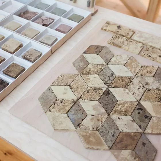
samples of materials
© Agnieszka Sukienniczak
The questionnaire begins with a general question about the feelings a hospital stay evokes. The interviewees' answers vary, which is hardly surprising. To the employed, the space is associated with good feelings, mainly the desire to help others. To the sick, the hospital brings to mind aversion associated with waiting, stress, anxiety, but at the same time hope for recovery. Another issue relates to the condition of Polish hospitals. Which of the proposed solutions should be introduced? Given the choice of increasing the amount of daylight, greenery, changing materials or improving the quality of ventilation, the answer concerning ventilation was chosen by 30%, 10% of respondents would increase the amount of greenery. The same number received the answer concerning daylight, as many as 50% of respondents would choose to change the choice of materials.
In the next part of the survey, the issues considered relate to the samples provided. They were selected to include plastics , natural raw materials, with different colors and degrees of sterility. Among them were: wood, PVC flooring, ceramic tiles, metal, concrete-textured board samples, fabrics and wallpaper of various textures. Which of these are associated with current hospitals? Patients mentioned white tiles and metal (used in mobile equipment), which is unpleasant to look at. Employees praised PVC carpeting because of its easy cleanliness. In the next question, I asked them to indicate which materials they would choose themselves. Interestingly, these differed from those typically used. Respondents unanimously indicated that they should create a homely atmosphere. Among the answers, we find wood-like materials, glass and fabrics - provided they can be easily sanitized. Warm, light shades of wood and colors of pink, beige and green were unanimously chosen.
Another issue was the foundation / dispensary buildings. Unlike hospital facilities due to the lack of operating rooms, the regulations for these facilities are different. In the eyes of staff, these spaces are now modern, associated with glass, fabrics and wood. Patients describe them as having a home-like atmosphere, additionally pointing out that the foundations often feature paintings/photographs on the walls.
In view of their various functions, should these facilities meet sterility requirements? Among employees, 80% of those surveyed said no. I find interesting the difference in response to this question, all patients answered in the affirmative.
What should the foundation's interiors look like? Those asked indicate that, unlike the rooms of hospitals, bolder compositions can be used, using more glass, mirrors or concrete panels. All the time, however, they emphasize that the interiors should be bright, airy, cheerful.
The last question was already specifically about the floor plan of the foundation I designed. I distinguish in it two private zones - with guest rooms for patients, and public - rooms for meetings, talks or therapies. Should the material be used uniformly, or change depending on the function of the rooms? Here, 60% of respondents indicated a variation of materials, the responses in both groups were the same.
In summary, although the people interviewed had not seen the examples I cited before, they indicated very similar materials based on wood and light colors. This choice also coincides with my design intentions. It was interesting to find that in the interviews it was the patients, by far, who more often expressed their concerns about the sterility of medical facilities.


