


A year after the opening of the new subway section to Warsaw's Wola, we check how the stations, whose design has won press acclaim, are doing. Do spaces filled to the brim with trendy accessories - from neon to terrazzo - age well?
three new stations
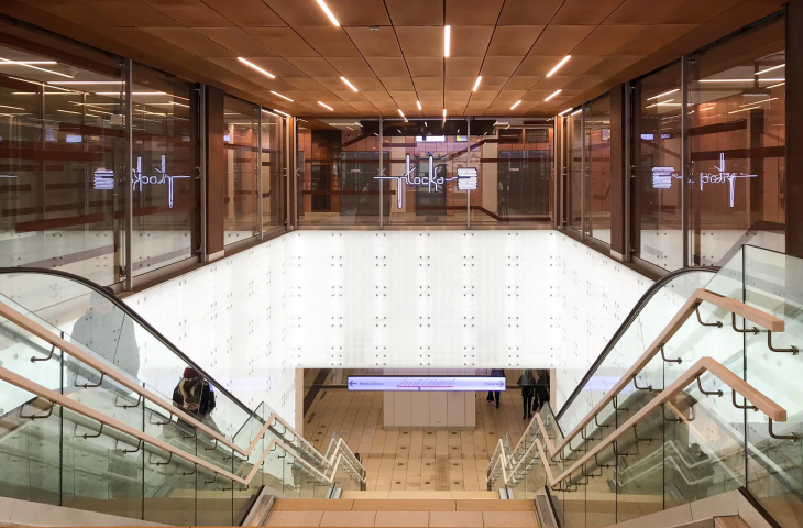
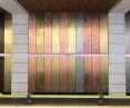
On April 4, 2020, a new section of the Warsaw subway to Wola opened during the first pandemic lockdown. The project included the construction of three stations - Plocka, Mlynow and Ksiazcia Janusza. Their design was selected in a competition organized by Warsaw City Hall in 2012. The winner was the concept prepared by BP Metroprojekt and the Kazimierski and Ryba Design Bureau. The station design concept was developed jointly by KiR and Archinauts offices. The architects intended the new stops to refer stylistically to the immediate area. Thus, at Plocka station, the copper walls and drawing of the ceilings allude to the former electronic factories. The Młynów station with its blue circles is a reference to the Moczydło swimming pools. Prince Janusz station, in turn, is a nod to the Ulrych family and their former farm in Wola.
Thestations have a similar functional layout of the platforms, with modifications in the spaces of underground passages, the number of exits and their standard - depending on the terrain conditions of the station. The exits on the outside are shaped in a similar way to the interiors - they are based on a common glass kiosk frame, to which characteristic motifs have been added.
Fashionable, but for how long?

The first Polish McDonald's
photo by Adam Fagen / CC
The Kazimierski and Ryba Design Bureau are architects best known for their striking (sometimes flashy) designs of the 1990s. It was they who designed the first Polish McDonald's glued to the wall of "Sezam" and the now demolished BGŻ bank headquarters on Kasprzaka Street - the literal embodiment of "ship style" in the postmodern version. These aesthetics today may evoke nostalgia, laughter or pity, but rather not admiration. The question is whether a similar fate awaits the equally flamboyant Volscian subway stations? As a scholar of Warsaw postmodernism Aleksandra Stępień-Dąbrowska once noted, "If the 1990s were to be considered the decade of architectural spectacle, Kazimierski and Ryba were its masters of ceremony." And it's hard to deny them the sense to hit popular tastes.
Plock

photo by Kacper Kepinski
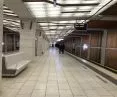
Plocka station seems to be the favorite new station of Varsovians, and indeed of all three it is the most elegant. The copper (or copper-like) wall cladding, large led-lit surfaces and IC-inspired ceiling drawings give it a dynamic but rather classic expression. On the floors, as in the other stations - terrazzo. In this case, white. The same mistake, by the way, was repeated at Młynovo. Why a mistake? Because when designing public spaces one should take into account its peculiarities, the way it is maintained, the intensity of use or the possibility of easy and quick repairs. This is not the decor of an office building calculated for 5 years, but a space that should serve the residents for as long as possible.


Photo by Kacper Kepinski
Unfortunately, the materials used already look significantly worse after a year than just after opening. Stains, abrasions, cracks. Of course, the way they are maintained is partly to blame - although the Warsaw subway is unlikely to have a problem with dirt. White flooring in such a place must have been risky. Likewise with the suspended glass ceilings. A similar solution was used in the glass tunnels leading to the stations of the central section of the subway. Again, the same problem - dust and dust deposits are deposited on the translucent panels from the upper, inaccessible side. The only way to remove them is to remove the panels, wipe them down and reinstall them. However, this is not a convenient or economical solution. And economy in the use of public spaces is what we should all expect.
Mills


photo by Kacper Kepinski
The situation is similar at Młynow. The most modest of all three stops, it refers to water and air. Initially the station was to be called Moczydło - and this is where the water references came from. Although the aesthetics of this station are the least intense (aggressive?), there are some questionable elements used here as well. These include, for example, lighting elements made of white plastic, on which dirt also settles, in addition, the surface deforms. A pleasant motif (repeated at all stations) are neon signs. Aesthetically designed and incorporated into the various spaces of the stations, they relate to their overall themes.
Prince Janusz

photo by Kacper Kepinski
The most mottled is the last station of Prince Janusz. Here, too, the lack of consistency and discipline in design is most disturbing. The myriad shades of green, which often clash with each other, look as if they stem from technological rather than design considerations. The striking green-gray gradient columns in the corridor spaces on level -1 come off rather haphazardly. The shades of the flooring and terrazzo are also different. The exits to the street compare poorly with previous stations. The stark green combined with the broken shapes of the roofs is a rather aggressive form in an unattractive area, which does not bring order here.

Photo by Kacper Kepinski
swelling with pride
The year 2021 for the Kazimierski and Ryba office started very well. The Wolski subway station was nominated for the prestigious Mies van der Rohe Award. A wave of admiration swept through the media and social networks, as if the prize had already been awarded. It's hard to deny architects the satisfaction of having their work recognized. However, it's hard to find in the media reports that this is only a national nomination. The building was submitted for the award by Hubert Trammer, but only in the next stage will it undergo verification. In the first phase, selected specialists have complete freedom in submitting projects (limited in time), which means that debatable projects also receive nominations (such as the project to rebuild Kielce's PKS Station, which was submitted the same year).
I am very pleased with this award. I swell with pride.
Andrzej Ryba, Gazeta Stołeczna

Budapest subway
Photo: Christo / Wikimedia Commons
It's worth comparing the Warsaw subway to Budapest in the context of the nomination, by the way. Submitted in 2015, the Fövám and Szt. Gellért stations are underground sculptures carved in concrete. The joint project by sporaarchitects and PALATIUM Stúdió is based on exposing expressive construction and concrete structures, playing with light and candid materials. The visual side of the station is built through the space itself, its construction and materials, rather than secondary additions. Complements are colorful mosaics of thousands of tiles, dynamizing the subdued colors of the underground tunnels. Such elegance and consistency were missing in Warsaw.

Budapest subway
photo by James Guppy / CC


