


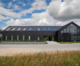


The Polish landscape has accustomed us to one repetitive block after another. Often sloppily finished with unsightly plaster of a color similar to nothing. Spatial chaos is accompanied by unbearable repetition of mediocre designs. The design of the IFA Group studio seeks different solutions.

The dominant element of the solid is sheet metal in shades of black
© IFA Group
Looking for the right patterns
For the investor, the most important thing was to create a building that would not only serve an office function, but create a new form of corporate visual identity, consistent with the brand perception of the company, which is engaged in intralogistics - the assembly of steel structures or the construction of high pallet storage warehouses.
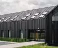
Color and sheet metal
The architects decided to create two designs for the building. One was based entirely on a white color scheme, the other on shades of black. The investor opted for the color black. The designers' goal was to create a solid that stands out from its surroundings, referring to the steel structures that the company for which it was made deals with. Black was used not only on the facade, but also inside the establishment.


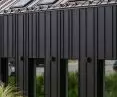
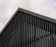
Details are important in the final solution of the facade
© IFA Group
The building of the IFA Group project can be considered a correct and interesting project, introducing solutions to improve the quality of public space. Offices and halls next to enterprises are often in Poland a hotbed of poor quality materials, mediocre solutions and architecture at all costs. The project prepared by IFA attempts to show that a company's headquarters can also serve as a business card, and that betting on better quality equals improved visual identity.
Kamil Domachowski of IFA Group will talk about the creation of the project, the choice of materials and technology, and the attempt to improve the space in Poland.
Wiktor Bochenek: The design of the Voss headquarters was initially made in two color tones - white and black. Where did this idea come from?
Kamil Domachowski: Pure idea; the environment around the building is a typical "idyll" of colors and shapes in Polish architecture. If the environment is calm, you can think of something that screams form, but if it's a bit chaotic, it's good to calm down the designed block. Another factor is the recognition of the company's headquarters. We tried to combine all these things.
The investor approached us with the outline of the solid and the initial functional division. The color of the facade white, black or any other was not particularly important, it was more about consistency in the decision - black is elegant. The facade itself, the facade refers to the steel structures that the investor creates every day.
It's nice when buildings are not hung with advertisements, which is what the company does. The vertical laths on the facade allude to the tall structures that Voss specializes in installing.


Black laths are an important element of the block, giving the block a vertical character
© IFA Group
Wiktor Bochenek: The facade of the building was made of sheet metal - an interesting choice. Why did you choose this particular material?
Kamil Domachowski: As an alternative choice, we had plaster or another form of ventilated facade, such as fiber-cement. The investor's industry is strongly associated with sheet metal, hence our choice.
Wiktor Bochenek: In this building, the correlation of exterior and interior architecture was important - what means were used to achieve it?
Kamil Domachowski: We did not look for an idea by force - the exterior massing intruded inside. The foyer is relatively large and well-lit. We used black color on the walls as well. The interiors are consistent, austere, functional. In addition to black, we used contemporary accessories, such as acoustic couches, colorful armchairs, and oak tables. The offices themselves are finished in white.

The characteristic black also appears inside
© IFA Group
Wiktor Bochenek: Technical solutions are also important, including the so-called "butterflies". What did you use and why did you choose such solutions?
Kamil Domachowski: The building is located in a heavily suburban area. It is partially adjacent to single-family housing, and partially adjacent to farmland. In addition to mechanical ventilation, we took the opportunity to use ordinary gravity. We did not want to create window divisions. We managed to convince the investor to use one opening, narrow vertical element along the entire length of the window as part of the ventilation of the rooms in question.
Wiktor Bochenek: What are you most proud of, and what was the most difficult?
Kamil Domachowski: We are proud that we attempted to create a solid that is consistent, elegant, and defends itself with the emotion it provides to its surroundings. We wanted it to be the visual identity of the company in an obvious way, without hanging a banner.
Wiktor Bochenek: Thank you for the interview!

there was a place for white in the offices
© IFA Group


