


{Student}, a graduate of the Wladyslaw Strzeminski Academy of Fine Arts in Lodz, fascinated by Polish Brutalist architecture, has created an atlas on this trend. Her book is an overview of five buildings and their history shown in the author's text, font and illustrations.
Thebook, designed by Paulina Adamowska, is a master's diploma made under the direction of Prof. Slawomir Kosmynek at the Academy of Fine Arts in Lodz. The publication is a review of the best examples of Brutalist architecture in Poland. It contains five buildings selected by the author, which, in her opinion, most closely meet the postulates of the ideas of this trend. The Academy of Fine Arts graduate, instead of an ordinary textbook, decided to create an illustrated atlas, which in an interesting way conveys the basic knowledge of Brutalism.

The atlas includes the author's texts, illustrations, as well as a special font
© Paulina Adamowska
As the author says:
The purpose of creating this book, among other things, is to popularize brutalism and show its uniqueness. Many people do not even know what this direction in architecture is called. Buildings are often criticized for the times in which they were built and no one pays attention to their form. In addition to this, a very important problem is that we are irretrievably losing them. The best example of Brutalism, the Katowice Railway Station, was demolished in 2011. The Forum Hotel in Krakow, distinguished by its massing, has been neglected for years and we don't know what fate awaits it.


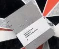
The cover was made of architectural concrete
© Paulina Adamowska
The designer wanted the book to be entirely her own creation. Paulina is the author of the text, illustrations and even the font. The illustrations of buildings found inside the atals also function as posters printed in 50×70 cm, or 50×50 cm format. The book has about 90 pages, and the cover is made of architectural concrete and stitched with Coptic stitch.

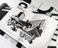
The illustrations in the atlas function as posters
© Paulina Adamowska
Dobrawa Bies: Where did the idea for the atlas come from and why the brutalism?
Paulina Adamowska: Two years ago I went to Krakow for a few days. I was on a walk by the Vistula River and saw a huge billboard on the other side of the river. Under this billboard I saw concrete and shapes that intrigued me. When I got home, I immediately checked what the building was. It was the Forum Hotel. It was only in old photos that I saw its shape in its entirety, and I was immediately captivated by its massive concrete form. A month later I had the pleasure of visiting the Barbican Centre in London and through this I saw two different approaches to Brutalism. I believe that this architectural style is underestimated. I decided to make a book about it to draw attention and interest others in Brutalism. We have already lost the best example of Brutalist architecture in Poland, and I would not like to see these mistakes duplicated.

The author chose five buildings that best show the idea of brutalism, for example, the Forum Hotel in Krakow
© Paulina Adamowska
Dobrawa: You are the author not only of the illustrations, but also of the font and texts. Please tell us about your work on the project.
Paulina: It took me almost a year to work on this project. At the beginning I focused on research. I collected a considerable amount of material on brutalism in Poland. I looked through a lot of books, magazines or websites. I chose five buildings in Poland that best exemplify the ideas of brutalism. When I started writing the text, I found so many great quotes by Filip Springer or Anna Cymer, among others, that I absolutely wanted to use them in my book. Once I had, partially written the text, I started working on the visual part. I visited all the locations mentioned in my atlas to photograph them, look at them carefully and look for inspiration to create illustrations. The only exception is the train station in Katowice, which was demolished in 2011. The illustrations I have created more or less reflect actual buildings. Sometimes, however, they are just abstract forms with concrete textures. I created most of the illustrations so that they could exist, as separate posters. At the end of the process, when I had the layout of the book and all the elements ready, I focused on designing a font that would reflect the brutalist forms. It consists of thirty-five variations, which I combined into a variety of compositions.


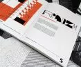
The font designed by Paulina refers to Brutalist forms
© Paulina Adamowska
Dobrawa: To whom is the atlas addressed? Do you think good design can influence the lives of its recipients?
Paulina: The book is addressed to all fans of architecture, especially modernist architecture. It is an illustrated atlas with basic information about this trend of architecture, not a textbook, a compendium of knowledge. It aims to make the viewer curious and inspire him to discover Brutalism. Design is an integral part of our lives. Each of us experiences it every day, consciously or not. Good design can arouse positive emotions in us, fascinate or delight us, while bad design can frustrate or irritate us. Brutalism combines extreme emotions, monumentality and inaccessibility with simultaneous beauty of form and utility design thinking. This is also what I wanted to show in my album by designing a concrete cover, or specially font, while keeping the content accessible.
Dobrawa: Thank you for the interview!
Dobrawa Bies


