


A new eatery has appeared on the map of Gdansk, near Hala Olivia, in a communist-era pavilion. At Nie/Mięsny there is something for everyone, as the idea of the owners is to run a kitchen without exclusion, judging food choices and divisions. Its colorful interior, full of plants and vintage elements, is the result of a collaboration between architects Mateusz Piotrowski of studio 2lf and Ula Schönhofer. We invite you to come inside!

One of the characteristic elements of the premises are vintage chairs
photo: Beata Czurakowska | lokum.studio © Mateusz Piotrowski, Ula Schönhofer
The history of the Nie/Mięsny brand on the Tri-City market begins in 2018, in the Lower Town in Gdansk, although before that the couple of owners, Kuba and Karolina, ran a foodtrack under the name Muka Bar, known to all the regulars of besieged festivals and outdoor events. The first restaurant designed by Pracownia 2lf was built in a former butcher store from the communist era. The modest investment involved preserving some of the design elements like the old butcher's hooks and the use of the original signboard, which also became the inspiration for the name Nie/Mięsny, says Mateusz Piotrowski.

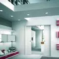
The projection of the Nie/Mięsny bistro
© Mateusz Piotrowski, Ula Schönhofer
A bistro in a communist-era pavilion
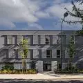
At the end of 2022, Kuba and Karolina decided to open a second establishment, in the post-war part of the Oliva district, three hundred meters from the Olivia Hall, close to the university campus. The idea behind both establishments is Middle Eastern-inspired cuisine, featuring meat and meatless dishes in equal measure. In keeping with the owners' philosophy: no exclusion, judgmental food choices or divisions. This time, too, they enlisted Matthew Piotrowski, and Ula Schönhofer joined the design team.

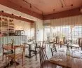
The eye is drawn to the colorful floor and strong ceiling
photo: Beata Czurakowska | lokum.studio © Mateusz Piotrowski, Ula Schönhofer
Thenew premises, like the previous one, were created in a communist-era pavilion, with Favier's characteristic giant radiator. According to the investors' guidelines, the premise of the project was some reference to the first Nie/Mięsny, but in a new, refreshed form, other than that we were left free. Previously there was a restaurant in this place, so we decided to use parts of the existing furniture, which we renovated, and in the chairs we changed the upholstery, which was matched to the color scheme of the premises, the designers say.

In pastel pots the architects placed plants
Photo: Beata Czurakowska | lokum.studio © Mateusz Piotrowski, Ula Schönhofer
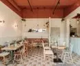
a place for everyone
In the design, the architects made sure that everyone would find a suitable place for themselves. Tables can be separated or combined for a larger group, there are four-person round tables by the windows, there are also upholstered benches, and next to the bar there is a small annex with lower café tables and poufs.

The eye is drawn to the strong accent of the ceiling, the fixtures and the upper strip of walls in the color of burnt sienna
Photo: Beata Czurakowska | lokum.studio © Mateusz Piotrowski, Ula Schönhofer
A strong accent of the ceiling, installations and the upper strip of walls in the color of burnt syene, juxtaposed with the floor in pastel colors, catches the eye. The floor is made of stained porcelain stoneware tiles with a side of ten centimeters. The walls, on the other hand, are painted in soft shades of beige-olive—darker and lighter.

The vertical rhythm also appears as window decoration
Photo: Beata Czurakowska | lokum.studio © Mateusz Piotrowski, Ula Schönhofer
A partition wall made of mesh and steel profiles, separates the premises from the toilet and serves as a place for hangers. The architects decided to leave the original block of the bar, changing its covering—patterned tiles, replaced by delicate vertical divisions. The vertical rhythm also appears as window decoration made of wooden slats. Shelves made on a closed structure of steel flat bars fill the space behind the bar. The wall below it is enclosed by a strip of white tiles in the format used on the floor. White tiles also appear on the bathroom walls, where they contrast with the intense color of the ceiling.

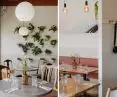
No/Meat is full of plants
Photo: Beata Czurakowska | lokum.studio © Mateusz Piotrowski, Ula Schönhofer
An important decorative element are numerous plants placed in pastel pots and hung on the walls. The architects also opted for new lighting in warm colors—in addition to vintage light bulbs hanging from the ceiling and ceiling spotlights, they placed original mirrored wall sconces on the walls.
interview with Mateusz Piotrowski
Dobrawa Bies: What was your main design inspiration and how do you work in a space that was already a restaurant? Do you prefer a „clean sheet” or an interior with a history?
Mateusz Piotrowski: We believe that the location of an investment should correspond with the interiors we design, and we usually have specific guidelines from investors who co-design each interior. In the case of this project, we were still inspired by the first Nie/Mięsny location. Some found elements are valuable to us so much that we decide to develop them in our concept, and some we have to delete/demolish/paint in a different color—making these decisions is a very important part of the concept stage. Our task is to maintain the right balance so as not to lose the character, of a given place, but at the same time to create a space that meets the expectations of a modern audience.

Pastel tiles are dyed in the mass
Photo: Beata Czurakowska | lokum.studio © Mateusz Piotrowski, Ula Schönhofer
Dobrawa: Why such color decisions and the use of different types of chairs, among other things?
Mateusz: We opted for a color palette that created a cozy and warm feel to the place, as well as blending well with the greenery—we knew that the investors would want to introduce live flowers into the interior. The bold color used on the ceiling adds character to the interior and unites the zones into a common space. In the case of chairs and tables, the budget issue was not insignificant (we used some of the existing elements in the premises), but above all, we judged that vintage chairs renovated is a good idea.

No/Meat bistro is located in a pavilion from the communist era
Photo: Beata Czurakowska | lokum.studio © Mateusz Piotrowski, Ula Schönhofer
Dobrawa: How are guests supposed to feel in this interior?
Mateusz: According to the philosophy of the owners: without exclusion, judging food choices and divisions, that's what the interior was supposed to be, friendly, uncluttered, with an atmosphere where most guests would feel comfortable.
Dobrawa: What was the biggest challenge in this implementation?
Mateusz: Maintaining a consistent character of the new place with reference to the first location and creating an attractive space using the potential of the new location.