


A new establishment has appeared on the gastronomic map of Poznan. An inconspicuous signboard hanging on one of the tenements in Jezyce invites you to a small space, owned by Jakub Tepper and Min, which takes us not only in place, but also in time to Japan of the 1980s. These homey, cozy interiors, reminiscent of the Showa period, were created by Maja Uzarowicz of Studio Uzarowicz. We invite you to visit Tonari.

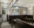
A lot of dark wood was used in the premises
Photo: addbox © Studio Uzarowicz
Tonari means neighbor/neighborhood. We may remember this word from Studio Ghibli 's cult animation "Tonari no Totoro" ("My neighbor Totoro"). That's what the place was supposed to be - homely, cozy, a bit cramped and bringing people together. The aesthetics were to be reminiscent of Japanese residential interiors from the Showa period - lots of dark wood, tatami mats, distinctive wallpaper, decorations, subdued lighting," explains Maja Uzarowicz.


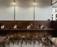
Tonari has been divided into several zones, depending on how you want to eat your meal
Photo: Addbox © Studio Uzarowicz
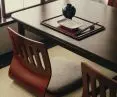
The investors wanted to show Japan in an authentic, even ordinary way - without stereotypical references to japandi style or orientalism. The architect divided Tonari's interior into several zones depending on the way one wants to dine. There is a space with classic tables, a bar where you can dine alone, a high bar and a book and press corner with original Japanese comics and current newspapers.

The area for dining at tables
Photo: Addbox © Studio Uzarowicz
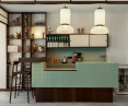
Attention is drawn to a separate, intimate "shoeless" space, where one sits on tatami mats. The focal point is the bar, which is meant to allude to homey Japanese cuisine. The large mosaic lump in the distinctive mint color is complemented by kitchen storage and shelves on which Japanese dishes are piled.
Analog photos were also created for the photo shoot done by Addbox, emphasizing the atmosphere of the interior.

Tonari is divided into several zones
© Studio Uzarowicz
interview with Maja Uzarowicz
Dobrawa Bies: We take a look inside the Tonari restaurant, which takes us from Poznań to Japan of the 1980s. Was designing with reference to such a distant country a challenge for you?
Maja Uzarowicz: Any theme in which there are very specific expectations regarding character and climate is always a challenge. However, in this case, the investors approached me, knowing my weakness for Japanese culture. For years, Japan has been very close to me on many levels (I collect kimonos, I'm interested in Japanese applied arts, martial arts, etc.), so I had a good feel for the effect they wanted to achieve. Which is not to say that I didn't have to prepare for it substantively as well.


In the premises we can find references to Japanese animation or neonostalgic styles
Photo: Addbox © Studio Uzarowicz
Dobrawa: Exactly - the design escapes the typical trends and associations with the Far East. Here we have references to the detailed animations of Studio Ghibli, or the neonostalgic style. How does it differ from the retro style? What kind of atmosphere did you want to create in the premises?
Maja: For me, neonostalgic style is more than retro, but the line between one and the other is quite fluid. For me, retro style is a more formal treatment, while in Tonari it was about creating specific associations and feelings, without taking elements of Japanese interiors literally. Through contemporary solutions, I wanted to recreate certain emotions, memories or images in my mind. Even if someone isn't interested in Japan, there's a good chance they grew up watching Japanese animations with Italian dubbing, such as Captain Tsubasa, and have specific emotions associated with it.


The atmosphere of the interior is emphasized by analog photographs
Photo: Addbox © Studio Uzarowicz
Dobrawa: Did the owners of the restaurant have any design guidelines, or did they give you a free hand?
Maja: The investors are very connected to Japan, so there was no question of taking shortcuts or compromising. It had to be authentic, and the form and aesthetics had to follow the memories and impressions the investors had collected over the years. This was also the atmosphere I wanted to create - nostalgic and cozy. A bit of a Japanese milk bar, a bit of Japanese mom's kitchen. This is the second restaurant I have designed for them, so I think they trust me and we feel similarly about aesthetic issues. All the accessories - figurines, posters, books or even bathroom accessories - came from Japan, from their collections.

The architect opted for a limited range of colors
Photo: Addbox © Studio Uzarowicz
Dobrawa: In Tonari, the main colors are wood brown, mint green and white. Please tell us more about the materials used and the color decisions.
Maja: We searched for the color of wood for quite a long time. Not only its shade was important, but also its luster and feel when walking in the tatami section, where you walk in socks. More economical solutions, like using furniture board, were out of the question. Wood was meant to be wood. So was the paper in the fanlight, which refers to traditional shoji screens - imported specially from Japan, chosen from many species. Aesthetically, thanks to the very fashionable japandi style, we are accustomed to very light wood species, and traditional domestic (though not exclusively) Japanese interiors from the Showa period are quite dark precisely because of the presence of dark wood. Big nods to the carpentry team at House of Wood, thanks to whom this project is so perfectly executed in every detail. In addition to precious wood, original straw tatami mats, glass lamps, an attentive eye will catch small details of .... plastic, which is also very present in Japan in its distinctive design.


Mint-colored tiles were used on the bar and in the bathroom
Photo: addbox © Studio Uzarowicz
Dobrawa: Favorite space in the premises is?
Maja: Definitely the bar. It is the heart of the premises and in me personally it stirs important memories and associations with Japan.
Dobrawa: Thank you for the interview.