


Can the interiors of a house simultaneously stimulate and soothe during the transition between rooms? How to reconcile green, copper and pastel colors? The latest realization of interior designers from Butterfly Studio shows how to achieve such effects.

What is worth noting in this interior is the unique shapes of tiles and panels. A variety of patterns appear here
© Butterfly Studio
initial design idea
The Buttefly Studio was approached by investors, whose day job is graphic design and programming. They wanted to create a unique space in their home near Warsaw, where the priority was to bet on unusual effects. The realization is expected to be completed in 2022, and the designed area was one hundred and ten square meters.

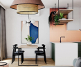
The color scheme, is based mainly on copper color and shades of green
© Butterfly Studio
The design of the house near Warsaw was an interesting design challenge for us from the beginning. The investors are involved in graphic design and programming, and from the very beginning they were open to strong accents, bold solutions and interesting color combinations," recalled the authors of the project, Anna Baranowska and Joanna Felczuk of Butterfly Studio.

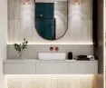
The upstairs bathroom is done in more peaceful tones
© Butterfly Studio
how was the interior division created?
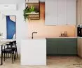
It was important in this project to divide the house into two color zones. It was important to create a very colorful interior on the first floor, using a variety of textures and shapes. It was also important to use copper, which the investors insisted on. The upstairs rooms were solved in a different way, with the vivid priority colors on the first floor replaced by muted colors. Above all, the bedroom was to be a more serious and elegant space - creating a place of rest.
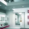
The entrance to the house itself also stands out in the space of the house. It was kept in dark tones in an effort to create an element of surprise, so that behind the glass door we see a very bright, colorful space with a view of the forest outside the window.

The vestibule was intentionally darkened
© Butterfly Studio
unusual colors and unique materials
The way the color scheme is used is equally important. For the investors, the appearance of two colors - copper and shades of green - was important. The designers from ButterflyStudio added blue, navy blue and pink - whose main purpose is to harmonize with the target colors.
The choice of materials turned out to be very diverse - fish scale-shaped tiles were used over the kitchen countertop. The bathroom, which was located next to the bedroom, was done differently from the rest of the interior. It featured a free-standing bathtub, subdued anthracite tiles arranged in a herringbone pattern and atmospheric lighting.

In the living room space, the color contrast of the interior is best seen
© Butterfly Studio
The interior of the house designed by Butterfly Studio tries to look for a variety of solutions in the use of colors in the interiors - from copper through green.

The bedroom was ultimately intended to be a calmer and more subdued space
© Butterfly Studio