


Aleksandra Kuza of the Tri-City studio Elementa Studio designed an apartment in which the effect of coziness and spatial harmony is caused by natural, slightly smoky colors and the right choice of materials. The effect is very interesting and gives the impression of being in an oasis of peace and relaxation in the middle of the urban hustle and bustle of Gdynia.

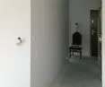
projection of the apartment before and after renovation
© Elementa Studio
Malgorzata Tomczak: The apartment in Nowy Orlowo is 67 sqm. The most important design task seems to have been working with light. What effect did you want to achieve?
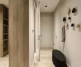
Aleksandra Kuza, Elementa Studio: Because of the poor lighting, the apartment seemed dark, sad. The first thing that came to my mind was the idea not to fight it, but to make it an asset. Keep the smoky character of the interior and at the same time gently enliven it. Artificial lighting is very important in this situation. It is designed on the principle of scenes. We can illuminate only the space we are currently using or the whole thing, or choose to softly and evenly illuminate the whole thing. The future users agreed with me on this point, which was crucial for the follow-up. They took place smoothly, with full understanding and acceptance.
Margaret: The interior is kept in natural grays and beiges. This creates a very friendly, calm atmosphere of a space where one relaxes well. What influenced your decision to choose such a color scheme.
Alexandra: I use natural colors in my projects. I love stone gray and beige tones and broken whites. And they are usually the base. In this case, this color scheme allowed to achieve a smoky effect, a gentle transition of colors.
I believe that home is an oasis where we feel ourselves. It can be crazy, green, gold, juicy, and it can also be more grounded, pastel, calm. The latter suits my nature more, and I've found that I get people who need this tranquility in their homes. I give it with pleasure.
Margaret: Pastel colors used on various details, such as lamps, fabrics , pillows break the monotony of the whole, and at the same time do not knock out the overall impression of pleasant tranquility and a sense of respite from urban life rushing by with its rhythm. How did you choose the accessories?
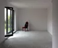
Alexandra: This design was certainly influenced by the trends and colors that appeared at the Milan trade fair (2014). Coral reigned supreme there, which a while later became the color of the year according to the Panthone pattern book. To break up the warm tones, I used an aged cool blue, and black for stronger accents. The recipe for harmony is the color palette. Using muted and distressed colors, we can achieve a soft transition effect. Not necessarily boring. Contrasts are hidden, smuggled in - here it was red and blue. You can play around a bit like on a real painter's palette.
I was also hugely impressed by the new collections of ceramic tile manufacturer Mutina, which fit perfectly with the color scheme idea. It wasn't obvious, as grays and whites were prevalent in the stores.
Margaret: What was the biggest challenge in working on this project? The rooms seem narrow, yet we managed to create a feeling of spaciousness, and the detailing and finishing is very refined.
Alexandra: Working on the functional layout is, next to inspiration, the most important stage of the project. By setting functions and divisions, you can make the space likeable even without color and accessories. It's still work on the harmony of the interior, improving the proportions as much as possible and necessary. In the case of this project, the challenge was to fit all the necessary functions into an aesthetically pleasing form.
The living space of the apartment was divided into three zones: a kitchen with a peninsula, a dining room with a fireplace and a living area for relaxation. They are small, but fulfill their function and optically equalize proportions , shorten and widen the interior.
The small bathroom accommodated a free-standing bathtub, and the washing machine was hidden in a coral enclosure, which took away a few dozen centimeters from the bedroom.
The detail in such small spaces plays the role of "surface distractor". This makes them more interesting, approachable or cozy. They do not dominate the whole like, for example, monocolor, which in small spaces is an advantage. Such an element is the wall of the fireplace - all covered with a tile with a delicate pattern resembling imprinted lace, or the bookcase with asymmetrically arranged shelves. These were the largest planes to be developed.
Working on the detail makes the interior stand out from others, and I think in this case it was worth it.
Margaret: Thank you for the interview!
interviewed: Malgorzata TOMCZAK

-
Kodia XL coffee table
-
Petpot LED surface mounted lamp
-
Boris technical lamp
-
Solid Ofxord Foxford bedspread
-
Grossman Grashoppa underfloor lamp
-
Woood bar chair
-
Karo bar chair
-
Tan Velur pillow


