


Bialystok RAJ pizza people wine is not simply a restaurant. Rather, it's a comprehensive concept, including not only the interior design, inspired by modernism and the aesthetics of the 1980s, but also branding and creative supervision of the concept's social media image. RAJ, which is the first interdisciplinary project by Damian Kozlowski and Katarzyna Fiedorczuk, designers from 74studio, created in collaboration with Dariusz Jablonski, is also a step towards creating an ecosystem of local artists and designers who can combine their services to create a new quality.
We immediately associate the name RAJ restaurant with something positive, perhaps a bit utopian, but certainly thoroughly pleasant. This was the goal of the owners and designers, as they were also the originators of the restaurant's name:
We wanted to offer something fresh and warm. We knew we were dealing with something new and unusual, a certified gluten-free cuisine that needed an interesting anturage. The name and branding idea was the result of hours of conversation and analysis of the local market and trends. We proposed RAJ - a name that at first glance is not associated with food, but sounds light, heavenly, warm and holiday. It's an analogy to the cuisine we were about to offer - gluten-free yet vegan or vegetarian food that is supposed to be light, heavenly good, warm and mood-enhancing. And above all, healthy. This easily laid out the path we would follow in designing both the visual identity and the interior of the restaurant. Both of these are consistent and follow the same color scheme.

The entrance to RAJ pizza people wine
photo by Paulina Angielczyk Parkometer © 74studio
modernist forms and craftsmanship
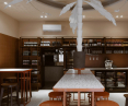
The interior of RAJ is small, but very impressive. The main room is less than 27 square meters, where non-standard solutions and compromises had to be made in terms of functionality. Although the establishment is small, there is seating for 24 people inside - mainly bar seating, but also those at lower tables where you can sit for longer.

Interior view of RAJ pizza people wine
photo by Paulina Angielczyk Parkometer © 74studio
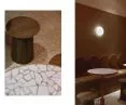
A standard bar replaces the bar annex for waiter service, also serving as a storage area for stocking the liquor on offer. The interior design is a mix of Polish modernism and 1980s style, with warm colors such browns, reds and oranges in various forms and finishes. The floor is covered with original terrazzo, and the walls are dominated by square tiles with a chalky finish, surrounding all the walls of the main room. The furniture attracts a lot of attention, as the dominant feature of this establishment is primarily handicraft. Every form except the wooden stools is handmade by local metalworkers, woodworkers and artists. The original table forms and their tops are made of broken ceramic with a luscious orangish finish.

Seating with tables made of broken ceramic and wooden stools
photo by Paulina Angielczyk Parkometer © 74studio
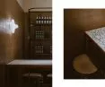
The bar annex was finished in a similar way, but this time with a dominant brown color. The mottled countertops, were complemented by cabinet fronts, which are filled with modified cork. A reference to modernist forms are also hand-profiled handles in the form of a circle. You'll also find brick seating, and the seating areas are enhanced by solid wood stools.

Details RAJ pizza people wine
photo by Paulina Angielczyk Parkometer © 74studio
palm tree, neon and mirror
The subdued color scheme of the establishment is broken by the central element, which is a synthetic palm tree, which was handmade from steel and finished in white. The palm tree is surrounded by a large red-orange neon sign in the form of a circle, and all this is reflected in a mirrored plane, which we notice on the ceiling.

Synthetic palm tree and neon
photo by Paulina Angielczyk Parkometer © 74studio
This is a form on the verge of pastiche, referring to the name of the restaurant. Its purpose is to add looseness, surprise, focus attention, be unique and one of a kind. It refers in styling to the 1980s, and is complemented by a large orange classic neon sign, also familiar from that era. It fills the interior with an incredibly pleasant warm light, which immediately evokes "paradise" memories. The mirror, on the other hand, creates a kind of portal, dousing the neon light and the palm tree, visually elevating the room and duplicating the effect of the decoration, making it even more special, the designers say.
The palm tree has quickly gone viral among visitors to the establishment, making it associated with this very place, becoming a trademark.

Round forms referring to modernism
photo by Paulina Angielczyk Parkometer © 74studio
more of a concept than a restaurant
RAJ is a concept also in culinary terms. It offers its guests gluten-free pizza, certified as MENU WITHOUT GLUTEN, which are also complemented by other main course items, whether gluten-free, vegetarian or vegan. All this is complemented by sophisticated gluten-free spirits and niche beverages from Polish manufacturers. As the designers say:
Paradise is closer to a concept than a restaurant - this place is very specific. It is not a typical restaurant, not only because of the cuisine offered, but also because of its size and arrangement.
RAJ will certainly show its full potential when it gets warmer outside. This is because a garden will be attached to the premises, and the doors will be wide open to passersby and guests looking in on a daily basis.