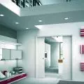


At Barbara's project by Robert Majkut 's studio has won an award in the European Property Awards. We talk to the author about the inspiration, cooperation with the investor and the result.
Wiktor Bochenek: We are talking about the realization of At Barbara's, which received the European Property Awards. What does this award mean to you? Does it open up new opportunities?
Robert Majkut: It's difficult to predict, because you never know what opens up new opportunities. For us, it is valuable because as a studio we relatively rarely create private projects, we specialize in commercial projects. The kind of coincidental situation that occurred in this project, that we got involved in it at all, was completely accidental, we got involved in it quite a long time ago and for completely non-obvious reasons.
This project is actually part of a much larger whole, a large family project carried out by a family investor, a project that developed in an amazing way from a much longer collaboration on a completely different topic. The project we are showing is an integral, but also independent part of it. We implemented it for nearly three years. The fact that we got an award for it is very nice, and it is always a valuable distinction, especially since the European Property Awards are to be counted among the most important awards, with a jury of almost eighty specialists. It does mean something, though.

At Barbara's realization was awarded in the European Property Awards
Photo: Mood Authors © Robert Majkut Design
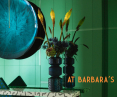
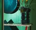
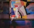
Wiktor: At Barbara's is primarily a revue of colors. Where did you get the idea to use such color tones?
Robert: Color is always a design element that I am particularly sensitive to. Playing with color in design is evident in everything we do. So playing with color is not something new for us. On the other hand, I have to admit that what condenses here, what happens there, is a phenomenon in itself.
We came across a person who wanted a place that was extremely intense and colorful, because he loves strong, contrasting juxtapositions. When we briefed, talking about expectations, she laid out before us a vision that was extremely saturated and unusual. Because dark navy blue and emerald green with orange or carmine are not typical, or at least common colors in interior design. This is carelessness and nonchalance, understood in a good sense, and at the same time openness, focusing on the quality of materials and precisely on a color scheme that is a bit out of this world. She was inspired by the films of Pedro Almodovar, as well as the colors of the 1960s and 1970s, the Memphis group, which we analyzed together. These were points that showed that we could move the sliders further....
From the basic assumptions of how it would look, to the final decisions about material selection and the creation process, we worked closely together all the time. The cool thing was that many of the things used in this project, designed by us as well, like most of the furniture à la Memphis, are things that were created for this project. This is the result of a sincere play with convention, stemming from the joy of designing a living and unconventional space. Even in the working method, for example, we did not use visualization, but hand-drawn concept design, which seemed more natural in the process and freer to express ideas. At the same time, this is not the owner's only apartment, so there was no need to do this space on the fly. Things were created one by one....
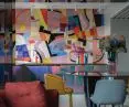
Wiktor: Attention is drawn to the unusual mosaic, where did the idea for such a solution come from?
Robert: Initially we thought there would be art hanging there. We got this apartment in a started form, part of the processes had already worked. They existed, but they were going in a completely different direction than what we discussed with our client. While discussing what we wanted the interior to look like, we realized that it would be a completely different apartment.
So we started to change the existing kitchen, adding more elements, such as a purple stone countertop and this unique tap with a ceramic red body. We came to the conclusion together along the way that why hang a painting when we could do it on the wall. That was the first step to making it in ceramic form. It was a eureka moment and complemented the convention. We liked the idea because it is a unique and very artistic solution. We are very familiar with such realizations, for example, from Gdynia, or other places where ceramic wall decorations were present.
With this, we wanted to enter a completely different level of thinking about ceramics in the kitchen. We transferred to the wall an impression from a painting that was to hang there. Inspired by its forms, colors, vibrancy and dynamics, we created this mosaic. In cooperation with a specialized company that created the ceramics for us by hand, we selected everything - every color and texture, enamels and so on. It's a non-obvious element, that's why it catches the eye.

The mosaic, which was based on a painting that was supposed to be there
Photo: Mood Authors © Robert Majkut Design
Wiktor: How did you try to refer to the style of the Memphis or pop art group?
Robert: It's a reference of several levels. Memphis primarily sought in design an antidote to "Bauhaus modernism," which was extremely disciplined and minimalist. It was about playfulness, color, expression and something not obvious - for example, creating furniture that looks but is not necessarily utilitarian. Their design was to entertain and be a contradiction of strict functionalism. This is one of the more important counterpoints that gave rise to postmodernism. And yet this sense of playing with form and expression is, after all, the essence of this design.
If, on the other hand, we think about what Memphis was to those times and place it in the broad context of culture, we see that it coincided with mature Pop Art. When we recall this aesthetic, we find the same play with form, quotation, playing with convention that we have now somewhat forgotten. In today's design, with all its responsibility that design must respect in the context of contemporary problems, if only environmental ones, this playfulness is present to a far lesser degree. As recent years have shown, after the minimalism of the 2000s there is a need for multicolor. We must also look for a place for joy in smart design.
Memphis-Almodovar-Popart inspirations show what counterpoints were important to us in creating such an unusual space. Playing with a metaphorical reality transported from another world is a distinctive juxtaposition that combines. It is a continuous game with these styles.

Bedroom - it is worth noting the unusual dresser
Photo: Mood Authors © Robert Majkut Design
Wiktor: How was the cooperation with the investor?
Robert: This is, as I mentioned, a big family project and one of those cases where we talk about what we want, not what we have to do. We had a lot of creative freedom, but also a lot of possibilities. At the point where we talk about the quality or coolness of things, rather than what is possible and what is not. I really appreciate that the client stimulated us to go further and further and was open to different ideas. This is a family of very creative personalities, looking for non-trivial solutions, working together in an intense dialogue.
Wiktor: If you had to point out what you like best about the apartment, what would it be?
Robert: It's hard to say. I am, if only because of the time in which this interior was created, very familiar with it. In the photos you can see the moments we focused on. I really like the green wall in the lobby with Christophe Gaignon's mirror, which we jokingly call the eye of Sauron. It is hand-cast from tinted glass, creates the effect of a human pupil, everything in it is absolutely phenomenal. There are such micro moments in this apartment, from the details of the lamps to the flowers inspired by Azuma Makoto's work, that I pay attention to and come to the conclusion that I wouldn't change anything there. This is already a lot for my search for professional satisfaction. This convention is not in the linear sequence of our design evolution, but that's good, because sometimes it's good to step out of your shoes and test your openness.
Victor: Thank you for the interview!


At Barbara's - details
Photo by Mood Authors © Robert Majkut Design