


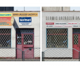


Changing the corporate identity can bring unexpected results. It directly improves the aesthetic quality, increases interest in the company and changes the perception of the street. Mottled banners and signs can be replaced with considerable benefit.

The mottled banners have been replaced by unique forms
© Traffic Design
The :DobryZnak initiative and the Traffic Design association organized a campaign in which several cities competed in an online plebiscite to carry out a metamorphosis and changes in the visual identity of a selected group of businesses. The winning city turned out to be Elblag, where six local companies were given the opportunity to change their banners and create a new, recognizable graphic design.
The offer was primarily for small, local businesses, which, due to their size, could not afford major image transformations. Traffic Design's goal was to create a new, legible and aesthetically pleasing graphic setting, which would also help improve the quality of the public space. What was decided to change?
I have to say that it was an incredible surprise to me that we won against cities like Szczecin and Zakopane. It means that people see this problem, that it is visible, that there is such a need in people's consciousness to create things that are elegant calm well-designed and made," points out Roman Smolenski, Elblag's visual artist.

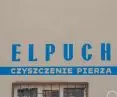
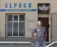
The changes have helped improve the visual identity
© Traffic Design
changed forms
The companies that received support are engaged in a variety of activities - froma small grocery store to a fishing store, a feather cleaning store or a gas appliance service.
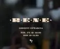
How did the sites change? First of all, restrictions were placed on the amount of material. Most of the signs and banners were previously overloaded with an excess of information, in addition, often difficult to see and illegible to the public. In order to organize and make them more legible, a decision was made to use soft colors and, above all, to rely on paint. Although Traffic Design often uses metal elements in its designs (along with the author's metallography - see here), in Elblag they have given way precisely in favor of delicate colors.
The designers included Eugenia Tynna, Pawel Ryzko and the Projektor Group. The changes to the space proposed by Traffic Design show that the principle of less is more is still alive.
Above all, it was decided to use less stimuli and soft colors
© Traffic Design
towards a better space
Last year's replacement of the visual identity of Traffic Design's Gdynia Milk Bar, which you can read about here, shows how a small aesthetic change can create and realize the potential of a place. The designers, however, are not resting on their laurels and are already announcing another attraction - in the spring, new insect hotels will be erected in Gdynia to support biodiversity.
It remains to wait for the next actions of the designers and believe that they will be imitated in other cities. After all, the Traffic Design Association has been trying for years to show that pastelosis combined with banter can be turned into high-class design that makes common space more open and friendly.

The new identity has been matched to the form
© Traffic Design


