


In 2015, architects from Studio 111 bought a three-room apartment in Gdynia from a developer, which was at a late stage of sales - arranged and finished. The functional and compositional problems they found caused them to start their design work from a clean sheet - the very beginning. We talk to Tom Miaskiewicz about designing for themselves, honesty of materials, trust and the power of ideas.

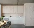
The kitchen took the form of a wooden pull-out drawer
Photo: Hanna Połczyńska, kroniki.studio © Pracownia 111
Dobrawa Bies: Does designing for yourself differ significantly from that for a client?
Tom Miaskiewicz: For us it is a huge difference. The crux is in trust. The ethos of architects in Poland is not very high. A lot of harmful beliefs have been established, such as that architectural discourse is a "matter of taste," and "tastes are not discussed." - i.e., design is taken as a lowly, biased field, far from the realm of knowledge. In the creative sphere, Polish investors are quite distrustful of architects: they look at us not as experts in their field, but rather as stylistic consultants. Interior design has just entered a new era of global, ephemeral and restorative trends - which are gradually crowding out deeper, authorial design thought. I have a feeling that never before has the world of interior design been so close to the world of fashion - and here, unfortunately, I mean chain store shopping, not haute couture. It doesn't help that the popular media fuels the mythology of the ever "new," glamorously named "philosophies" and seasonal styles. Architects, lured by ready-made inspirations pouring out of increasingly clever browsers, quite voluntarily give up their creative independence, eagerly adopting new "shallow" rules and convenient working tools. However, the interiors created in this way are usually fraught with original sins: creative inconsistency and thoughtlessness, stylistic reproducibility, weakness of ideas and impermanence of effect. Ultimately, clients feel unsatisfied after a short time and blame the architects. And in my opinion, they are quite right here.


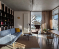
A three-room apartment from the developer got a completely different shape
Photo: Hanna Połczyńska, kroniki.studio © Pracownia 111
Designing for yourself allows you to go beyond the drawer-picture way of thinking and talking. We don't start our work by looking for style, but rather for interesting questions and clever answers to labeled problems. Here begins a process that can be compared to the phenomenon of erosion: the gradual unveiling of an enduring idea that initially doesn't even have a graphic form. But when you're designing for yourself, this isn't a problem - you're not obliged to present photorealistic visualizations after two or three weeks. If the idea is strong, you feel it, believe in it and consistently develop it until you finally see it - from the flooring material to the choice of sofa. Suddenly you find that the idea has taken on material and form, has become tangible and convincing, has developed an individual style whose power lies in its palpable connection to a particular take on a particular place. No component of the design is then accidental - you can easily explain the genesis of each detail not once reaching for the trite and unconvincing: "this is nice", "this is fashionable", "I like this color", "I saw something like this on Pinterest and I liked it". The whole joke here is precisely that you don't start with a ready-made image, an inspiration, an example, a quickly pieced together variant presented to someone for evaluation, but with a clean sheet and trust in yourself.


The power of the idea, architectural consistency, material naturalness and sincerity of the story are the universal principles of architects
Photo: Hanna Połczyńska, kroniki.studio © Pracownia 111
Dobrawa: What were the assumptions and design inspirations?
Tom: If we had started six years ago (because that's when the design began) from any concretized inspirations, today we would probably have hexagons in the bathroom and a desire to renovate. There was one simple and obvious demand - that is, how to use a particular development space for a family of 4 in the smartest way possible. Initially, we didn't even know how many rooms we would have - because first we had to answer a question about our definition of the word "room." So where did we start? From a few universal principles that we always follow: the power of an idea born of well-placed questions, architectural consistency set against the temptation of easy decorating, material naturalness and honesty of story.
Dobrawa: Please tell us about the design solutions and the furniture-cubes.
Tom: In the design of our apartment, it started, of course, with the partition walls. However, the question was not how to move them or paint them. The first questions had an amusingly banal tone: What are walls for? What attracts us to open spaces? What exactly is an interior without walls, and what is a wall itself? We agreed that the arrangement from the developer was wrong and started with a blank sheet of paper. The temptation to leave it that way after demolition came immediately. However, while avant-garde, single-space lofts have always attracted us, we decided that we simply wanted to separate certain functions - for us, a bed and bath in the living room is utopia. Seemingly trivial questions led us to the key one: Can you eat a wall and have a wall?


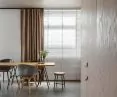
three furniture-cubes arrange the space
Photo: Hanna Połczyńska, kroniki.studio © Pracownia 111
This is how the idea of three furniture-cubes, loosely arranged in an open space, came about. The white box holds a bedroom and a large bookcase in the living room. The wooden one absorbed the closets at the entrance, the laundry room, plumbing closets and the kitchen, which took the form of an overhanging drawer. Black includes a bathroom and a bedroom alcove in the children's space. The latter is accessed by a narrow passageway - closed not by a door, but by a movable panel that hides in the bedroom enclosure during the day, letting some light into the entrance area.
We also removed the plaster from the ceiling, revealing the most beautiful concrete there is - that is, not the kind from the store, but the kind that comes with the building. We selected the concrete floor to be a mirror image for the ceiling. Both planes form a clear enclosure of the space, giving it continuity. We treated all cubicle enclosures with iron consistency: we hand-selected, knotless pine plywood and panels of oiled or lacquered MDF. The rooms blended with the furniture into inseparable hybrids, so the boundaries between the two scales were finally abolished. Elegantly finished cubbies never meet the concrete background "on contact," separated from the floor and ceiling by narrow gaps, they resemble movable objects that can be effortlessly moved to another place.


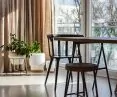
IKEA is a favorite marketplace for designers
Photo: Hanna Połczyńska, kroniki.studio © Pracownia 111
Dobrawa: The apartment is dominated by bright colors, geometry and.... furniture from IKEA. Where did this design decision come from?
Tom: In accordance with the design philosophy cited above, we followed architectural logic and material honesty in the selection of finishes, rather than talking about favorite colors. The color scheme is largely consequential, and actually not at all the bright colors themselves - the corridor is even a bit dark, which I don't hesitate to admit. When designing this interior, we consistently realized the spatial story we believed in at the beginning of the work. In view of this, I can somewhat perversely say that we didn't have much influence on the color scheme - it was sort of predefined and had to be simply guessed. We are minimalists in life and architects at work, so also in interiors we always put architectural logic before decorating. So we created a space of respite for ourselves: simple, homogeneous, logical, free of imitation, filled with materials we like to look at and touch. And only with them, without unnecessary ornamentation. We love nature - so we invited it into the house, for example, installing pine boards ourselves behind the bed, which smell beautiful to us to this day. And in fact, they are the only things that decorate our bedroom The selection of furniture and "loose" details is for us a bit like sprinkling a well-prepared dish with a handful of aromatic herbs - a very pleasant crowning activity, provided that a tasty dish was created first. I'll jokingly say that IKEA is our favorite marketplace - with masses of herbs displayed in big bags right in front of our noses. Some of these bags hide real treasures at good prices. But, as is usual at such a market, you have to have a really keen sense of smell to find the really good stuff yourself. What satisfaction, however, when we succeed! Returning from the world of culinary, which I don't really know, to the world of design: Ilse Crawford, HAY, Tom Doixon, Virgil Abloh, Chris Stamp - an argument for snobs and unbelievers who don't believe that top quality can be found at the market.


Architectural logic the authors always put before decorating
Photo: Hanna Połczyńska, kroniki.studio © Studio 111
Dobrawa: How to arrange the space wisely to maintain visual consistency?
Tom: Every architect has his or her own favorite recipe for smart design that works for them. I think that a universal code does not exist. We like to start by looking for accurate insights, mini-explorations that capture the essence of a place and its issues. It is from these that an idea emerges that is worth guiding consistently through all layers of the project. When looking for it, it is worth rejecting axioms and habits, because it is through them that we lose vigilance. One cannot rush to answers until one has asked a series of basic, seemingly trivial questions. Indeed, there are plenty of shorthand rules that are often helpful, but they should never be trusted unreflectively. Let's pay attention to your question, for example: already in it we have the assumption that a well-arranged space has to be visually coherent. But what if we ever design in a place where it would be better to divide the space into completely separate worlds? Such places exist, and it's worth noting them when we come to design in one of them someday - and visual coherence is only one of the acceptable paths. Here are some examples of popular half-truths that are actually quite funny: "a white ceiling is better because it visually raises the interior" (i.e., the best interiors are those with mirrors on the ceilings), or: "white is worse because it gets dirtier" (two widely recognized exceptions to this rule are flour factories and bathroom ceramics). My favorite, from the field of cubic architecture: "plaster on the wall is better than wood, because wood ages ugly" (the durability of plaster aesthetics, reaching up to two seasons, is, after all, legendary - and white plaster has apparently recently joined the exceptional group of beloved white exceptions with a concessionary tariff, led by bathroom ceramics).
Dobrawa: Thank you for the interview.


