


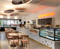


In Warsaw, a forgotten 1960s modernist pavilion has been transformed into the Washington W96 café.
Architects from SOJKA WOJCIECHOWSKI decided to exploit the potential of the communist-era building, and built the interior aesthetic around the preserved original terrazzo floor.
Washington W96 is a place created by coffee lovers and specialists, owners of local coffee shops. The building into which the Warsaw café has moved is a former commercial pavilion, built together with a complex of residential blocks in 1960-1962. From the very beginning, the building belonged to the Warsaw Cooperative of Spożywców SPOŁEM. It housed the once thriving Marek grocery store, later renamed the Tanioch store, and then closed. Although the building stood empty for some time and began to be seen only as a relic of the past, investors saw its potential and decided to open a café there. In order to do this, a new interior design was needed - they invited architects from SOJKA & WOJCIECHOWSKI to work with them.


The starting point in the interior design was the terrazzo floor
photo: Sojka & Wojciechowski
The starting point in the design was the floor. It was from the old terrazzo floor called "marble of the communist era" that the selection of colors and subsequent interior elements began. The architects began by establishing a functional layout, creating an open, undivided, illuminated space. Referring to the pavilion's facade, they introduced a pink-brick color, designed new seating and a huge bar clad in terrazzo tiles. This is how they created a place where you can sip specialty coffee, taste sweets baked on site, and in the evening enjoy Tomek Zielke's and Filip Kopiczynski's original dishes and sip selected natural wine.
Dobrawa Bies: What was the main inspiration for the design of Café Washington?
Mikolaj Wojciechowski: The building itself was quite an inspiration. It' s an interesting modernist pavilion that no one paid attention to until now, because it was covered with a layer of advertisements and large-format stickers. Suddenly, after they were removed and cleaned up, it turned out to be a capital bright block. Ever since the Prasowy Milk Bar project, where we paid homage to the modernist Warsaw buildings of Supersam, Rotunda, Chemistry Pavilion, etc. on the walls, we have felt a great bond with the architecture of that period. Therefore, when we saw this pavilion and the interior we decided that we must try to "not destroy" it with our design.

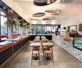
For the seats on the parapet, the architects added soft rollers as backrests
Photo: Washington W96
Dobrawa Bies: Please tell us about the course of the design work, where did you start? How do the café's customers feel about the space?
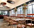
Mikolaj Wojciechowski: As with any project, we started by determining the functional layout. We were concerned with dividing the large, rectangular layout of the interior in such a way that it was not just a classic dining room with a huge number of tables, but a more intimate interior, where everyone would find a comfortable place for themselves. Tasks heavy given the open character of the room, which we planned to preserve from the beginning.
We decided to "play" with levels and started by designating a mezzanine - a platform at the end of the premises. This is a special place, where soft, large armchairs and a couch dominate, plus we sit in the window itself, so we have a perfect view of the street. It was immediately known that this would be the favorite place of all guests - and so it was. On the opposite side was the place that was the least interesting of all the premises space. After all, no one wants to sit in the entrance and additionally on the way to the toilet. We decided to make it more attractive by making a large, soft upholstered couch. We know that everyone likes this type of seating the most, and it turned out that we hit the spot. The couch right after the mezzanine is the most occupied place in the cafe.


A large, soft couch and terrazzo on the bathroom walls
photo: Sojka & Wojciechowski
Next we tackled the middle of the cafe with its large display window and high windowsill. We wrestled with the thought of whether to make a long countertop along the windowsill, or rather use it as a seat. The latter option won out, and to the seats on the windowsill we added soft, rollers as backrests. This procedure makes it easier to sit sideways to the display window and is much more comfortable than the hockers we would have to set up next to the countertop. This space also has its fans. Last left is the central space, where classic tables and chairs dominate. This is meant to be a place for more formal meetings, when the evening menu is in use and we prefer to sit comfortably rather than just stopping for a coffee and cake. Thanks to this layout of the interior, we succeeded in the most important thing from our point of view - the premises is an open, undivided, illuminated block, which is probably what the building's architectural creators intended it to be.
Dobrawa Bies: What were the needs and expectations of the investor? How did the cooperation proceed?
Mikolaj Wojciechowski: The needs at the beginning were the same as always, that is, to fit as many places as possible, but of course without exaggeration. Cooperation with the investor was great, he did not impose his ideas and had a lot of trust in us in the decisions we made - which is very important in the implementation of this type of investment. Some of our interior layout ideas, resulting in the reduction of spaces in favor of more spectacular aesthetic solutions, such as a platform, the client understood and accepted. In terms of aesthetics, we were largely given a free hand.

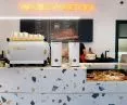
The architects decided to juxtapose the original terrazzo with a contemporary one with large colorful stains
Photo: Sojka & Wojciechowski
Dobrawa Bies: Where did the idea for such a combination of colors, patterns and materials come from?
Mikolaj Wojciechowski: We were moving in a modernist building from the communist period, so we "got" the original terrazzo floor, which after cleaning gave one of the foundations for building the project. Terrazzo/terrazzo is currently experiencing a renaissance. Lots of new original designs inspired by terrazzo are being created - so we decided to juxtapose this original material with a contemporary one. In contrast to the original, finely spotted tiles, the new material is more colorful with large spots. The main element - a huge seven-meter bar - was made of it, as well as the decorative lamps under the ceiling and the walls in the bathrooms. We decided to follow suit, and while the original body of the building remained austere, black and white, the elements we put inside got color. Chairs, sofas, tables, upholstered elements lamps, flowerbeds, etc. We considered various options, pink-brick won - which was the hardest to convince the investors :) The color introduced a more cheerful character, corresponding well with both the new terrazzo and the colorful baked goods served inside.


