



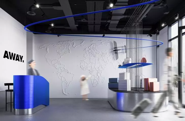
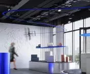
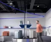
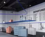

How can you bring the atmosphere of an airport into a retail space? Joanna Pawlak’s design for the Away brand, created at the Academy of Fine Arts in Warsaw, draws on associations with travel, movement, and exploring the world. A minimalist interior, display units resembling baggage carousels, and a relief map of the world create a space where the presentation of suitcases and travel accessories becomes part of a larger narrative about travel.
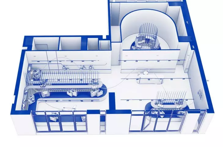
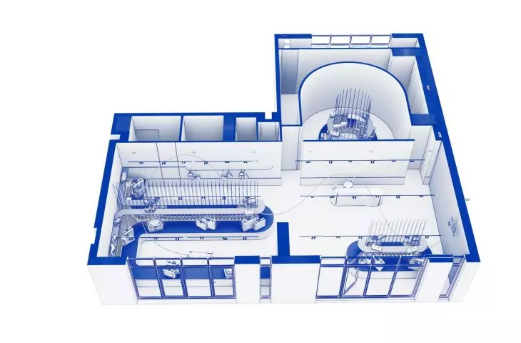
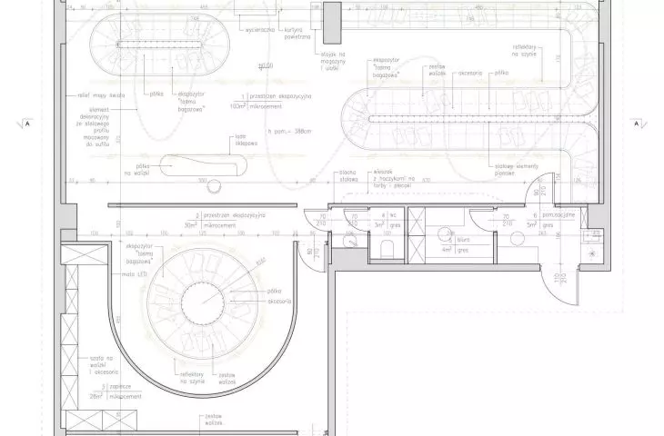
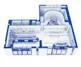
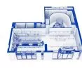
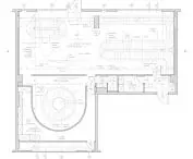
top view © Joanna Pawlak 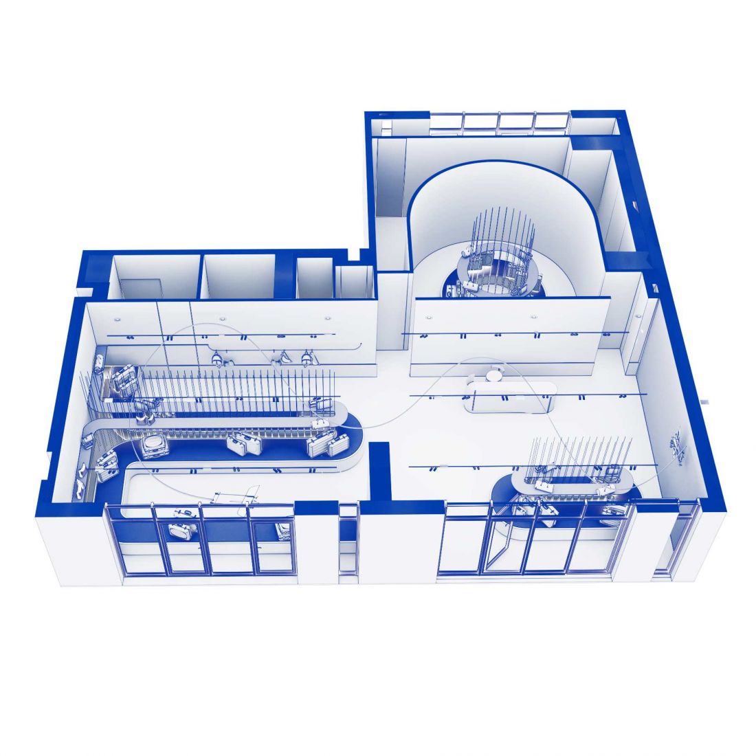
a store that begins a journey
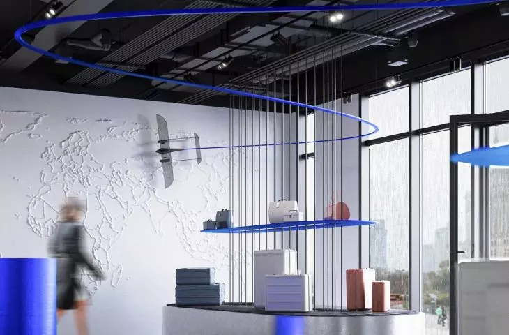
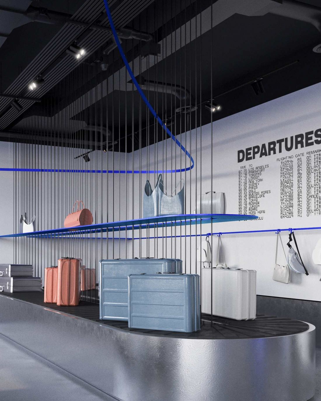
The starting point for the concept is the aesthetic of an airport—a place associated with movement, waiting for the next leg of the journey, and encounters between different cultures. The designer draws on the distinctive elements of this environment, translating them into the language of the store’s interior. The main display units resemble baggage carousels, and one of them was designed to be mobile. This allows products to be displayed not only inside the store but also from the street side.
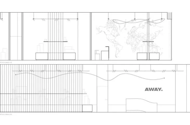
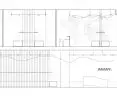
cross-sections © Joanna Pawlak 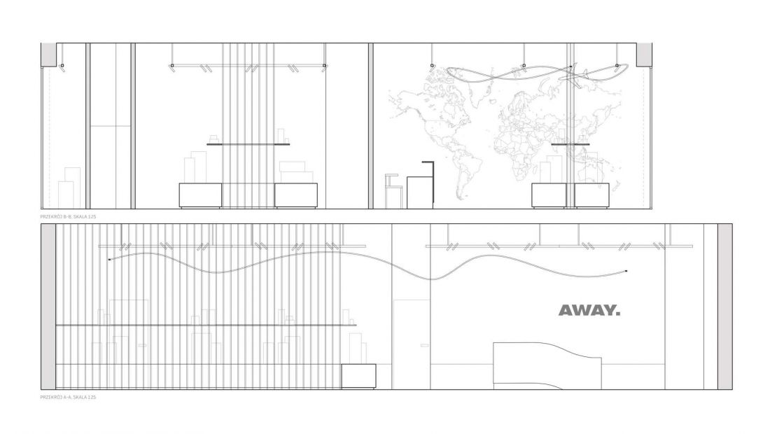
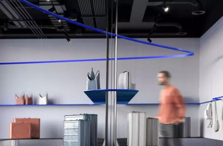
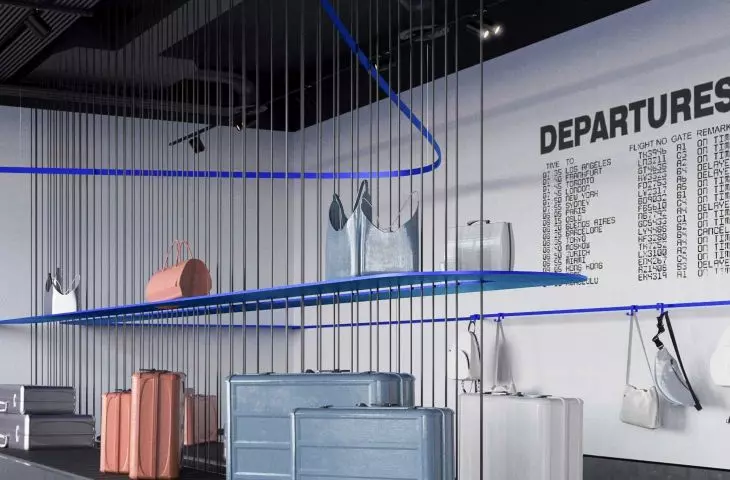
Decorative lines running along the ceiling resemble the contrails left by airplanes in the sky. Their dynamic trajectory introduces movement into the composition and reinforces the space’s travel-inspired character. Another key element is the wall featuring a relief map of the world. Customers can mark on it the places they’ve visited, those that are particularly dear to them, or the regions they come from. The map thus serves not only a decorative function but also an interactive one—it encourages the sharing of experiences and can become a common point of connection for the community of travelers.
© Joanna Pawlak 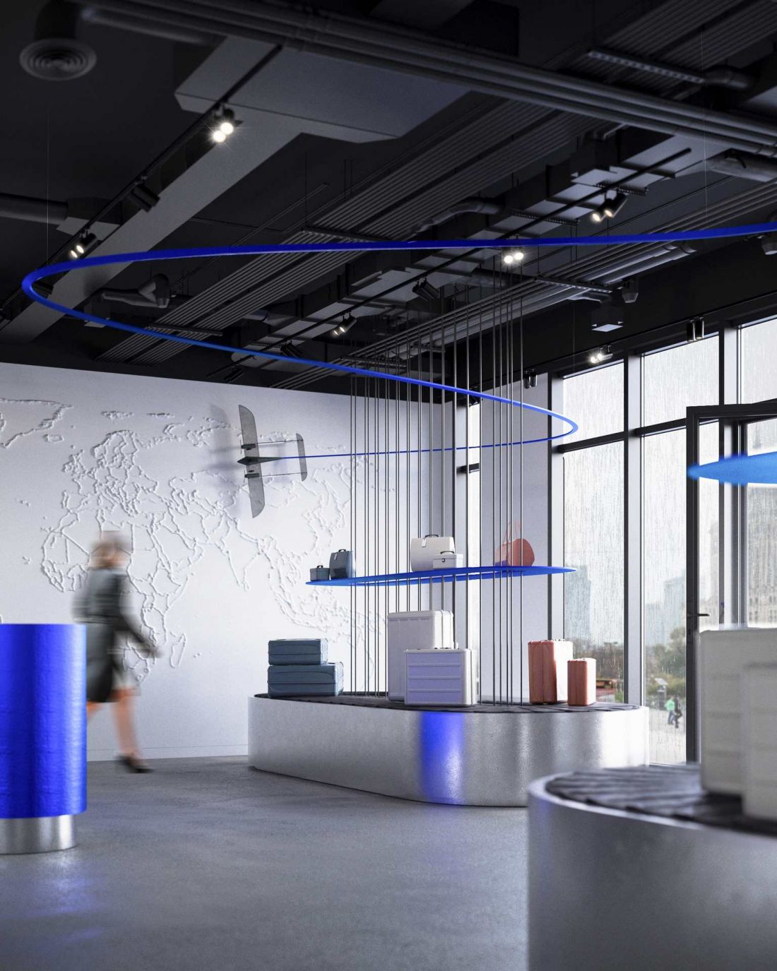
suitcases in the foreground
The design is based on a minimalist palette of materials and colors. Black, white, and silver provide a neutral backdrop for the products, allowing the variety of suitcase colors to stand out. Dark blue accents add character to the interior and evoke associations with the sky.
The minimalist nature of the design serves primarily to present the product range clearly. Display elements and details inspired by airport infrastructure help establish the space’s identity without competing with the products. The second section of the store features an LED screen capable of displaying content related to current marketing campaigns or seasonal themes. This solution allows the visual character of the space to be adapted according to the brand’s needs.
© Joanna Pawlak
The concept also includes the back-of-house facilities necessary for the store’s operation: a storage area for luggage and accessories, a break room for employees, an office, and a restroom. As a result, the design combines a scenographic concept with functional back-of-house facilities.
An experience rather than a mere display
In Joanna Pawlak’s design, the Away store becomes a space that evokes the emotions associated with planning a trip. Luggage straps, lines running along the ceiling, and a world map create a cohesive narrative, while interactive elements engage visitors. Shopping is placed within the context of travel—from choosing a suitcase to memories of places already visited and plans for future trips.
© Joanna Pawlak 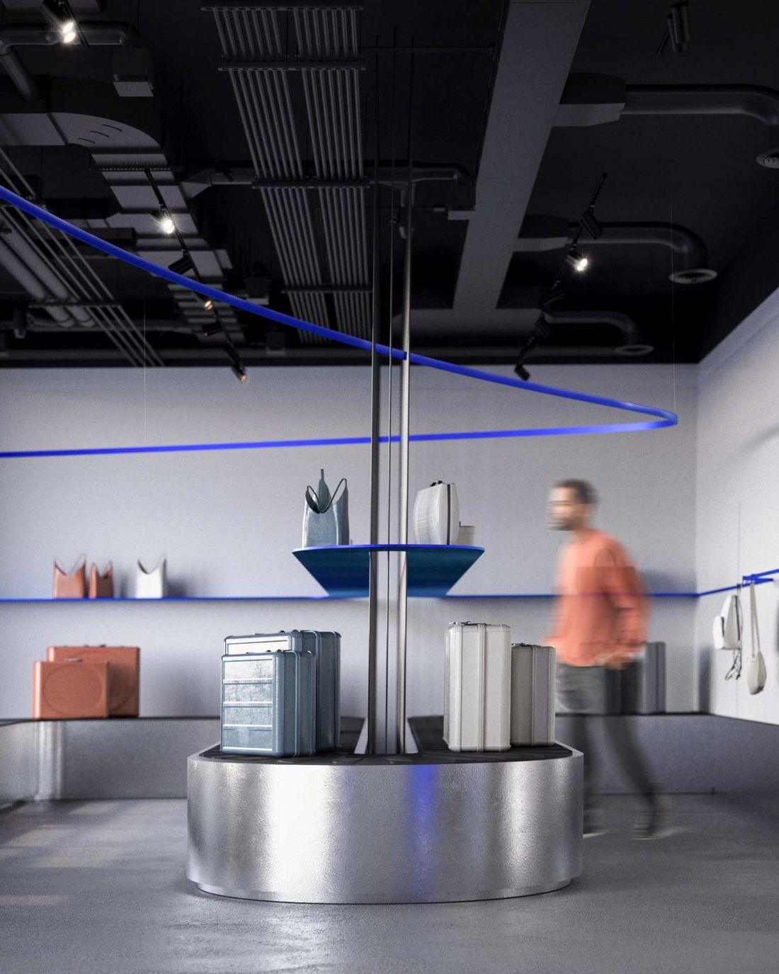
This is an example of a concept where brand identity isn’t limited to a logo or color scheme. It’s built through the interior layout, the way products are presented, and solutions that encourage interaction. As soon as the customer crosses the threshold, they are meant to feel that the journey begins before they even reach the airport—it starts right there in the store.