


In Wrzeszcz, Gdansk, on the third floor of an old tenement house live Kasia, Kuba and Roman the cat. They recently approached the BO/SKO studio with a request to create a spacious, unconventional interior - thus an apartment full of color, golden accents, light and vintage furniture was created on seventy square meters.
Geometric lamps and a mirror, green doors, white, wood and a pink kitchen are characteristic elements of the Gdansk apartment. Attention is drawn to the old wooden floor, which the architects managed to preserve and restore. Two open passageways - to the living room and kitchen, are distinguished by the shape of the arch and the colors - gold and pink.


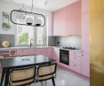
Pink kitchen furniture and terrazzo countertops
Photo: Hanna Połczyńska / kroniki.studio © bo/sko
Pink kitchen with chairs by Marcel Breuer
The first of the passageways, finished in brass sheet metal, leads to the kitchen, where a neutral background exposes the kitchen cabinetry in millenial pink. Personalized furniture with openwork fronts conceals the washing machine and a gas installation. The terrazzo countertops allude to the building's history, and chairs designed by Marcel Breuer are arranged around a black table.

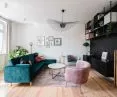
Bright living room with colorful furniture
Photo: Hanna Połczyńska / kroniki.studio © bo/sko
A golden radiator and shell-shaped armchairs
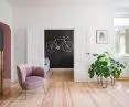
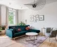
Another passage, marked in pink, leads to the living room, with white walls, whitewashed floorboards and numerous plants. The main role in this space is played by a restored gold radiator. Next to it is an alcove finished with black paneling and a cabinet. In the center, the authors placed shell-shaped armchairs and an emerald sofa.


Round mirrors in the kitchen and black mosaic in the bathroom
Photo: Hanna Połczyńska / kroniki.studio © bo/sko
fish scales and plafonds
Behind the double white doors is a small study. A desk combined with a navy blue bookcase is the workspace, and next to it, a black wall is decorated with a golden bicycle. The bedroom is full of light beige - on the walls, the headboard, as well as the finish of the unusual closet. Its curve, makes the development not overwhelming and does not interfere with communication. Attention is drawn to the lighting - vintage crystal plafonds juxtaposed with lamps from the Gdynia studio Ummo. The bathroom, on the other hand, is a classic combination of black, white and gold. Against the background of large tiles, a renovated chest of drawers with a terrazzo top serving as a sink cabinet looks good. A black mosaic in the form of a fish scale adds character to the shower stall.
Dobrawa Bies: How do you wisely combine the new with the old?
bo/sko: In our projects we are not afraid to combine vintage elements with new solutions. The context of a place, the history of the inhabitants of a given space, are a pretext for us to reach for a piece of furniture or an interior element with a past. Most often we combine these elements on the basis of contrast of form or color, but it is important that such a contrast is properly set in the space.


Open passages, geometry and Roman cat
Photo: Hanna Połczyńska / kroniki.studio © bo/sko
Dobrawa Bies: What were the assumptions and design inspirations? Did you manage to achieve all of them?
bo/sko: The location of the project in a tenement in Wrzeszcz clarified our design assumptions - when we work in interiors with history, we want to show part of this history, the context of the place is crucial here. The main idea of the project was to create a spacious interior (originally the apartment had red walls, furniture and paneling, it was difficult to talk about light or breath in the rooms). It's hard for us to pinpoint a clear inspiration - geometry, honesty of material and light are what guided us and invariably stimulate our creativity. The theme of vintage or recycled furniture was certainly important - almost every room has "old" elements, sometimes it's flooring, doors, furniture or lighting.

Color accents are characteristic of bo/sko studio projects
Photo: Hanna Połczyńska / kroniki.studio © bo/sko
Dobrawa Bies: What did the investors expect? Did the cooperation go easily?
bo/sko: We have to admit that quite often we are lucky when it comes to investors, and this was also the case here. We create each project individually, a large part of our work is taken up by a conversation with the client - we are creating someone's private space, a kind of sacrum, so it is important that this interior is tailor-made. The investors expected from us an unconventional interior, where they could display their interests, passions, collections. Some functional constraints were also important, such as the need for a large closet or coping with a gas stove. Working with Kasia and Kuba was an interesting adventure, in aesthetic matters we understood each other perfectly, Investors gave us a lot of trust, which we also appreciated during our work.

The use of corlor in the interior requires courage
Photo: Hanna Połczyńska / kroniki.studio © bo/sko
Dobrawa Bies: An interesting color accent is the pink kitchen and the gold radiator. Is it better to design in bolder colors? How do you combine everything wisely so as not to "overpower" and overwhelm the interior?
bo/sko: Color accent is something characteristic of our projects, so we were even more curious when investor Kasia announced that she dreams of a pink kitchen. Using a strong color in an interior requires courage, as well as the ability to complement it. In selecting colors in an interior, whether working with a neutral palette or a bolder one, it is important to fit the different elements together. In public interior designs, the use of strong color is more common, making the viewer remember the place. In private interiors, it requires skill and feeling.
Dobrawa Bies: Thank you for the interview.


