






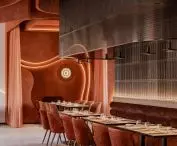
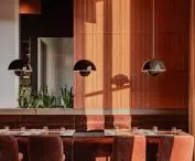
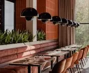
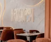


In this interior round are not only pizzas on thin dough. {They have tamed the unfavorable spatial conditions of the premises with the help of roundness, appropriate selection of design elements and colors. Although the Lodz restaurant is called Heksagon 2.0, you won't find too many angles here. How does it look after a three-year renovation?
The new interior of Heksagon is not the first project for which its owners have used the services of boko architects. The cooperation began when decorating sister restaurant Hidden Rivers, to which boko architects added an industrial touch. The opening of the new establishment coincided with the renovation of Heksagon at 144 Pomorska Street, which had been diversifying Lodz's gastronomic offer since 2017. Equally four years after the opening, it was time for a big change in 2021. Now Heksagon is unveiling its new look, with little left of the cold geometry of the original design.

Heksagon 2.0 - the new interior of the Lodz restaurant
design: boko architects photo: przestrzenie.fotografia
Initially, Heksagon was housed in a small one-story pavilion squeezed between historic, dilapidated tenements and the modern buildings of Lodz on Pomorska Street - the longest street in the city. Although the restaurant prospered, the premises conditions were not favorable. In view of this, the renovation, which began in 2021, was not limited to the interior. Heksagon's address remained the same, but the premises' usable area was significantly increased thanks to the superstructure of the earlier pavilion with a volume that more than doubled the building's height.


Heksagon 2.0 - the new interior of the Lodz restaurant
design: boko architekci photo: przestrzenie.fotografia
the ceiling low and the bar high
Although boko architects had much more room to spare after the superstructure, Heksagon 2.0 inherited from its previous incarnation the low-slung ceilings in the first floor. boko architects, however, found their recipe for this problem:
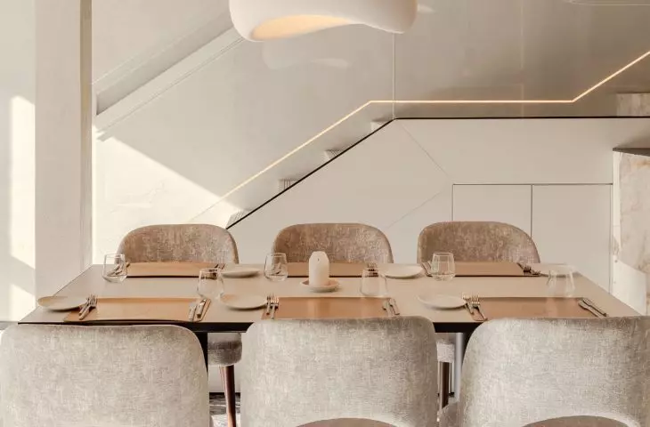
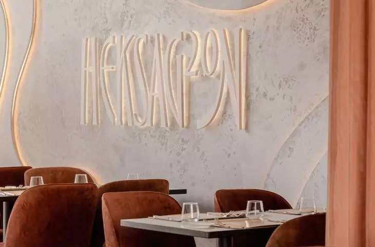
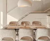
The first floor was built on the basis of a pre-existing structure, which had the effect of making the floor height not very impressive. Accordingly, the walls and ceiling were finished with the same decorative plaster in broken white. This treatment allowed the horizontal and vertical planes to intermingle, blurring the clear boundary between them.
- write the designers.
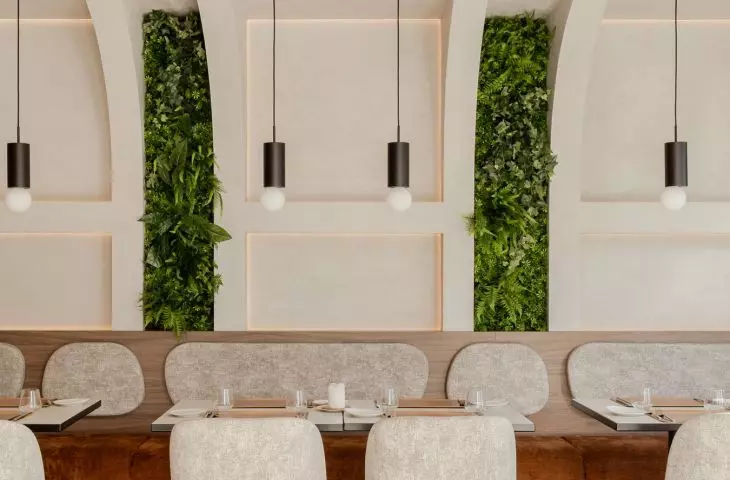
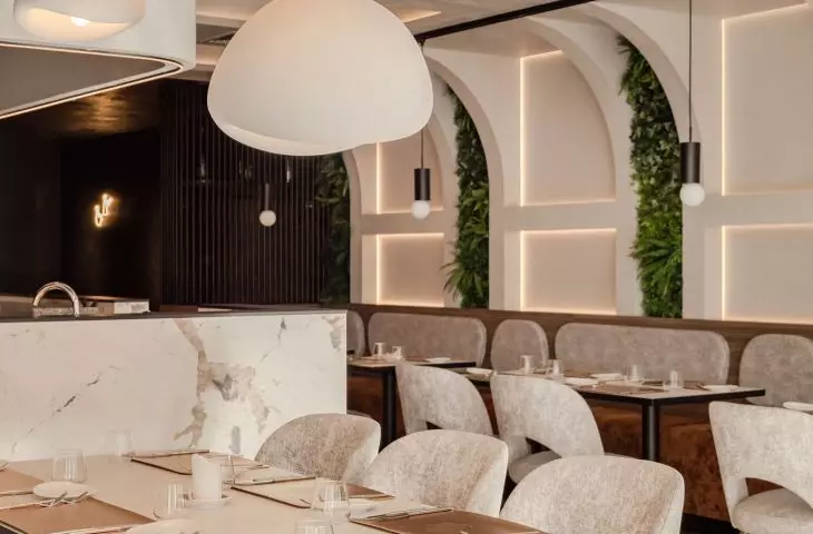
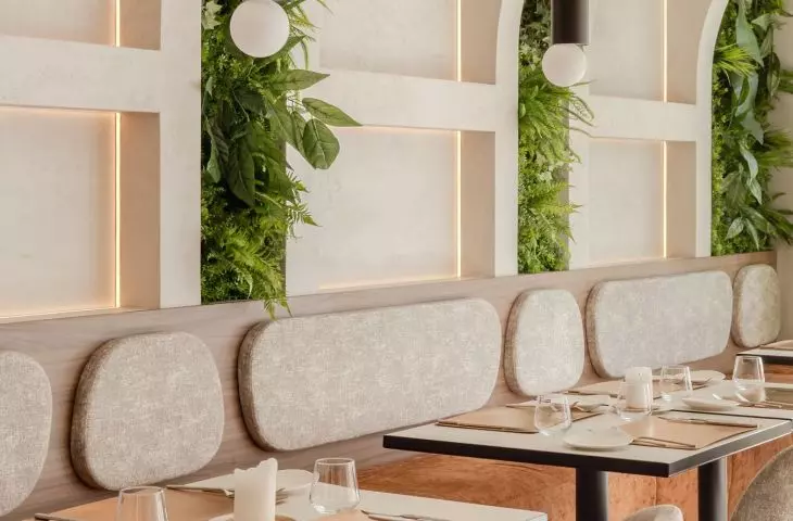
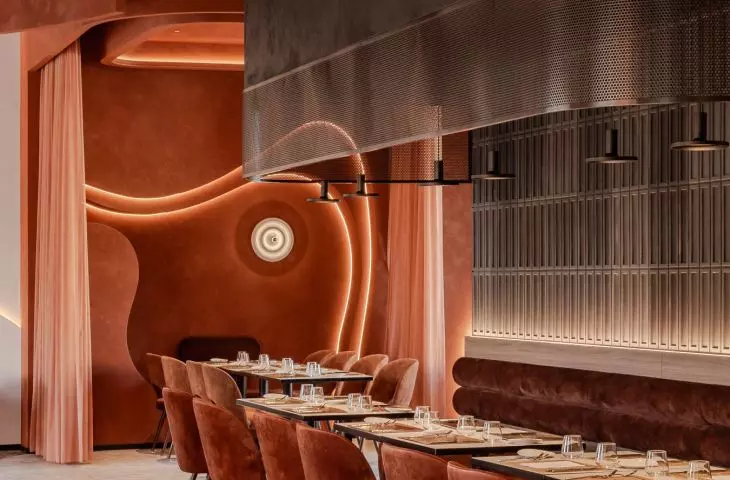
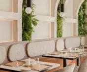
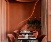
The light color of the walls also has a well-known effect on the optical size of the interior - it makes it appear much larger than it really is. To minimize the effect of overwhelmingly low ceilings, Heksagon's interior designers decided to hide the edges where the walls meet the ceilings. They did this by arranging structures on the walls in the form of architectural niches, the frames of which vault out to form arches that gently connect the verticals to the levels.
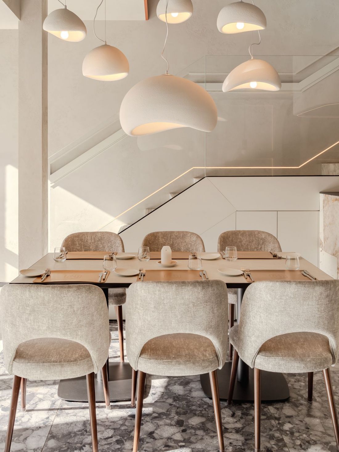
Heksagon 2.0 - the new interior of a Lodz restaurant
design: boko architekci photo: przestrzenie.fotografia
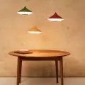
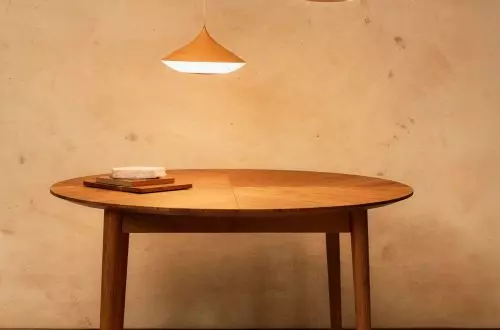
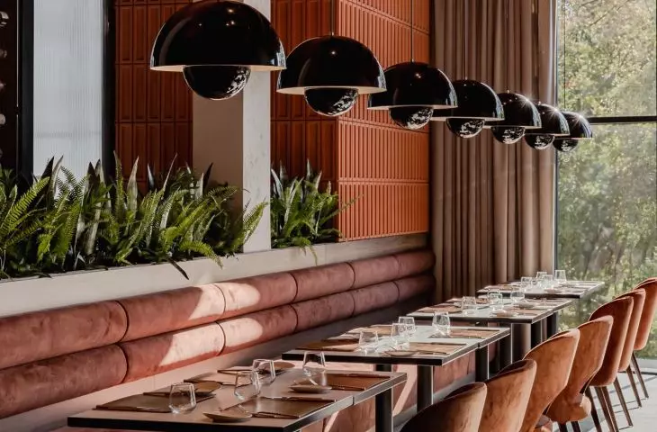
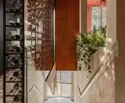
The lightness of the interior is also given by the design elements used - including lamps hovering over the tables like clouds gliding across the sky, plants looking out from between architectural niches and bright floors.
The first floor is completely different, where thanks to a well-thought-out superstructure boko.architects had a much larger cubic capacity to use.
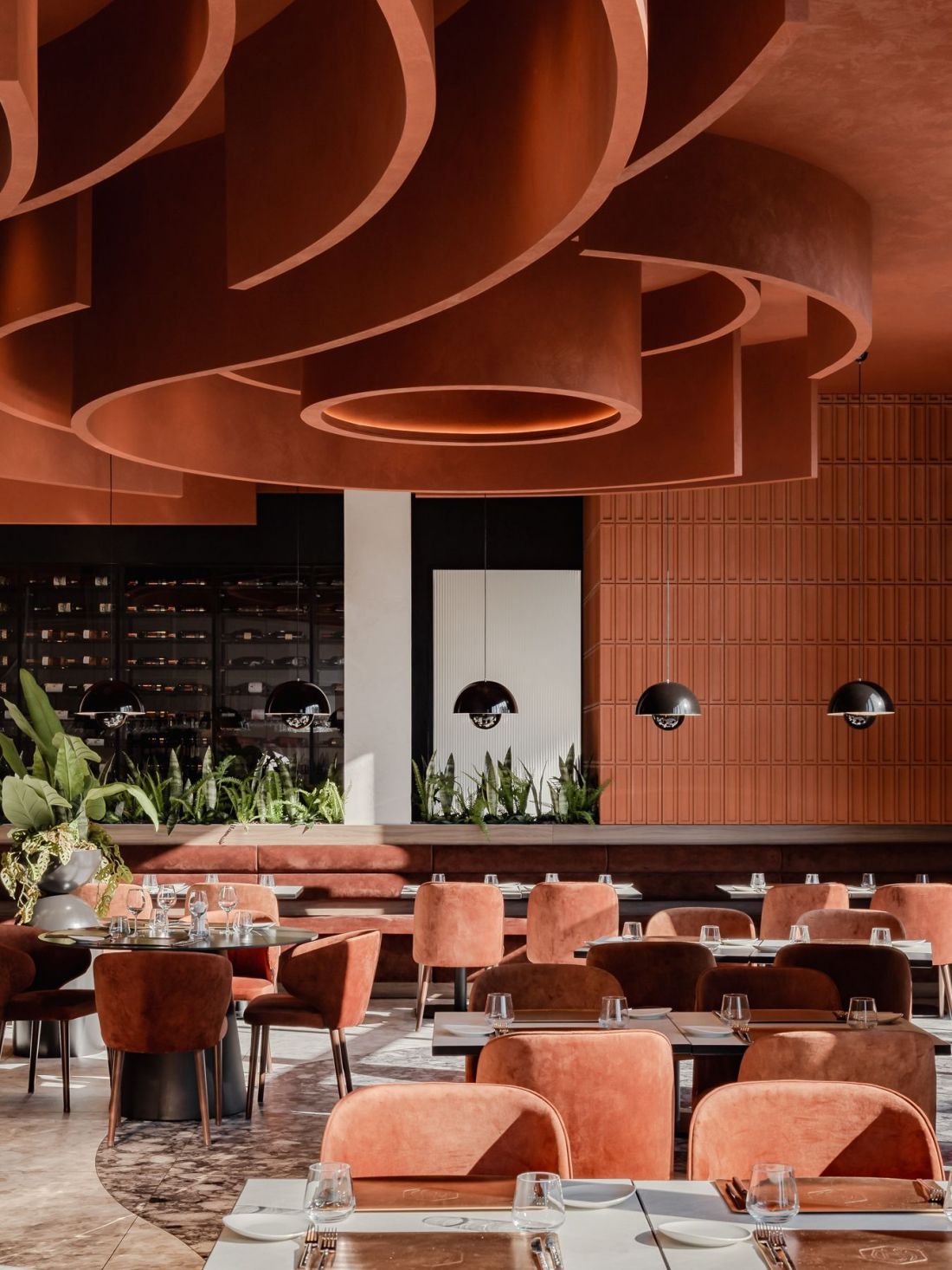
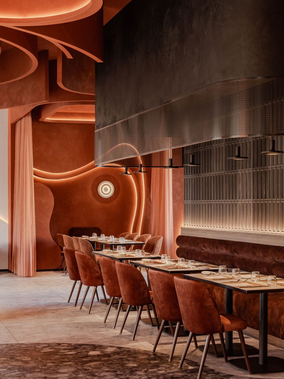
Heksagon 2.0 - the new interior of a Lodz restaurant
design: boko architekci photo: przestrzenie.fotografia
a place where Lodz flows into the interior
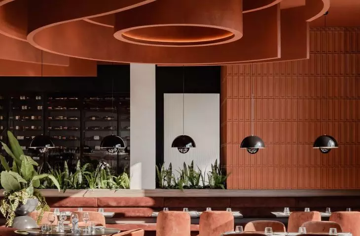
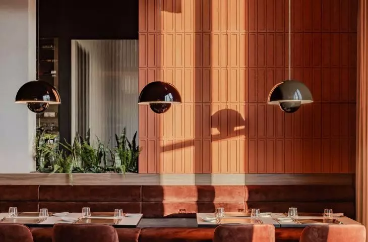
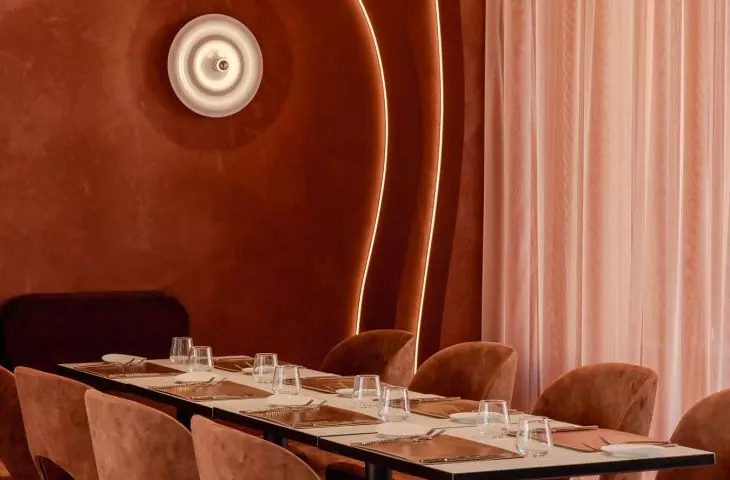
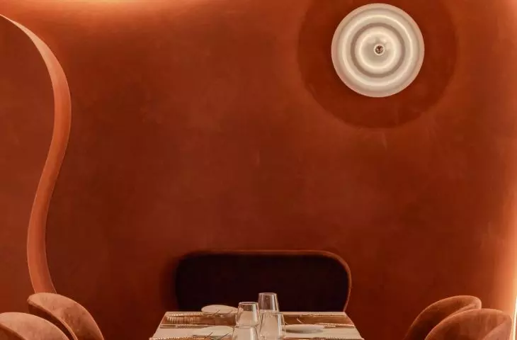
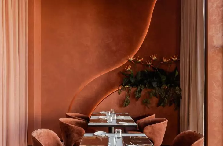
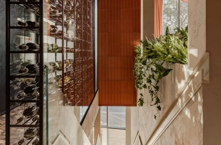
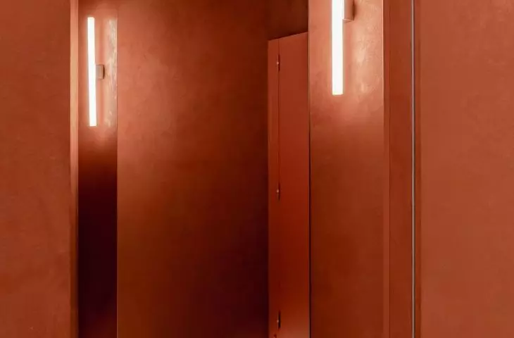
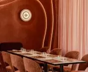
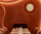
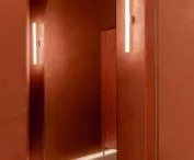
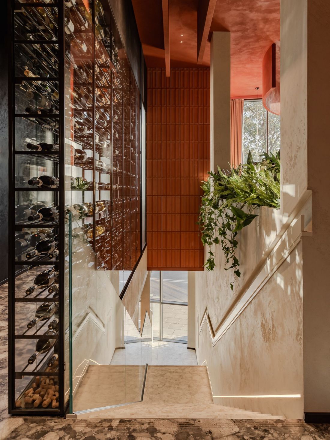
The architecture of Lodz stands in brick and clinker. This can be seen in both degraded tenements falling into disrepair and beautifully restored monuments of industrial architecture. Typically, brick hues are seen on the facades of buildings. The design by boko architects brings the reddish aura of Lodz to the interior of the Heksagon 2.0 restaurant.
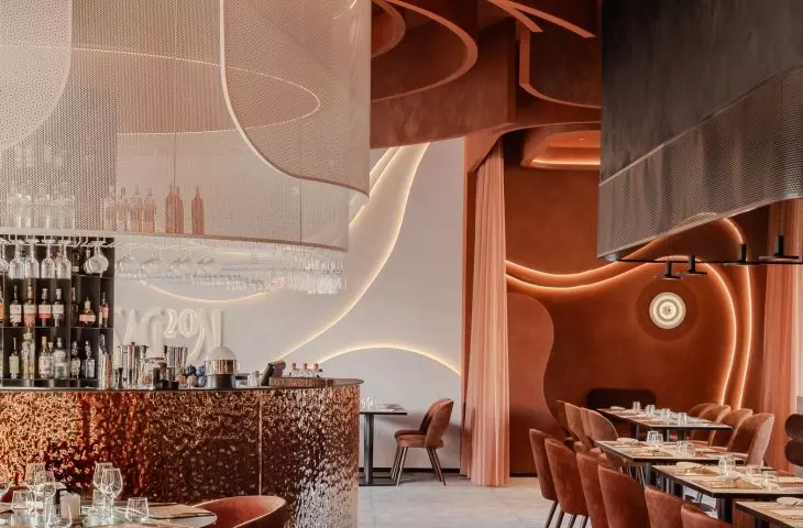
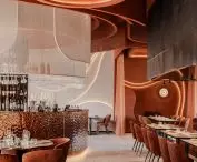
Without a doubt, it is the restaurant's ceilings that are the most striking design element, drawing the eye from the very entrance. The ceiling of the first floor is particularly impressive and distinctive. Its organic form resembles waves, which radiate out from above the bar and meander freely above the heads of guests.
- reads the description of the realization.
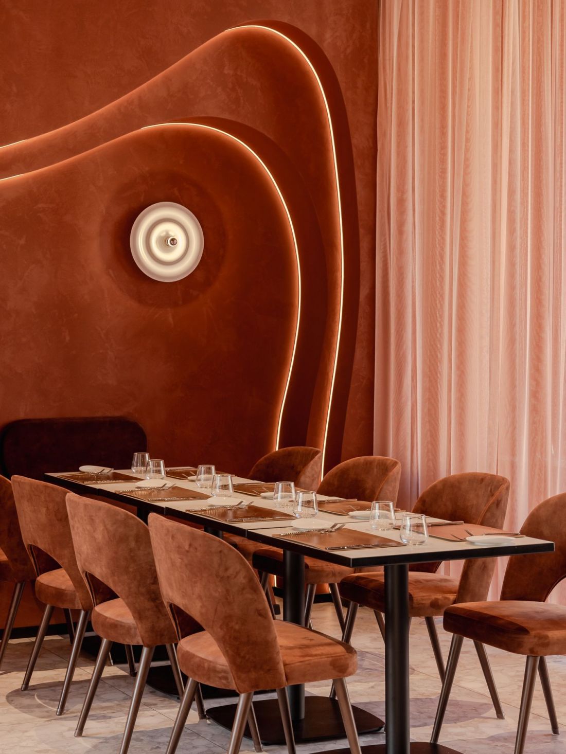
The ceiling was decorated with perpendicularly suspended ribbons of curved forms, concentrically composed on the surfaces of the ceilings. Their rounded shapes correspond with other elements of the interior design - "cartographically" structured walls, Scandinavian lamps in the form of "mushrooms" and, above all, the dominant feature of the interior, the round bar.

Heksagon 2.0 - the new interior of a restaurant in Lodz, Poland
design: boko architekci photo: przestrzenie.fotografia
circular center design
Also above it, the ceiling received a special setting - this time the suspended ribbons took on a lighter color and became openwork and much longer, almost reaching the bar counters. In this way they communicate that this is where the most important point of the restaurant interior is located:
The centrally located bar is the heart of the restaurant, both functionally and visually. The circular, decorative bar, encased in hammered copper sheet metal, subtly reflects light, creating an effect reminiscent of a sheet of water. Its location not only divides the room into several intimate zones, but also introduces an integrative element into the interior, around which the life of the restaurant revolves.
- we learn from the description.
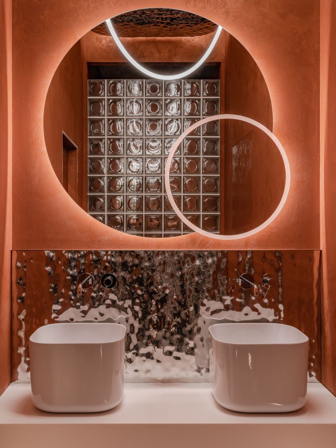
Heksagon 2.0 - the new interior of a Lodz restaurant
proj.: boko architekci fot: przestrzenie.fotografia
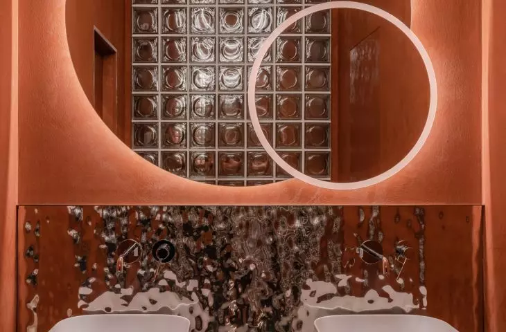
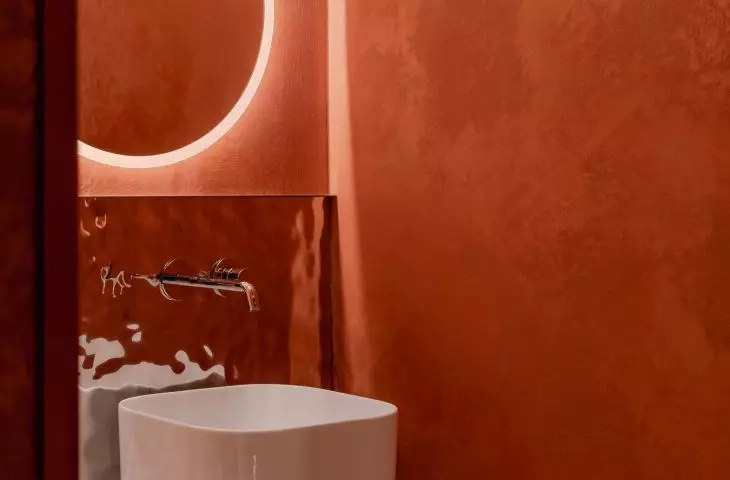
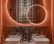
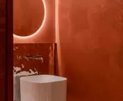
The aforementioned sheet metal also plays a role in other spaces of Lodz's Heksagon. Hammered planes found their way into the toilets, where, incidentally, the circular motif is replicated again. Copper sheets were placed behind the sinks (a plus for ease of cleaning!), as well as on the ceiling. Their mirrored surface optically enlarges the small interior of the sanitary room. A keen eye will also notice the circles in the backlit mirrors and on one of the walls, which was laid with glass tiles with a circular motif.

Heksagon 2.0 - the new interior of a Lodz restaurant
design: boko architekci photo: przestrzenie.fotografia
attractive counterpoint
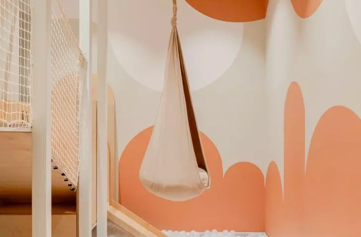
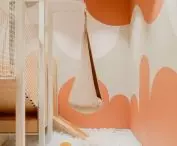
The intimate interior on the first floor finds a counterpoint in the way the space has been arranged for the restaurant's customers with special needs - the youngest ones. In contrast to the dark, brick colors, the architects used light shades, wood and colorful, round (and how!) polychromes on the walls. There are teddy bears, a hammock and a slide that ends in a pool of balls. There are enough attractions to preface the time that caregivers spend at the restaurant's tables.
Heksagon 2.0 - the new interior of a Lodz restaurant
design: boko architects photo: przestrzenie.fotografia
The goal was first and foremost to create a multifunctional space, attractive both to those looking for a place for a romantic dinner, a birthday party or those planning a business lunch.
Would you, too, be able to find a place for yourself in Heksagon?