





We open the summer fashion corner and present the season's trend: departing from the senses. For starters - from the sense of sight. It's time to hide unnecessary eyes, eyelids and eyelashes to the bottom of the closet. We can already manage without these unfashionable accessories. Also in architecture.
"He looks at such and does not see," was once heard mostly by men asked to get something out of the refrigerator. They would poke their eyes into a big jar of pickles and swear it wasn't in the fridge. All until a woman's hand took out a glass filled with cucumbers, bearing a picture of cucumbers and the word Cucumbers. This niche family pastime has now gone mainstream. Regardless of gender, people en masse look and don't see. Or they see something else. This, in turn, fits in with the once equally marginal propensity for delusions and hallucinations. A barrel of laughs in increasingly bleak times. The evidence? There's tons of evidence in the form of comments and opinions made live and online. More - even summaries of texts or descriptions of photos, videos and buildings viewed contradict what was seen or read really.
Here, next to an article in which it clearly stands that politician X emphatically warns against his opponent Y, we read "why do you keep writing about X? it's really a dyed-in-the-wool letter symmetrist on a leash of President Y for Putin's blushes." With a detailed description of some investment flies a hailstorm of questions about the details, which in this description are discussed in the first sentences. Along with the photo caption saying what is in the photo, there are questions of "what is in the photo?". And, of course, there is a proliferation of comments on content that is not in the articles being commented on. Not to mention articles that are not there, because the Polish media somehow look, but see very poorly, what is being done in, for example, such Gaza.
Funny this trend has not escaped architecture. A few months ago, a transformed courtyard in front of the Imperial Castle - a grand edifice from the early 20th century - opened in Poznan. Instead of a parking lot, there is greenery and small architecture, but there is also a new, heavily glazed single-story pavilion with a café and an arcade. Some like it and say it fits. Others say it's an abomination and an assault on the historic space. Fine, everyone can have an opinion. However, opponents still say that the pavilion has obscured the Castle. So much so that to cover up the behemoth, it would have to be encased on all sides with blocks of several stories. More: it is not the Castle, but the pavilion that is obscured - by densely planted trees. Thus, we have a typical vox populi description of reality in line with the latest trend, that is, not very in line with reality. Hence the conclusion that the sense of sight is essentially superfluous, because the images delivered to the brain are processed by some twisted software anyway.
And how about the architects? Humans may be confused, but probably not professionals. So no. Lo and behold, a sensible and capable Poznan designer also tells me emphatically that the Castle has been covered up. I don't believe my ears and throw the lifebelt. Maybe he was looking at the castle, crouching by the wall of the pavilion on the street side? Maybe he couldn't see the castle from inside the cafe toilet? The designer gets a little flustered, so he brings out a second cannon: he claims that the courtyard design chosen in the competition is incompatible with the rules of the competition. I got it wrong, because I happened to co-write the competition guidelines. Again, the architect saw something different, but this time he goes into denial, and for a second I think it's getting thick, but after a moment I determine with myself that it's been thick for a long time. Not from today some architects perceive reality in a specific way, regardless of trends. This is evidenced by both their statements and projects. There has already been a lot about both the peppering of context, and blindness to various industry rules, and the failure to see residential pathology. There is no need to repeat ourselves.
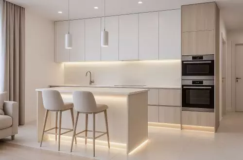
However, there has been little, until now, about progressive color blindness. First, designers proved in the 1990s that they stopped at the elementary school level with color selection and, together with various amateurs, made Poland a multicolored bigot. Now the pendulum has swung the other way: if you already match something with something, it's light graphite with dark graphite, white with beige, white with whiter white. On facades and in interiors. On the one hand, it's a good thing, because it's a remedy for bigotry; on the other hand, it's so-so, because we're in danger of commodification, with no regard for context, local traditions and the properties of human perception. Both vivid and barely vivid colors - in the type of ugier, burnt sienna, cinnabar - found their way into the index. Indoors you will occasionally hit something from the latter set, but even that is not too often. Outdoors, however, the livelier accents are exceptions, as if the 1990s had exhausted the color limit for a hundred years. I emphasize: accents, because I'm not talking about a renewed explosion of tankers of colored paints, just an apt choice of color as a counterpoint
What to advise? It's hard to even count on children today to liven up one of the white and gray residential condominiums with chalk drawings on the sidewalks. Once, they are chased by the neighborhood's prestige wardens, who treat a princess, flower or house drawn on concrete as an "act of vandalism" and an assault on property values. And secondly, a child may physically fail. Here is the latest research showing that four- and five-year-olds want to draw with crayons because they don't know how to hold them, and pressing the crayon to the paper is too much effort for their hands. Only the thumb that operates a smartphone works efficiently.
Teenagers, on the other hand, don't know how to use a shovel or hammer nails, but that doesn't stop them from efficiently brandishing a knife to enter a store with it and demand the removal of rainbow gadgets, as the press recently reported. The aversion to the rainbow, moreover, shows that we can't count on teenagers when it comes to colors, either. Surveys also report that both adults and young people are having increasing difficulty in writing a thought. So, in the interest of audience convenience, we are starting to comment on texts for them. According to the latest trends:
"I understand that it is cucumber season so you write about cucumbers, but what does this have to do with bigos cooking leave it to specialists every child knows that bigos is not multicolored but brown and not from paint but from a jar I withdraw my subscription."
Jakub Głaz
more: A&B 7-8/2025 - HOUSES: investor + architect,
download free e-publications of A&B