


The city on a human scale: color in small architecture.
From the series "Outdoor spaces - solutions, trends, arrangements 2021".
In the text Benches, deckchairs and small architecture details from the Millo and Traffic series, we wrote about how well-chosen and placed small architecture supports the emergence of interaction in public spaces and is part of creating a friendly "city for people." Is color in relation to public space equally important? We will try to answer this question in the following article.

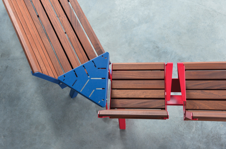
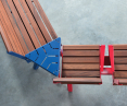
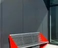
Traffic bench
© Komserwis
Psychology of color and architecture
In modern public space, neutral, monochromatic colors dominate, matching the existing buildings. From the perspective of the architectural landscape, this is a positive development, as too much color can introduce chaos and overwhelm.
However, we are increasingly looking at the city on a human scale, so that a given public space positively affects the well-being of residents, stimulates interaction and creative activities, or guarantees safety. And this is where color can come to our aid. After all, colors not only have a decorative function, but also influence our feelings and cause certain reactions. Here are some examples:
- Red - stimulates, affects motivation, but also attracts attention. So it is worth using it, if only in architectural details.
- Orange - arouses enthusiasm and joy, motivates interaction and physical activity.
- Yellow - lifts the spirit, creates a warm atmosphere, stimulates the work of the mind, and therefore encourages learning.
- Green - brings peace, harmony, allows you to regenerate and catch your inner balance.
- Blue - provides security and reliability, causes tranquility, composure, calmness.
- Brown - introduces an atmosphere of warmth, stability, security and permanence.
Jadwiga Husarska-Sobina, who with her team designed the Traffic series of urban furniture for Komserwis, appreciates the value of color in public space:
Color has an incredible effect on emotions. It can soothe, for example, with the shade of green we have such primary associations: we go out to the forest and are relaxed. It is worth moving this color to different places, even stressful ones, to change emotions a bit.

Traffic bench
© Komserwis
What other tasks does color have in public space?
We posed this question to Magdalena Milert, an architect and urban planner who runs the industry blog pieing.cafe and is an expert on people-friendly public spaces:
The space we surround ourselves with is important for our quality of life, it affects our well-being, creativity, and desire to be in a given place. It can be inclusive, that is, inclusive, assimilating, encouraging us to stay in it or, on the contrary, giving signals that we are not welcome in it. It is also related to the notion of a docile space, i.e. one that gives a sense of comfort, prompting people to extend their contact with it, or get to know people. Such behavior is influenced by the spatial organization of a place, but also by color, which is an integral part of the design. Color is an important element influencing the perception of a building, highlighting its assets or segments and determining the aesthetic qualities of the composition. Moreover, it significantly affects our entire impression, both in a positive and negative sense. The task of color should always be to enhance and complement the form.
Color and small architecture Komserwis
When was color thought of at Komserwis, a company that produces modern small architecture? Elżbieta Dworak answered this question:
Vibrant colors in Komserwis furniture have appeared before, but we introduced them on a larger scale in our new collections: Letter, Fin and Traffic. While the so-called earth colors, grays, browns are still leading in small architecture, blues and greens are also increasingly visible. Along with changes in the functioning of public spaces come color changes in urban furniture. They are supposed not only to perform their function, but also to visually harmonize with a given place and its purpose.
So, too, manufacturers of small architecture are recognizing the value of introducing color into public spaces.
3 ideas for color in the city using Komserwis' small architecture as an example
There was a little theory, information and assumptions, time for specific solutions related to colorful small architecture in public space.

Letter bench
© Komserwis
Colorful detail - Letter bench
The Letterbench is made of steel, but has a light and modern character thanks to its fancy form. Its shape is inspired by origami, the Japanese art of paper folding. In the basic version, the bases of the bench are in red. Thus, such an urban piece of furniture will be a perfect counterpoint to an environment where neutral colors dominate. Aleksandra Stefanska, the designer of this bench, says that the red hue will work well in spaces full of energy, spaces in motion:
The first places that come to mind are the Polish Aviation Museum in Krakow by the Polish-German studio Pysall. Ruge Architekten and the Fire Museum in Zory, designed by Barbara and Oskar Grąbczewski. Both buildings are characterized by dynamic planes.
Komserwis also offers a variant of the Letter bench with a wood or blue base.
You will also be interested in this: Letter bench from A to Z
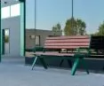
Color as an element of the whole project, e.g. thematic - Fin Komserwis benches in Brzeg Dolny
Urban furniture from the Fin collection was recommended for the Good Design 2020 competition. They were appreciated, among other things, for their bold shapes and colors. These color possibilities were used by designers of the space around the new library in Brzeg Dolny. Multicolored seats were placed in the area around the library and on the green roof. The colors of the benches were matched to the different stages of the educational path, so they not only please the eye, but also teach. On the occasion of this investment, it is worth mentioning that the design of the greenery and space around the library refer to the meadows along the Oder River:
There are no traditional flower beds here, only lawns with clumps of single specimens of ornamental grasses. The roof terrace looks similar, overgrown with green vegetation. I think the Fin Komserwis seats fit perfectly into our architectural concept and the development of the area around the building," argues Bogusława Aleksandrowicz, Director of MiGBP Tama in Brzeg Dolny.

Urban furniture from the Fin collection
© Komserwis
Local place marketing vs. color
The task of the authorities is to create such a public space that will be a certain showcase of a given city. The distinctive feature of the original space can be city furniture with interesting shapes and colors, such as benches from the Traffic series by Komserwis. This collection will work well in dynamic spaces: around bus stops and train stations, i.e. in places where tourists start to get to know the city.
In the Traffic series, the designers chose the colors so as to fit in with urban colors, while not being monotonous. Shades of blue, red and yellow were used. All these colors function in public space, but putting them together within one modular bench, gave a new and original effect. The station with such urban furniture is memorable for a long time.
Creators of colorful urban furniture admit that with such projects, the idea is to disenchant traditional small architecture, which does not always have to be gray and brown. However, it's worth looking at this aspect in a broader way: what's important is how color affects residents and their approach to a place. After all, colorful public spaces are not only distinctive, but also in their surroundings we simply feel good.
For more information, visit the company's KOMSERWIS Sp. z o.o. page on the A&B portal.