



Cube-shaped houses have a distinctive quality — a simple, geometric form that, for years, was primarily a response to the need for functional living space. This house in Sosnowiec underwent a complete renovation, and its interiors were redesigned by Dominika Cymerman’s Studio — Ambiente. Instead of trying to tone down the character of the existing architecture, the designer opted for contrast: she paired the house’s simple base with color, patterns, rounded forms, and furniture that serves as decoration in its own right.
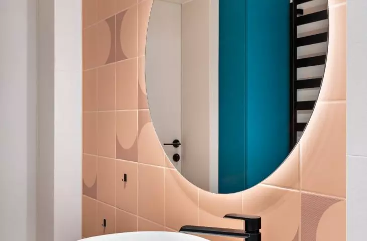
colorful and patterned tiles
The project covers approximately 75 m² of living space designed for a family of 2+1. The clients approached the designer early in the general renovation process, which allowed them to develop the most optimal layout. The ground floor features a kitchen, a dining room connected to the living room, a bedroom, a children’s room, and a bathroom. The upper floor is designated as a relaxation and guest area. Previously, both levels of the house functioned as separate apartments, so one of the design tasks was to design the hallway and staircase in such a way as to connect both levels not only functionally but also visually and in terms of materials.
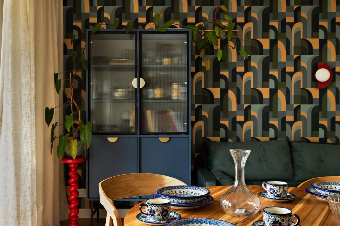
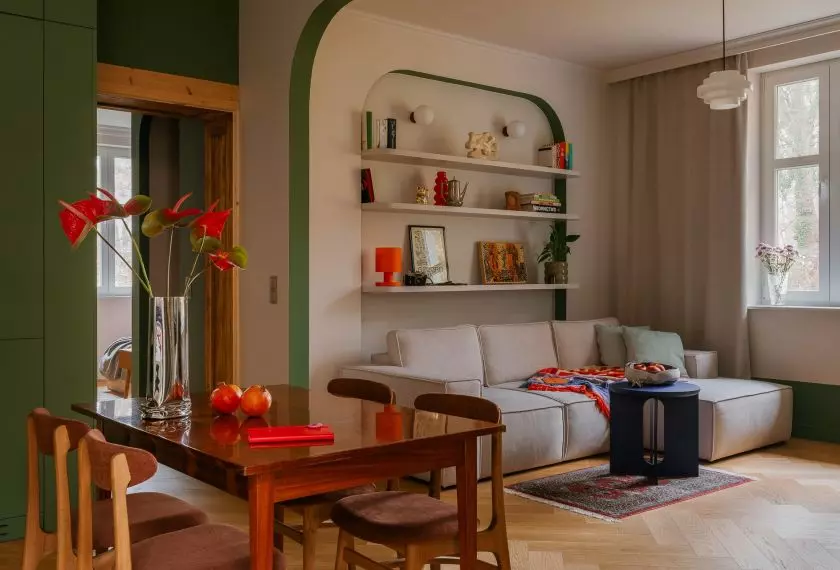
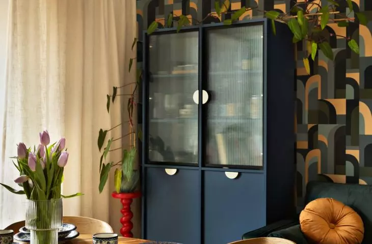
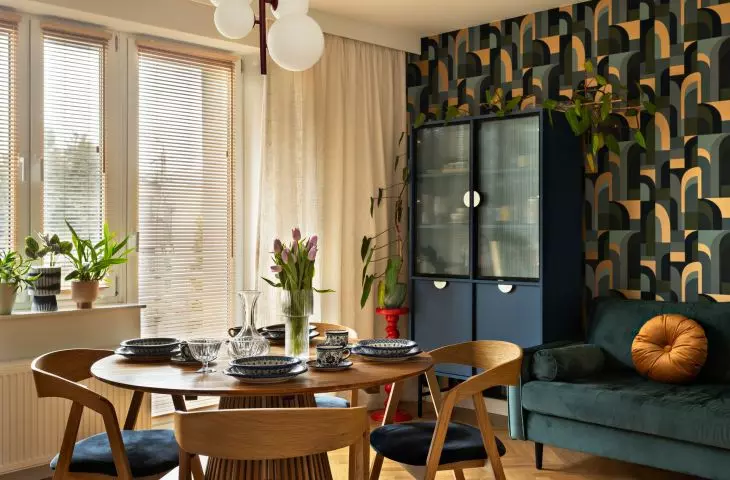
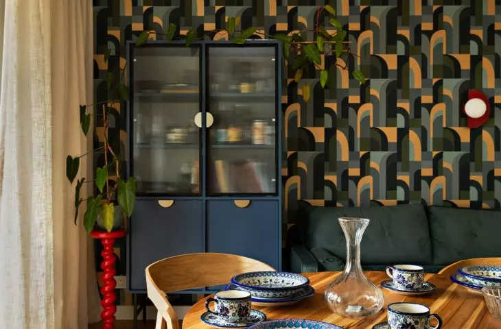
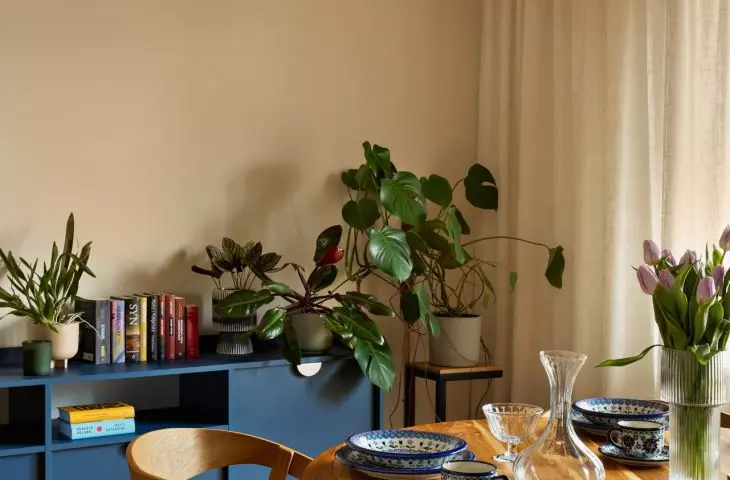
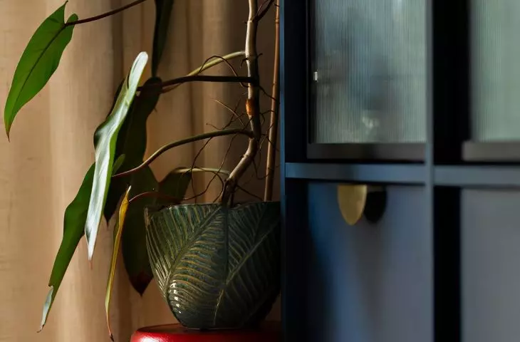
The dining room is dominated by navy blue and warm wood tones.
Photo: Dekorialove Anna Laskowska
Different aesthetics, a common language
The interior does not attempt to compete with the home’s simple architecture. Instead, it uses it as a neutral framework for more decorative elements. Inspiration is drawn from several aesthetics— mid-century modern, retro, and Art Deco —but they do not form a single, rigidly defined style. Color is the most important means of expression. The clients love color and wanted the house to be filled with it. Each room therefore has its own color palette— ranging from a cool, light green in the kitchen, through powder pink and intense red in the bedroom, to deep navies and greens in the living area. The colors, however, are not very saturated. The designer deliberately chose more subdued shades that work well in the natural light characteristic of Polish interiors —which is often cool. Thanks to this, even with a large number of colors, the overall atmosphere remains warm and cozy. The second motif that unifies the design is pattern. It appears consistently throughout the house—on wallpaper, tiles, fabrics, and in the natural grain of the wood. In the rooms, they are complemented by herringbone-patterned oak parquet flooring, which creates a distinctive yet timeless material base.
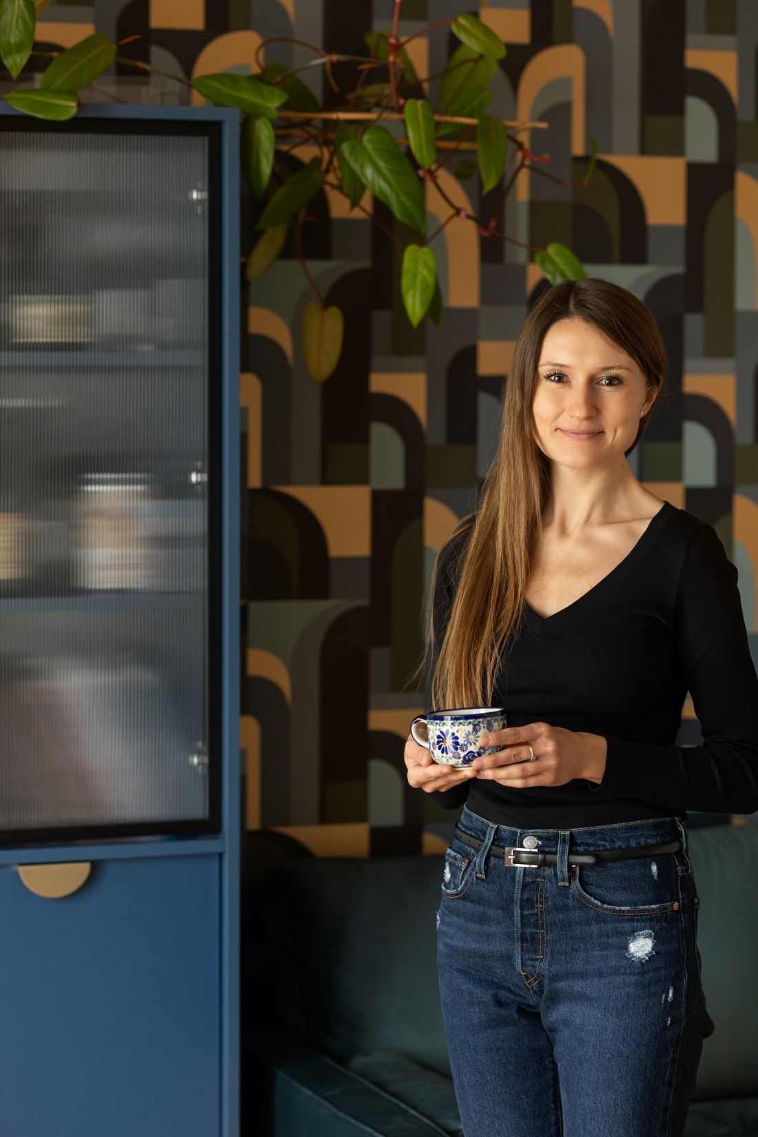
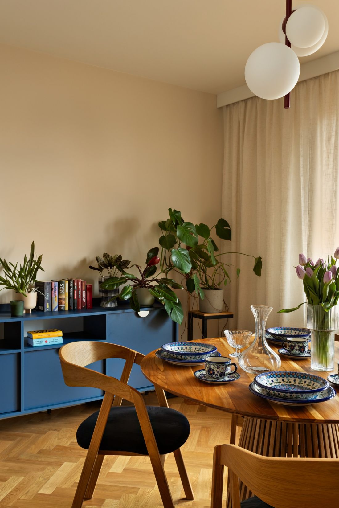
The entire design is very cozy and family-oriented.
Photo: Dekorialove Anna Laskowska
A kitchen in a shaded space
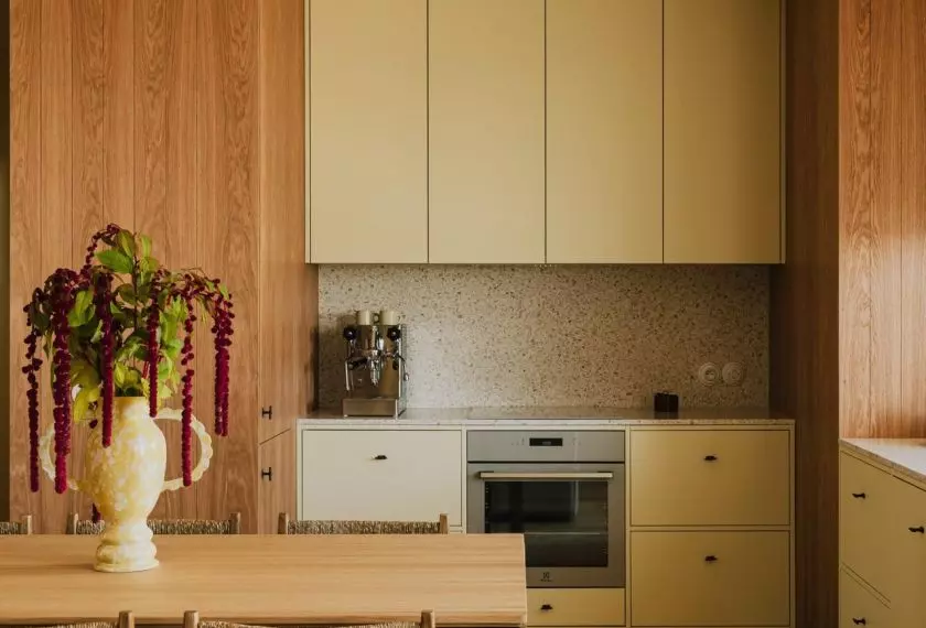
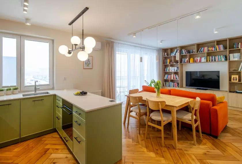
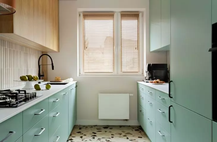
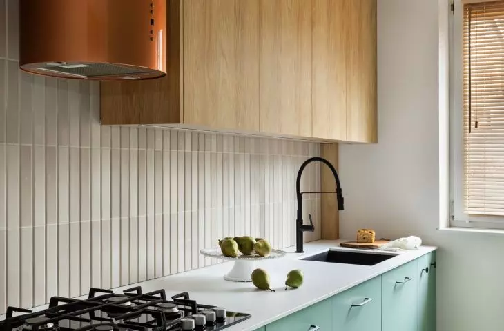
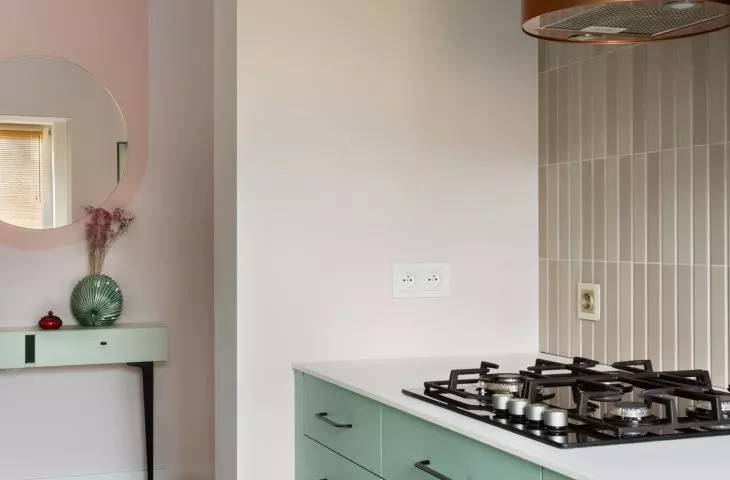
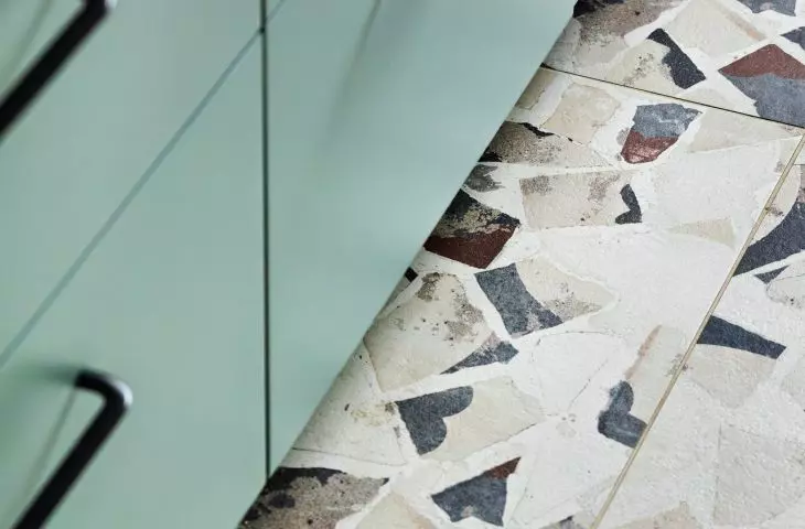
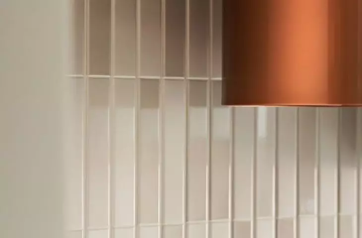
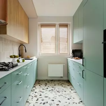
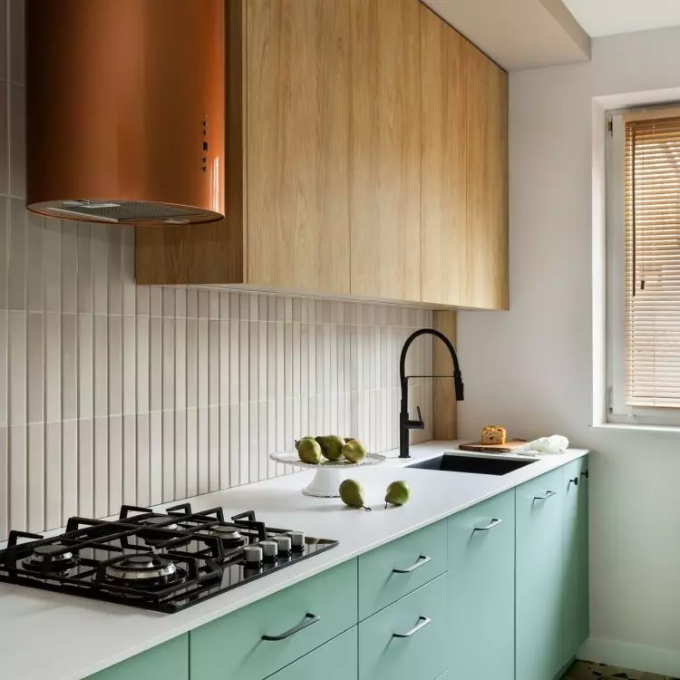
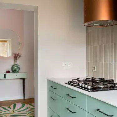
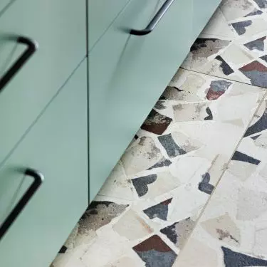
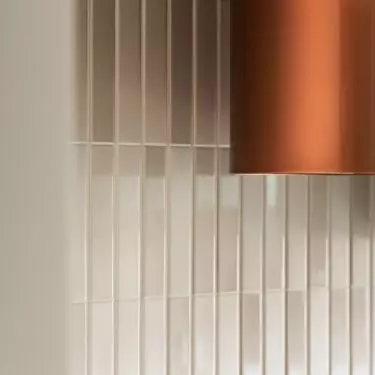
The kitchen faces a shaded courtyard, so it was intended to be bright from the start. The cabinet fronts, in a cool, light shade of green, are paired with a warm, highly decorative floor and a copper-colored range hood. The patterned floor is, of course, a strong decorative element, but it also helps balance the room’s proportions. The pattern visually breaks up the large area covered by cabinets and draws attention away from the less-than-ideal layout of the space. At the same time, the kitchen was designed to be highly practical. Ample storage space was one of the clients’ priorities. The tall cabinets house a refrigerator and an oven, and despite the limited square footage, the designers managed to incorporate plenty of counter space and drawers, which make it easier to organize kitchen items.
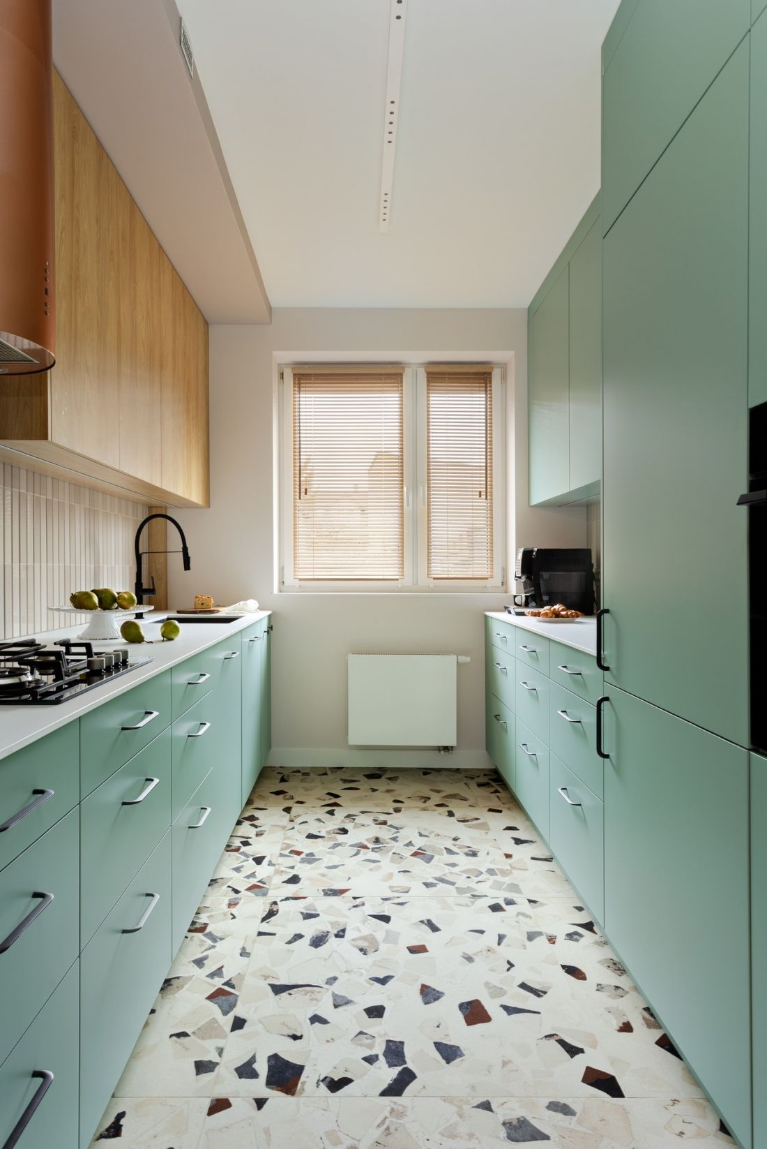
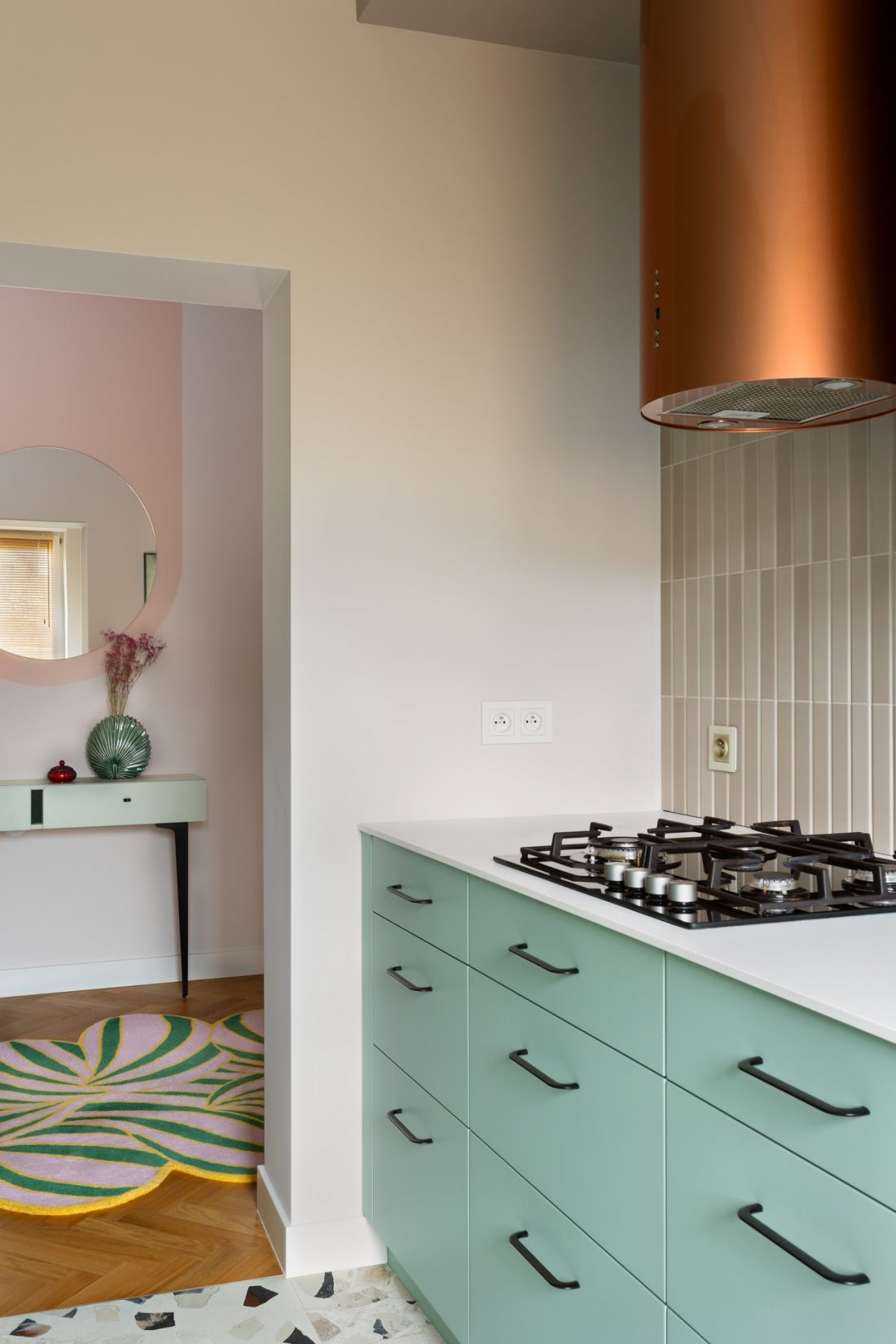
A kitchen with light green cabinet fronts.
Photo: Dekorialove Anna Laskowska
The dining room: decoration instead of an excess of furniture
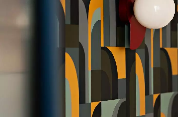
The centerpiece of the dining room is a round wooden table. Its decorative leg and distinctive grain mean it doesn’t need many additional embellishments. The table’s organic form harmonizes well with the wooden parquet floor and the soft lines of the furnishings. Relatively few pieces of furniture were included in this room. This stems from the function of the entire house— the main living area and guest quarters were planned for the upper floor. However, the clients were concerned that the dining room would look empty and unfinished as a result. The solution was Art Deco-patterned wallpaper, which covers a large portion of the wall and gives the interior character without the need to add further elements. Next to it are a chest of drawers and a display cabinet with fluted glass. They provide the necessary space for tableware and small items, while also serving as part of the decorative composition.
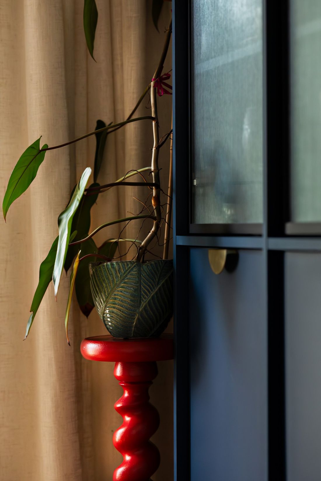
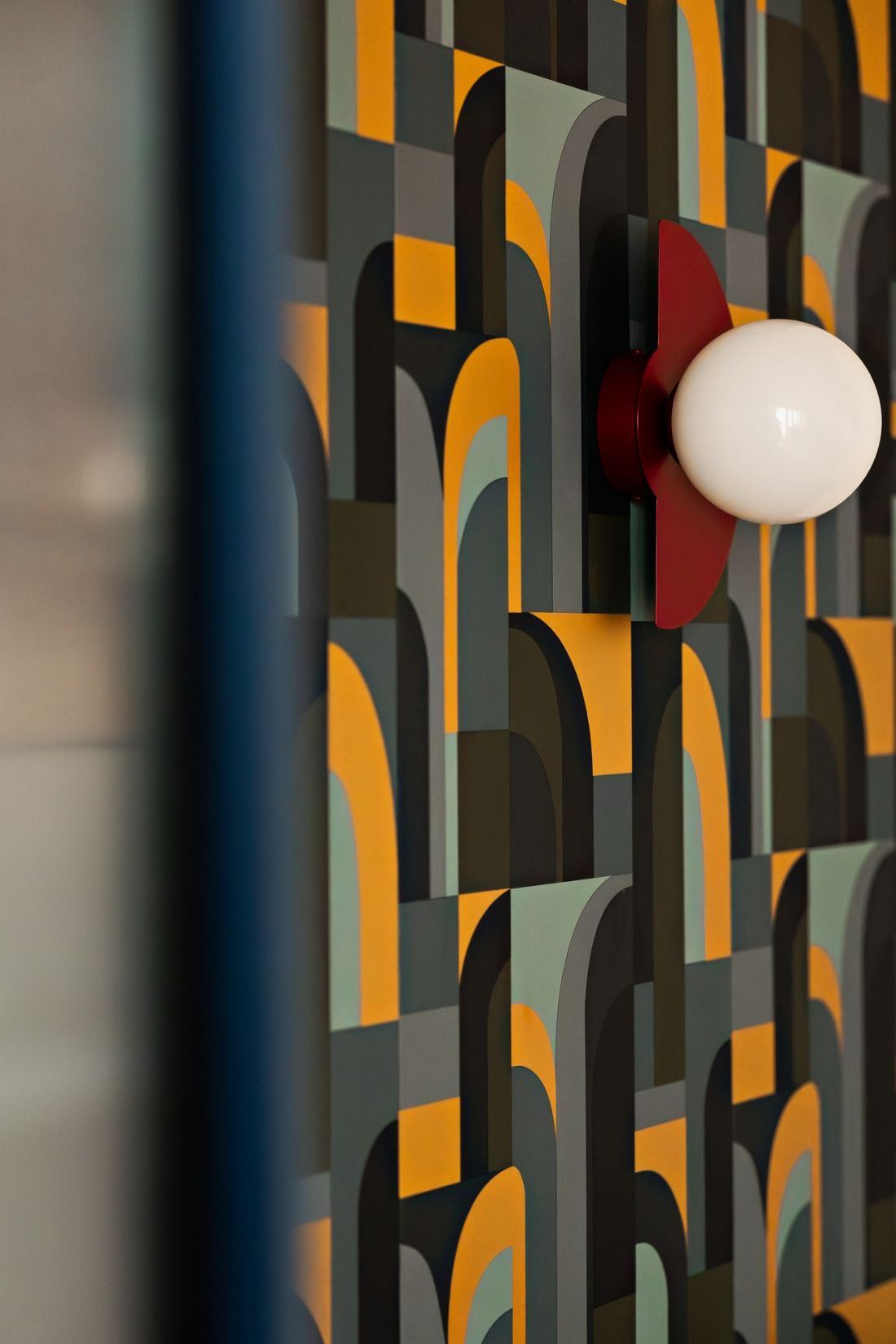
Patterned wallpaper makes the interior feel “full” despite the limited number of furniture pieces
Photo: Dekorialove Anna Laskowska
royal bedroom
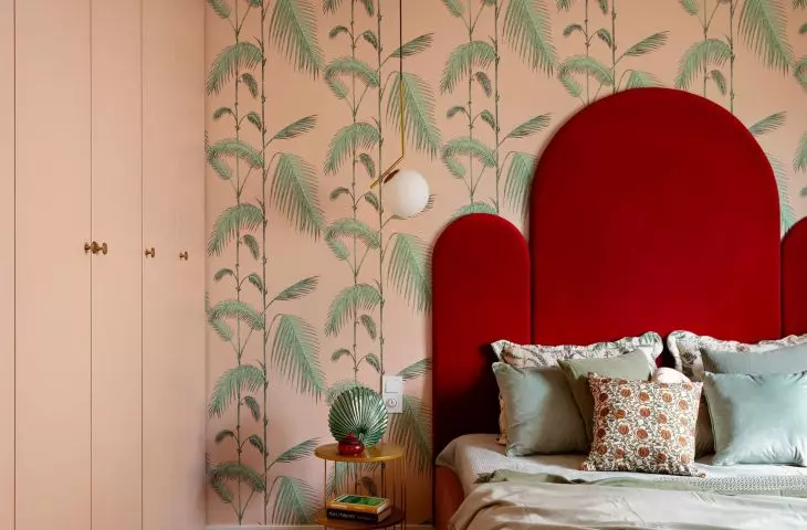
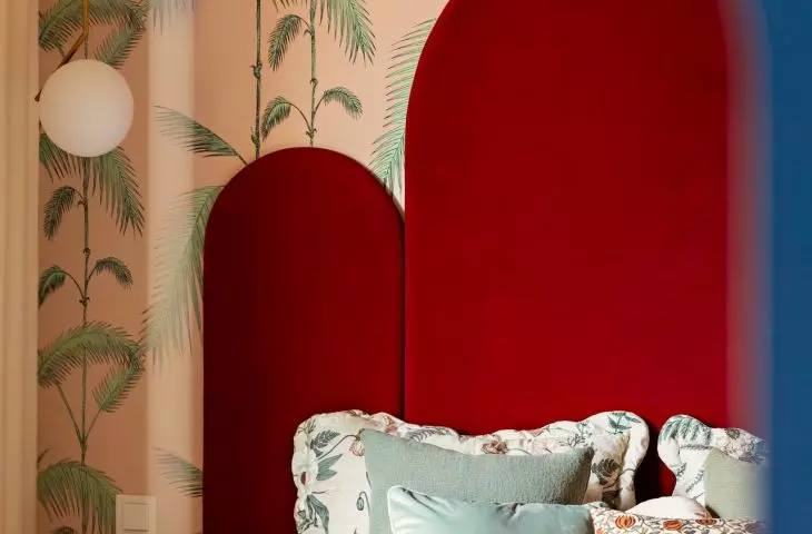
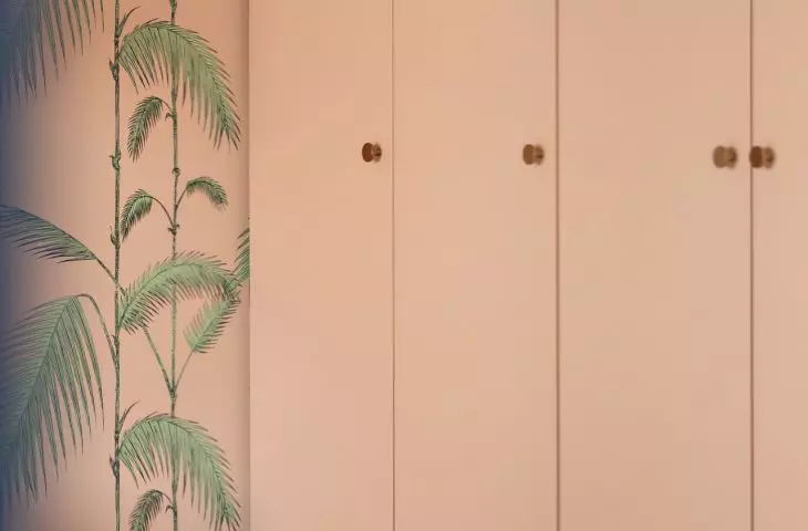
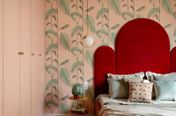
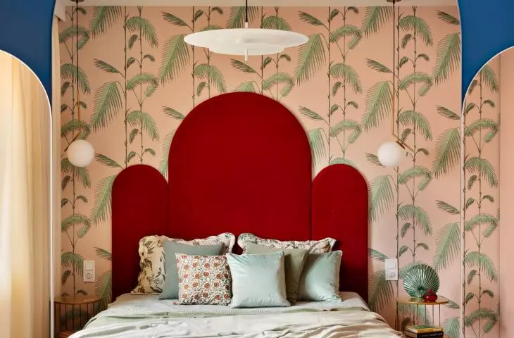
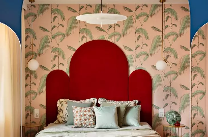
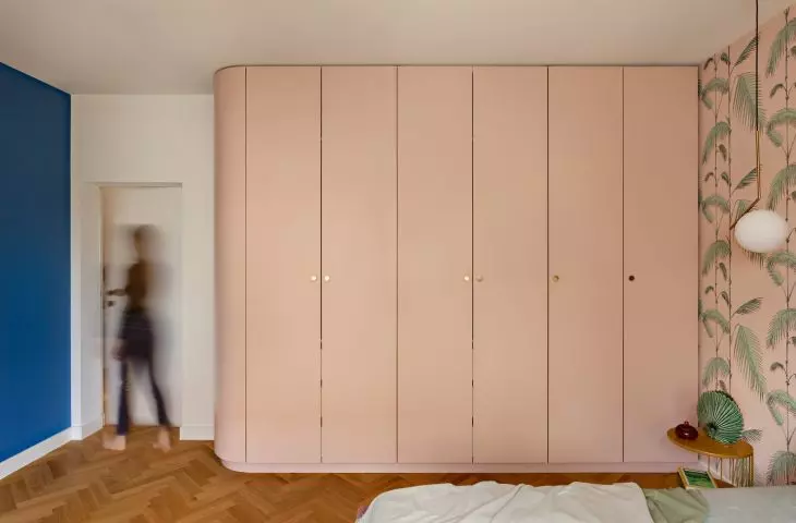
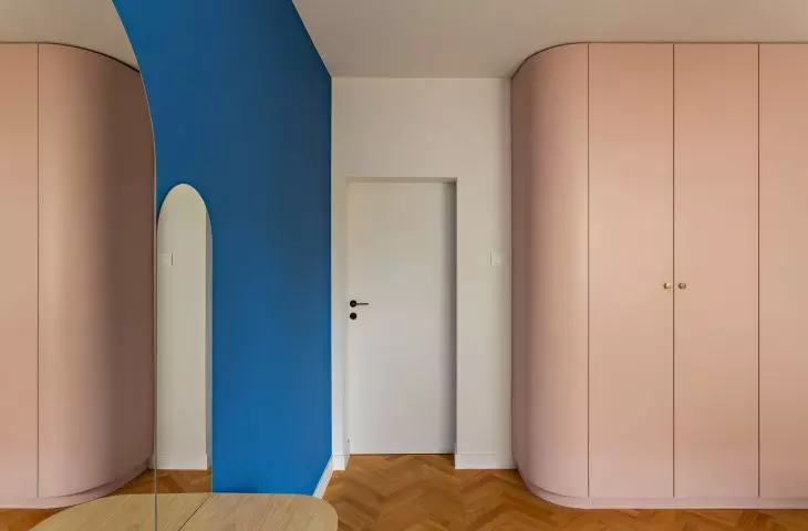
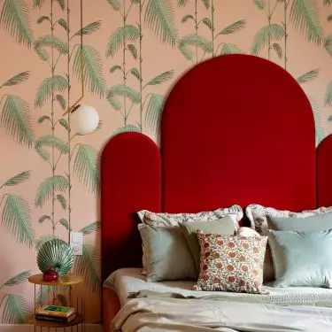
The bedroom measures approximately 20 m² and was designed as a more decorative, atmospheric space. Its centerpiece is a bed with a soft, velour headboard, whose rounded shape evokes the image of a crown. Behind the bed is decorative wallpaper by Cole & Son featuring a classic pattern. Its presence means the wall behind the bed no longer needs additional decoration. Opposite it is a vanity with a mirror, whose shape echoes that of the headboard. It is precisely this repetition of soft lines that ensures the unusual forms of the furnishings are not isolated, random accents, but rather create a cohesive aesthetic for the entire interior. The large wardrobe has been given a more minimalist treatment. Its powder-pink fronts are gently rounded, ensuring that the expansive built-in unit does not appear heavy. Instead of a classic rectangular shape, the piece softly blends into the room’s space.
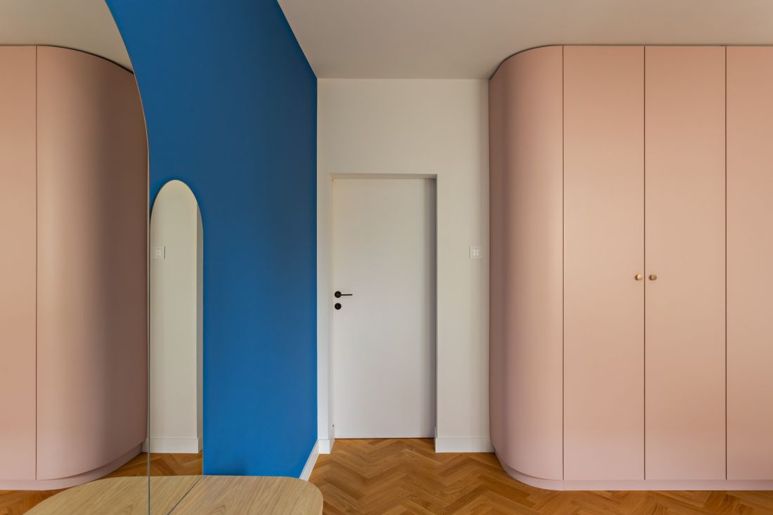
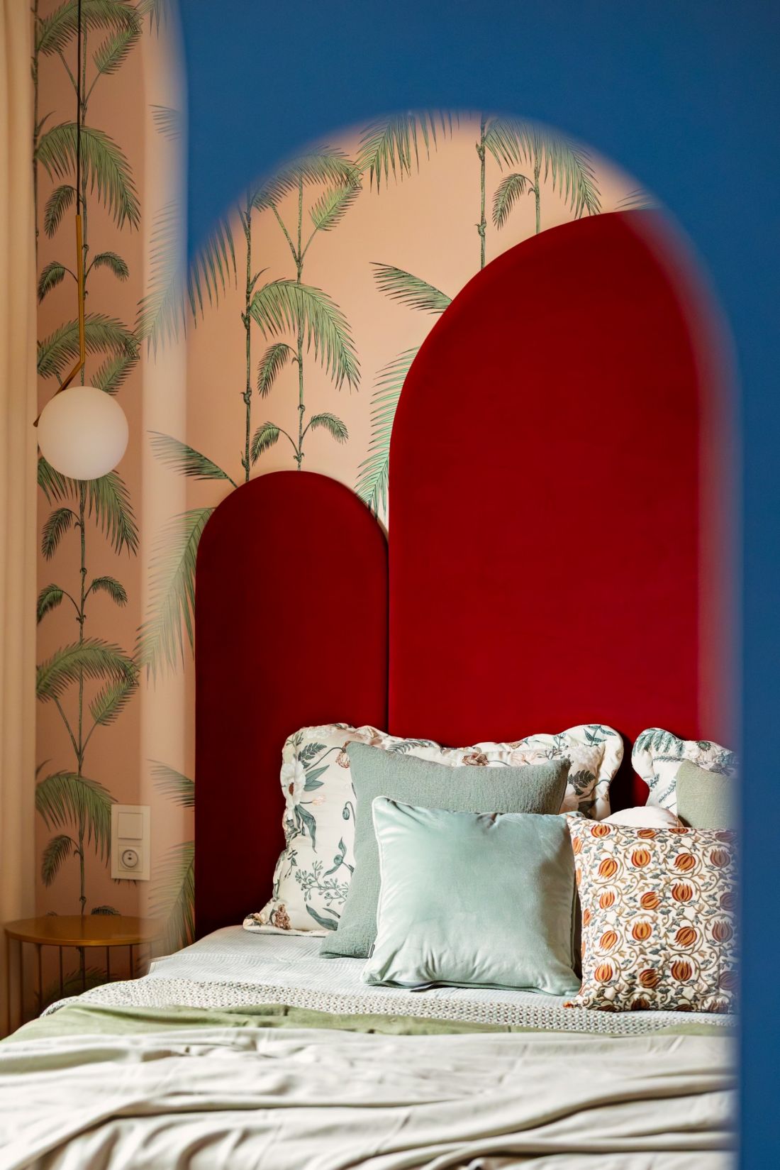
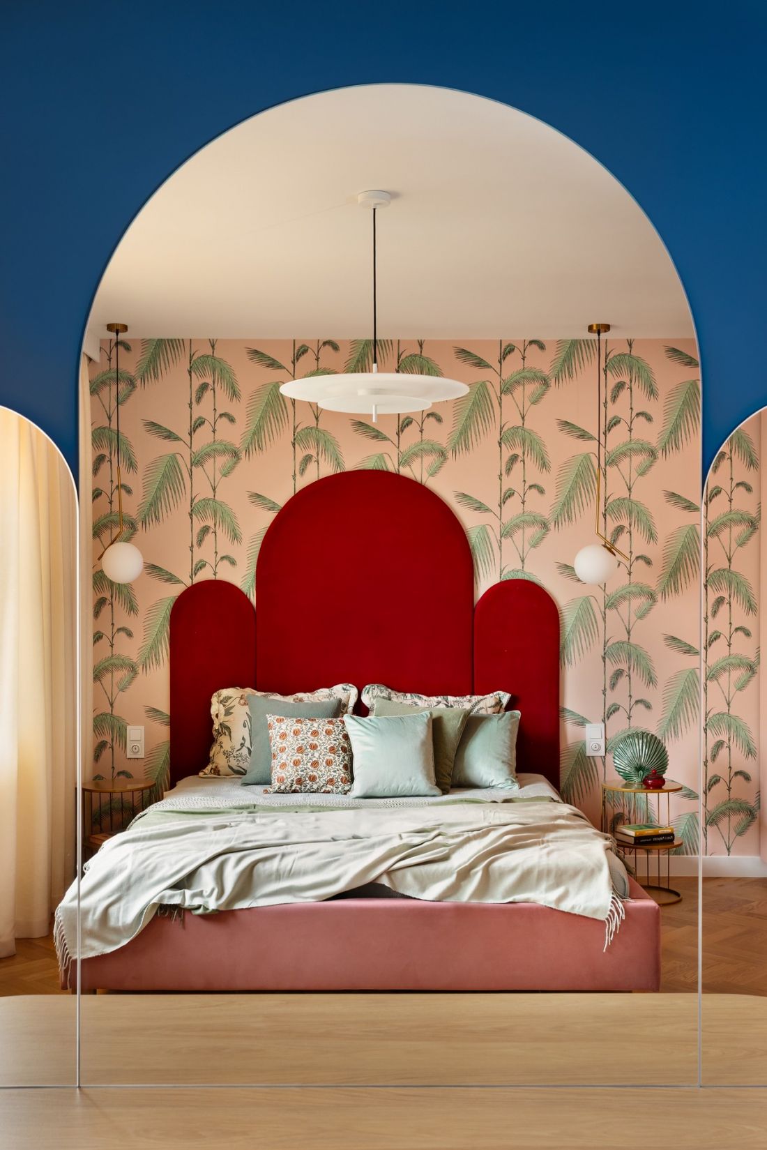
The bedroom is a play on colors—there’s no boredom or conservative choices here.
Photo: Dekorialove Anna Laskowska
a child’s room designed to grow with the child
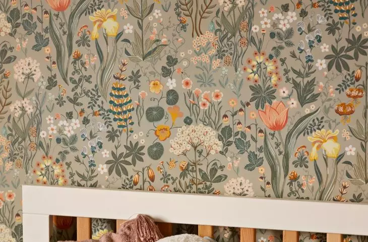
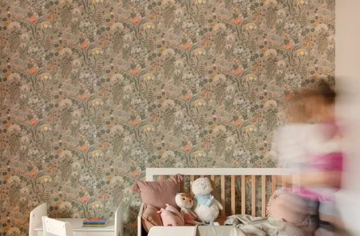
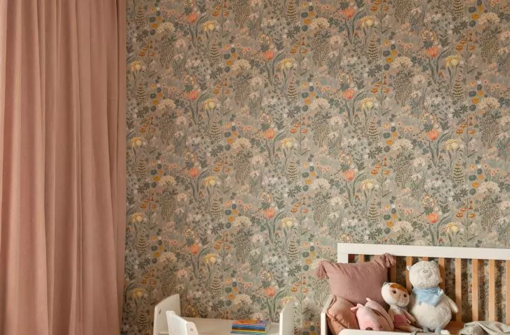
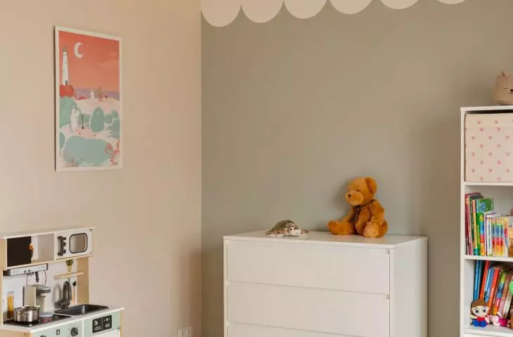
The child’s room is large, but thanks to the right choice of materials and colors, it remains cozy. An oak floor, wallpaper from a Swedish brand, a warm and muted color palette, and simple furniture create an interior inspired by Scandinavian design. Instead of a very literal, childish decor, solutions were chosen that are meant to remain relevant for a long time. The rug and plush curtain further soften the space. This is particularly important because the room’s occupant is still very young. The designer therefore assumed that the interior should grow with her, rather than require a complete overhaul in a few years. The timeless foundation allows for the gradual replacement of accessories and furnishings as the child’s needs change.
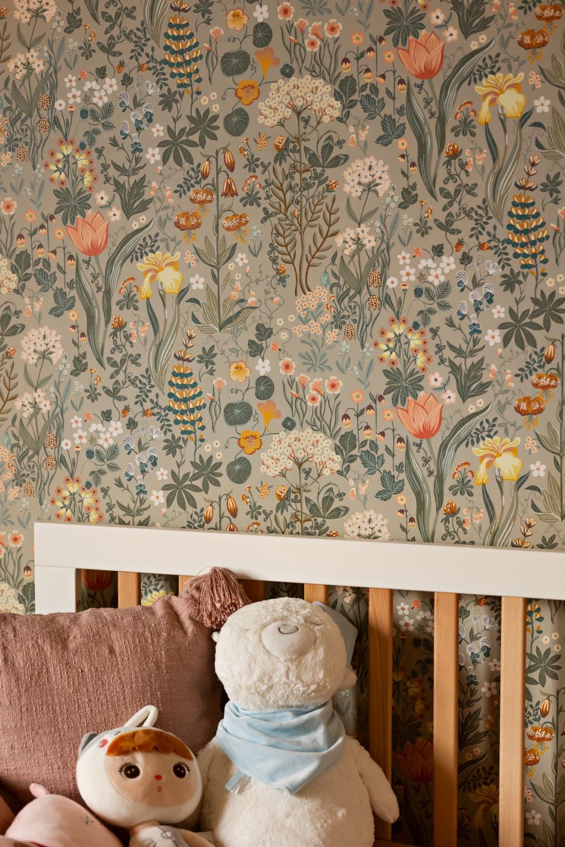
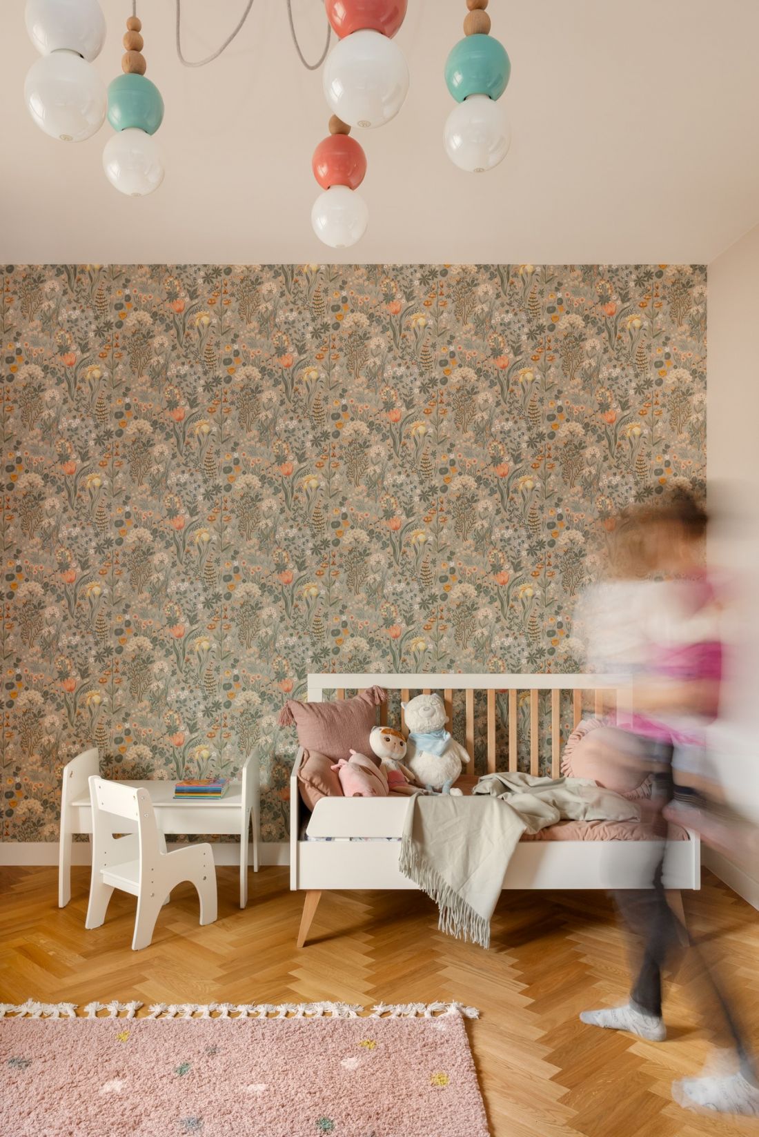
The girl’s room is meant to grow with her.
Photo: Dekorialove Anna Laskowska
Renovating a House with History
Designing the interior of an existing home requires a completely different approach than designing a new, empty space. Here, many decisions must be made with the existing architecture in mind. If the clients do not want to tear down walls, the designer must find a way to make use of the existing layout while concealing its less desirable elements. In this house, maintaining a balance between aesthetics and functionality was particularly important. The clients wanted to limit the amount of furniture to only what was truly necessary, which—given the size of the built-in units—required careful attention to scale and proportions. It was equally important to select materials and colors that were striking but did not overwhelm the space. That is why color does not appear here as a random decoration. It is a tool for shaping space—it can break it up, highlight a specific zone, or divert attention from its proportions. Patterns fill the spaces where the designers chose not to place additional furniture, and the built-in units serve multiple functions simultaneously.