


"Colorless is only that which light can completely penetrate. Color has its origin in the purely physical world. It is created by the reflection or penetration of light rays. The things we see get their color and appearance from the rays of light." Verner Panton
Color is an integral part of our world, not only in the natural environment, but also in that created by man.
Over the past decades, observations and scientific research have proven that the relationship between man and the space of that in which he functions is determined by the sensory perception of color. Our perception of color is absolutely important, affecting the individual and psychologically and physiologically. This aspect is confirmed by many disciplines of psychology, architectural psychology, color psychology, psychosomatics and visual ergonomics. Frank H. Mahnke, a consultant and color designer, points out:
The environment and its colors are perceived, and the brain processes and evaluates what it perceives on an objective and subjective basis. Psychological influence, communication, information and psychological impact are aspects of our perceptual evaluation processes.
Consequently, the goals of color design in architectural spaces are not just about decoration.

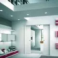
Photo: © CreoConcept
The end of gray
There have been attempts to find a cure for gray. It was thought that if it was painted over, it would be better. The thought was wrong. The worst poisons are said to be created during drug development. - Filip Springer
In recent years we have noticed an increasing interest in color. This element is being introduced into industrial, minimalist spaces. This is due to the need to commune with color, and its strong, mainly positive effect on our body. Thus, industrial interiors become an ideal base for creating offices with a stronger color accent. Monotony sends weak environmental signals and over-stimulation of confusing signals. People subjected to insufficient environmental stimulation show signs of anxiety, irritability, emotional overreaction, difficulty concentrating and perceptual disturbances.
Good design should put people at the center of attention and purpose, so with the office space user in mind, bolder design has begun, with more intense colors affecting perception.
Breaking the gray in the interior is the goal that designers set for themselves. This treatment is aimed at making the interior more comfortable. Thus, it significantly improves the way employees function in offices. A colorful space stimulates and is a factor that significantly improves work efficiency.
Color in the interior does not have to appear only in the form of painted walls. Interior furnishings and accessories are also responsible for breaking the monotony in the office. Colorful furniture, upholstery, ceramics are all designed to breathe life into an originally gray and minimalist office space.
Color not a coincidence
Colorchoice should not be a gamble. It should be a conscious choice. Colors have meaning and function," says Verner Panton.
In his book "Notes on Color," the Danish designer collects his ideas and thoughts on colors. Thus, the color scheme of office spaces is not a matter of chance, nor can it be subordinated to the subjective taste of the manager. An office atmosphere can act as an inspiration and improve the quality of work, thus promoting productivity and creativity. A balanced color scheme means that the user experiences neither monotony nor sensory overload. It is important to realize that color in an interior is not just a decorative element. An important element is the right balance, between intense colors that distract our minds, and bland shades that put us in a state of fatigue.
To a large extent, the choice of color in the office space is influenced by the visual identity of the brand. It is the starting point when designing spaces consistent with the company's idea. So the office should show the universe of its values.


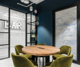
Photo: © CreoConcept
Monochromatic interior
The strong effect of color on our mind, stimulates the nervous system, so the color scheme of the office should be properly matched to the nature of the room and its function, among other things. As already mentioned, the choice of colors cannot be a matter of chance. The use of color in an interior is a deliberate and thoughtful action. Each space is characterized by a specific division due to the functionality of its individual parts. It is therefore necessary to match the appropriate color to each of them. Monochromatic spaces are guaranteed to be consistent. An impressive and yet subtle effect is given by the use of not one color, but two or three complementary to each other shades. This procedure guarantees the consistency of all interiors, and color balance. In such interiors, depending on their purpose, it is much easier to focus, stimulate creativity or relax. Well-designed in terms of color use, the office significantly affects the functioning of the employee. Imagine a situation in which we spend most of our day in a white, color-neutral interior. After a long time, the body begins to negatively perceive this monotony. Introducing color into one room does not necessarily guarantee an improvement in this functionality. Once the color is properly selected for different parts of the office, an employee moving around the office will absorb the different colors in a balanced way.
The impression of color, and the message it conveys, us of great importance in creating a psychological mood or atmosphere that supports the function of the space. A conference room has a different function than offices, so the color scheme must be chosen with these functions in mind. "Colors are the visualization of feelings," says psychologist and philosopher Max Lüscher, so it is necessary to skillfully reproduce the feelings to be evoked in the individual who is communing in a dedicated space with a particular color.
Color in good light
Color has its origin in purely physical light. It is created by the intermingling or reflection of light rays. The color we see looks that way only because of light rays. The eye's adaptation process involves the eye's immediate response to changes in the degree of illumination.

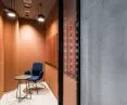
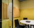
Photo: © CreoConcept
Glass exposes color
Imagine a large-format open-plan office, where without any systematics we see multicolored planes and elements of interior design.
Arguably, such a view will have a negative effect on any office user. A way to systematize the color chaos is to use glass partitions in the interior. Glass gives a great opportunity to divide the space in an unconventional way. Industrial, minimalist, open spaces gain, for example, through the use of curved glass. The curved and dynamic lines of such walls break the neutrality of the room, giving it character. High aesthetics of offices are of great importance, but only in combination with the highest technological sanders ensure the comfort of working in it.
Thoughtful color variety stimulates our brain to work effectively. Interesting effects will also be achieved when using colored glass, the light refracting on the colored glass surfaces will introduce a unique visual atmosphere. At the same time, it is a less conventional solution than the color introduced into the interior on the walls.
A treatment that will bring a touch of privacy to an office interior is PDLC glass and film, also known as LCD. They use a liquid crystal layer that changes optical properties when voltage is applied. With the flip of a switch, it turns standard or colored transparent glass into matte glass. Such a matte surface can also be used as a screen for multimedia projections. PDLC glass has many applications, but the primary use is for privacy and security. At the same time, this type of solution corresponds well with multicolored interior elements. Matte glass is the perfect balance to expose colorful surfaces.
Color is the resultant design of the space. An element that gives shape and character to the entire interior strongly influencing the viewer. At CreoConcept we know how important a good impression is, the right color evoking only good moods.
Think Creo
For more information, visit CreoConcept 's page on the A&B portal.