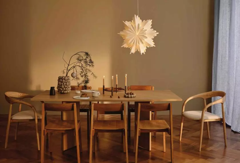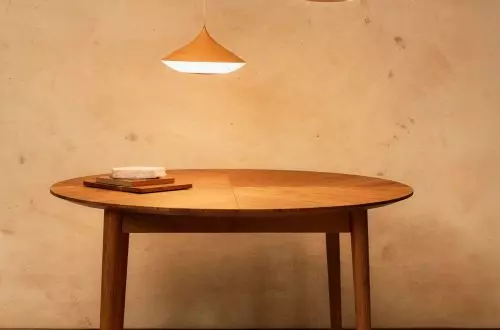


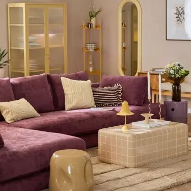


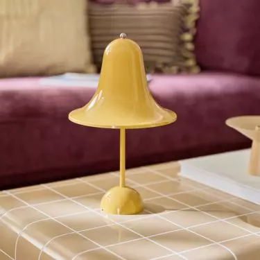
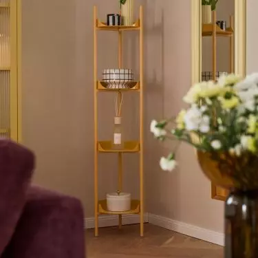
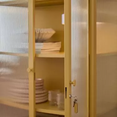
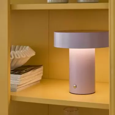
Modern interior trends are increasingly turning to bold but thoughtful color solutions to break up monotony and give a space a unique character. One of them is the color blocking technique, which in recent years has been gaining increasing popularity among designers and design enthusiasts. Its application in interior design, however, requires not only knowledge of the principles of color selection, but also the ability to create harmony and functionality of the space.
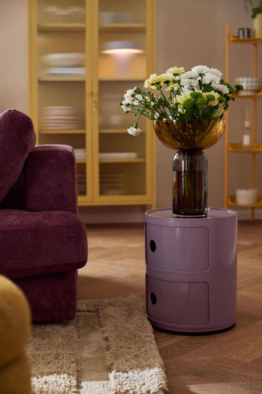
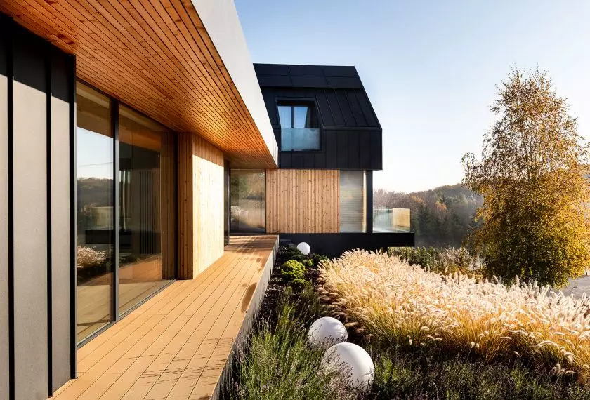
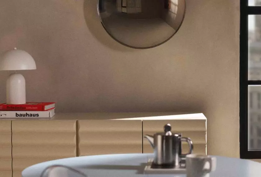
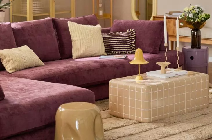
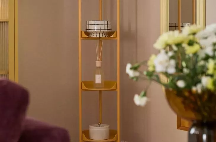
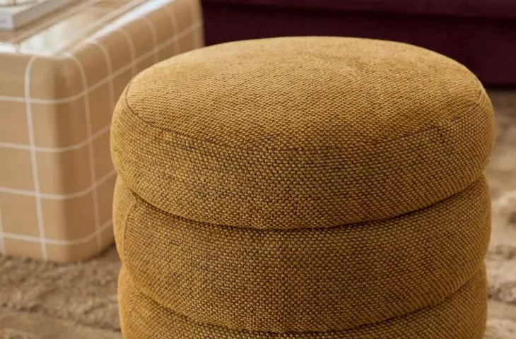
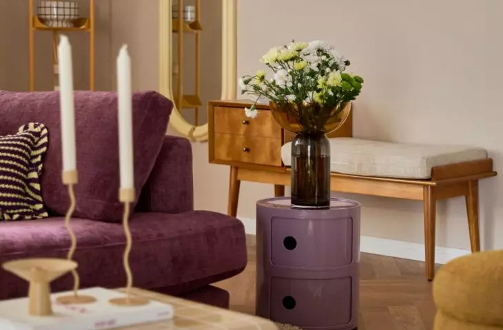
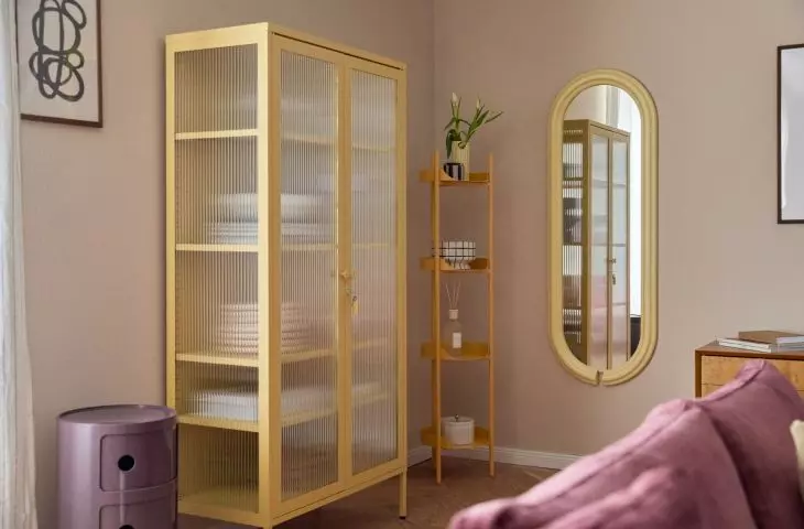
Color blocking is a technique involving the juxtaposition of large, uniform planes in intense, often contrasting colors
© Westwing
History of color blocking
Color blocking is a technique based on combining colors in a distinct and thoughtful way. Its origins are considered to be the career of Piet Mondrian - painter and pioneer of neoplasticism, one of the most important art trends of the 20th century. Mondrian created a distinctive style based on maximum simplicity of content, using simple geometric shapes and contrasting primary colors. His works, often composed of black lines dividing planes in red, blue, yellow and white, revolutionized the art of the first decade of the 20th century and inspired many artists working in various fields.
The neoplastic trend returned to favor in the 1960s, when it inspired prestigious fashion designers such as Yves Saint Laurent. This period, full of experimentation and rebellion against tradition, eagerly turned to contrasting color combinations as an expression of modernity and freshness. Combining opposing colors quickly became very popular, especially among young people and hippie circles, for whom vivid colors and original contrasts were a manifestation of freedom and individuality.
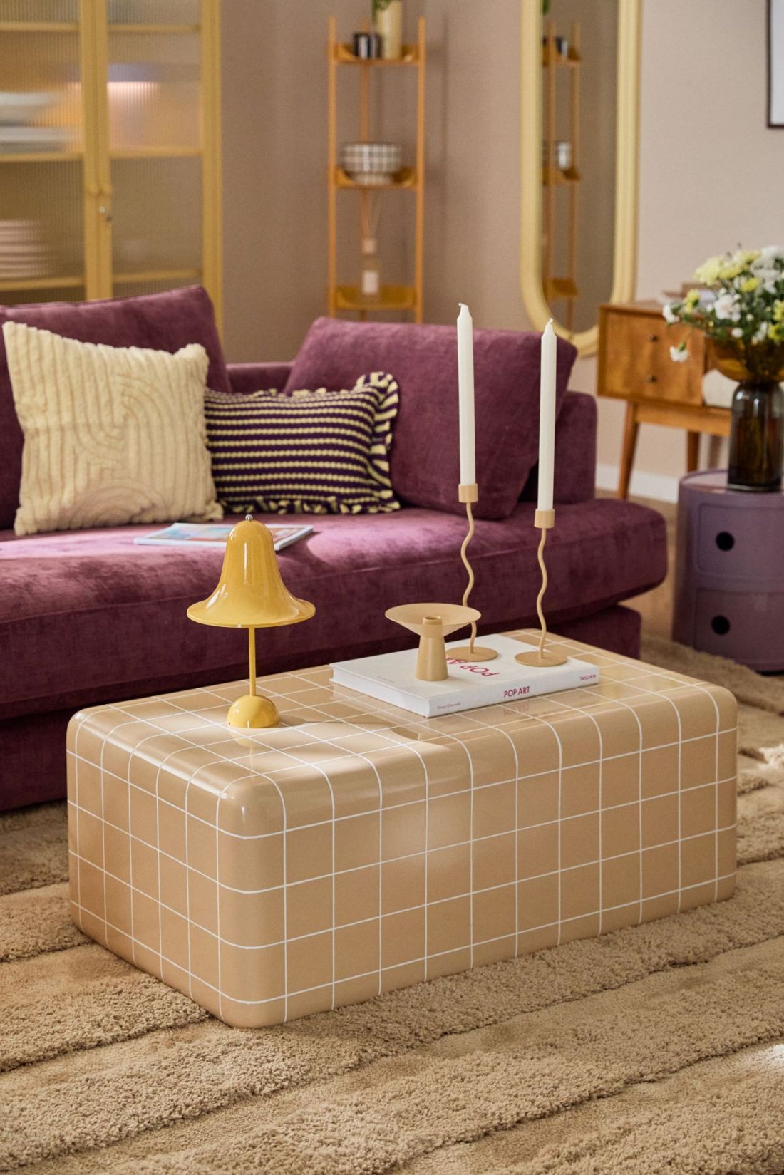
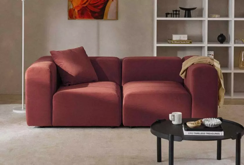
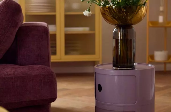
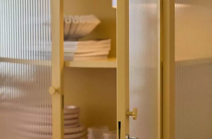
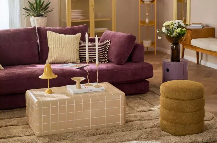
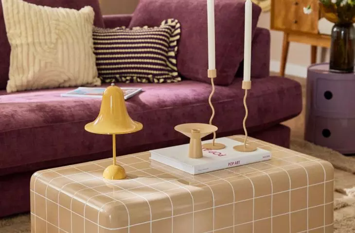
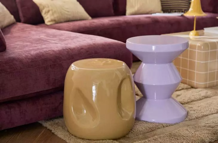
Color blocking is not afraid of expressive juxtapositions - it allows bold color games that break traditional schemes and introduce dynamism into the interior
© Westwing
What is color blocking?
Color blocking is a technique that involves juxtaposing large, uniform planes in intense, often contrasting colors. In interior design, this usually means combining colorful walls, furniture or accessories in such a way as to create a distinctive yet cohesive visual effect. The method was inspired primarily by fashion trends, where color blocking has long been a means of expression and experimentation with color.
Unlike more subtle decorating techniques, color blocking is not afraid of expressive juxtapositions - it allows bold color games that break traditional patterns and bring dynamism to the interior. However, the key is to maintain moderation and consciously compose colors so that the effect does not become chaotic.
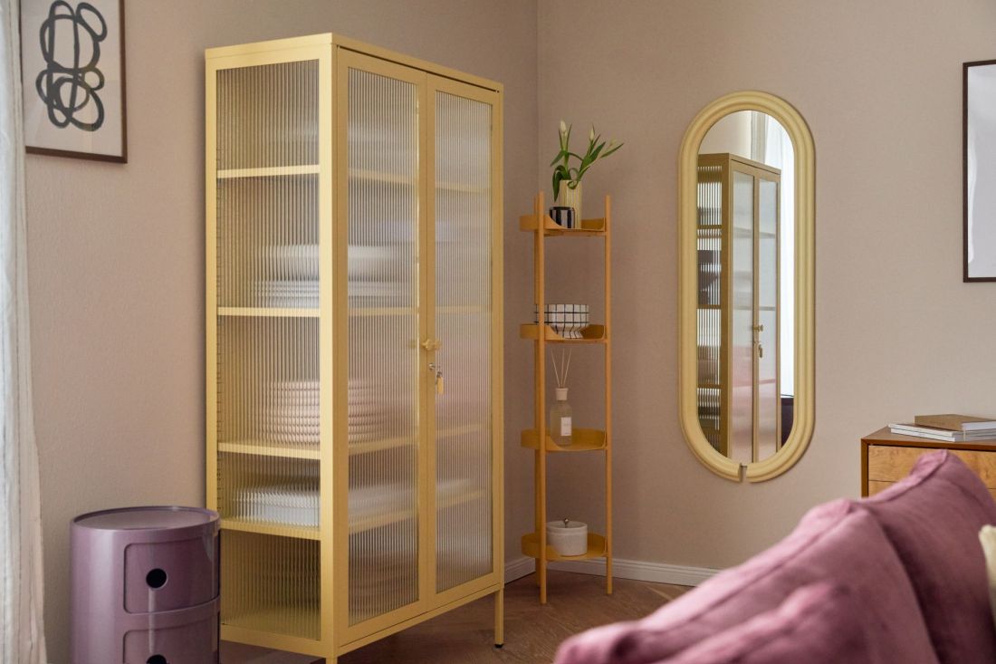
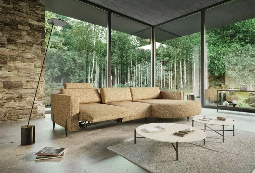
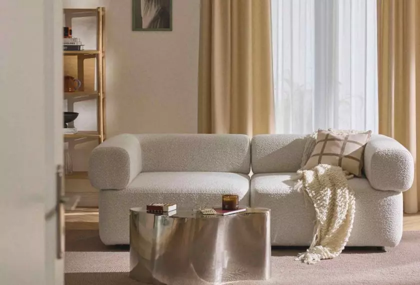
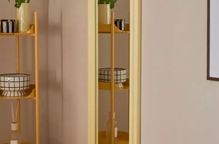
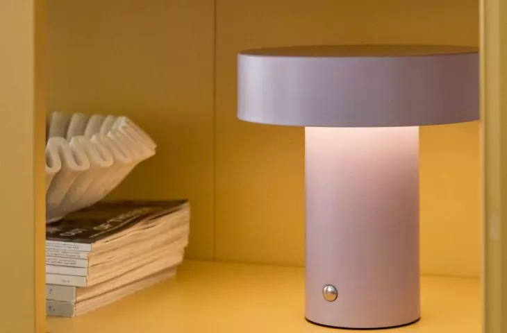
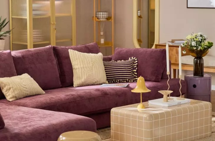
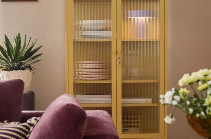
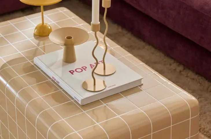
The use of color blocking requires a thoughtful selection of colors
© Westwing
Basic principles of color blocking in interior design
Choice of colors - harmony and contrast
The use of color blocking requires a thoughtful choice of colors. You can bet on contrasting combinations, such as red with green, blue with orange or yellow with purple. Alternatively, you can use a palette of colors close to each other on the color wheel, creating a more subdued but still expressive effect. It is important to keep the colors saturated and clean, as fuzzy or pastel shades lose the "color block" effect characteristic of color blocking.
Proportions and spatial layout
A key issue is the proper distribution of colors in the space. The dominant color should occupy the largest area, and the others should be accents and counterpoints. For example, one wall can be painted in an intense color, while the others are painted in more neutral or complementary colors. The division of space into color "blocks" can also be achieved with furniture, carpets or decorative elements. It is worth remembering that individual colors do not have to be separated by straight lines - rounded and irregular shapes also work well with the principles of color blocking.
Materials and textures
Although the technique focuses on color, the surface texture should not be forgotten. Smooth, matte or semi-matte walls emphasize the intensity of colors well. On the other hand, accessories made of different materials (e.g., fabric, wood, metal) enrich the composition, creating an interesting contrast with uniform planes.
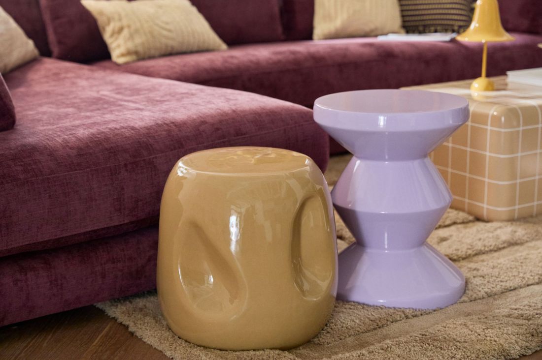
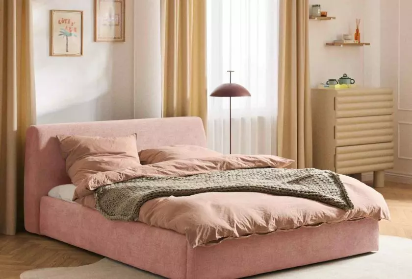
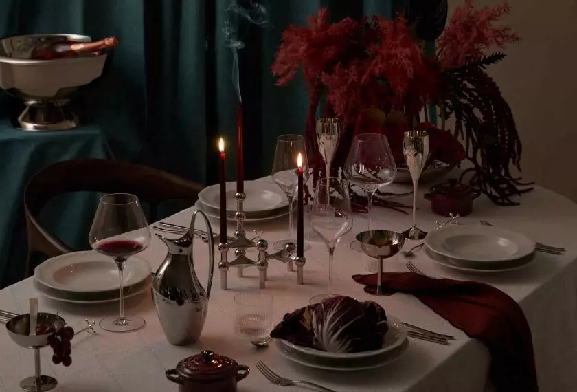
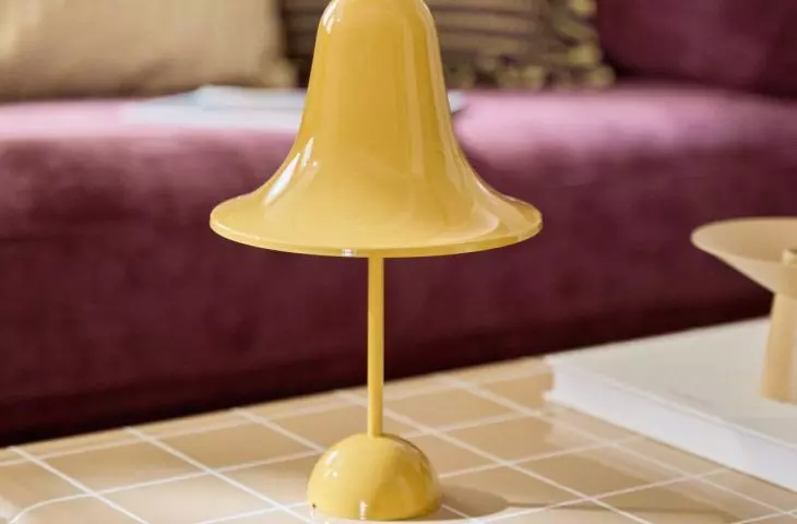
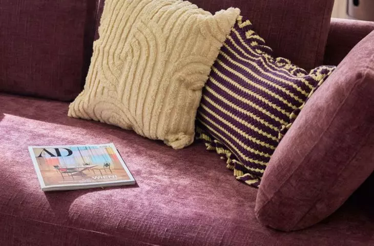
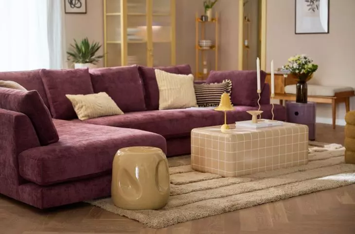
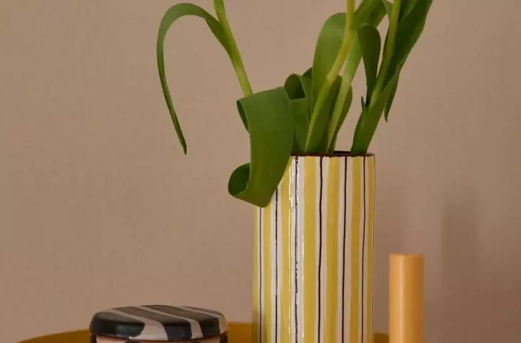
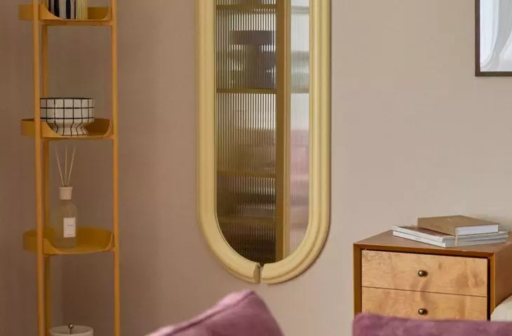
It is important in this technique that the colors are saturated and pure
© Westwing
How to apply color blocking in practice?
Walls and ceilings
The most classic application of color blocking is painting walls. You can isolate one or two walls in a room and paint them in contrasting colors, such as deep navy blue and mustard yellow. Another option is to divide the wall into fields of different colors, creating a geometric pattern. An interesting solution is also to paint the ceiling in a different color than the walls, which adds an unusual dimension and dynamism to the space.
Furniture as color blocking elements
Furniture is another way to introduce strong color accents. Instead of choosing a set of furniture maintained in a single hue, you can opt for, for example, a red armchair, a green dresser and a yellow coffee table, creating a set of contrasting pieces. Such an arrangement, however, requires consistency and control over the color palette, so as not to create an effect of visual chaos.
Accessories and textiles
Colorful pillows, curtains, carpets or lamps are elements that can be easily changed and experimented with in the spirit of color blocking. Their role is especially important if the interior is kept in a neutral base, as it is the accessories that can enliven the space.
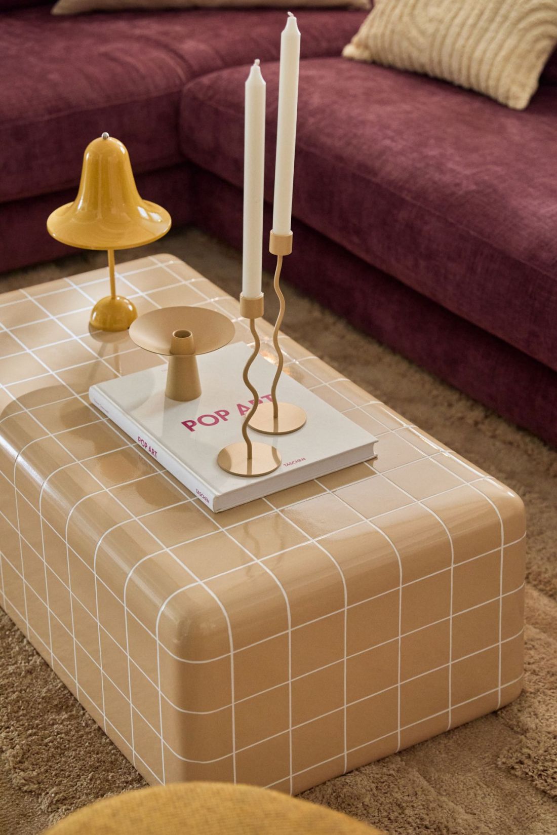
Color blocking is an effective and flexible design technique that allows you to create interiors that are expressive, yet consistent and functional
© Westwing
Colors and their importance in color blocking
Colors in interior design carry a certain psychological impact. In the color blocking technique, where colors are emphasized and juxtaposed in a distinctive way, their impact is even more pronounced.
- Red - stimulates energy, promotes action and dynamism.
- Blue - calms, brings peace and balance.
- Yellow - stimulates creativity, adds optimism.
- Green - is associated with nature, promotes relaxation.
- Purple - gives elegance and mystery to the space.
- Orange - enhances the warmth and coziness of the interior.
Knowing these properties allows you to choose colors so that they not only blend aesthetically, but also support the function of the room.
When to avoid color blocking?
Color blocking is not a universal technique and will not always work in every space. Small, poorly lit rooms can seem overwhelmed by intense colors. In such cases, it is advisable to limit yourself to more subtle accents or use bright, brightening colors. In addition, in homes where a minimalist or classic style is preferred, color blocking can interfere with stylistic consistency. On the other hand, those who appreciate eclecticism and color experimentation will find room for creativity in this technique.
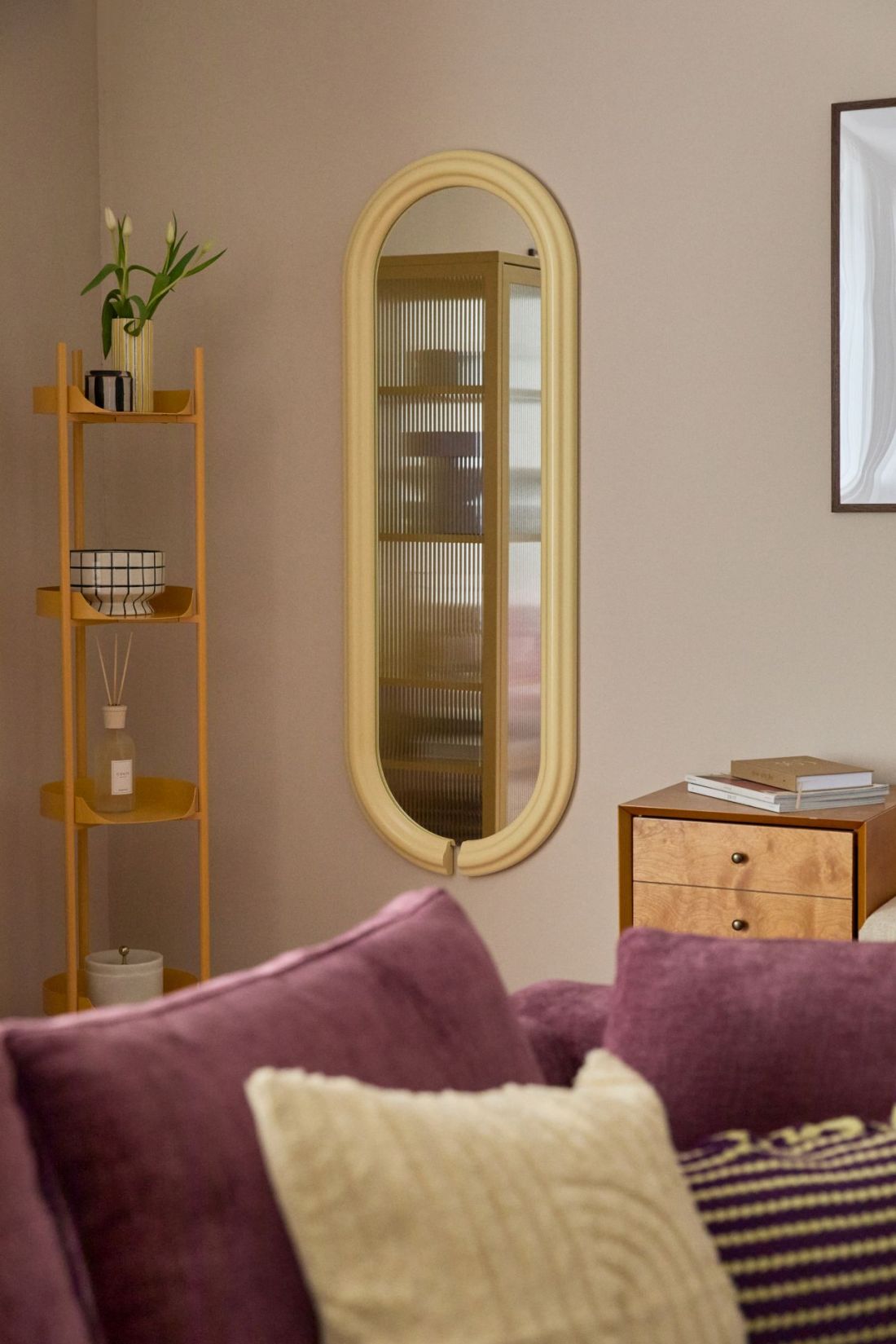
The key to success is a conscious choice of colors, attention to proportions and consistency in composition
© Westwing
Color blocking - the foundation of modern
and thoughtful interior design
Color blocking is an effective and flexible interior design technique that allows you to create interiors that are expressive, yet consistent and functional. The key to success is the conscious selection of colors, attention to proportions and consistency in composition. Thanks to this, even a small space can gain individual character and become a place that inspires everyday life. Knowledge of the principles of color blocking and the ability to apply them in practice gives users of a house or apartment the opportunity to consciously shape an environment that not only meets their needs, but also fits in with current interior design trends.