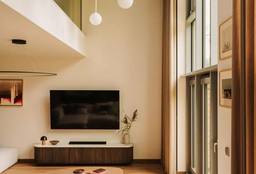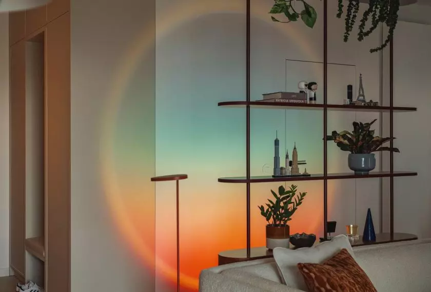



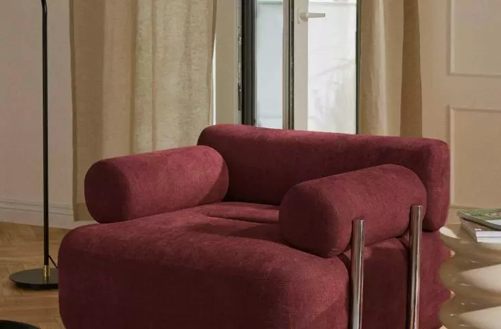
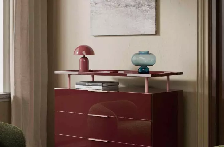
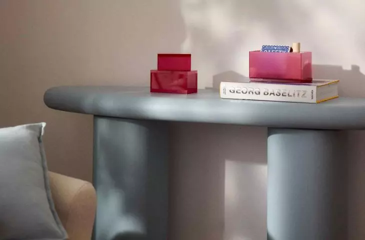
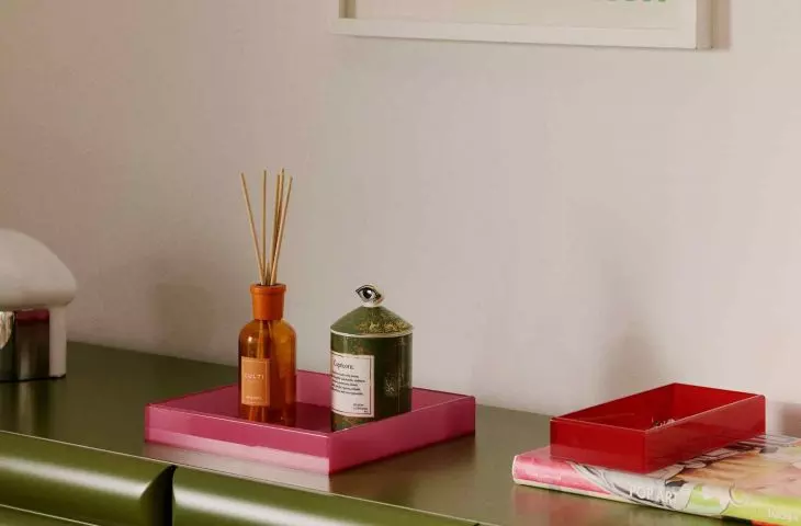
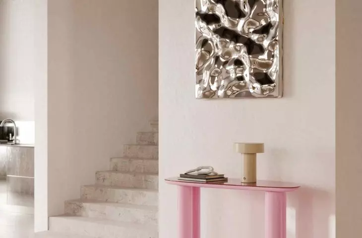
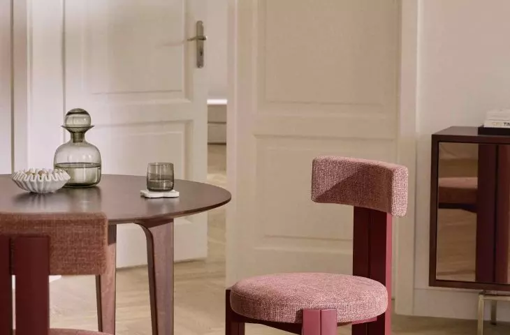
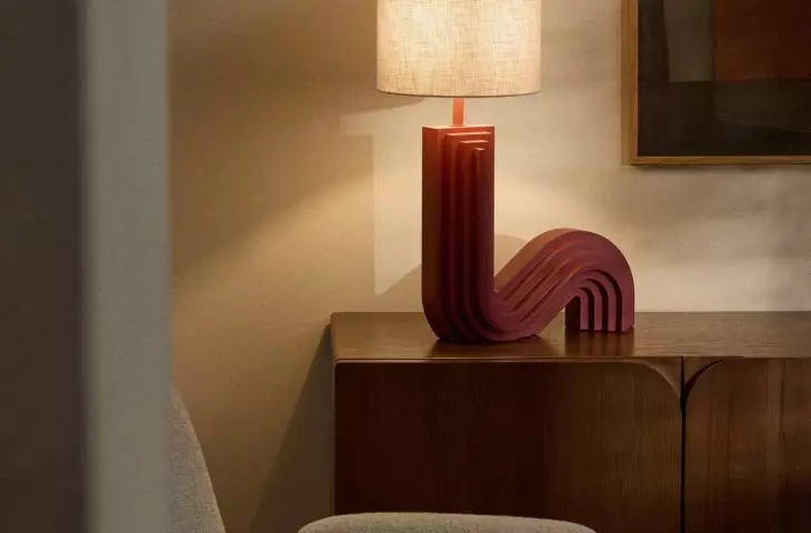
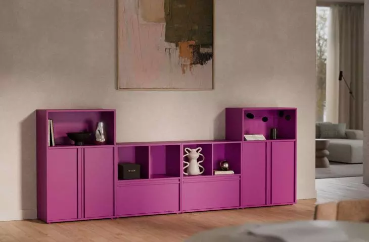
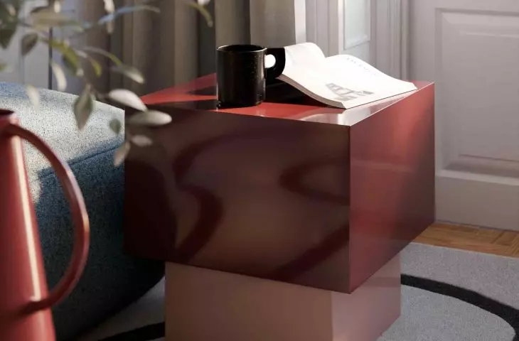
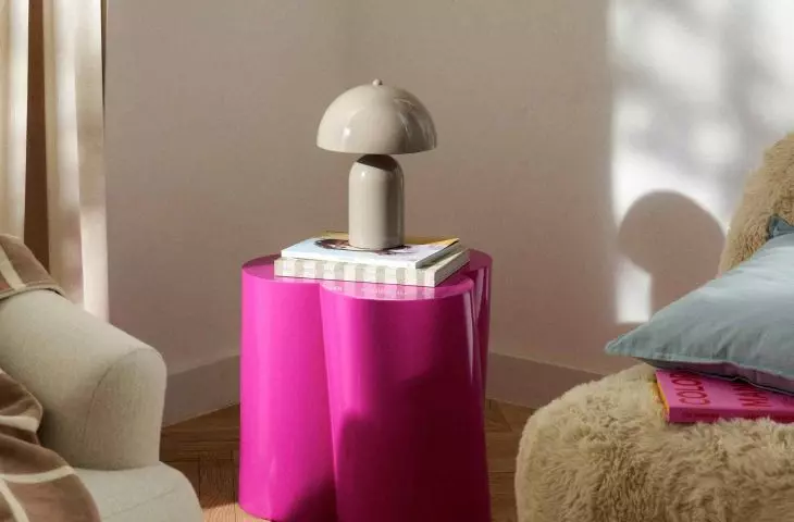
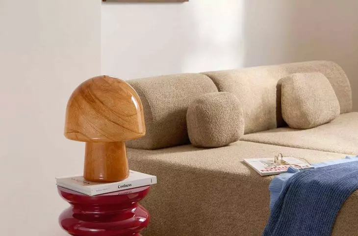
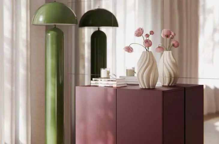
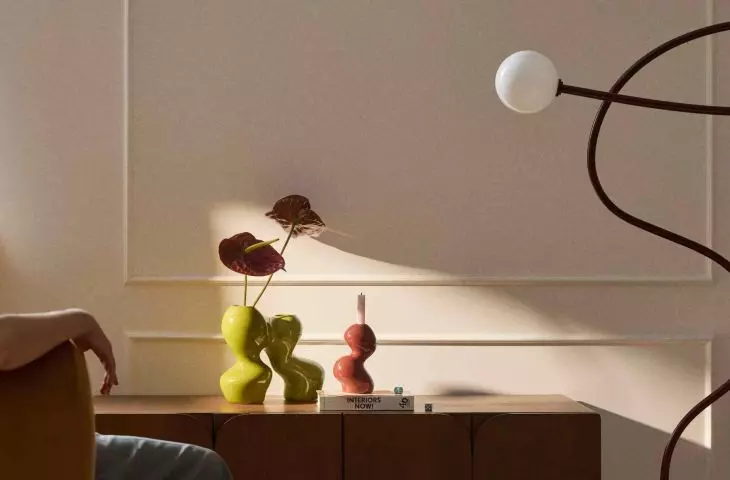
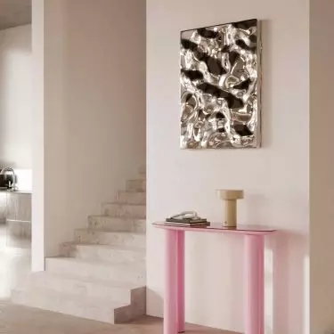
The Pantone Institute's Color of the Year 2026 - Cloud Dancer - emphasizes the need for lightness, tranquility and neutral backgrounds in interiors. This is another sign of the continued dominance of the aesthetics of tranquility, based on beiges, creams and bleached grays. At the same time, however, fatigue with this uniformity and the need for stronger expression is becoming more pronounced. In response to this trend, designers are turning to color as a tool for narrating and building the identity of a space. One of the most prominent trends promising to emerge in 2026 is Berry Tones - deep, saturated hues inspired by the berry palette. Berry hues cease to be an accessory, becoming a conscious and dominant design element.
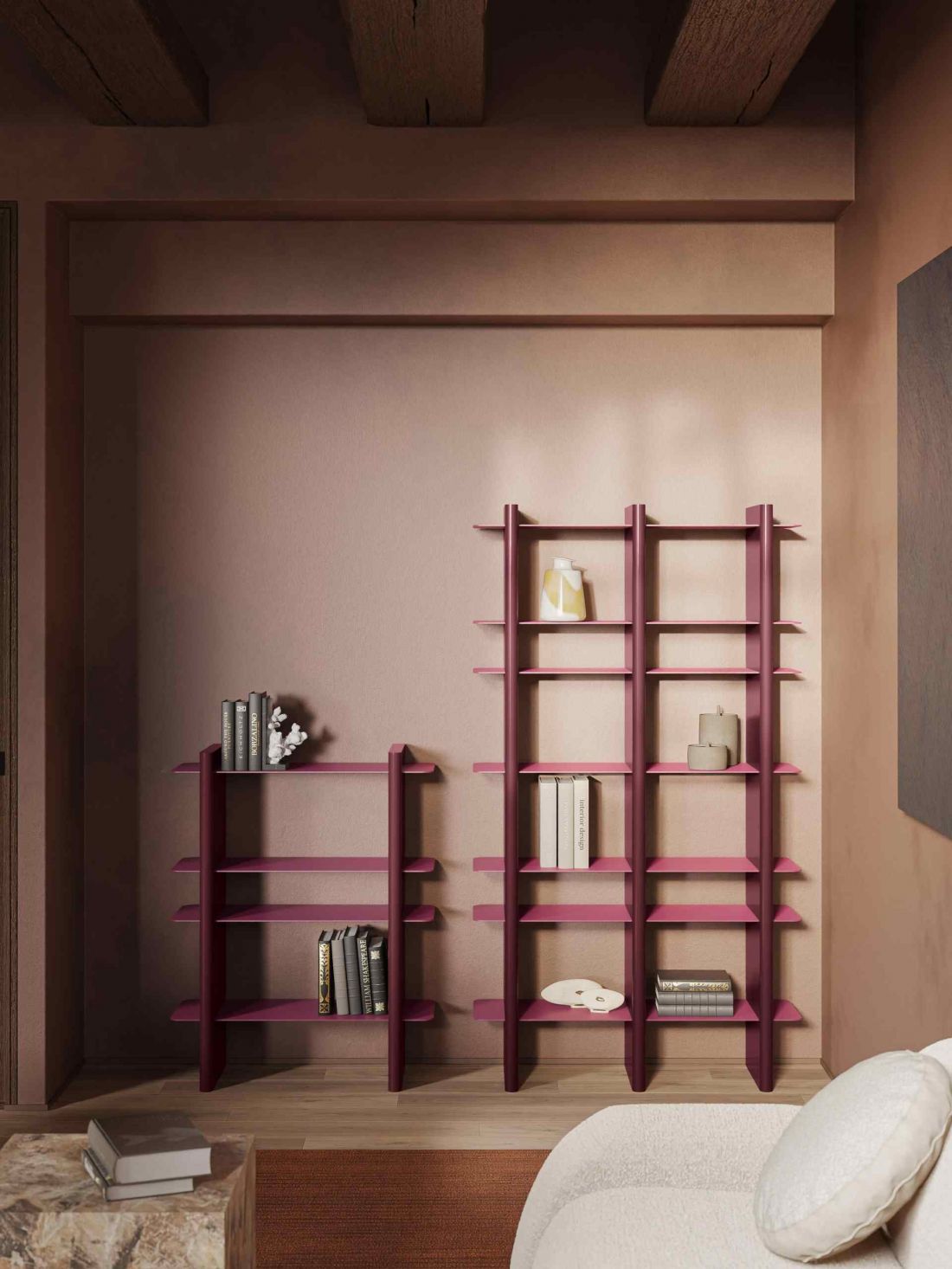
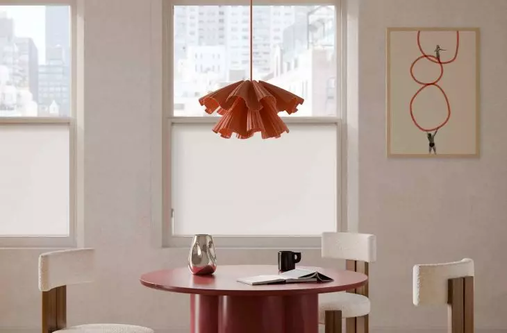
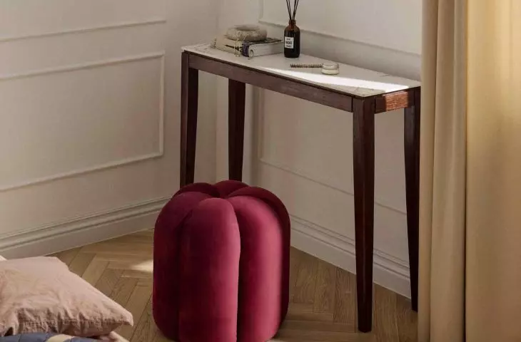
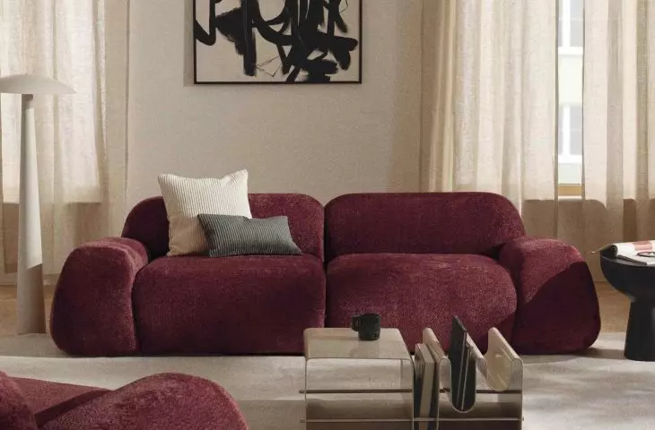
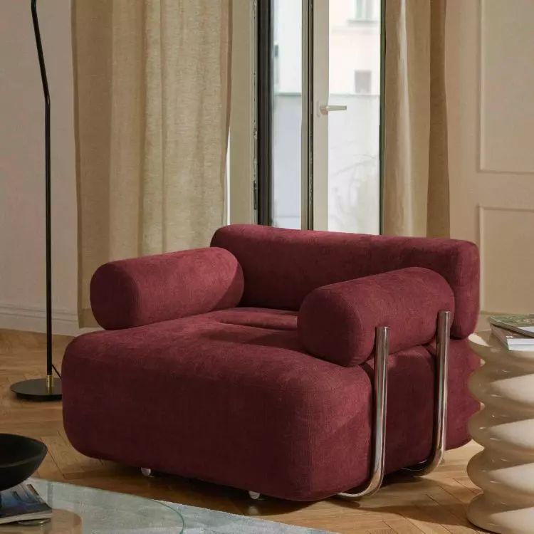
Berry Tones is one of the most prominent trends for 2026
© Westwing
What exactly are Berry Tones?
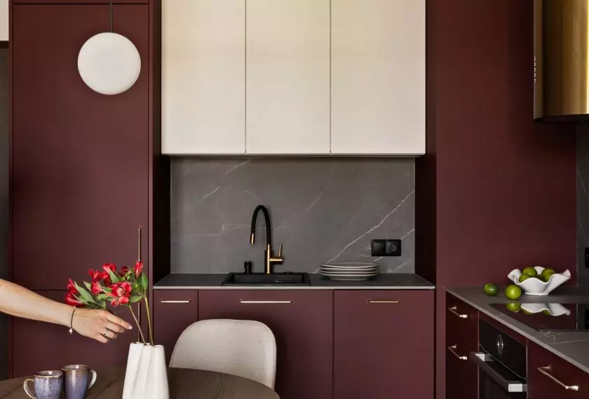
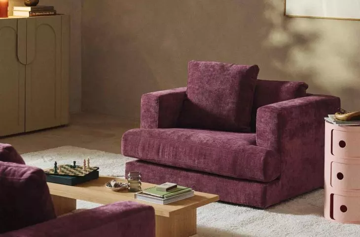
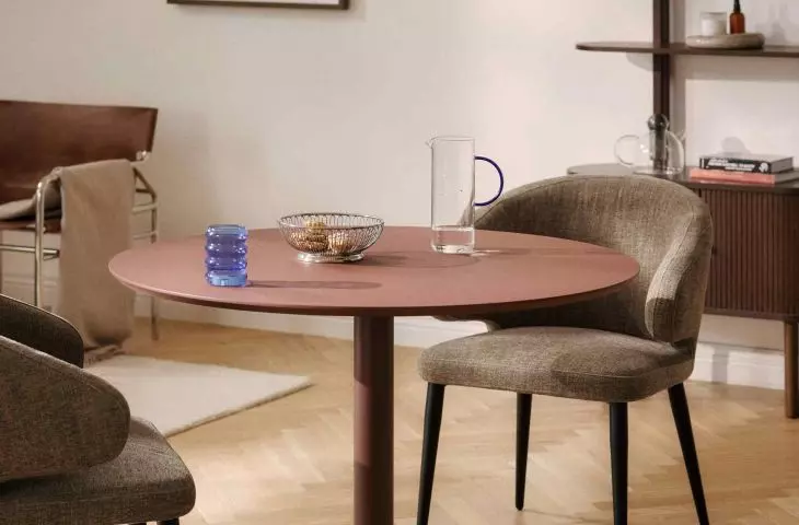
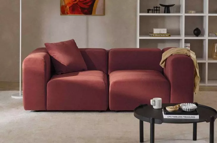
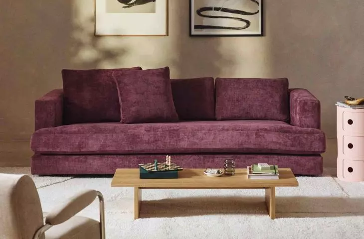
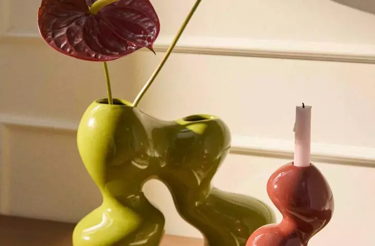
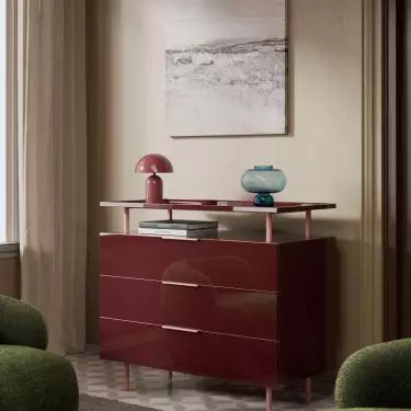
Berry Tones is a term for a color palette that includes deep purples, burgundies, shades of ripe plum, dark magenta and wine reds. Their common denominator is a high degree of saturation and visual depth, which sets them apart from the pastel variants known from earlier seasons. The inspiration came from berries - intense in color, but at the same time natural, set in the natural world, not artificial decorativeness.
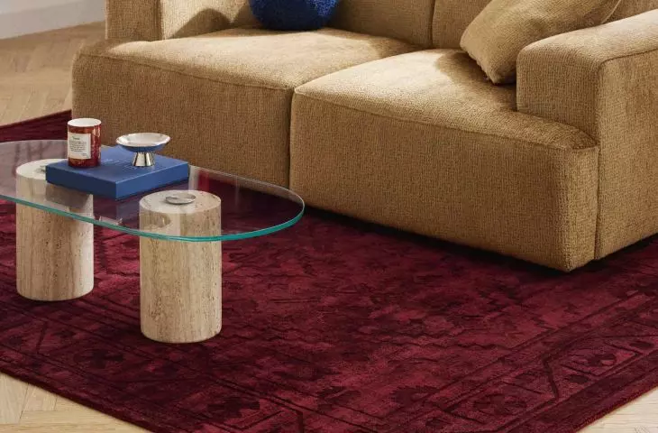
Berry Tones - deep, saturated shades inspired by the berry fruit palette
© Westwing
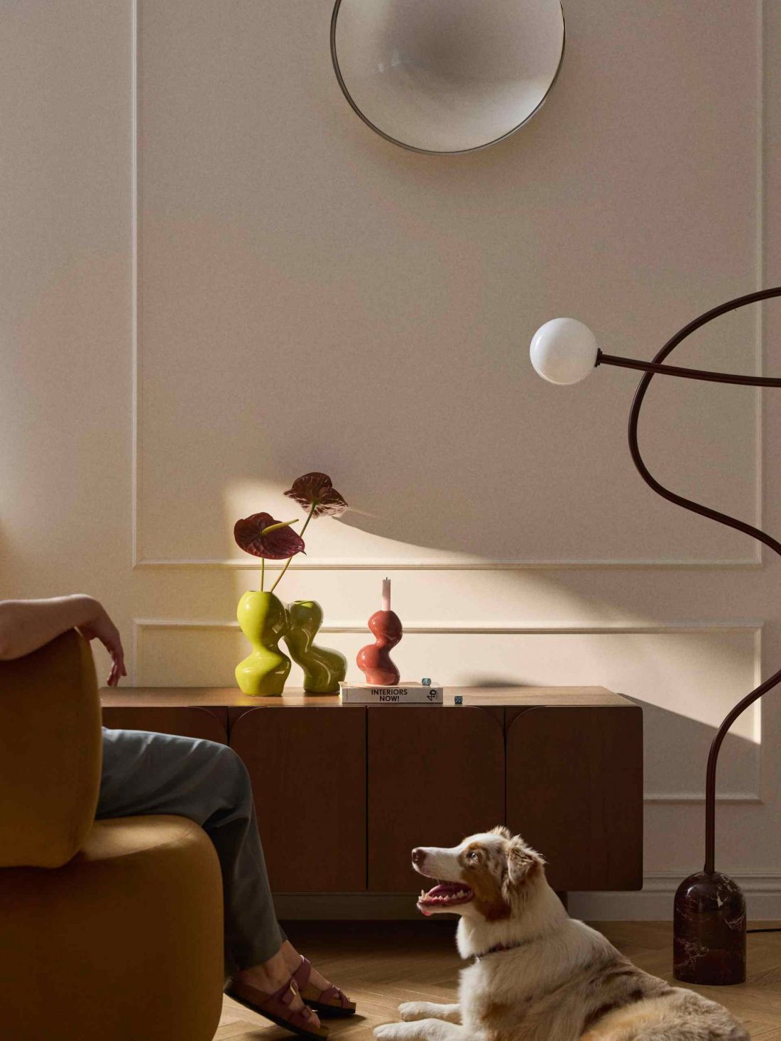
Interior designers are increasingly turning to these colors, treating them as a conscious aesthetic manifesto. Berry Tones are not trying to soothe anyone or neutralize a space. Their task is to give the interior a distinct character and emotional depth. This is the palette of choice for people who expect more than just functionality from an interior.
Berry Tones is one of the most prominent trends for 2026
© Westwing
Color as a counterpoint to contemporary minimalism
The context in which Berry Tones are gaining popularity is no small matter. The Pantone Institute declared the color of the year for 2026 the shade Cloud Dancer - a bright, almost ethereal shade, symbolizing peace and the need for tranquility. Juxtaposed with this proposal, berry hues seem downright provocative. Instead of lightness they offer visual weight, instead of neutrality - intensity and temperature of color. However, this is not a contradiction, but evidence of an increasing polarization of aesthetic needs. Contemporary trends do not impose one dominant narrative, but open up space for different ways of defining comfort. Berry Tones respond to the need for interiors that are more personal, saturated and expressive.
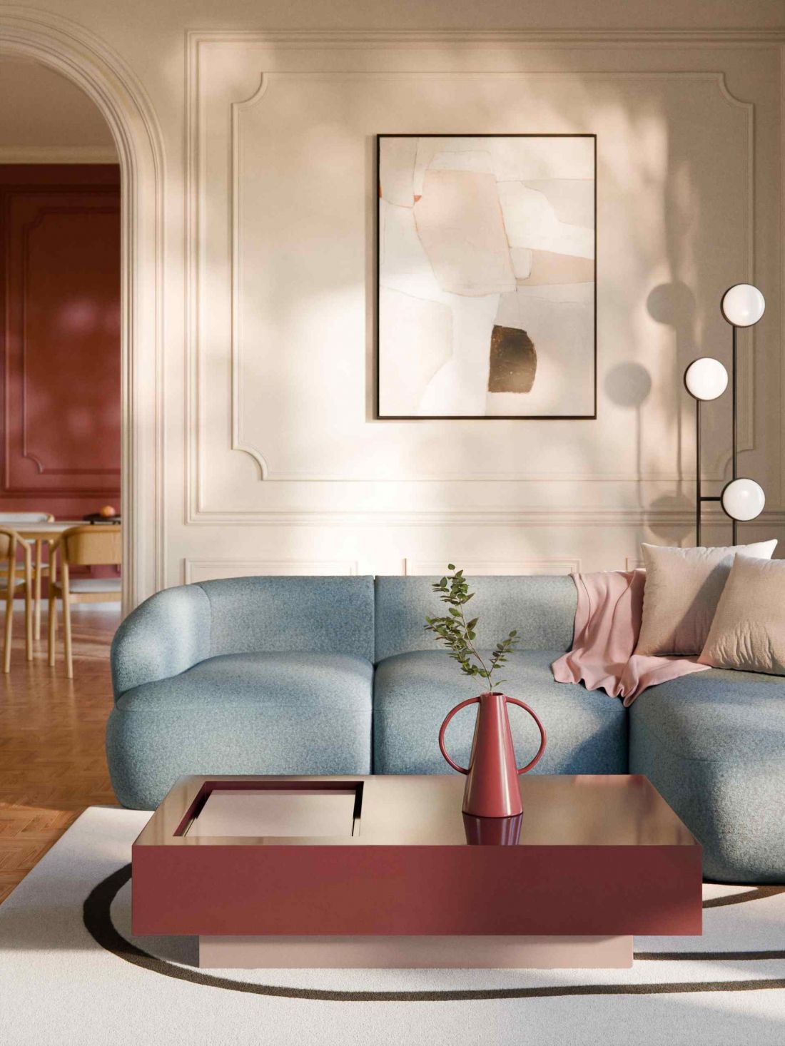
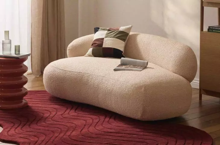
For those who feel tired of neutral arrangements, Berry Tones are a cohesive, thoughtful proposition grounded in current trends
© Westwing
Where do Berry Tones find their best place?
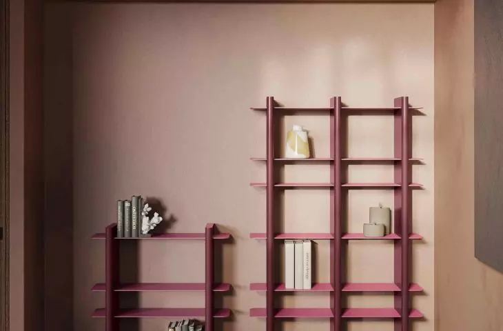
Berry tones offer a wide range of design possibilities. In large spaces, they can appear on accent walls, especially in living rooms, studies or dining rooms. A single surface maintained in deep purple or burgundy can give the interior a clear structure and visually organize the space, without the need for physical divisions.
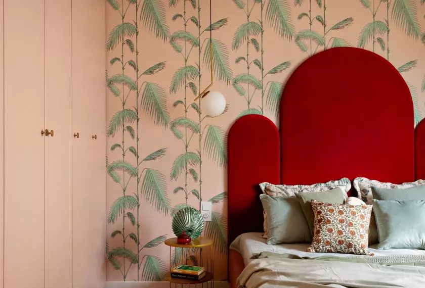
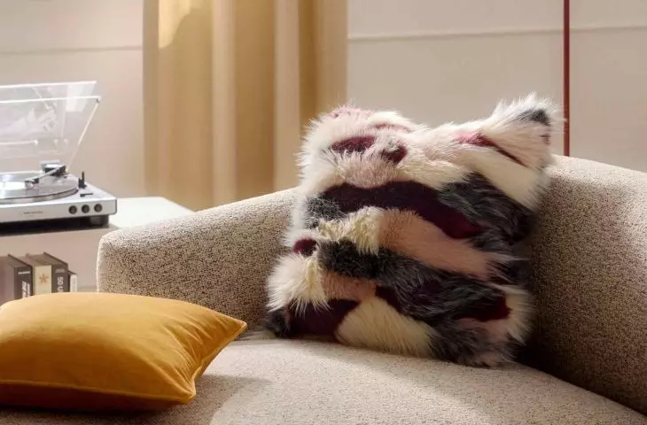
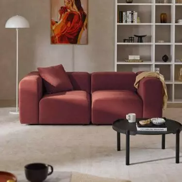
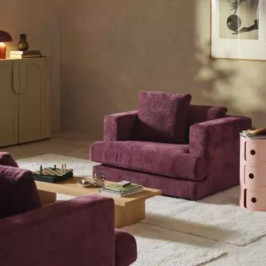
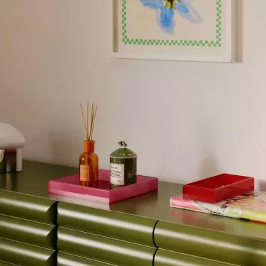
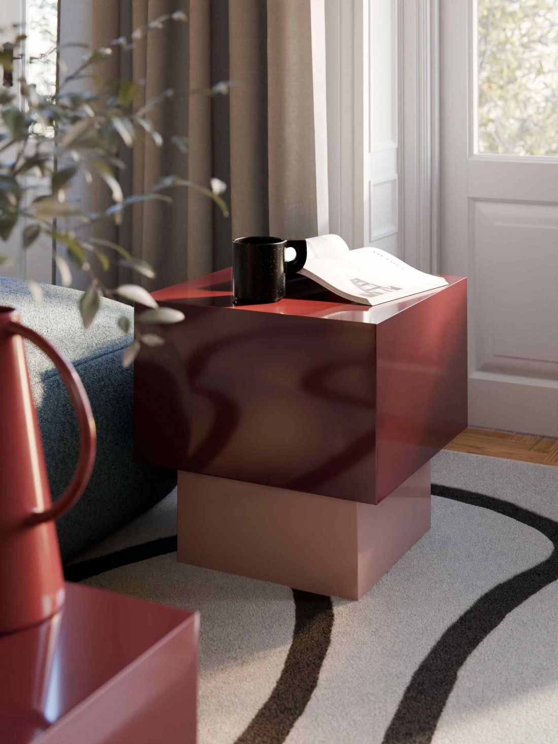
Upholstered furniture plays an equally important role. Sofas, armchairs or chaise longues in shades of plum or ripe wine become the focal point of the arrangement, around which the entire composition is built. In smaller interiors Berry Tones often appear in details: curtains, blankets, pillows, rugs or ceramics. Such a solution allows the introduction of intense color in a controlled and easy to modify way.
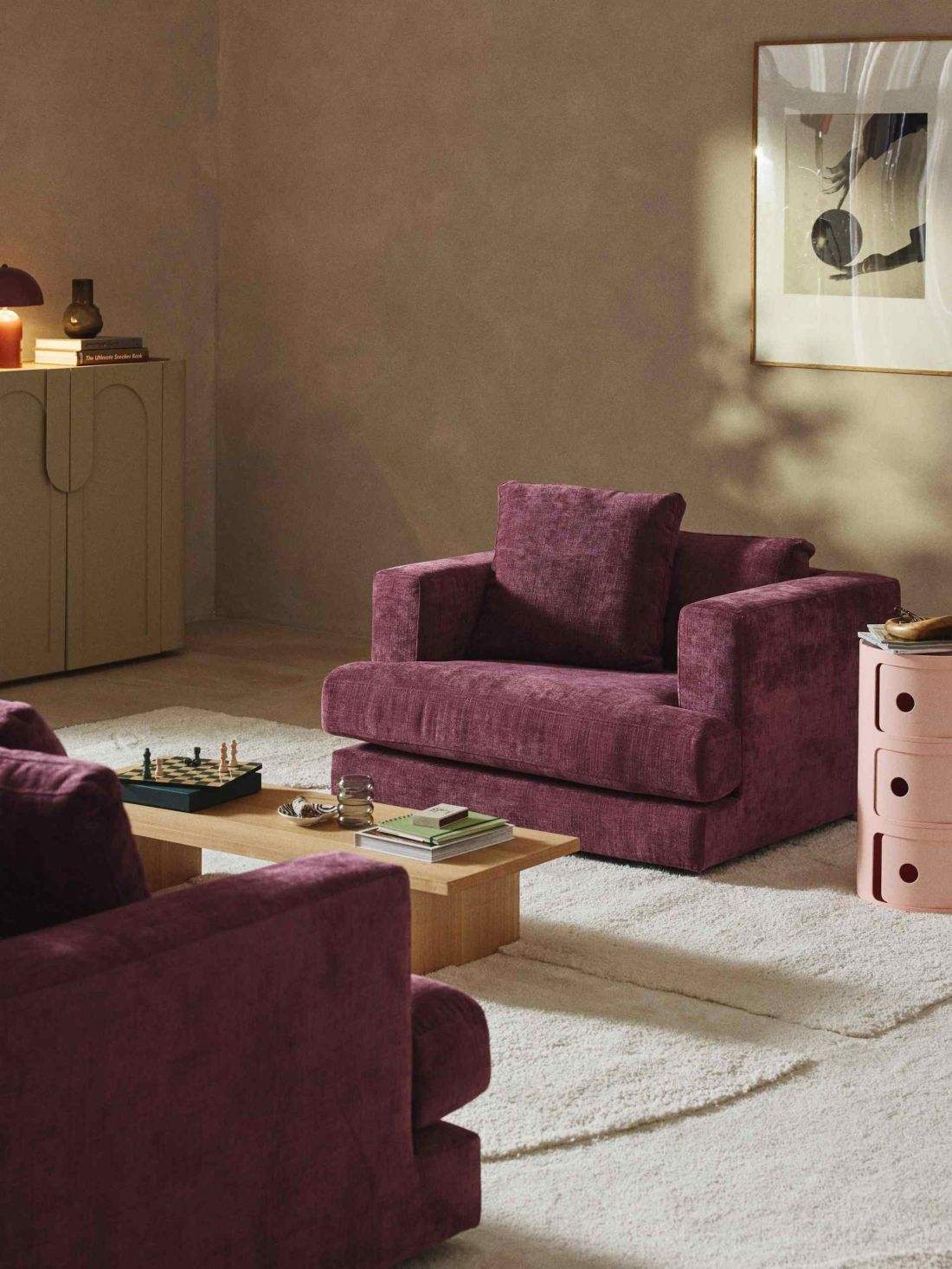
Berry Tones is one of the most prominent trends for 2026
© Westwing
Materials that bring out the depth of color
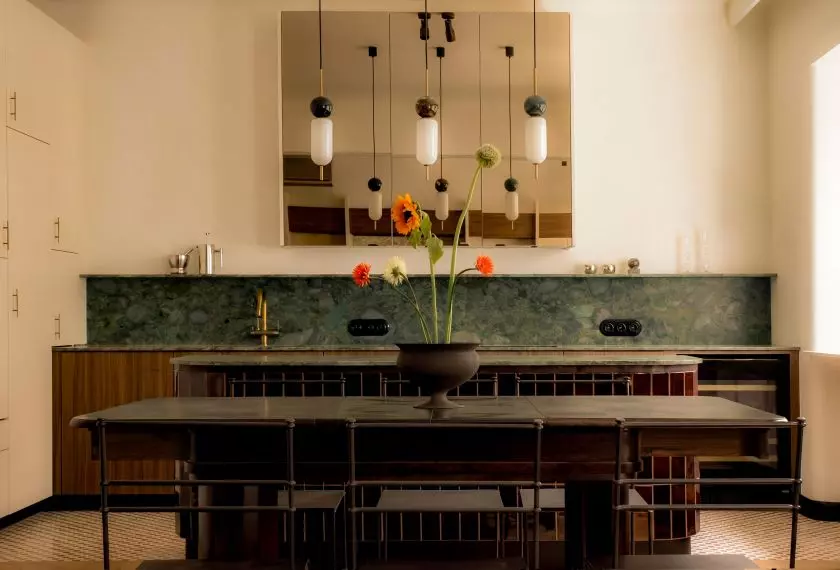
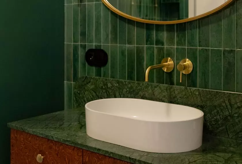
A key element in working with Berry Tones is the right choice of materials. Berry colors look best on surfaces that can "lift" their visual weight. Velour, velvet, thick wool or natural leather enhance the impression of depth and make the color multidimensional. For hard materials, natural stone, veneer and solid wood work well. Of particular importance is the relationship of Berry Tones with wood. Warm, darker colorations - walnut, oiled oak, rosewood - create a cohesive, balanced whole with Berry Tones. They can be complemented by metals with a warm character: brass, brushed gold or copper. Such combinations allow to maintain elegance and avoid the impression of randomness.
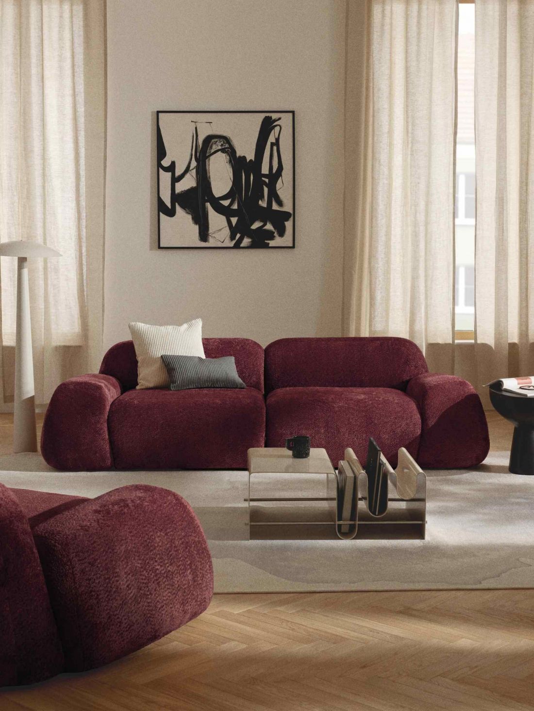
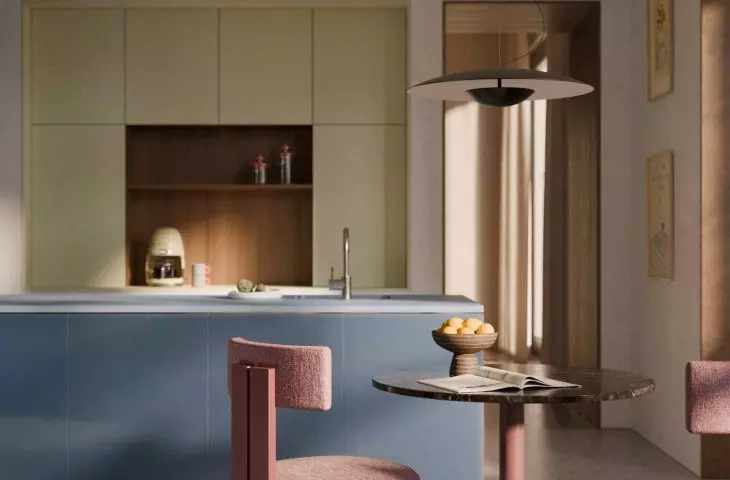
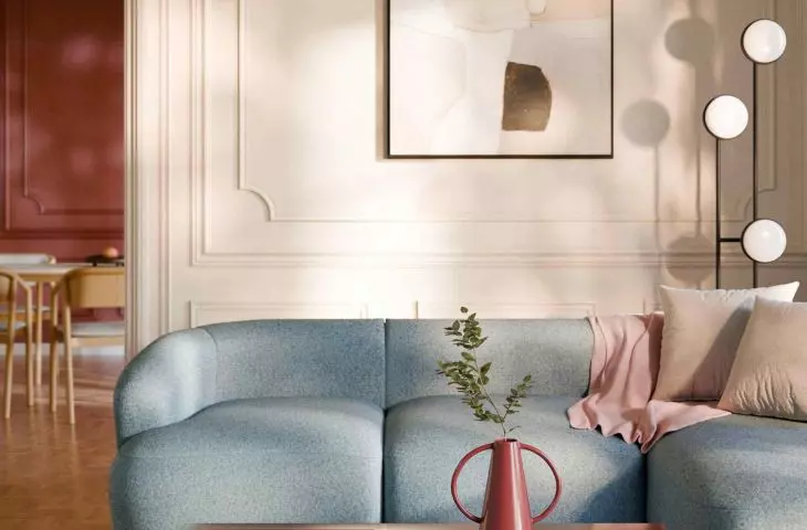
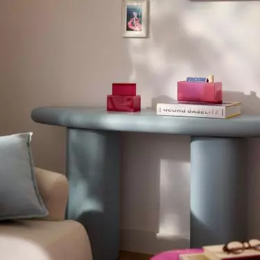
Beiges, creams, light grays and broken whites perform a stabilizing function, allowing intense colors to resound without the risk of visual overload
© Westwing
Neutral background as an element of balance
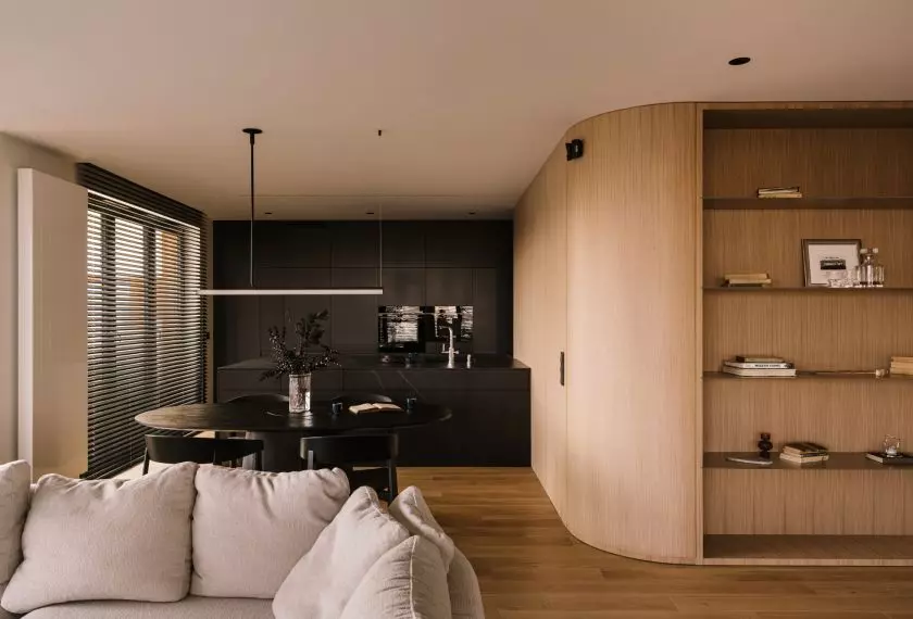
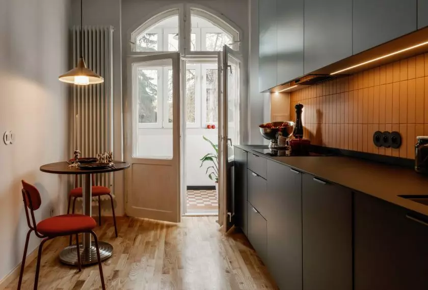
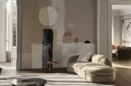
Although Berry Tones are dominant colors, their strength is only fully revealed when paired with a neutral background. Beiges, creams, light grays and broken whites serve a stabilizing function, allowing the intense colors to ring out without risking visual overload. It is the contrast, not the amount of color, that determines the quality of the arrangement. Neutral surfaces - floors, ceilings, larger sections of walls - create a calm base against which berry accents gain prominence and importance. Such an arrangement promotes the legibility of the space and gives the opportunity to make gradual changes without completely redefining the interior.
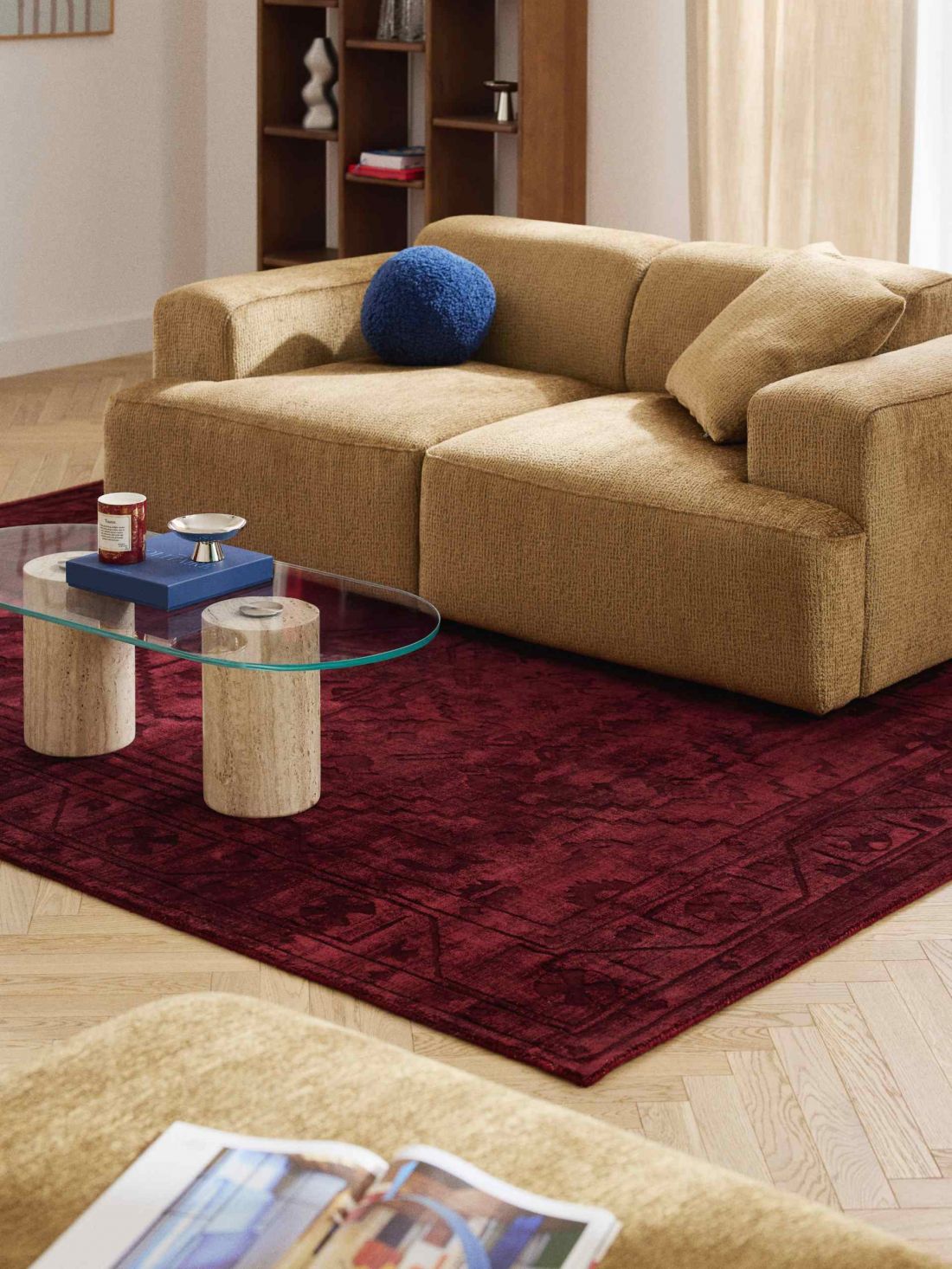
Berry Tones is one of the most prominent trends for 2026
© Westwing
Seasonal trend or new classic?
Although Berry Tones are today described as one of the key trends for 2026, they can hardly be considered a one-season phenomenon. Deep purples and burgundies regularly recur in design history, whether in interiors, fashion or fine art. Their presence testifies to the universal potential of these colors and their adaptability in changing aesthetic contexts. However, the contemporary version of Berry Tones differs from earlier interpretations. Instead of decorative splendor, there is greater formal discipline, economy of form and conscious handling of contrast. Thanks to this, Berry Tones successfully function in both classic and modern, loft or eclectic spaces.
The new role of color in interiors
For those who feel tired of neutral arrangements, Berry Tones are a consistent proposal, thoughtful and grounded in current trends. This is a trend that is not based on a short-term visual effect, but on a conscious aesthetic choice. Interiors built around berry hues do not fade into the background, but become spaces with lasting character.