

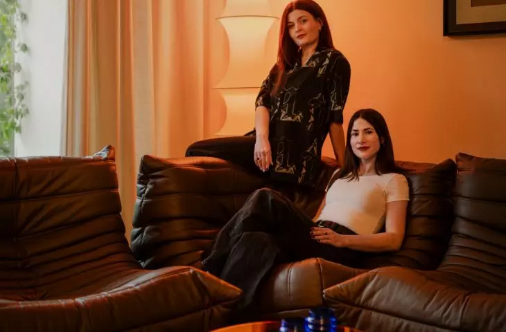
This 70-meter apartment in Warsaw’s Powiśle district doesn’t try to be a neutral backdrop. From the very first step, it sets its own rhythm: a burgundy-and-beige checkerboard pattern on the floor, dark wood, glass blocks, and soft, amber light. Daria Bolewicka and Daria Skoczylas-Woźniak from the BO/SKO studio have created a space where elegance doesn’t mean coldness, and retro inspirations appear with subtlety, without being overt.
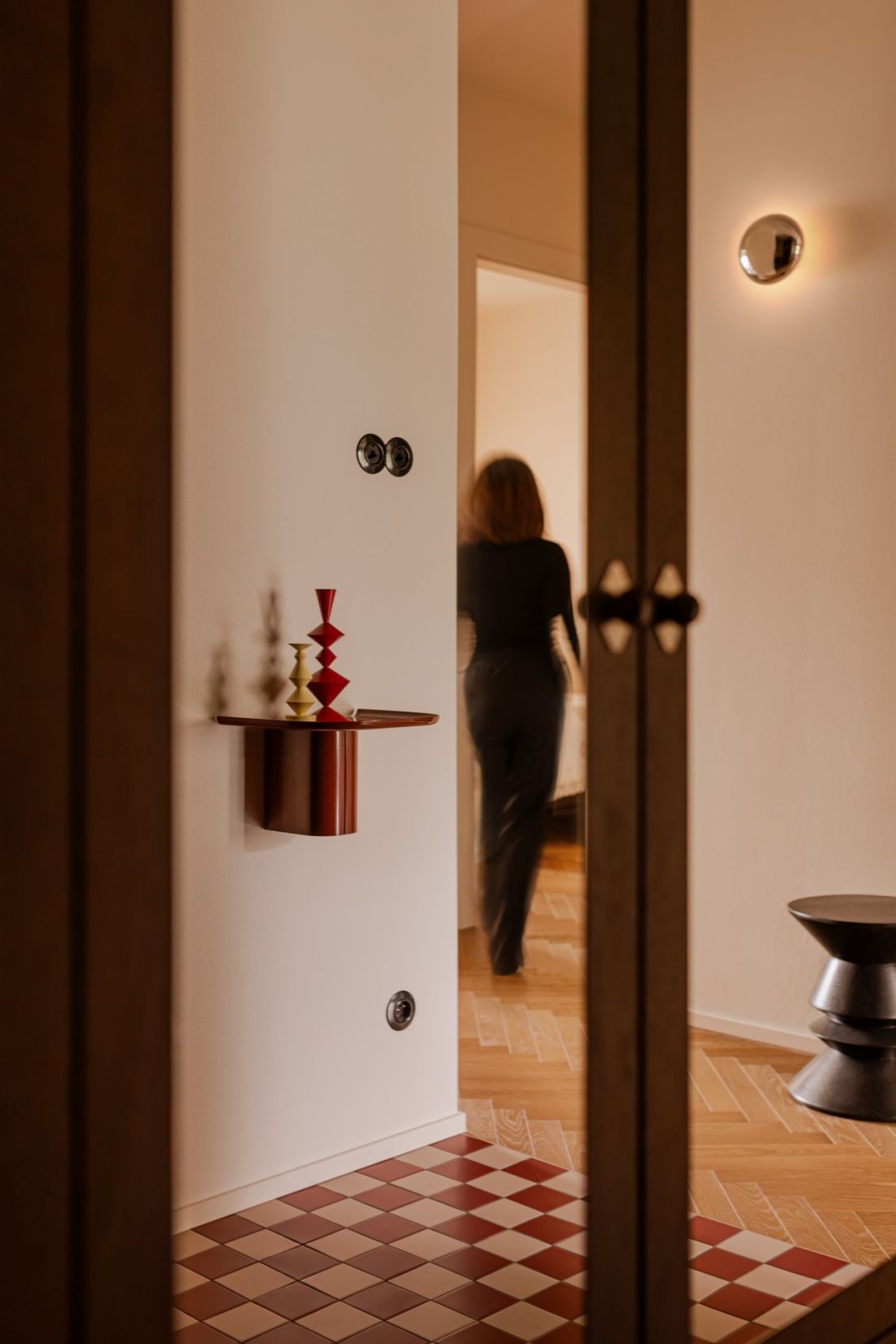
The first impression is set by the burgundy, dark wood, and subtle details visible right in the entryway — © Jakub Nanowski
The first impression is burgundy
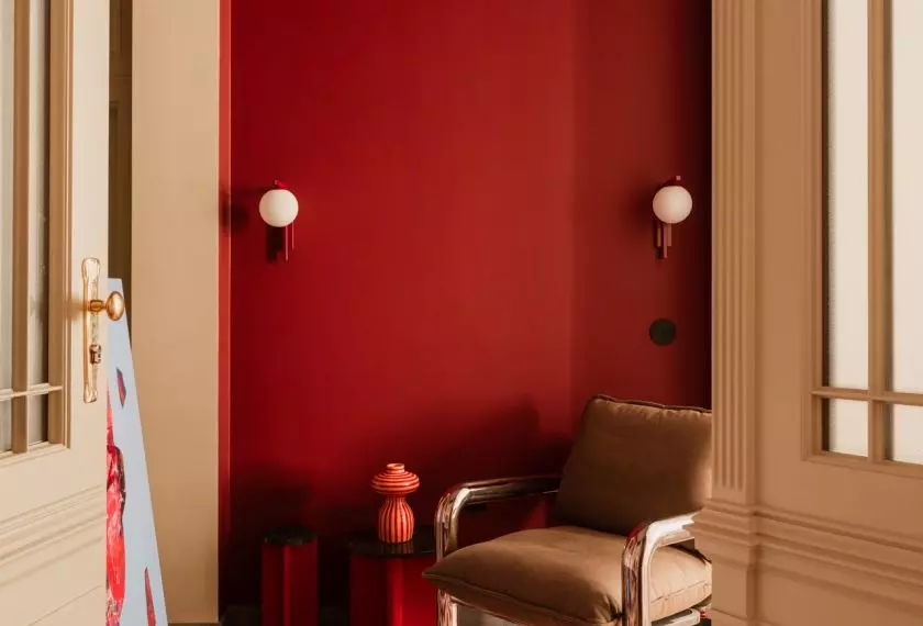
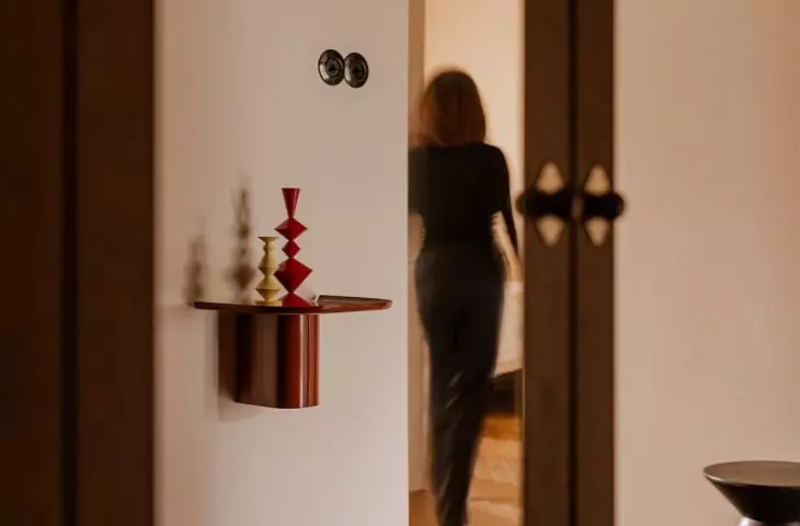
There are apartments that are simply well-decorated, and there are those that immediately reveal their personality. This apartment belongs to the latter category. As we enter the entryway, a checkerboard pattern in shades of burgundy, beige, and brown unfolds beneath our feet. A small, lacquered shelf with a few carefully selected trinkets enhances the interior’s color scheme, while the dark woodwork draws the eye further into the next rooms. Even at this point, it’s clear that the design won’t be a story of conservative minimalism. The apartment’s owner is someone connected to the world of psychology and sensitive to art. From the very beginning, she had her own vision, and the bo/sko studio treated it as an important starting point. Instead of designing a universal space “for everyone,” the architects built the apartment around color, texture, light, and objects that hold personal significance. As a result, the apartment doesn’t look like a ready-made trend from a mood board, but rather like a place that can gain even greater depth over time.
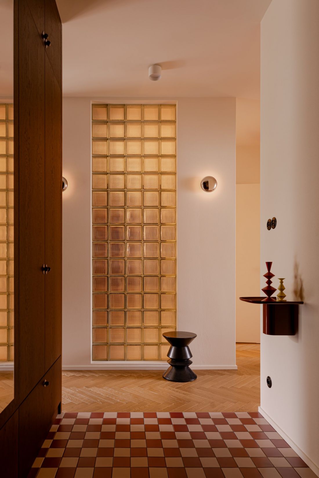
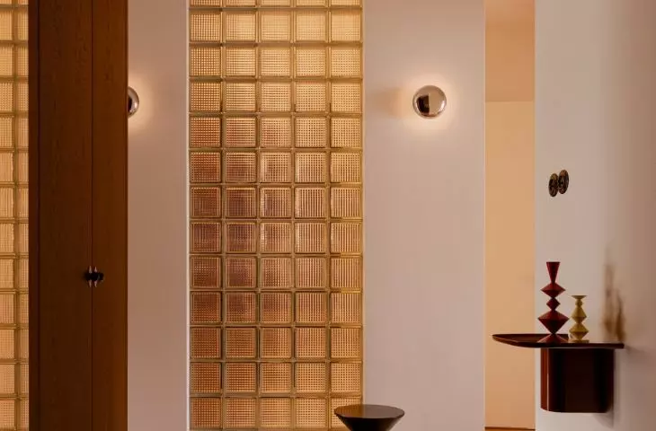
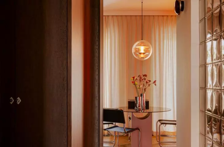
Glass blocks, a checkerboard pattern, and dark woodwork create the first, striking impression upon entering the apartment — © Jakub Nanowski
Glass blocks make a comeback at their best
One of the most distinctive elements of the design is the glass blocks. They were installed in place of a partially demolished wall that separated the bathroom. It’s a simple touch, but it significantly changes the feel of the entire apartment. Instead of a solid partition, a luminous, geometric surface has been created that organizes the space and brings a sense of lightness to it. Glass blocks are often associated with old stairwells, modernist buildings, or interiors from the ’80s and ’90s. Here, they are not a nostalgic reference. Combined with cream-colored plaster, dark wood, and warm lighting, they look elegant, almost like jewelry. Their regular arrangement gives the apartment architectural order, while the light filtering through them softens the overall look.
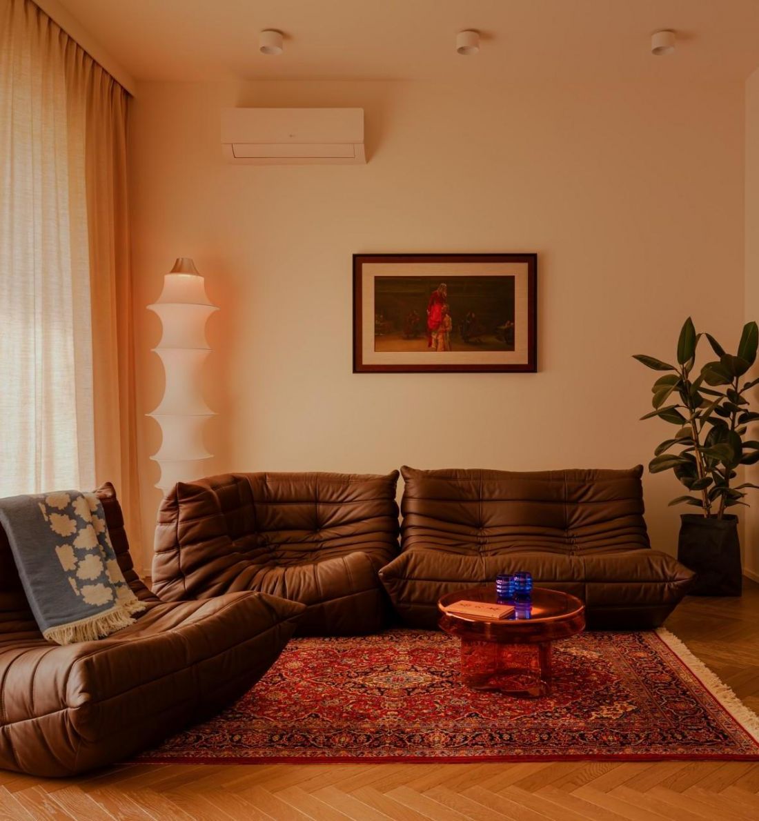
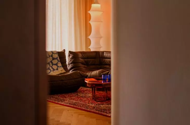
The living area with a Persian rug, chocolate-colored leather, and a transparent red coffee table — © Jakub Nanowski
burgundy, beige, and brown instead of safe white
The color palette is one of this project’s greatest strengths. There is no cool white here, nor any random accents. Instead, there are shades that create a cohesive, deep composition: burgundy, chocolate brown, cream, black, stone grays, and a touch of ultramarine. These colors are rich but not garish. They look great in daylight, and in the evening, they become even more enveloping. The walls are covered with clay plaster in a delicate, creamy shade. This material doesn’t create a perfectly smooth, flat surface. It has a subtle texture that prevents light from reflecting sharply, allowing it to diffuse softly across the walls. With a ceiling height of nearly three meters, this approach effectively balances the proportions and allows bolder details to stand out without creating a sense of chaos.
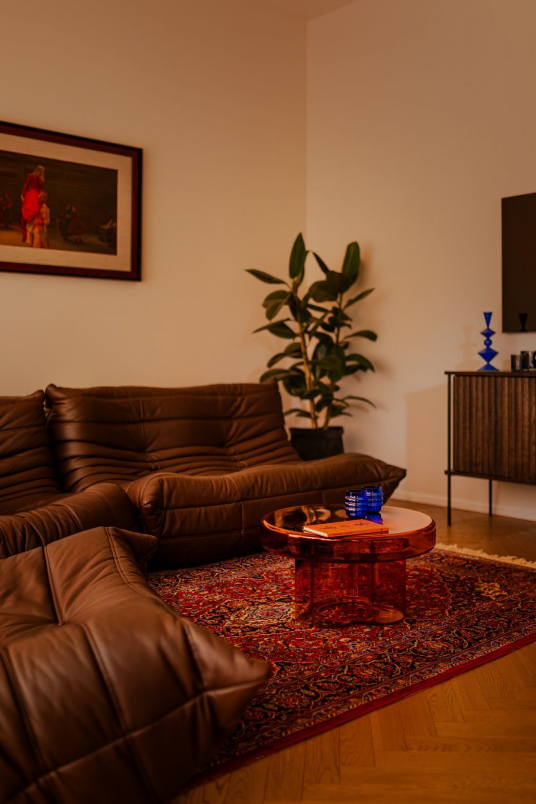
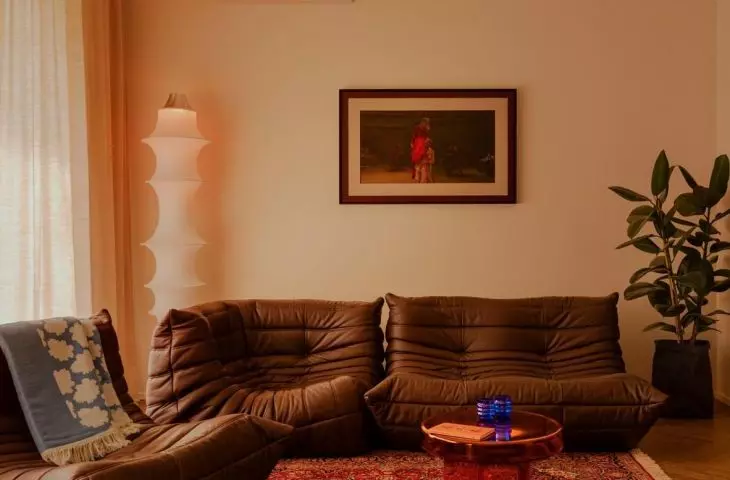
The living area was designed as a cozy, elegant space with bold colors and striking details — © Jakub Nanowski
a living room like a private club, not a cookie-cutter living area
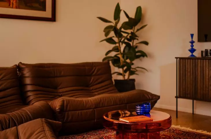
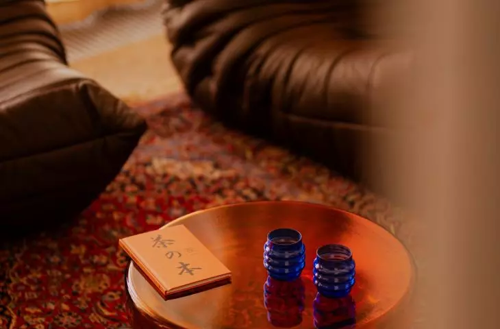
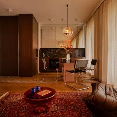
The living area is open to the kitchen, but it’s far from a typical living room with a kitchenette. The first thing that catches the eye is the Persian rug—vibrant, decorative, and definitely not chosen at random. On top of it stands a translucent red coffee table that, in the light, resembles an object made of colored glass. Next to it are chocolate-brown leather furniture by Ligne Roset, soft curtains, and dark wood. This is not a living room designed solely for show. Rather, it’s a place for an evening with a book, a conversation at the table, or a leisurely cup of coffee. It has the feel of a private club, but without the stuffiness. Reflections, textiles, and light filtered through the curtains all contribute to this atmosphere. The interior is elegant yet very homey.
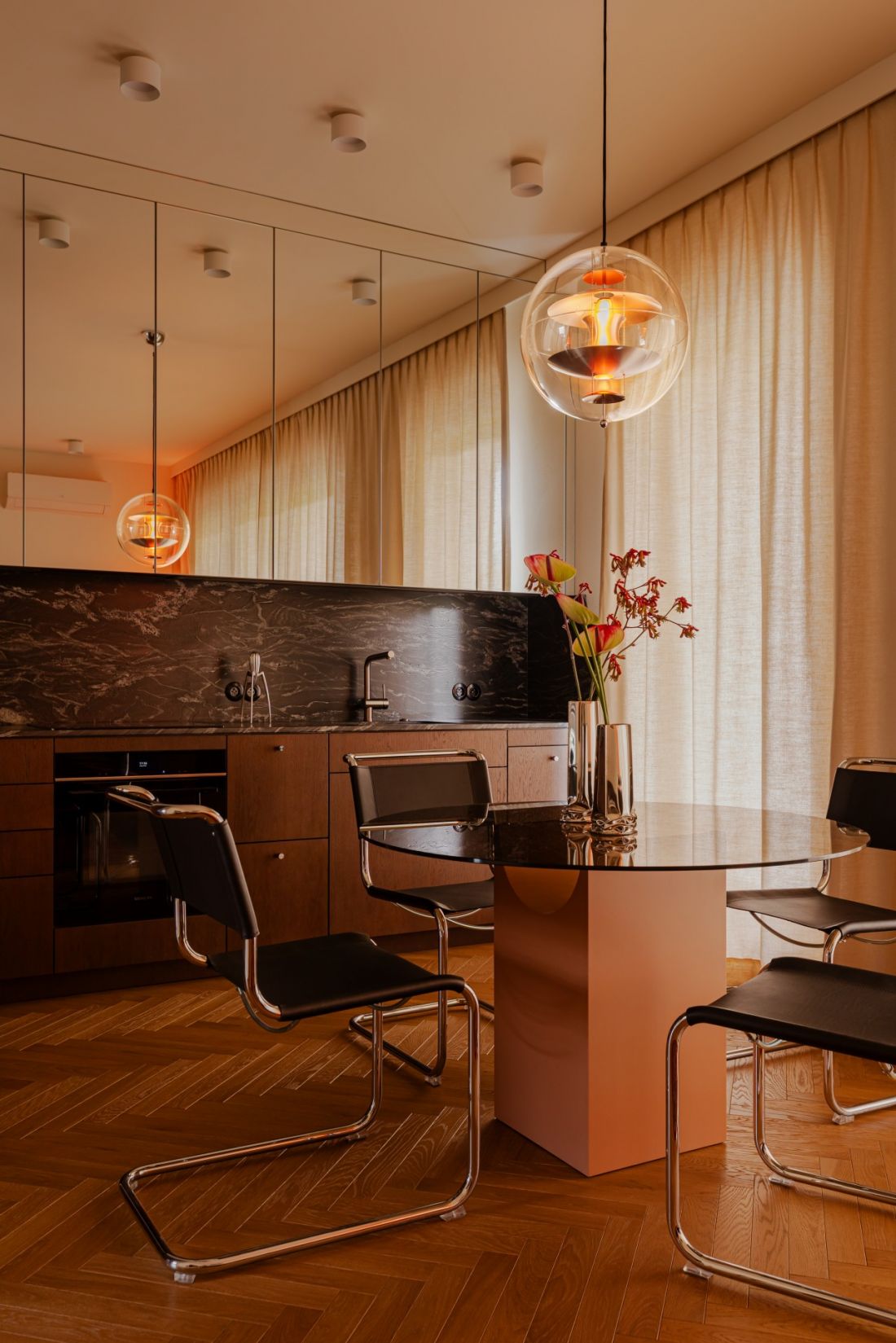
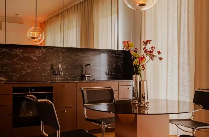
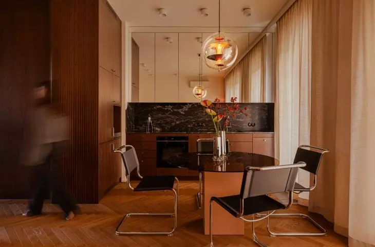
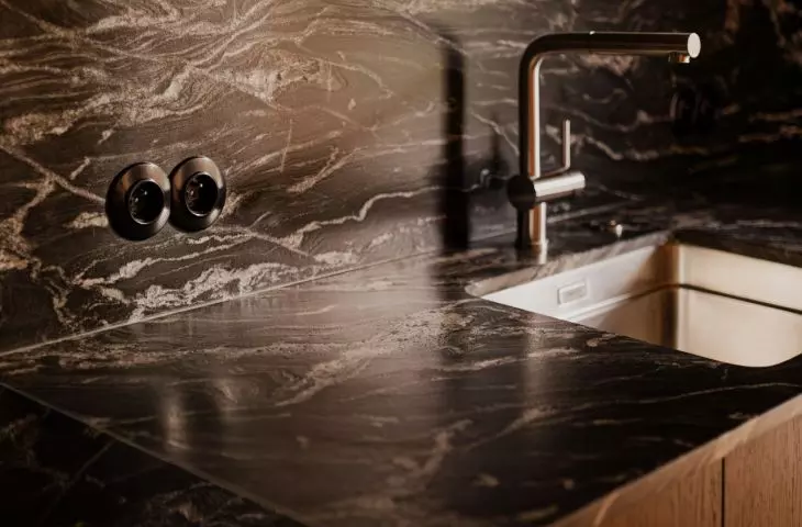
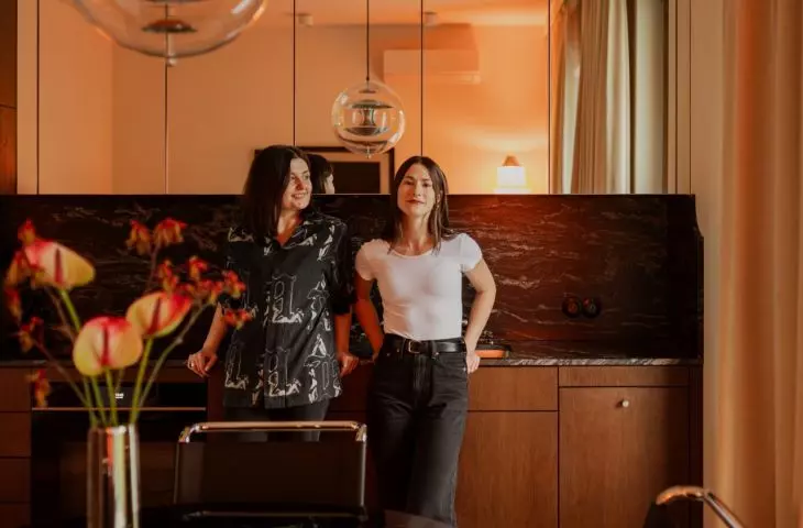
The kitchen and dining room are based on the contrast between dark stone, wood, chrome, and soft curtains — © Jakub Nanowski
a kitchen that plays with stone and reflections
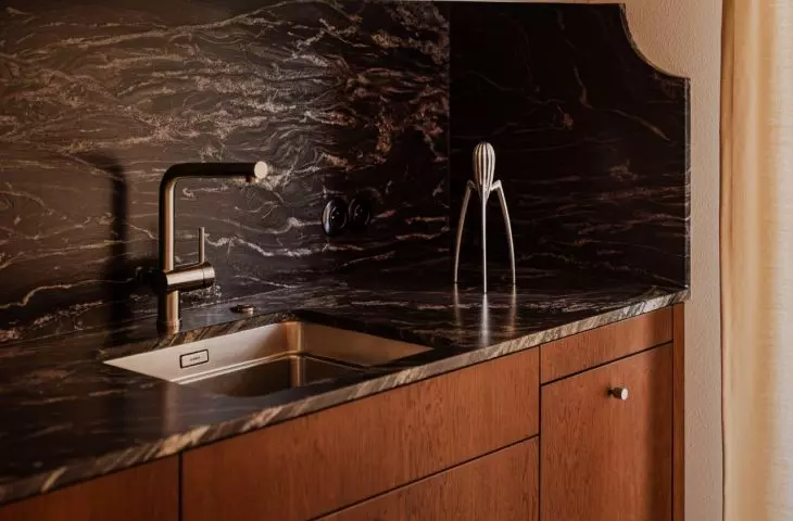
The kitchen island has a bolder, more graphic look. Wooden cabinetry meets dark, natural stone with a distinctive pattern here. The same material appears on the countertop and the wall above it, giving the kitchen an almost sculptural character. Black and chrome details add precision without detracting from the warmth. The mirrored surface above the countertop is a brilliant touch. It reflects the curtains, the lamp, the table, and the light, giving the kitchen depth and making it seem lighter despite the use of dark stone. Stone, wood, and the mirror create a composition that defines the atmosphere of the living area: elegant, warm, and slightly retro, yet presented in a contemporary way.
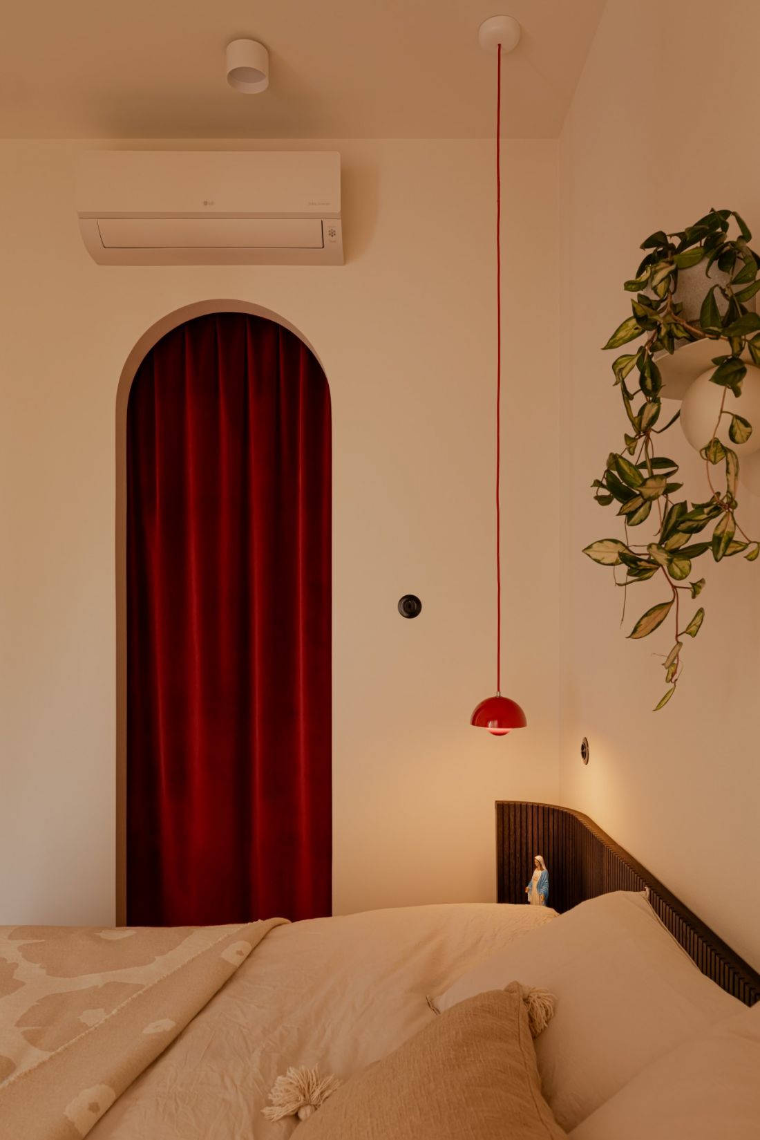
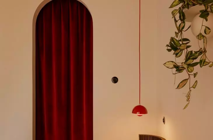
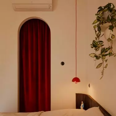
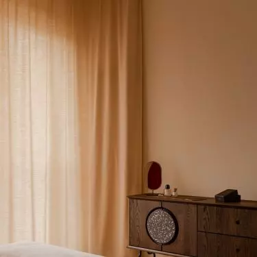
The burgundy curtain and the rounded arch give the bedroom a soft, intimate character — © Jakub Nanowski
details that guide you through the interior
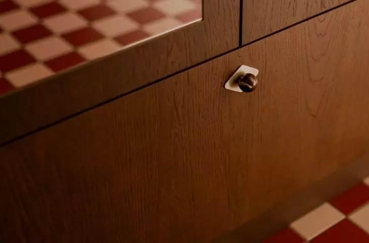
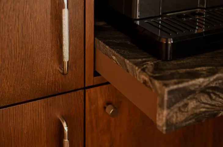
In this design, a lot happens in the details. There are rounded doorways, delicate, jewelry-like handles, black light switches, chrome elements, spherical lamps, and items belonging to the owner. Each of these elements might get lost in a more haphazard arrangement. Here, they form a common language. It’s also clear that the designers weren’t afraid to juxtapose elements of varying weight. A massive stone sits next to a light curtain. A checkerboard pattern meets a classic herringbone. A Persian rug lies next to a modern side table. Leather furniture, glass, and wood do not compete with one another but rather add further layers to the space.
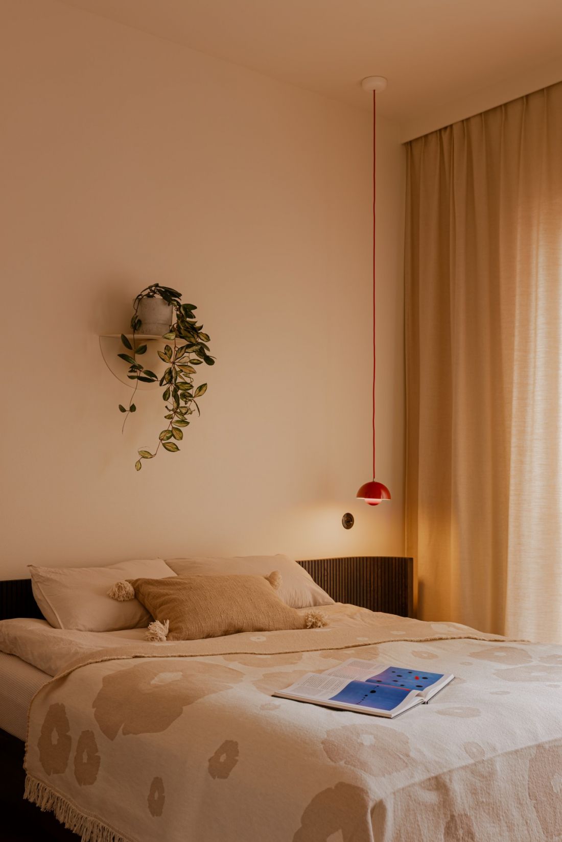
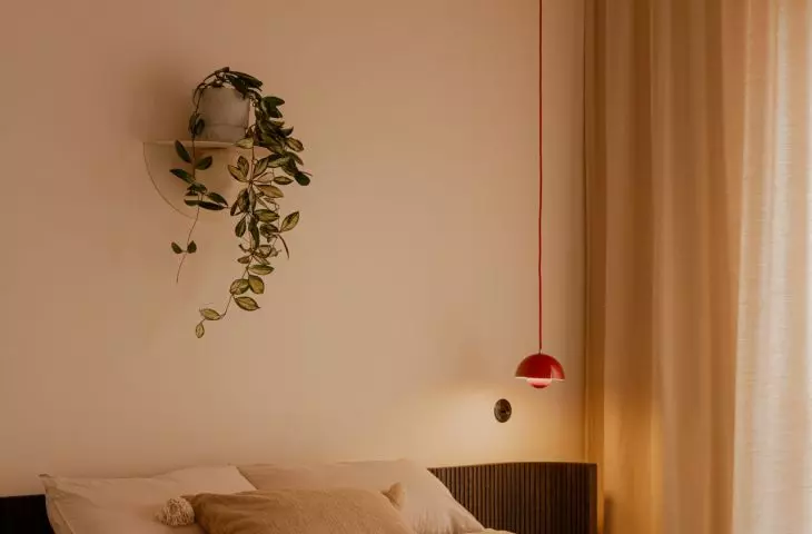
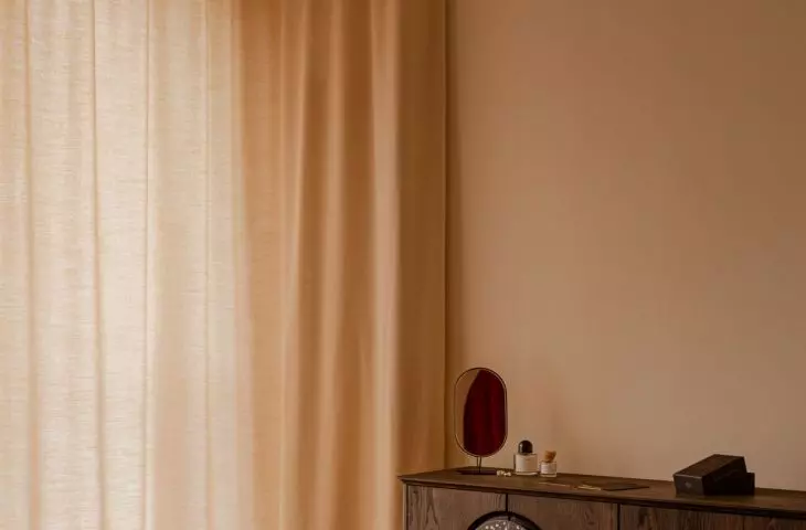
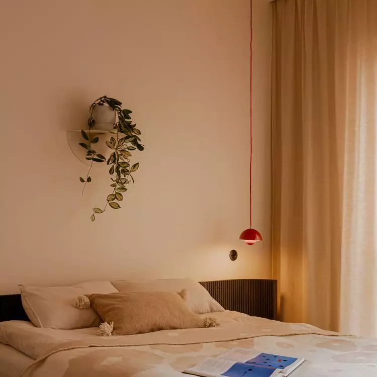
The bedroom features a light, calm color palette — © Jakub Nanowski
a bedroom without unnecessary ornamentation
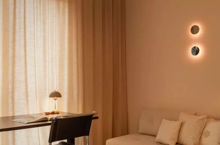
In addition to the living room and kitchen, the apartment features a bedroom with a walk-in closet and a study. The bedroom is calmer and more serene, yet it doesn’t stand apart from the rest of the design. The soft shape of the bed, the rounded transition to the walk-in closet, and the burgundy curtain create an atmosphere of intimacy without excessive decoration. This is not a bedroom designed solely “for the camera,” but a place meant to be calming. The home office was designed as a brighter workspace, with a desk by the window and space for books and the owner’s personal items. This is an important part of the entire apartment because it shows that the design doesn’t end with striking photo opportunities. There’s also room here for daily rituals, concentration, and things that don’t have to be perfectly styled to be valuable.
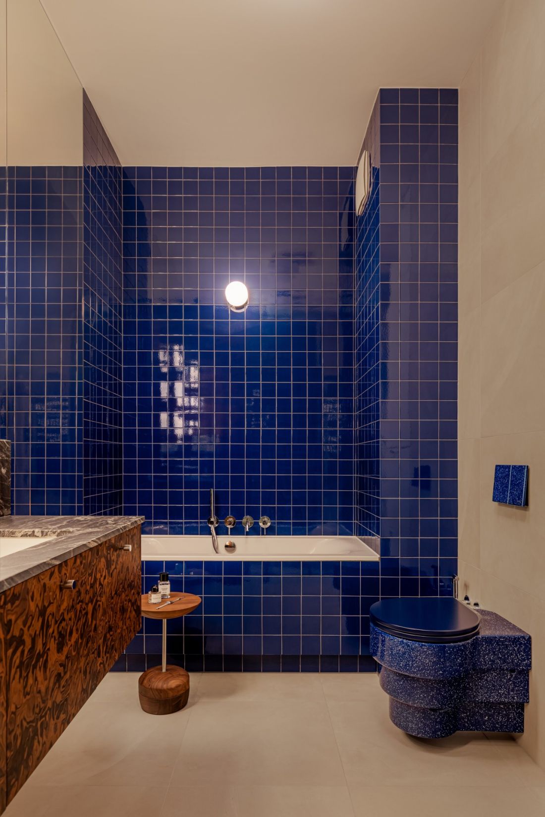
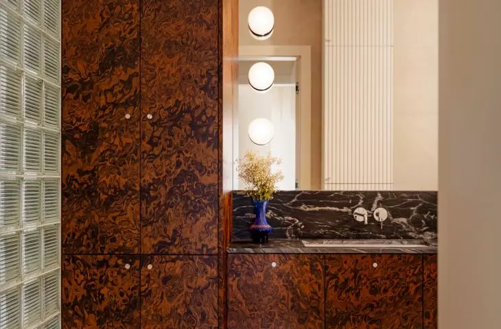
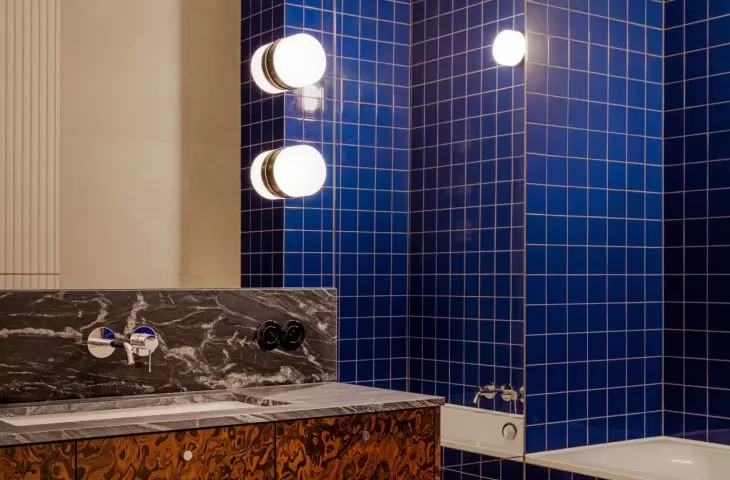
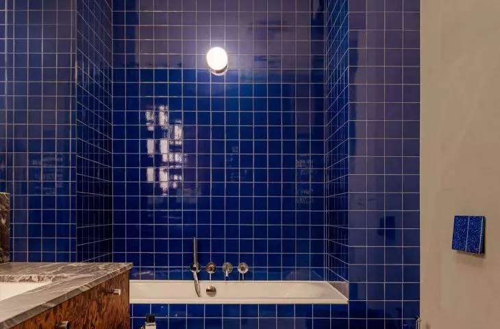
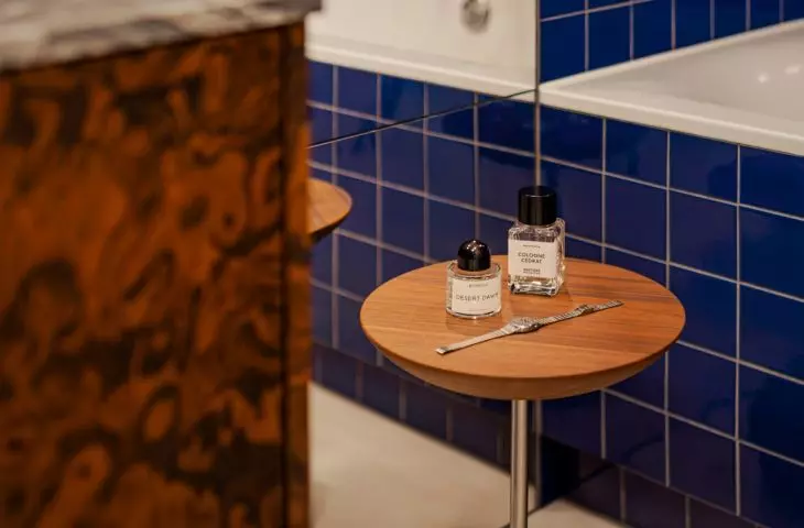
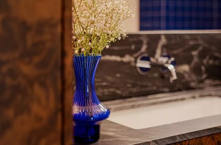
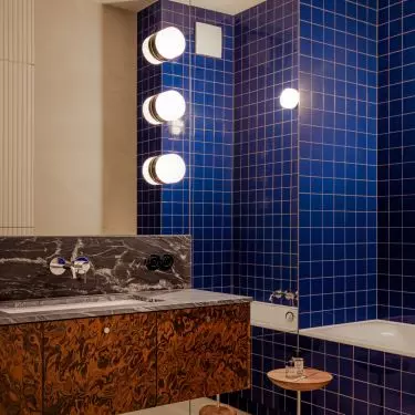
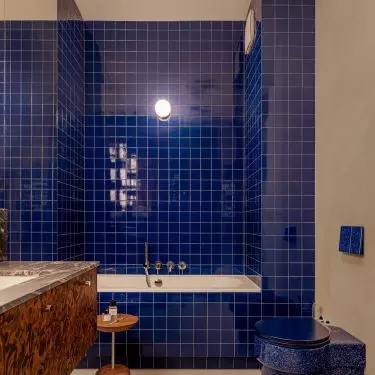
The intense blue in the larger bathroom creates a strong counterpoint to the warm browns found throughout the apartment — © Jakub Nanowski
Two bathrooms, two different scenarios
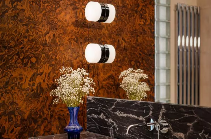
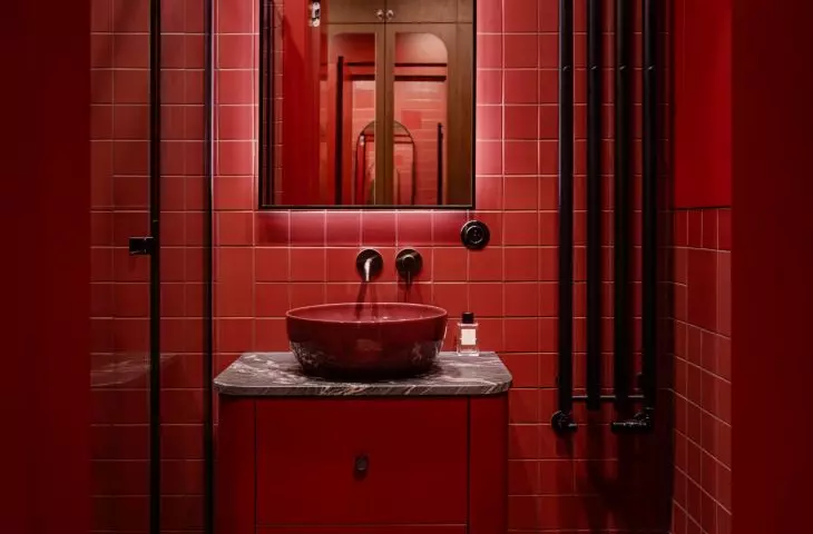
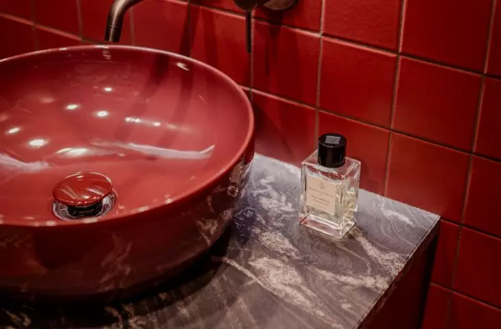
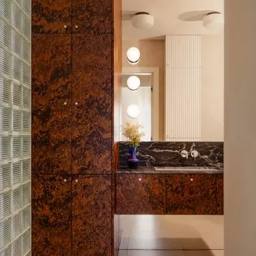
The apartment has two bathrooms, and each showcases a different aspect of this design. The smaller one, located closer to the entrance, is finished in a deep burgundy tone. It has a more theatrical, intimate character. The second, larger one functions as a bathing room. There, warm browns are paired with a bolder ultramarine hue, a mirror, stone, and glass blocks. This is a good example of bold design in small spaces. A bathroom doesn’t have to stick to a light, neutral palette to feel comfortable. Sometimes it’s precisely the darker colors, gloss, texture, and well-directed lighting that make a room more sensual and memorable.
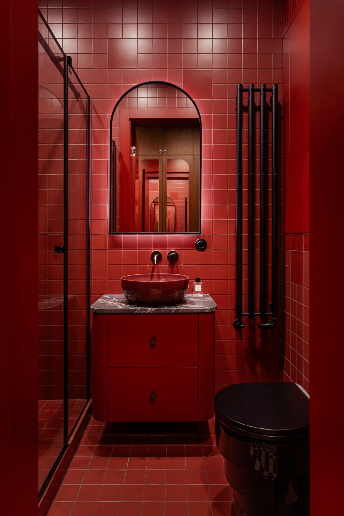
This small bathroom was designed with boldness: burgundy, black, and glossy finishes create an intimate, striking interior — © Jakub Nanowski
an apartment with its own story
The greatest strength of this apartment lies in the fact that it is not anonymous. The design incorporates items belonging to the owner: a Persian rug, books, sentimental objects, and a painting featuring a still from the film *Chłopi*. These elements weren’t treated as mere accessories added after the renovation was complete. They truly help shape the apartment’s character. Studio bo/sko designed a space that blends order with emotion. There’s geometry, but no rigidity. There’s elegance, but no aloofness. There are retro inspirations, but without copying the past. This is an apartment where burgundy, glass, wood, and stone create more than just a pretty composition. They create an atmosphere you’ll want to return to.