

The ground floor of a townhouse in downtown Katowice might bring to mind the hustle and bustle of city life, but this apartment reveals a completely different side of the city. The architects at Pracownia Brokat designed a space where, instead of the hustle and bustle outside the window, there is a garden, greenery, and silence. The interiors, designed for a family of four, combine a light, calm base with the warmth of wood, vintage furniture, and brick-red accents. The most distinctive element, however , remains the exposed wooden ceiling structure, which gives the entire interior a slightly rustic—and at times even Mediterranean—character.
The renovation of the tenement building presented an opportunity for major changes
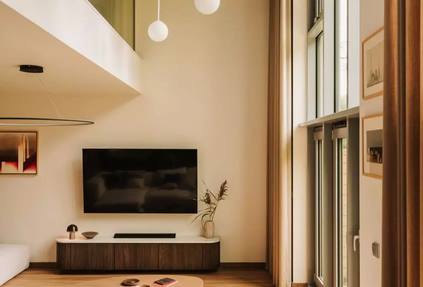
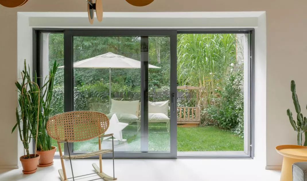
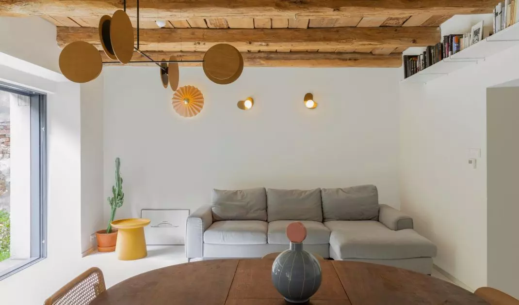
The owners found themselves at a unique moment — they bought the apartment at a time when the entire tenement building was undergoing a major renovation. Thanks to this, they were able not only to remodel the interior but also to influence selected elements of the building. One of the most important decisions wasto enlarge the window opening in the living room and replace it with a large glass panel overlooking the garden. This solution makes particularly good use of the southern exposure of the living area. The large window brings more light into the interior while blurring the boundary between the living room and the greenery beyond it. In this ground-floor apartment, the garden thus becomes almost another room. The second change, which largely determined the character of the interior, was exposing the wooden ceiling structure. The raw beams and wooden planks were left exposed, becoming one of the most important elements of the design.
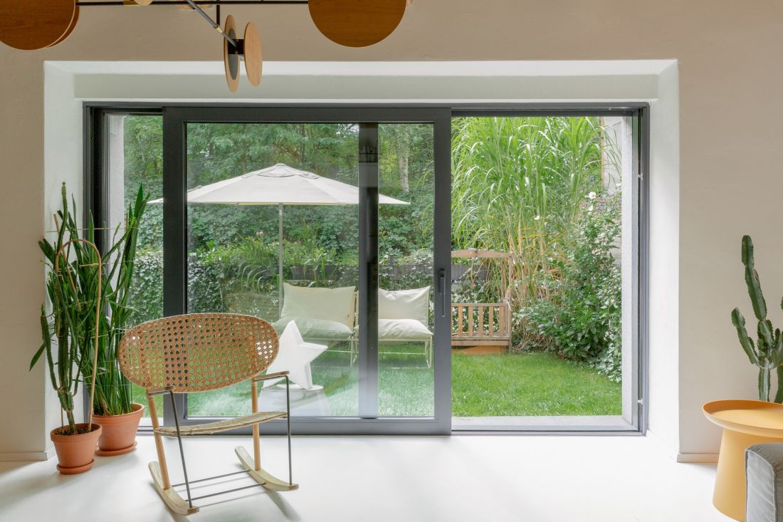
Large windows flood the interior with light and make the garden feel like an extension of the apartment.
Photo: Marta Różycka
The ceiling sets the tone for the entire interior
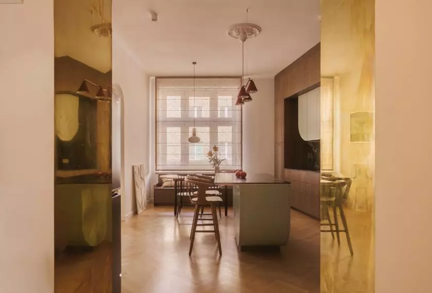
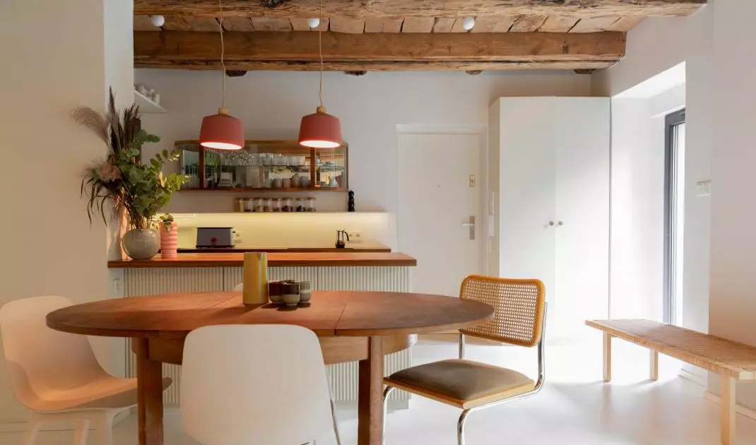
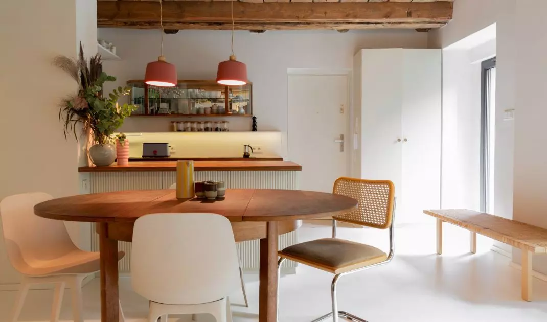
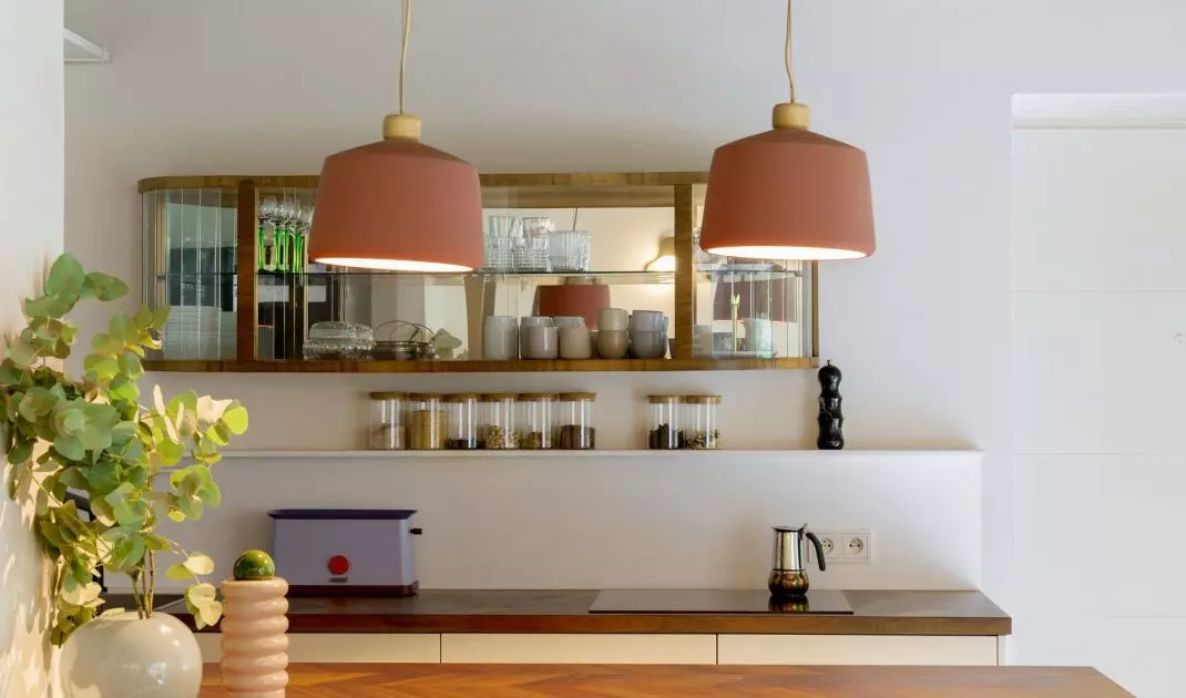
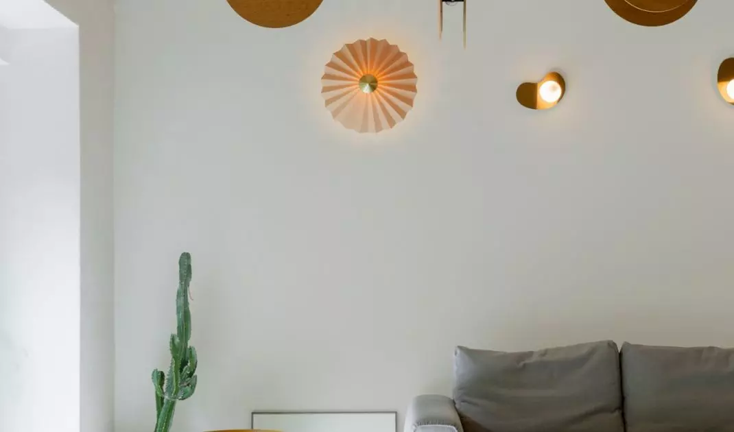
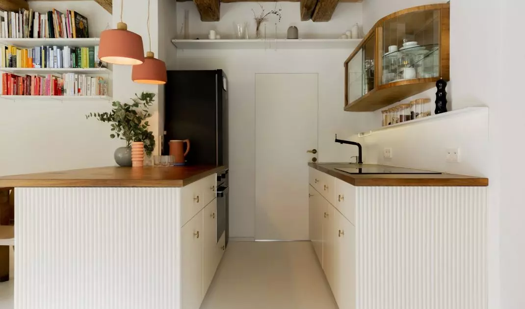
It is precisely the wooden ceiling that ensures the apartment does not resemble a typical, minimalist design dominated by white. Its irregularity, natural color palette, and visible texture bring something to the interior that cannot be achieved with modern materials — authenticity and history. Paired with light-colored walls, a white floor, and simple built-in furniture, the wood becomes even more striking. At the same time, it doesn’t overwhelm the space. On the contrary—it warms it up and prevents the white from feeling cold. One could say that the typical arrangement— a wooden floor and a white ceiling —has been reversed and swapped. In the living area, this effect is enhanced by two brick-red pendant lamps hanging over the kitchen island. Their simple, ceramic form harmonizes well with both the wood and the light-colored background. Together with the exposed beams, the wooden table, and the brass accents, they create a palette more reminiscent of southern Europe than a typical city apartment. However, this is not a literal Mediterranean-style interior. This atmosphere emerges subtly — through light, natural materials, white, warm wood, and the color of brick.
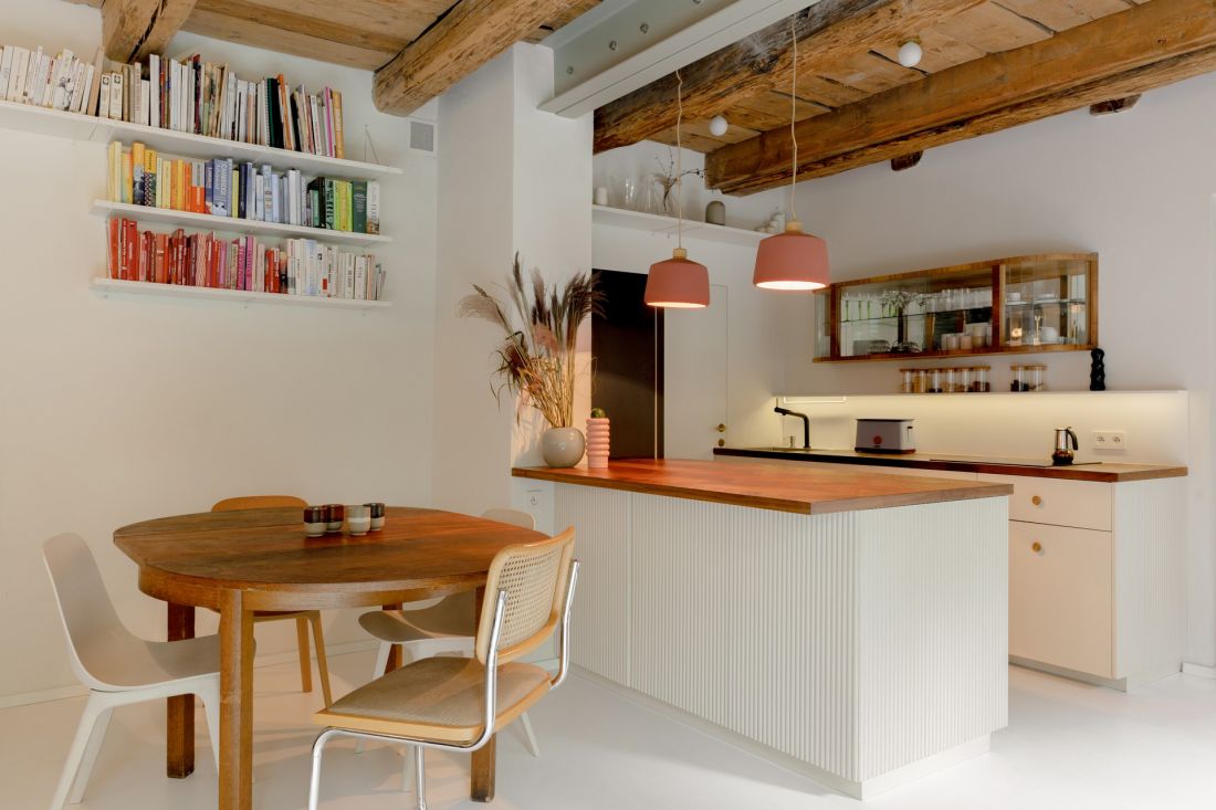
The foundation consists of expansive white surfaces, interspersed with wooden design elements.
Photo: Marta Różycka
Functional layout: daytime on the south side, nighttime on the north side
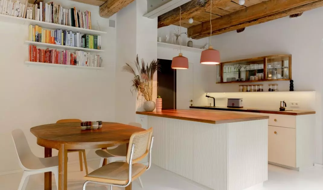
The layout was redesigned to meet the needs of a family of four. Due to the arrangement of the windows, the apartment was divided into two distinct zones. The southern side houses the living area — a kitchen connected to the living room. The northern part, on the other hand, was designated as the private zone: a bedroom with a walk-in closet and a children’s room. The bathroom, which does not require natural light, was placed centrally. A walk-in closet was created next to the bedroom, and within it, space was also set aside for a laundry area. The living room gained the most space. Opening it up to the kitchen allowed for the creation of one large communal living area — with an island, a dining area, and a seating area.
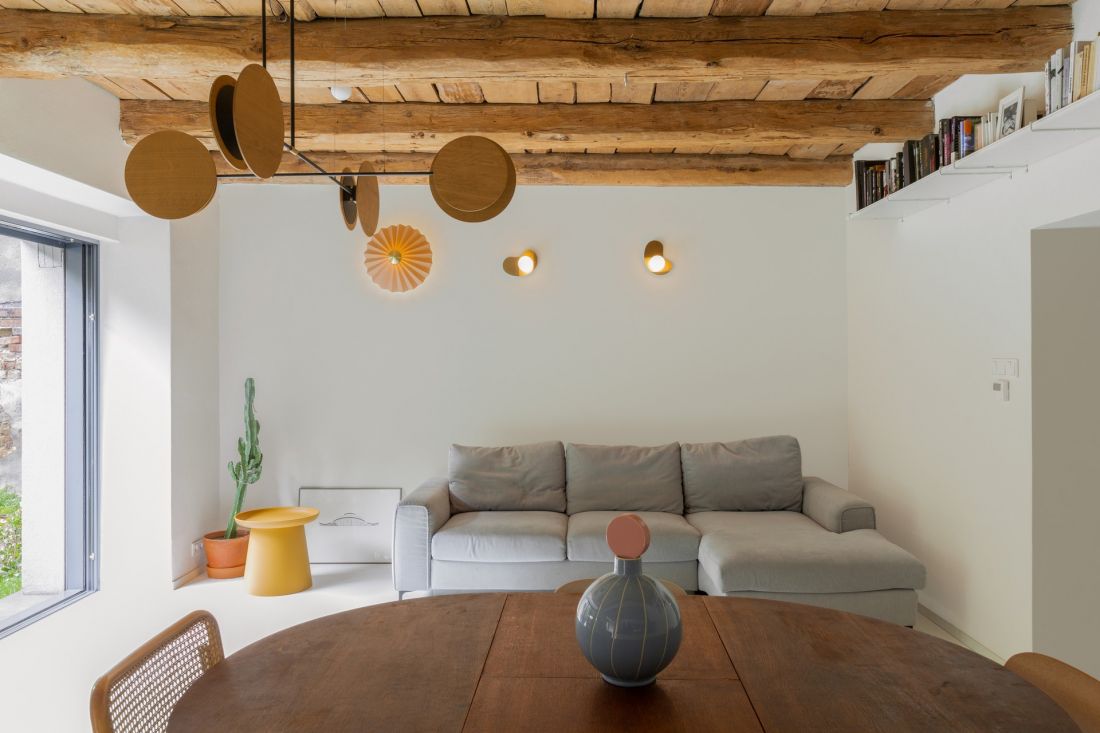
Thanks to changes in the functional layout, the living area has been expanded.
Photo: Marta Różycka
White as a backdrop for wood and vintage elements
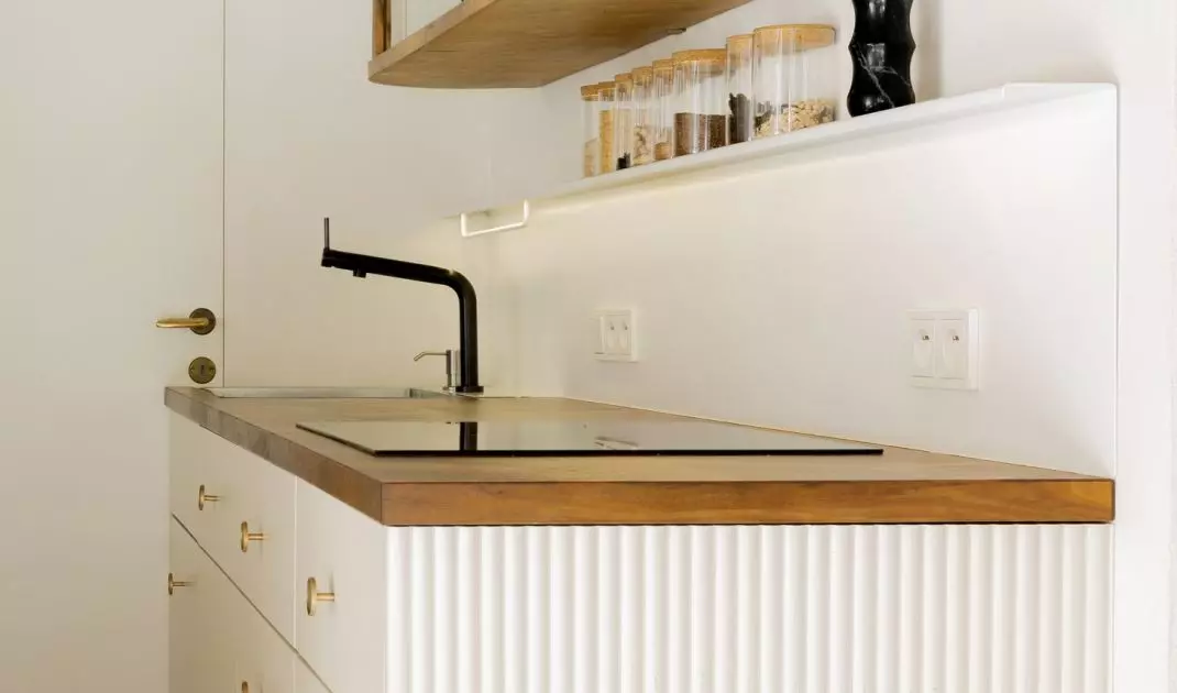
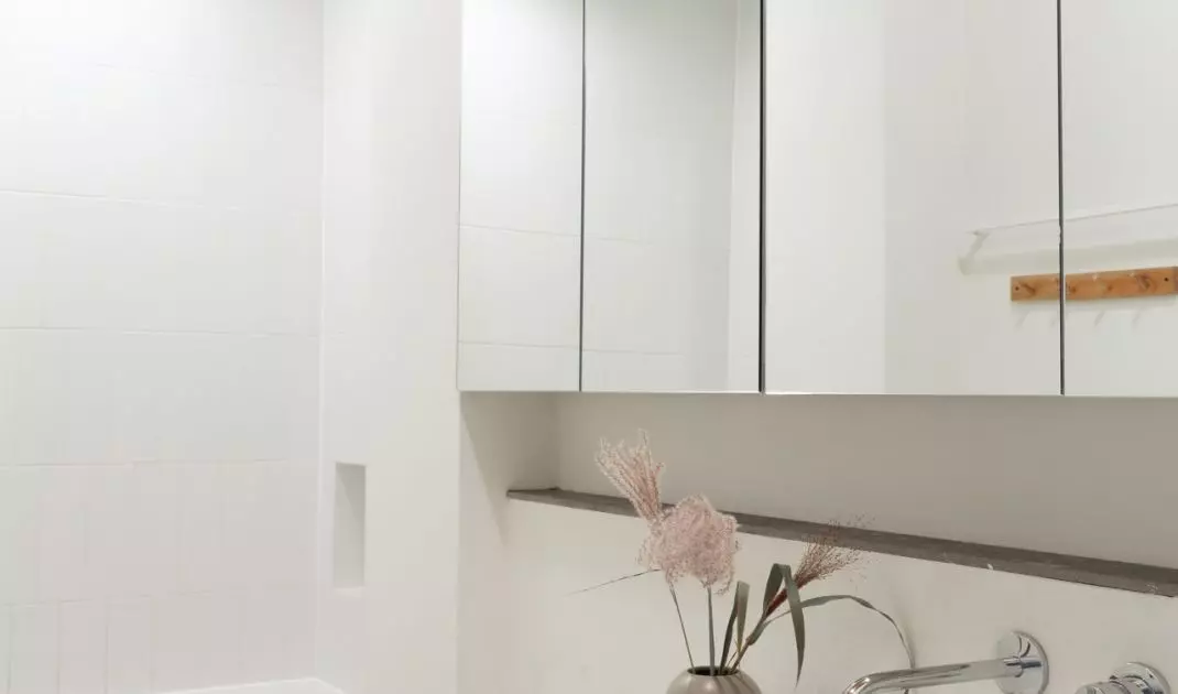
The material palette is calm and natural. Off-white, beiges, and grays form the base, paired with brown, brick-red accents, and warm wood. This makes the interior bright but not sterile. Textures also play a significant role. The walls were finished with restoration plaster, which leaves a delicately porous surface. The floor is made of smooth , off-white polyurethane resin. Its uniform surface further calms the interior and allows the wooden elements to stand out. This decision was driven by the choice of underfloor heating instead of traditional radiators. An interesting detail is the subtle grooving created with half-round wooden dowels, used on the sides of the kitchen cabinets and on the kitchen island. A similar motif in the form of delicate grooves appears on the front of the bathtub, stylistically connecting the kitchen with the bathroom. These are small but distinctive elements that break up the simplicity of the white surfaces.
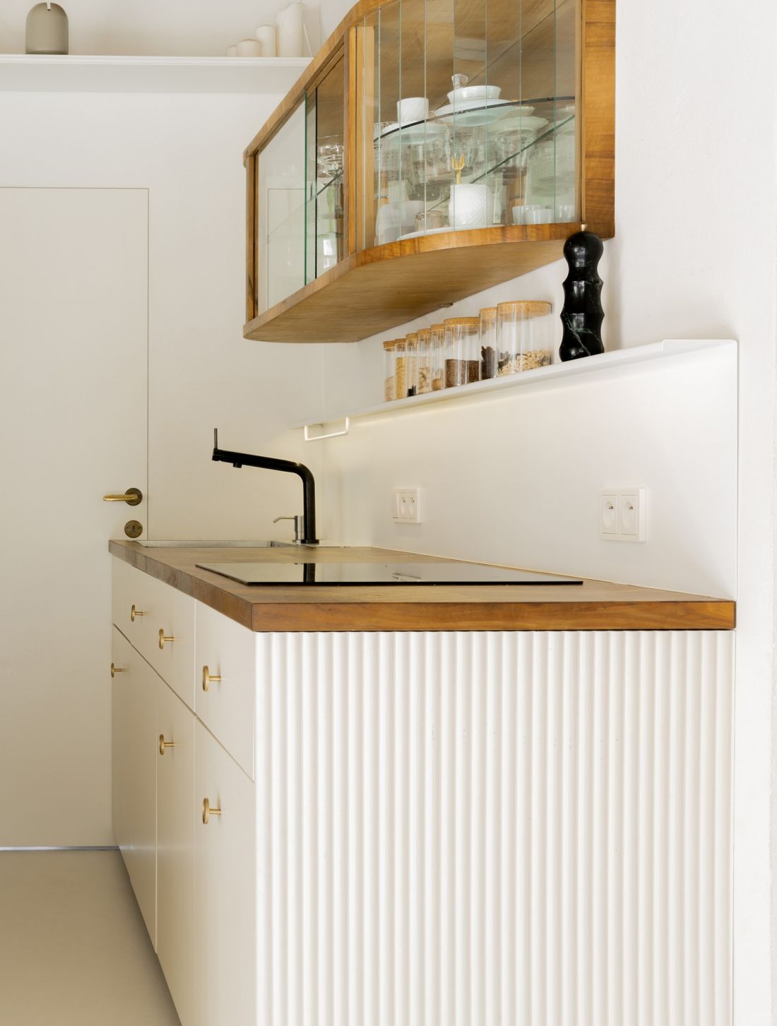
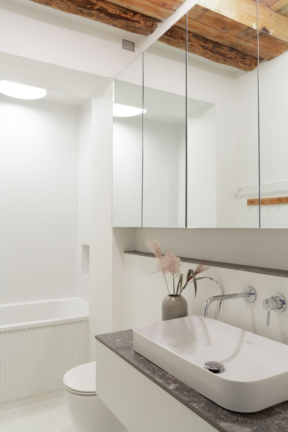
Thanks to these similar motifs, the kitchen and bathroom form a cohesive whole and connect the various areas of the apartment.
Photo: Marta Różycka
vintage furniture
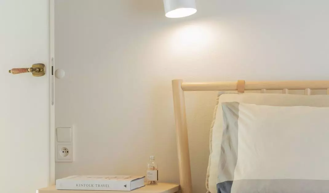
The new built-in cabinetry has been paired with items that already have their own history. In the living area , there’s an old , repurposed dining table and a display cabinet used as upper kitchen cabinetry. Brass details also emphasize the vintage character. The kitchen handles, lamp components, and door knobs come from an antique market in Bytom. Interestingly, the doorknobs do not form a single set — each comes from a different model. Thanks to this, the interior does not feel like it was designed “by the book,” and the individual elements have a more personal character.
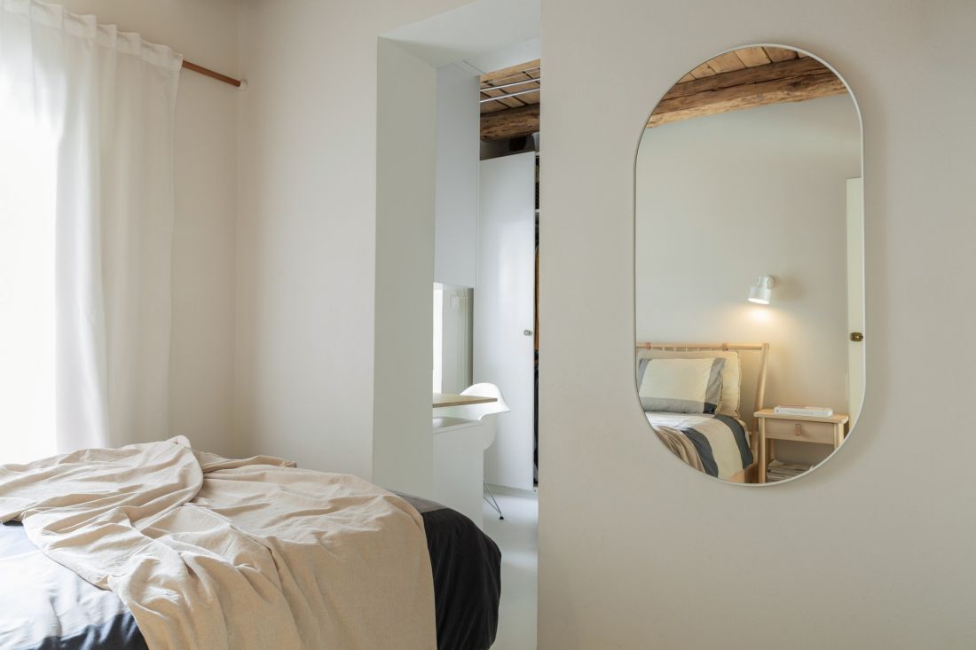
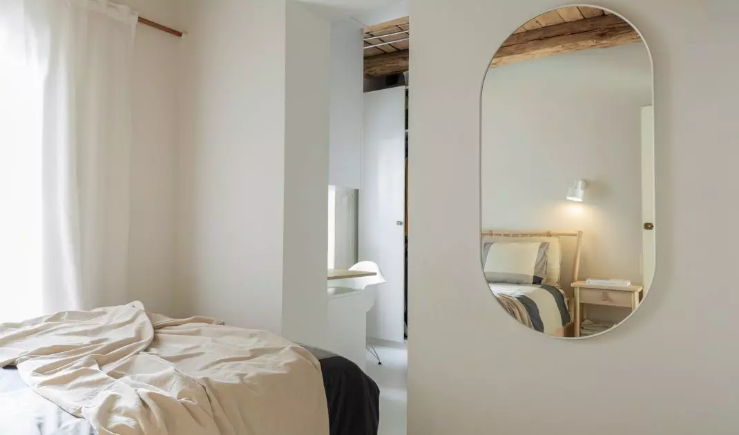
The sleeping area is also decorated in white. The light-colored bed, with its simple, airy design, evokes a Mediterranean aesthetic.
Photo: Marta Różycka
A room for two boys—like a little playground
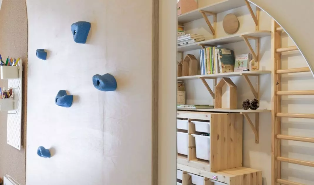
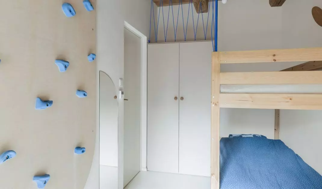
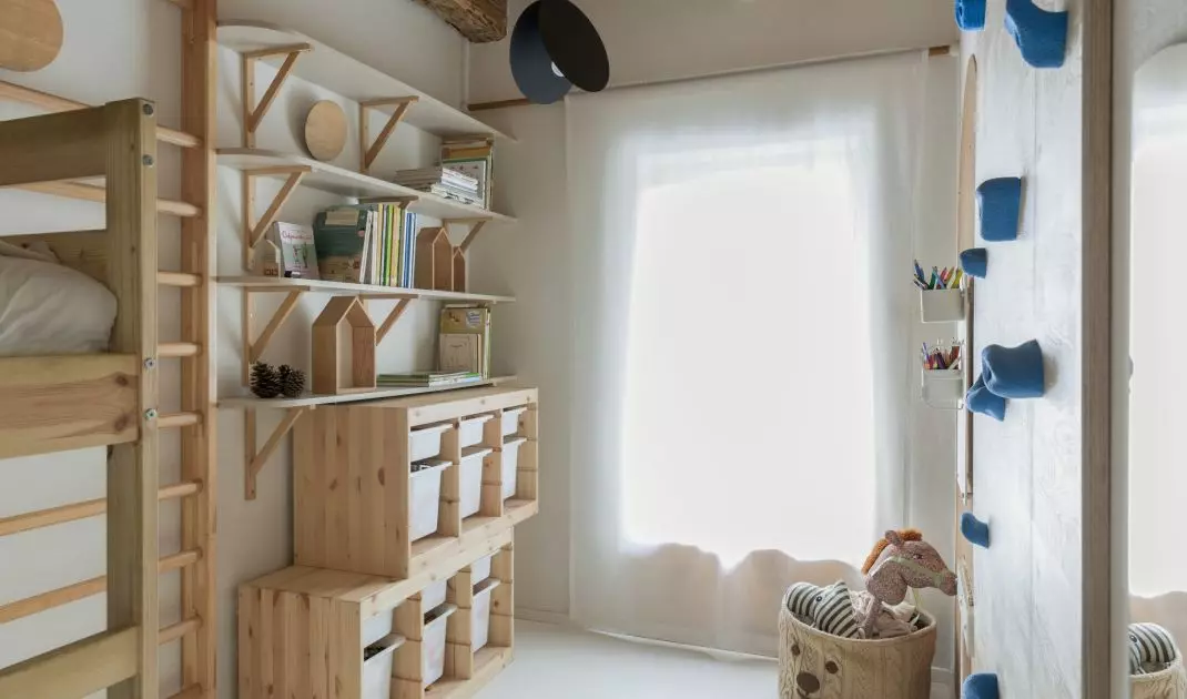
The most unusual room is the two brothers’ bedroom. The design had to accommodate the children’s needs, so instead of a classic set of beds, a bunk bed was installed along with a whole system of elements that encourage physical activity. One wall features a climbing wall with blue handholds, and the bed is accessible via a wooden ladder. The space above the closet was also utilized to create an additional play nook secured with a rope. As in the rest of the apartment, natural materials were the focus here as well. Plywood and pine dominate, and the color palette is limited to wood tones, off-white, and blue accents. The only other colors come from books and toys.
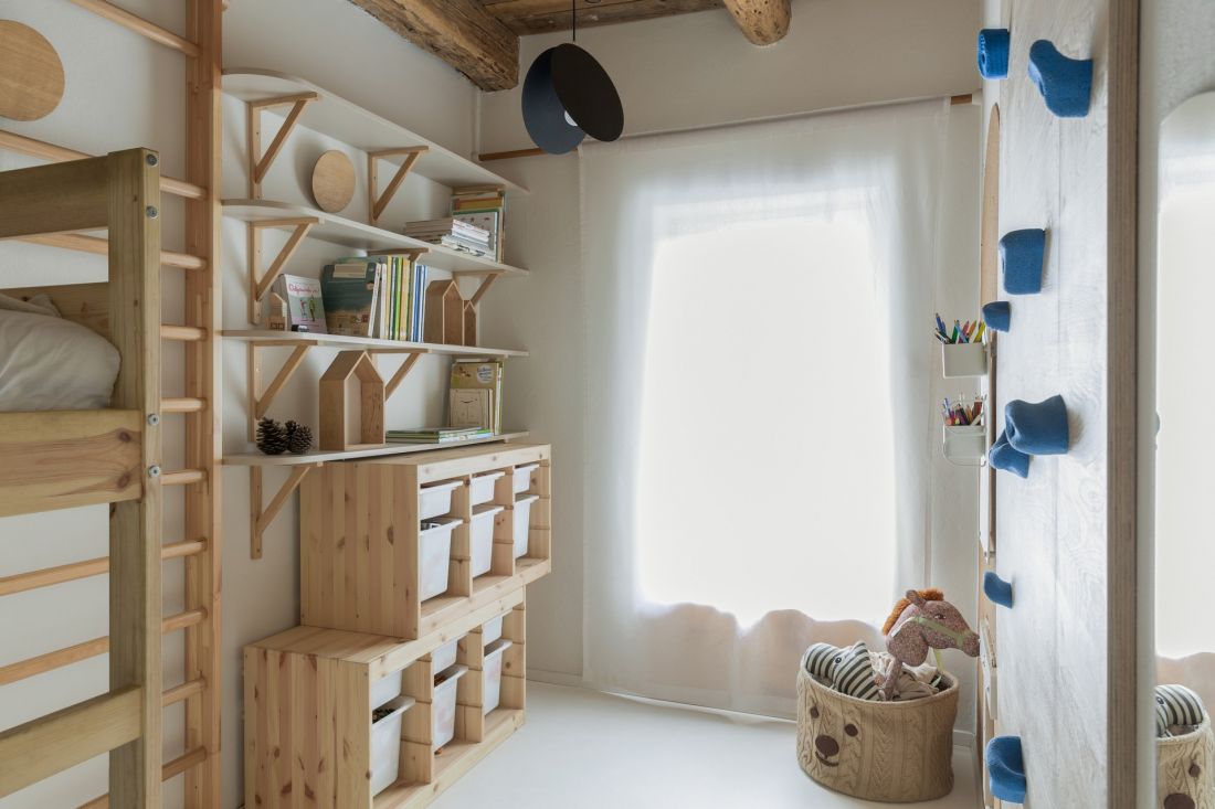
The boys’ room was designed as a small playground.
Photo: Marta Różycka
A homey atmosphere instead of catalog perfection
The Brokat Studio demonstrates that you don’t need a lot of design elements to create a distinctive interior. Sometimes it’s enough to focus on what the existing space offers and the possibilities it holds. Thanks to the right approach and a certain amount of courage—because, let’s be honest , opting for an unconventional ceiling and making it the central theme takes real courage — they’ve managed to design interiors worth remembering. The resulting atmosphere is a blend of Mediterranean spirit and rustic vibes, with neither style dominating the other. What matters most is simply the cozy, homey atmosphere that makes you want to relax.