

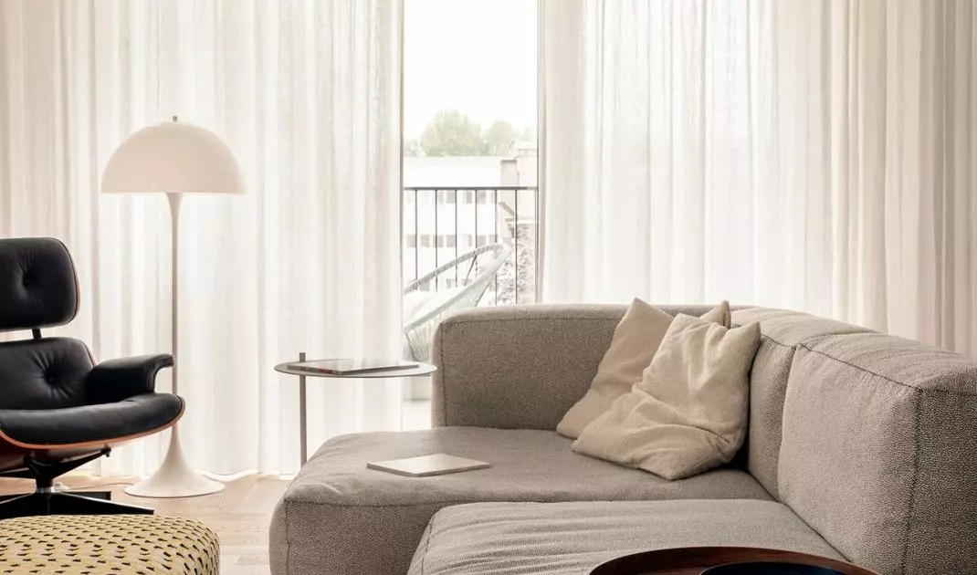
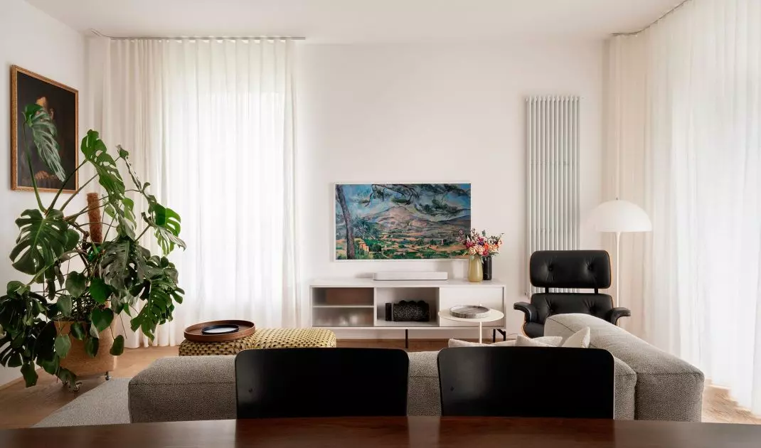
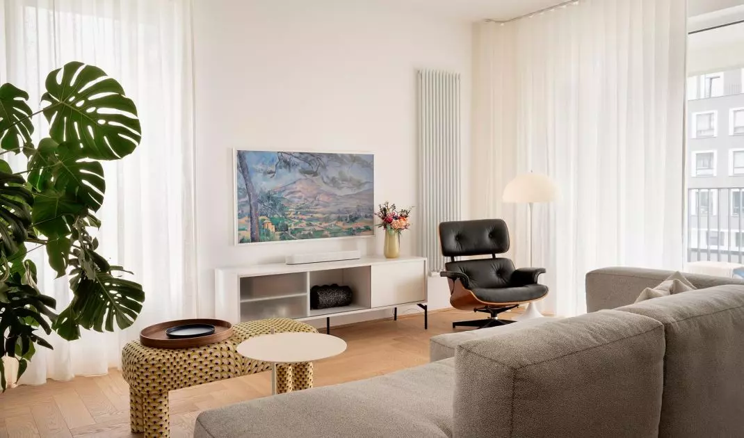
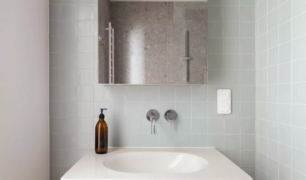
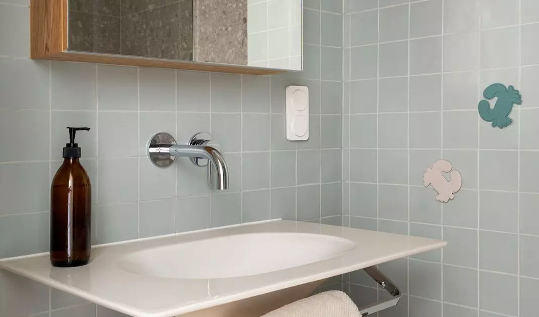
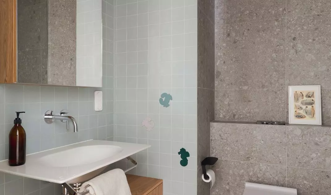
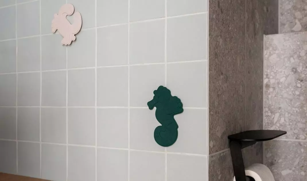
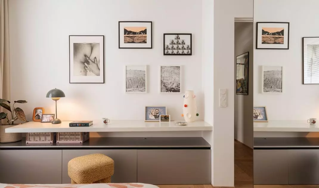
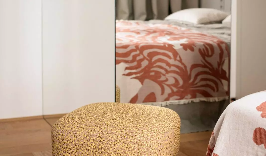
This 92-meter apartment was created gradually over nearly three years, evolving alongside the owners’ needs and tastes. The project, designed by Studio Kulis , began at the shell stage , which allowed the team to refine the layout and details and then give the space an increasingly personal character. Instead of furnishing the entire space all at once , the team opted for a process spread out over time — searching for secondhand furniture, selecting works of art, and combining objects that do not necessarily come from the same era or represent a single style. As a result, the interior doesn’t feel like a ready-made arrangement plucked from a catalog, but rather a space that has gradually filled with objects that each have their own story.
A Bright Entrance, a Warm Welcome
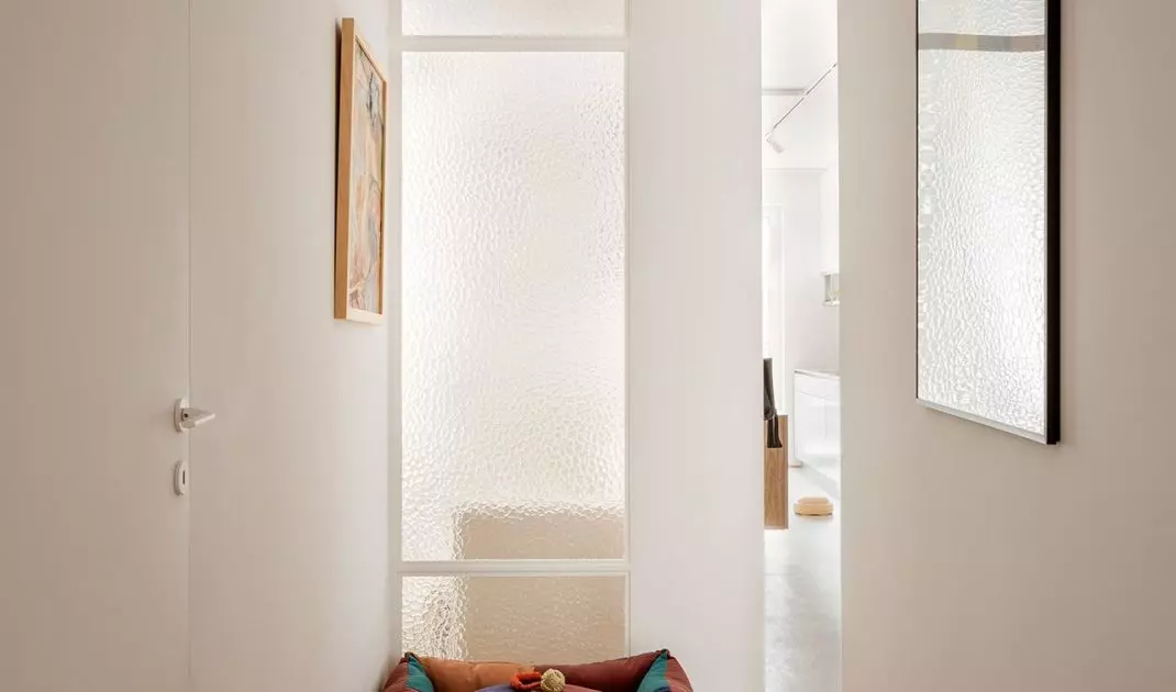
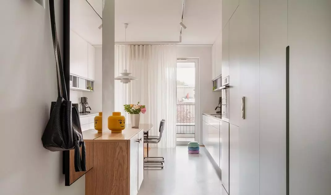
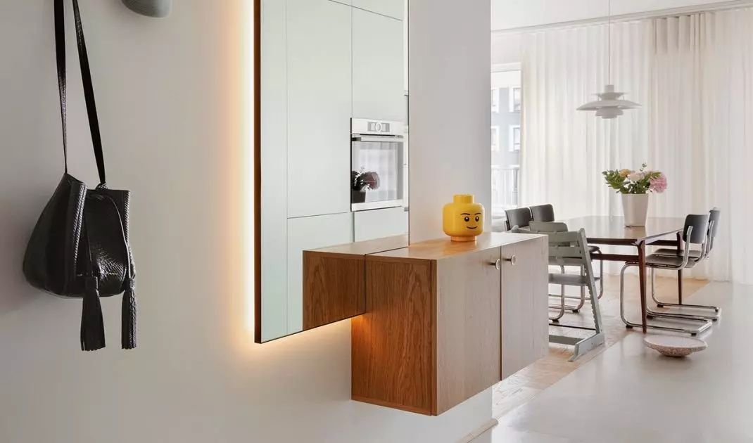
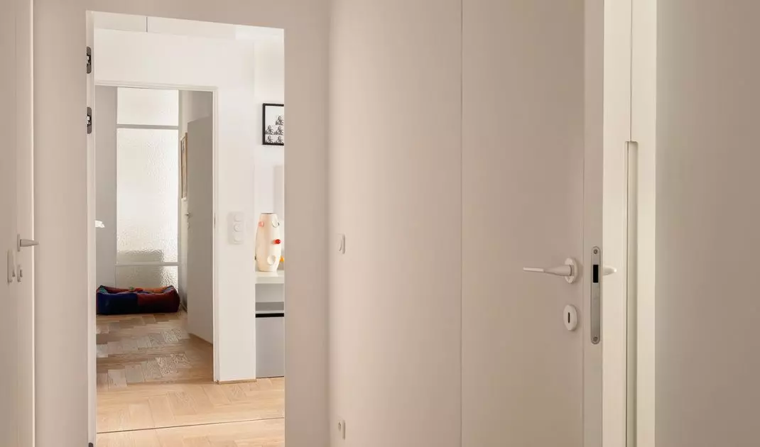
Right from the threshold , the bright, monolithic floor catches the eye , emphasizing the minimalist character of the entryway and creating a calm backdrop for the other elements. Its uniform surface gives the space a modern, architectural feel, while also contrasting with the wooden floor, which doesn’t appear until the living room. Laid in a herringbone pattern, it brings more warmth and a classic rhythm to the living area, subtly marking the transition between the apartment’s different zones.
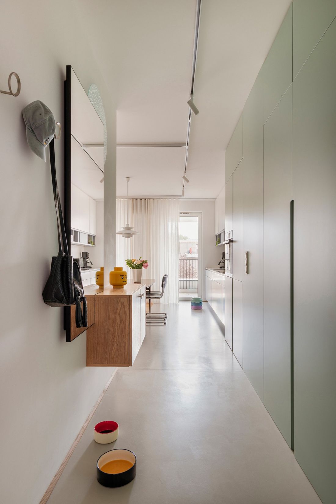
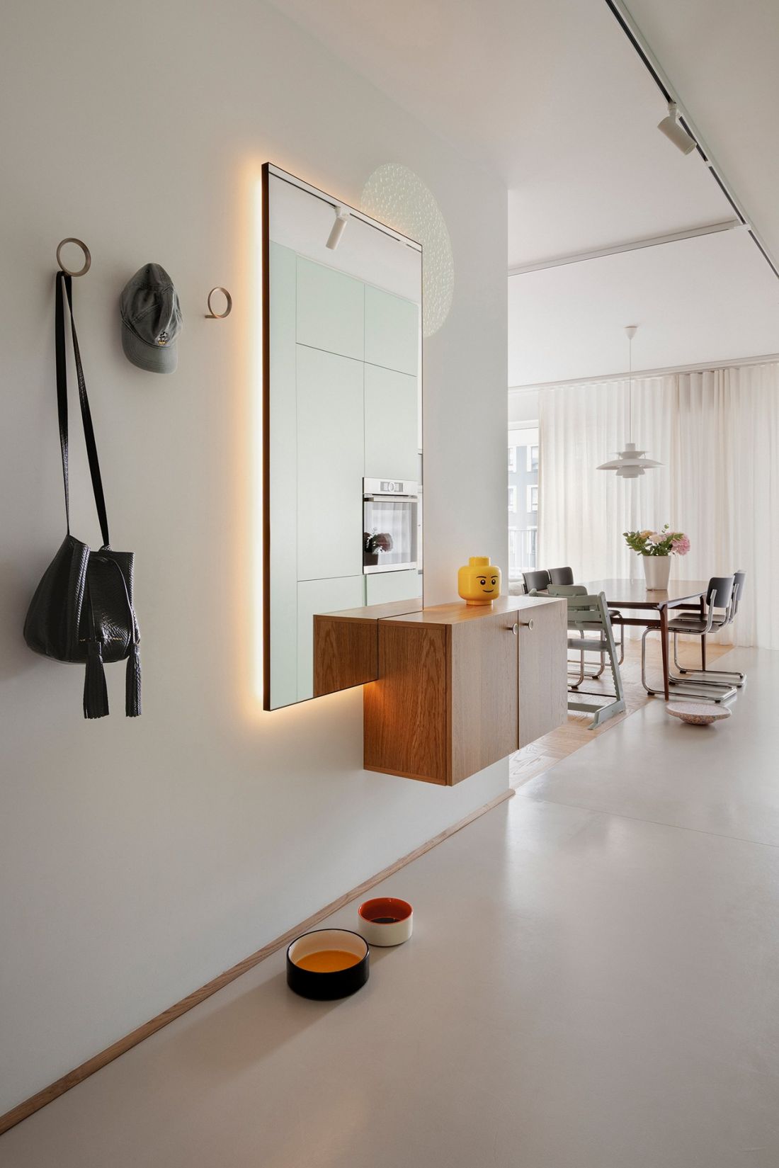
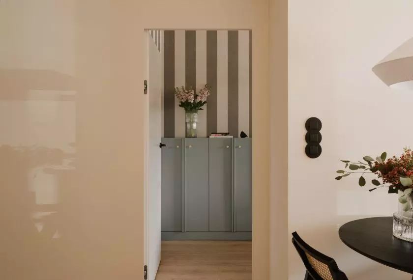
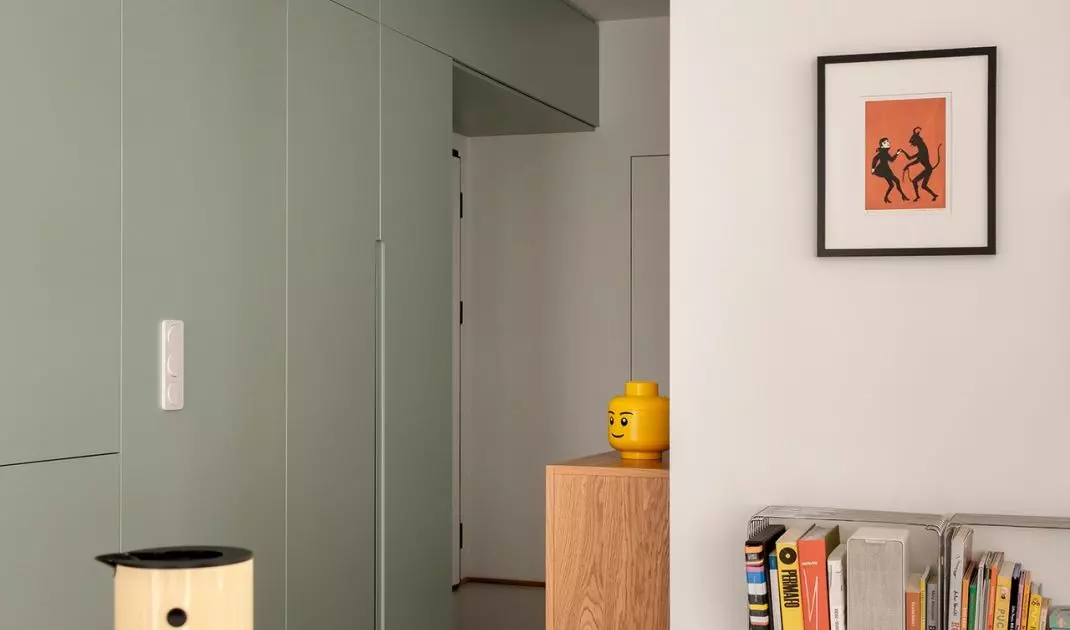
The hallway leading to the living area is decorated in light colors. The smooth built-in cabinets, floors, and walls are accented by the wood grain visible in the suspended cabinet.
Photo: Martyna Rudnicka
A modern foundation without cold minimalism
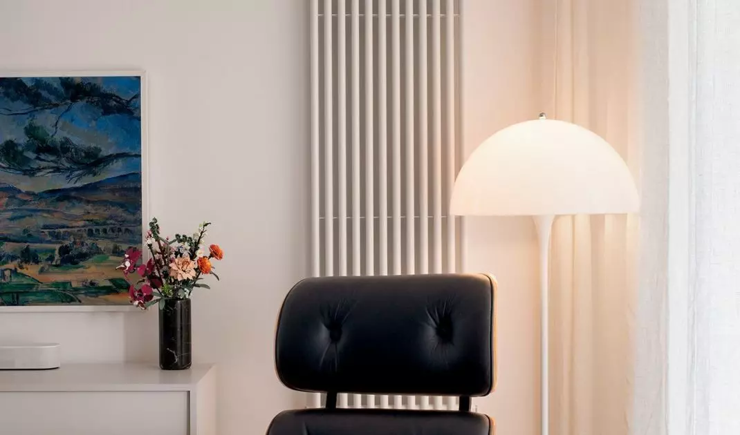
The entire space is kept in light colors, complemented by delicate color accents. White, beiges, and wood tones form a neutral base against which individual pieces of furniture, artwork, and accessories stand out more clearly. Modern architecture, however, is not an end in itself — it serves rather as a backdrop for furnishings that bring diversity and individual character to the interior . In the living room, a soft, light-colored sofa sits next to a black armchair with a striking, modernist form, and a simple TV cabinet does not compete with the painting hanging above it. A large monstera plant by the window softens the geometric order of the furniture, adding an organic touch to the composition. As a result, the interior remains light and orderly, yet does not feel sterile.
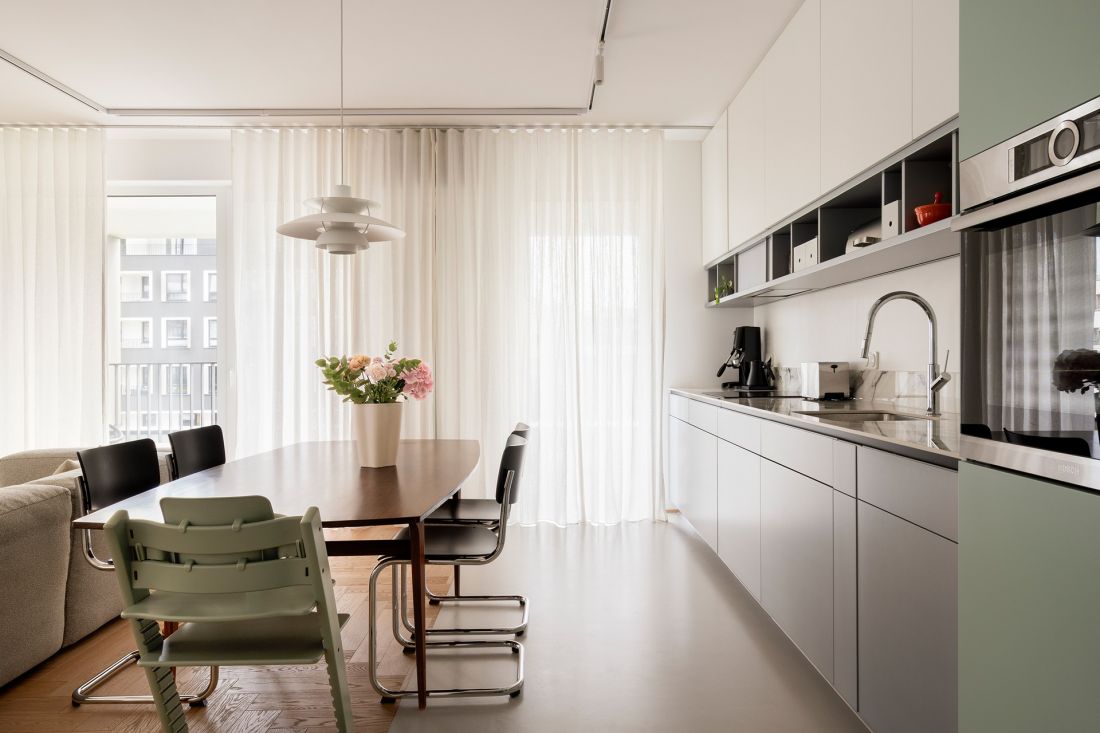
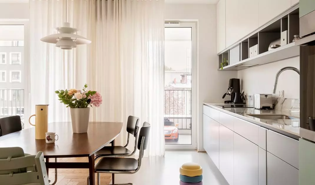
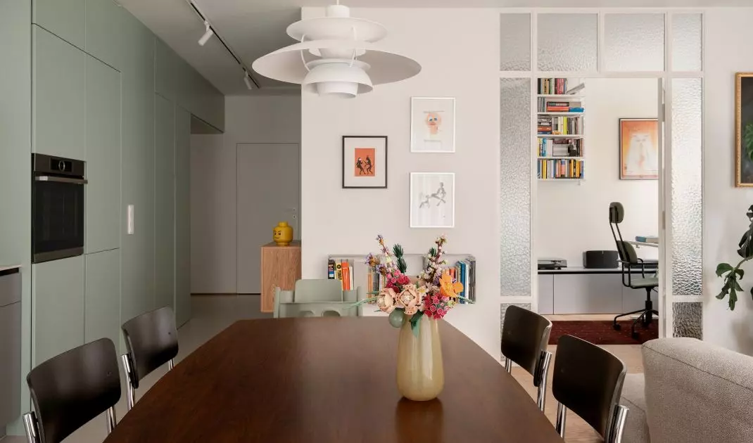
The kitchen and entryway areas are separated from the living area by a change in floor finish.
Photo: Martyna Rudnicka
Classics and antiques in contrast to modern minimalism
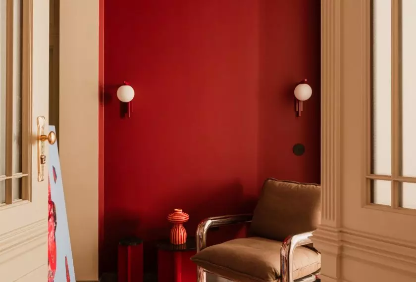
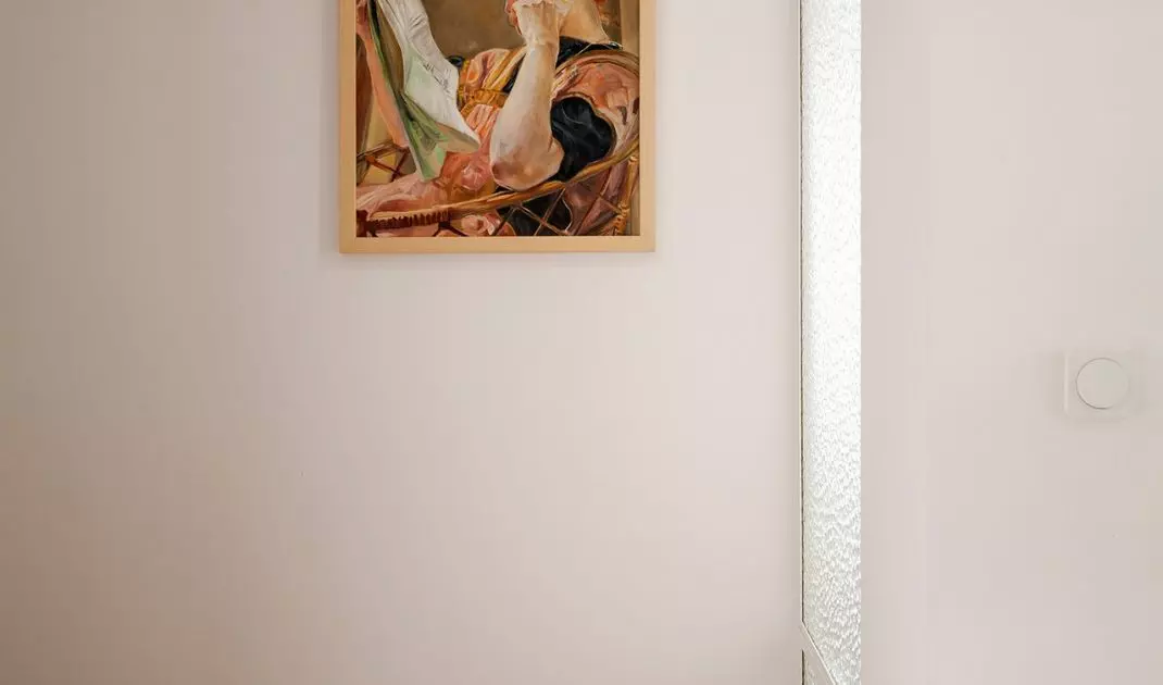
Works of art play a special role, breaking up the contemporary character of the design. Classic paintings in ornate frames are juxtaposed with modern prints and photographs, creating a composition that defies a single stylistic order. Alongside contemporary built-in furniture , there are pieces with modernist silhouettes and objects that stand out for their form. Secondhand furniture brings not only diversity to the design but also a sense of authenticity.
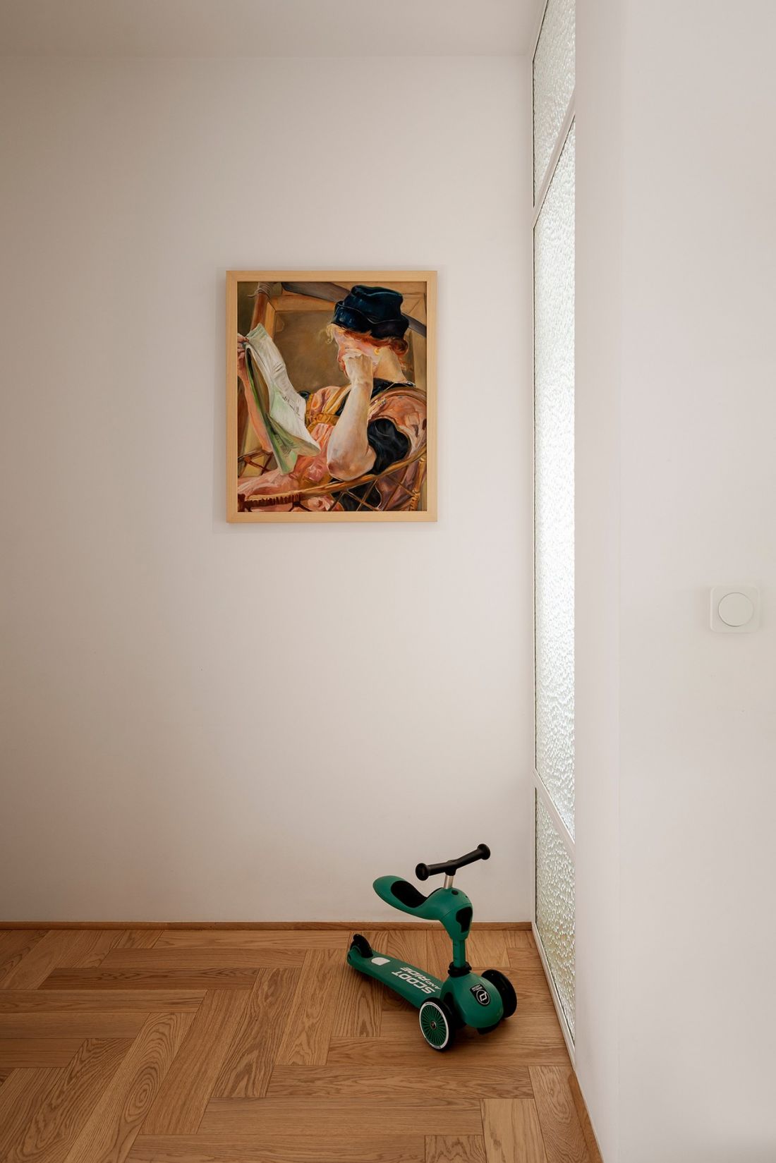
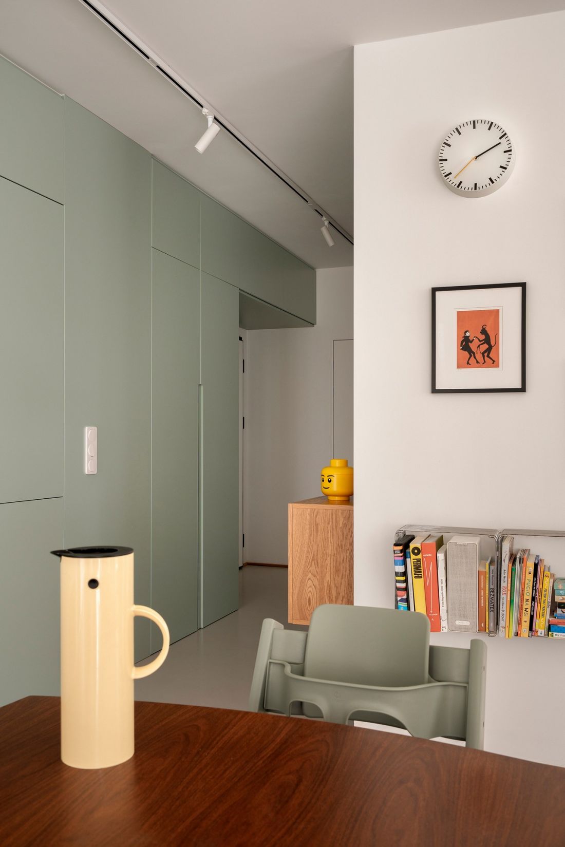
Art is scattered throughout the apartment — classical paintings are juxtaposed with more contemporary prints.
Photo: Martyna Rudnicka
glass that doesn’t close off the space
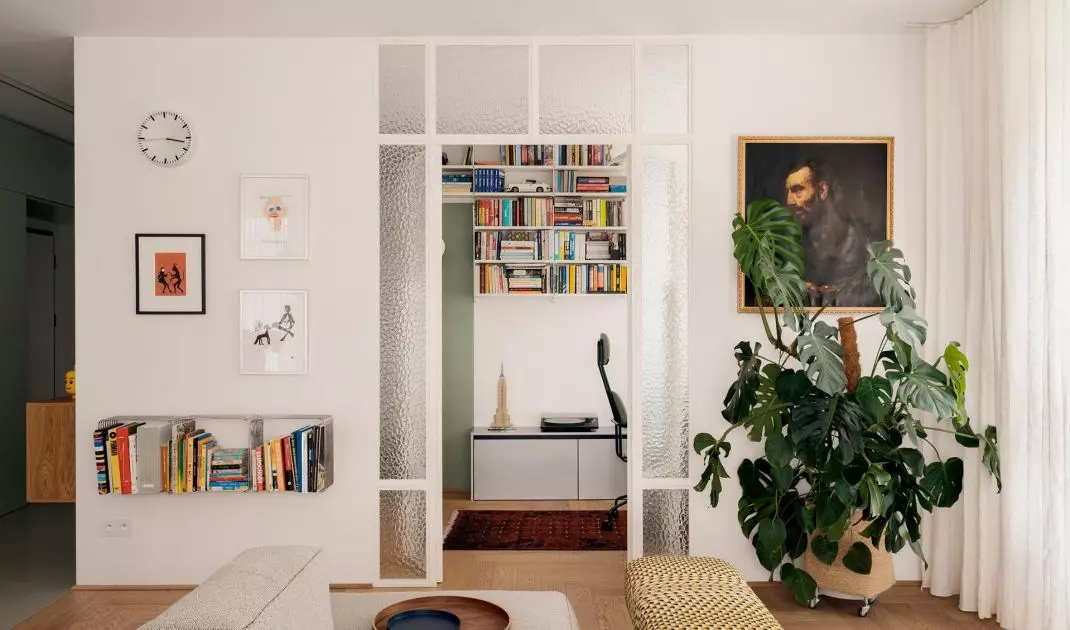
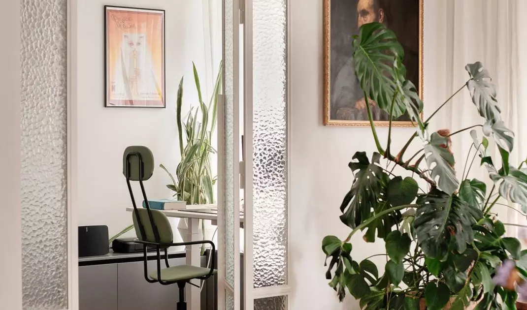
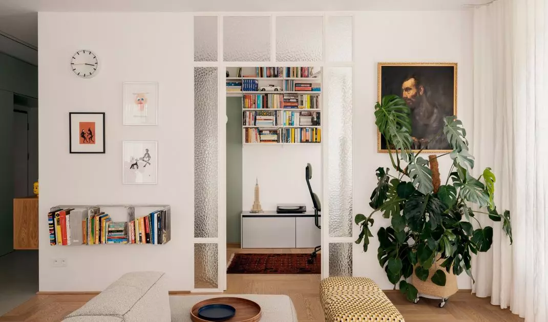
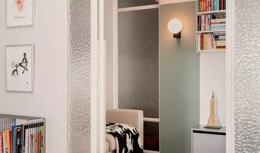
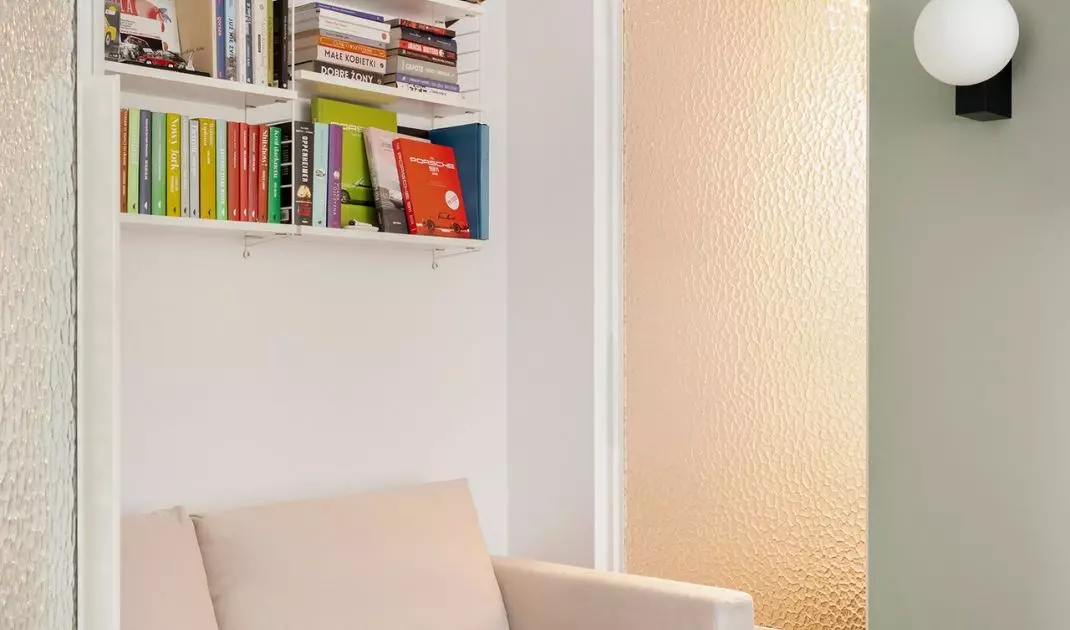
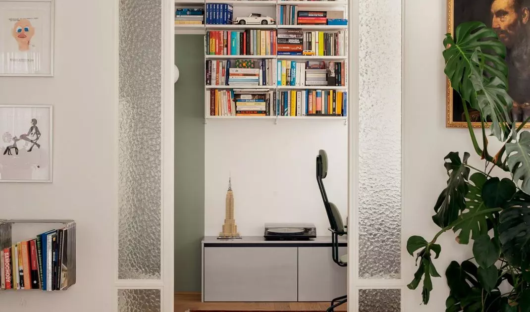
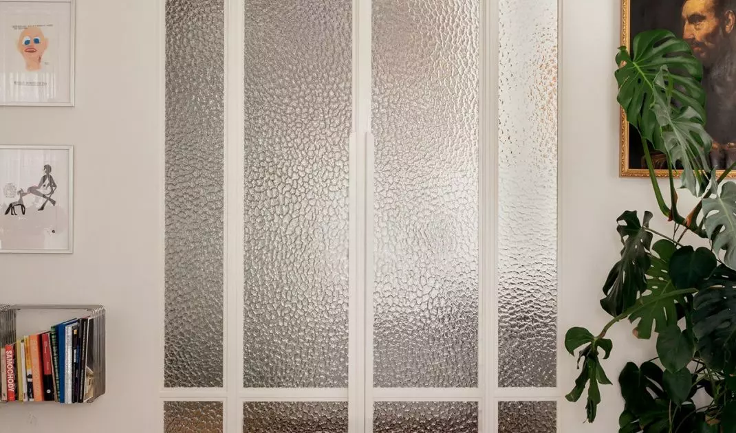
A partition with irregularly textured glass panels appears in the apartment’s layout. It separates the study from the living area, but thanks to its transparent surfaces, it does not completely cut it off from the living room. Diffused light filters between the rooms, and the distorted image on the other side of the glass creates a subtle visual boundary. The textured glass introduces a play of light and reflections into the interior, and its divisions become a distinctive element of the composition. Instead of solid doors, a lightweight partition organizes the space without compromising its openness; when the doors are opened, the entire apartment appears visually larger and more spacious.
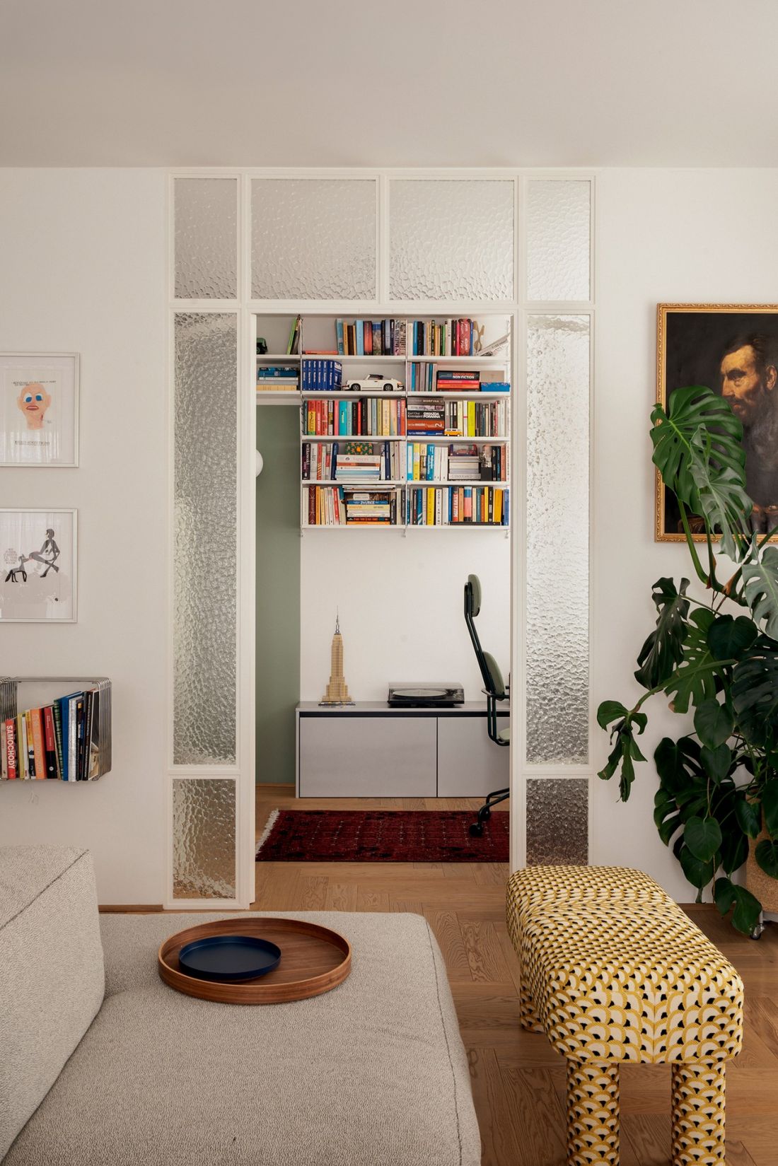
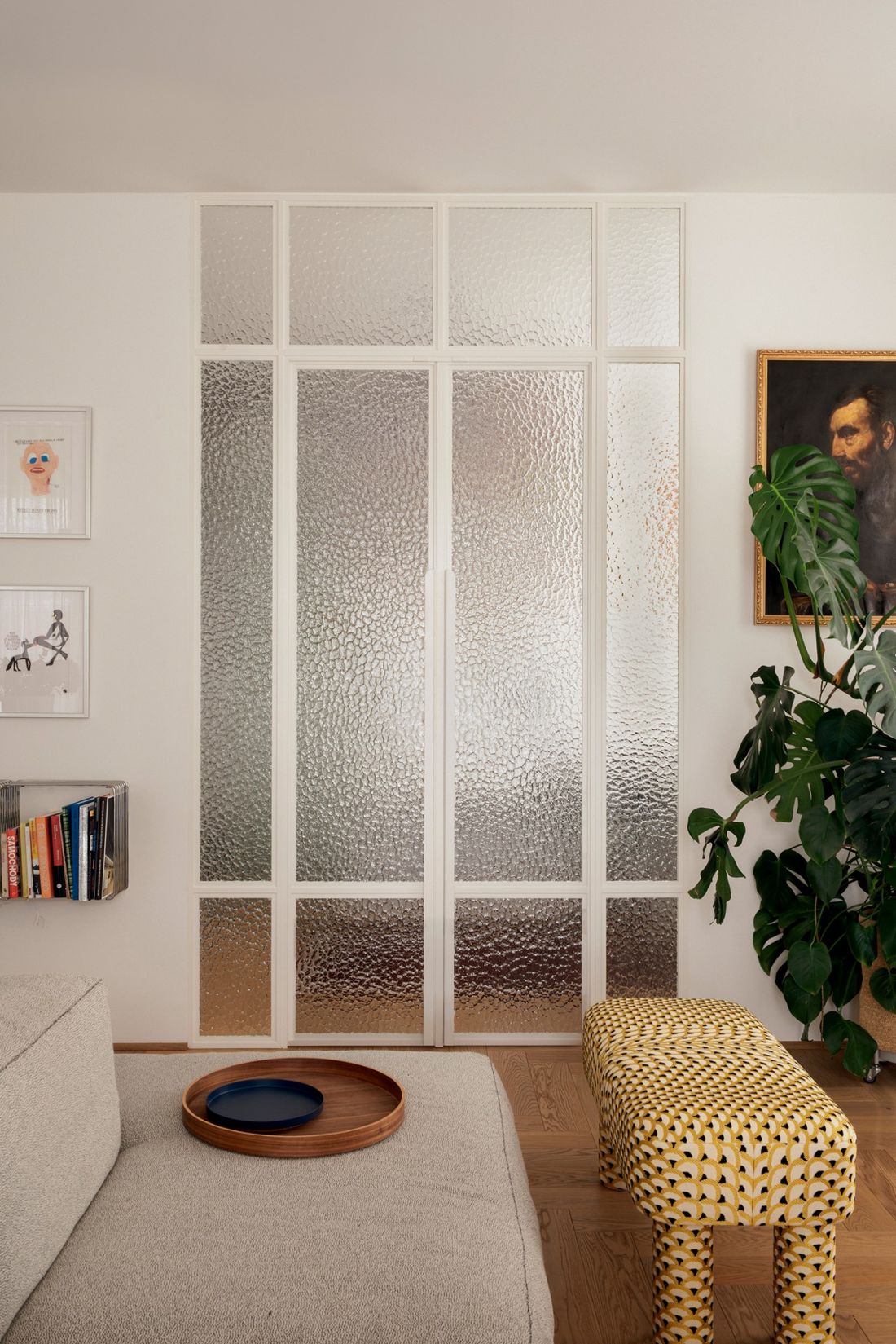
The glass’s ornamentation harmonizes with the patterned upholstery of the small bench.
Photo: Martyna Rudnicka
study with an open bookshelf
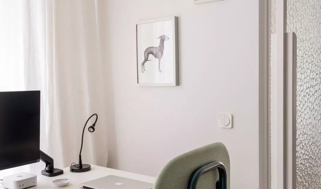
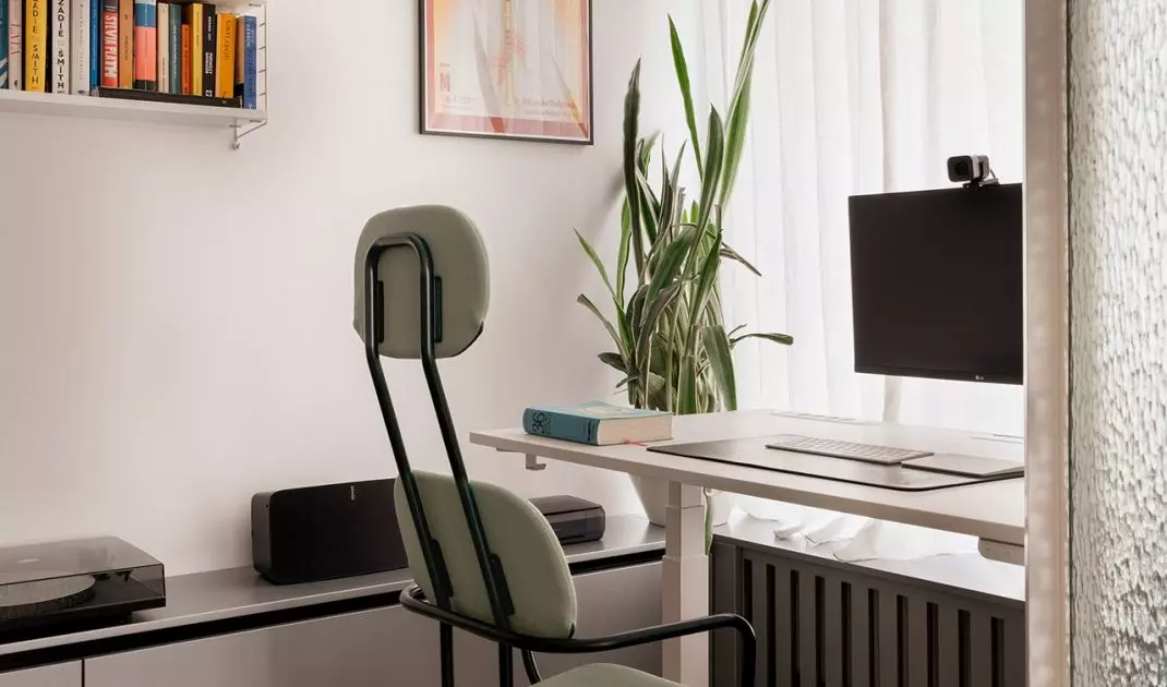
Behind the glass partition is a workspace, a key element of which is an open bookshelf. The shelves filled with books add color and a homey feel. Rather than completely concealing the room’s function, it has been allowed to become part of the apartment’s everyday landscape. Books and small objects give this area a personal touch, breaking up the simplicity of the built-in furniture. The study is therefore not an isolated workspace, but an integral part of the interior, where functionality blends with attention to detail.
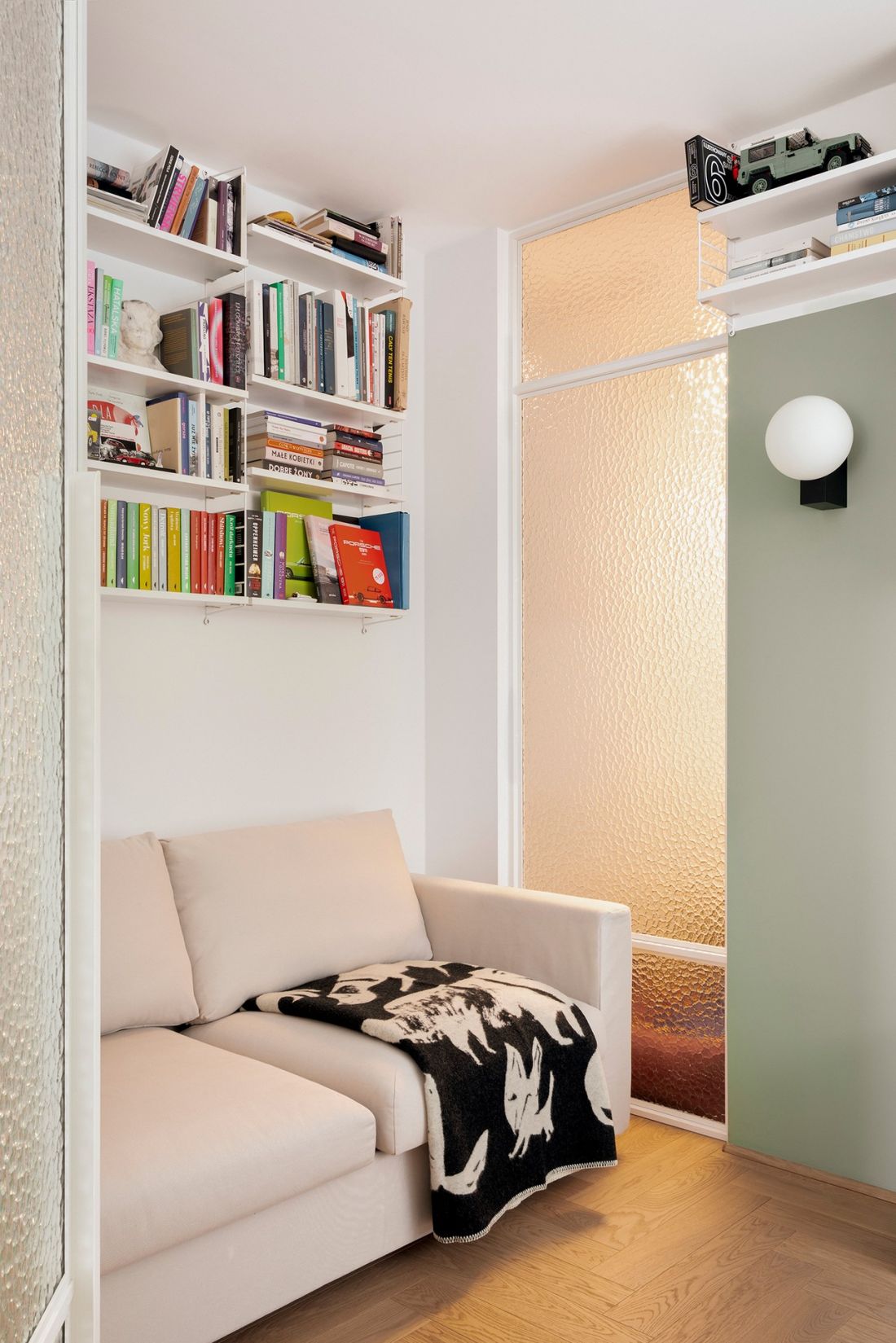
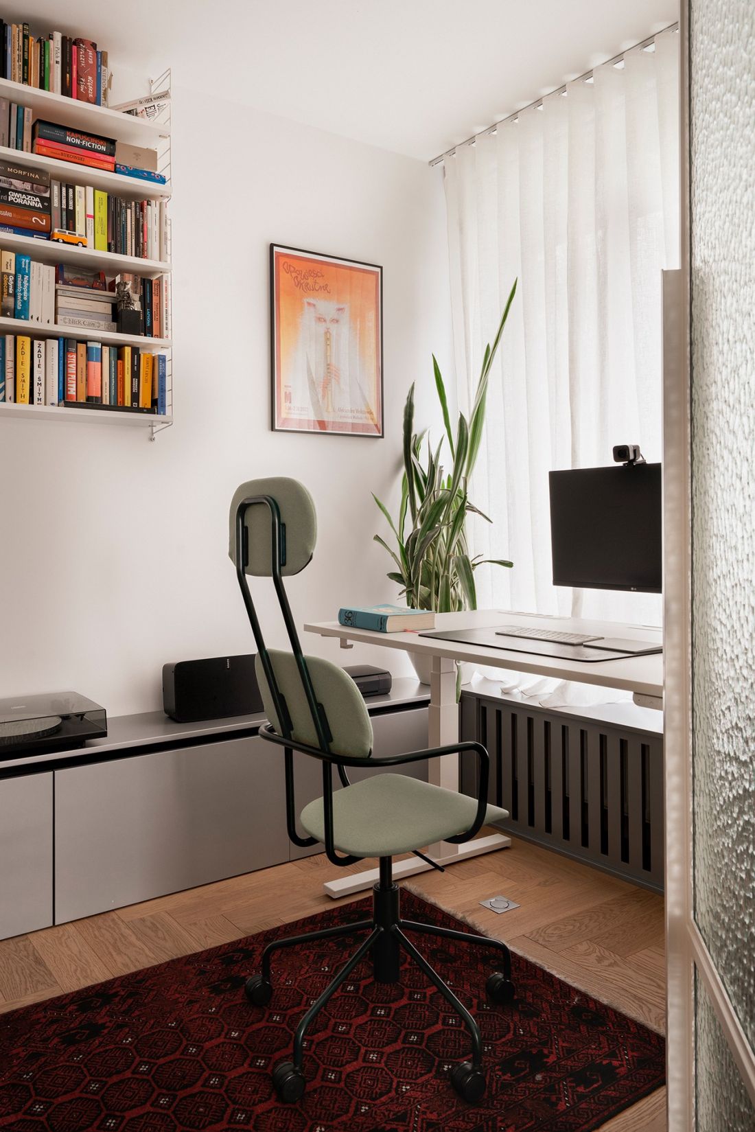
Thanks to the glass partitions used in the home office, the room does not feel separated from the rest of the apartment.
Photo: Martyna Rudnicka
Greenery as a Connecting Element
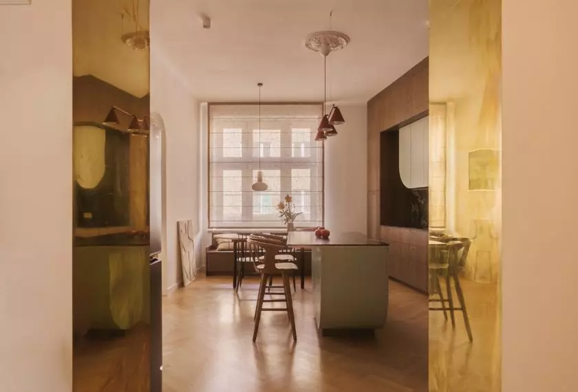
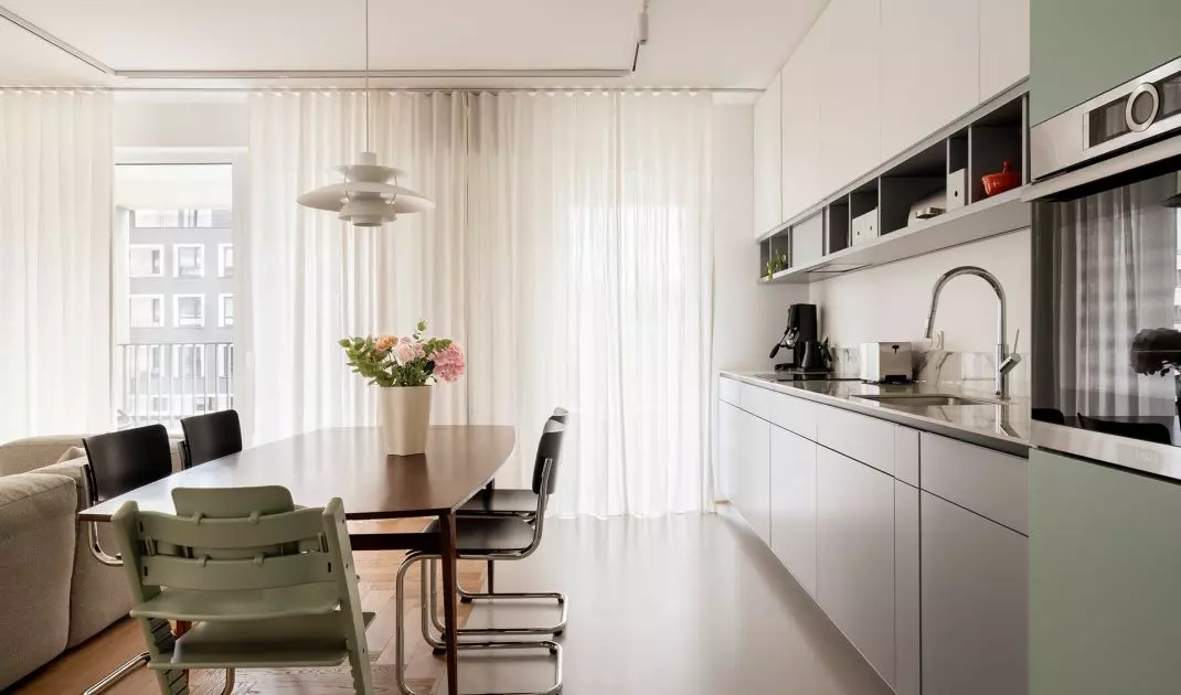
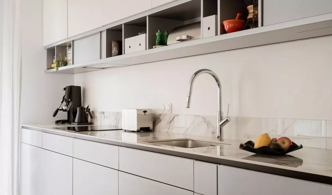
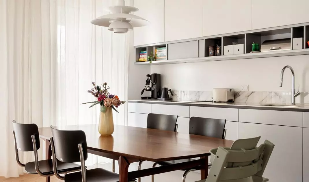
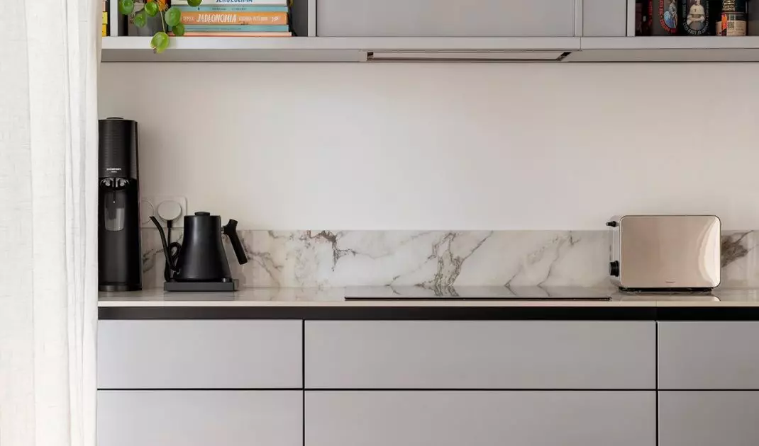
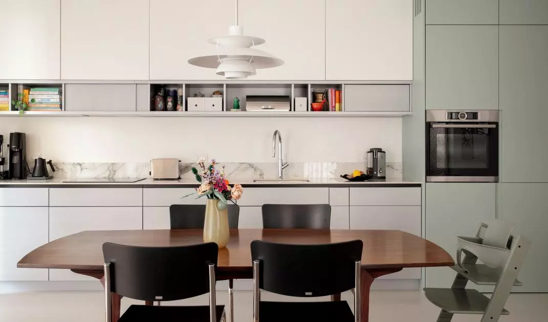
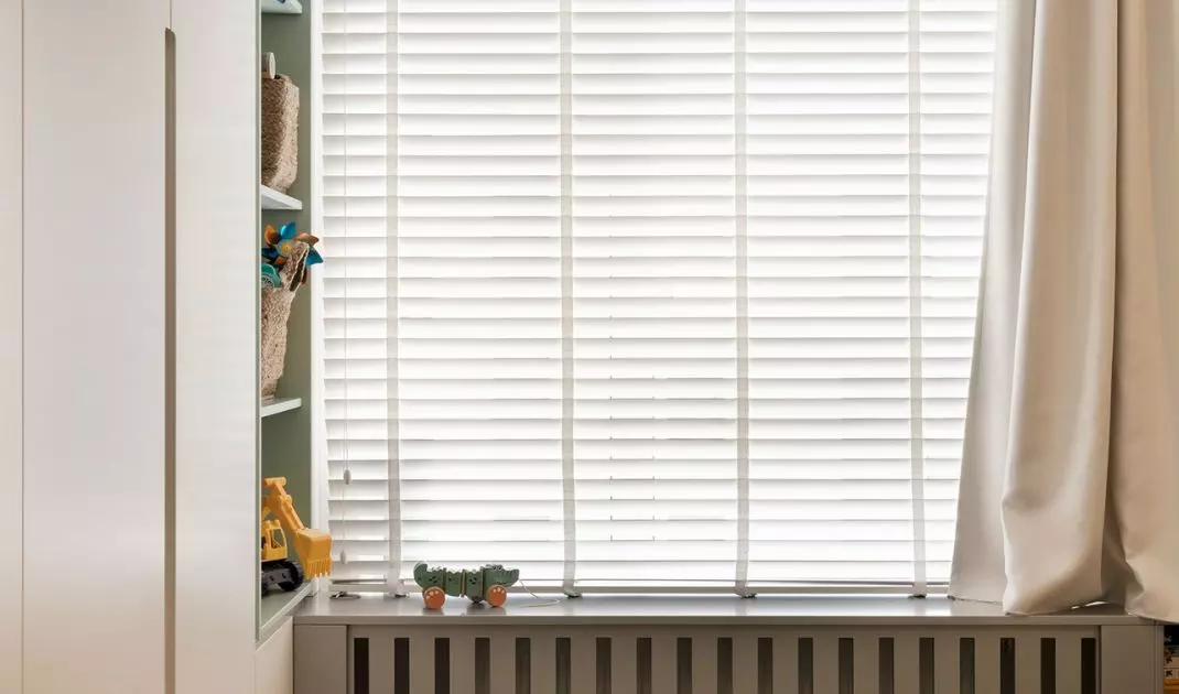
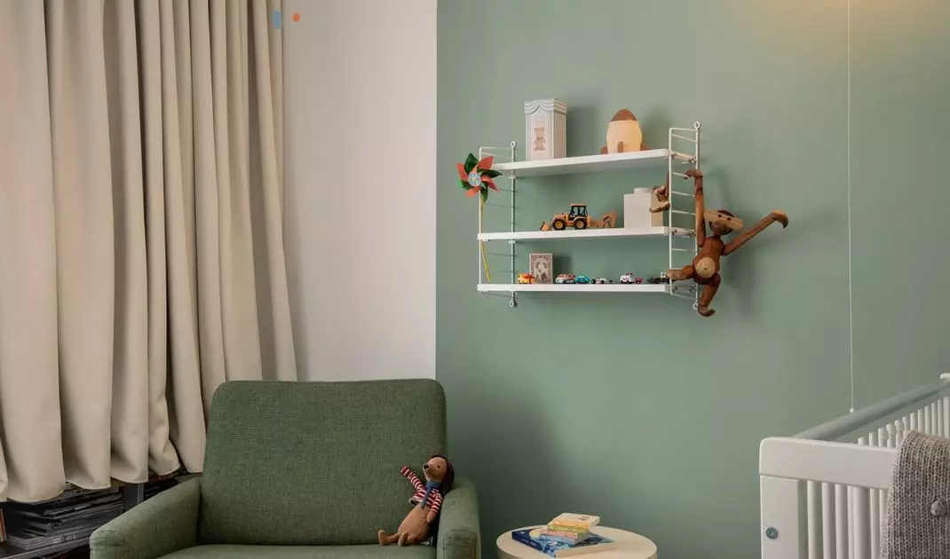
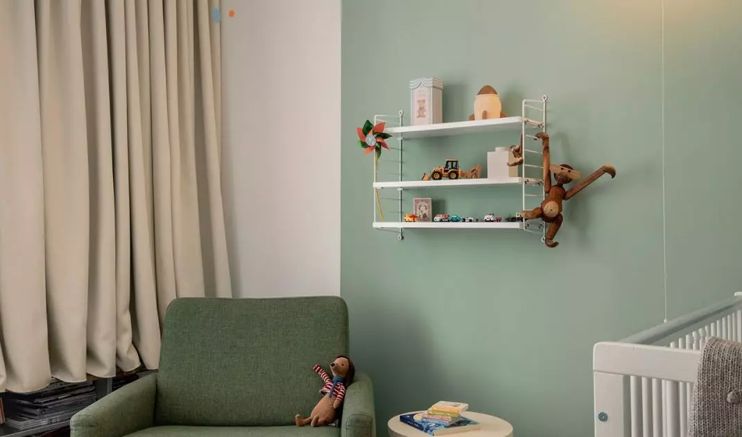
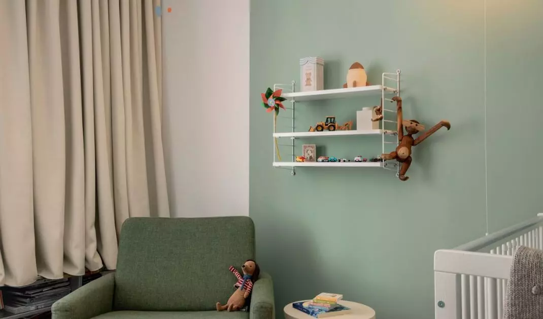
Green appears throughout the apartment in various forms, connecting zones with different functions while maintaining the cohesion of the entire design. In the kitchen, it takes the form of tall cabinetry paired with smooth, light-colored fronts. Its soft shade breaks up the monochromatic scheme without dominating the whole, and the subdued countertop and stone surface of the backsplash allow it to stand out without being overly intense. An open niche running along the upper cabinets adds a sense of lightness to the cabinetry , introducing a more personal dimension to the kitchen and echoing the bookshelf in the study. A similar color scheme recurs in the children’s room, where the green on the wall creates a calm backdrop for the furniture, toys, and colorful accessories. The character of the interior is defined here by everyday objects, varied textures, and freely combined colors, thanks to which the room remains inviting and can evolve as the child grows up. In both spaces, green thus plays a similar role— it enlivens the subdued base, gives it a unique character, and helps create cohesion without having to repeat the same design solutions.
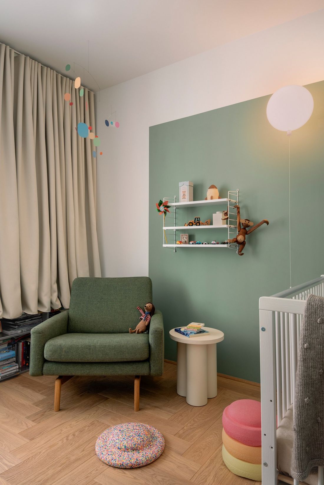
Accents of muted green appear in individual rooms.
Photo: Martyna Rudnicka
A bedroom is also about books
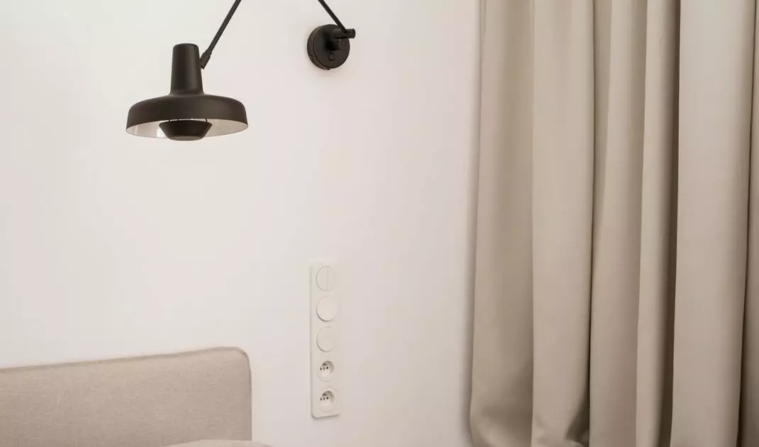
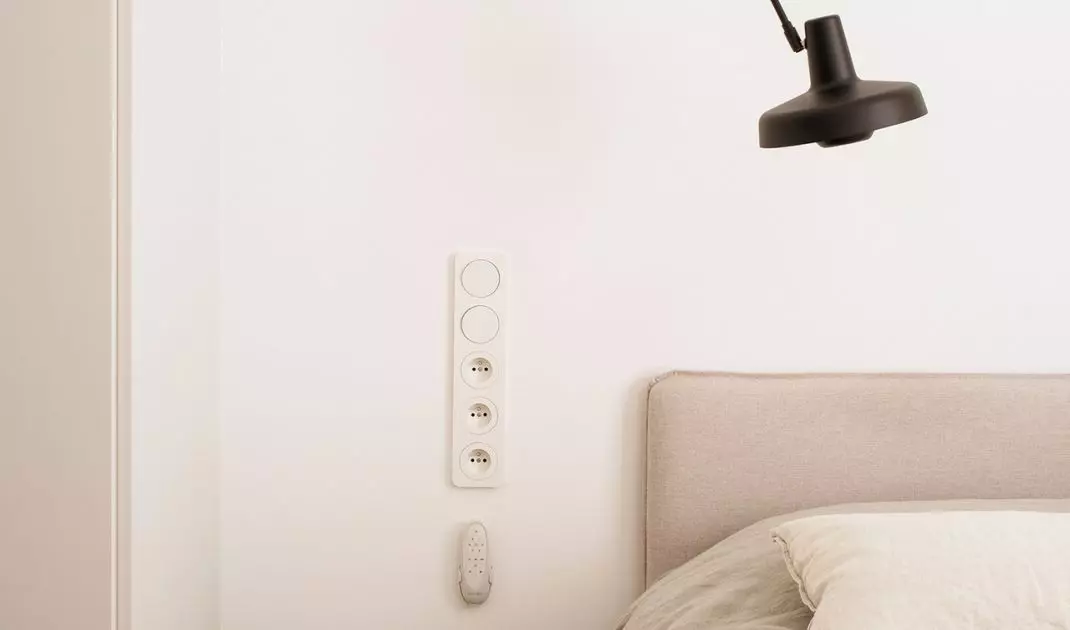
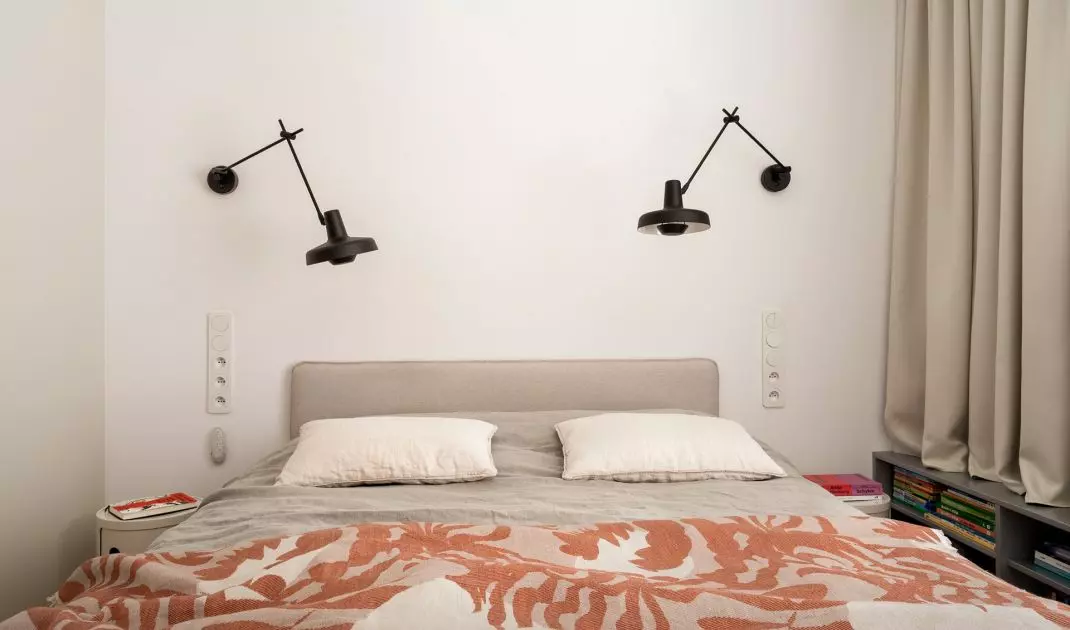
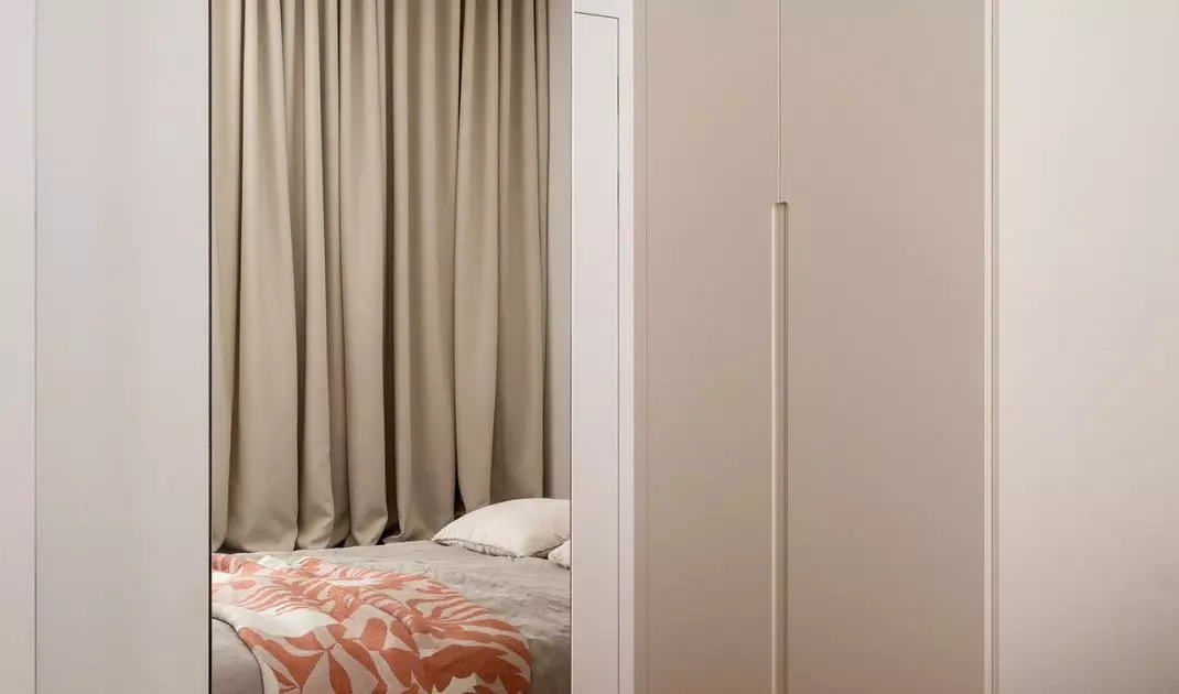
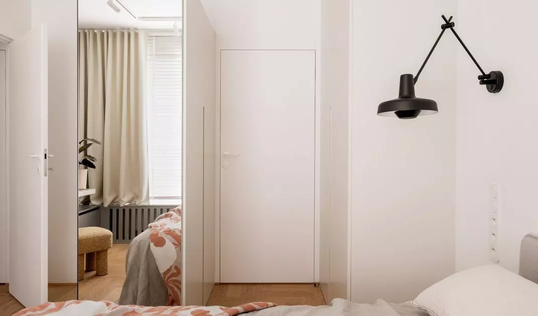
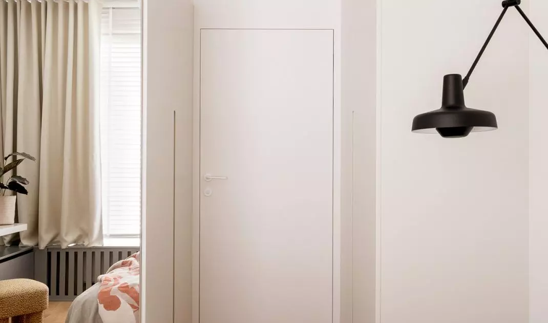
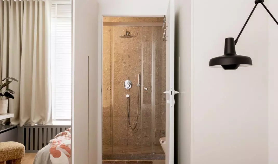
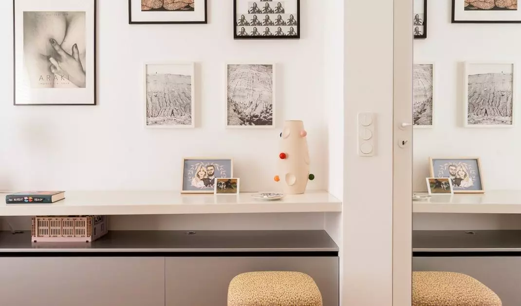
The bedroom features a light, calm color scheme, yet it is not lacking in striking details. The visually light bed with an upholstered headboard is paired with black, geometrically shaped wall sconces, whose bold lines contrast with the soft fabrics. Under the window, there’s space for a small, open bookshelf, thanks to which books become a natural part of the decor, just as they do in the apartment’s other rooms. A larger art collection is displayed above the low built-in cabinetry — paintings and prints form a multi-element composition, giving the wall a unique character. Storage is provided by built-in cabinetry that combines glass fronts with light-colored solid panels. The bedroom also has its own bathroom, creating a more private, independent area within the apartment.
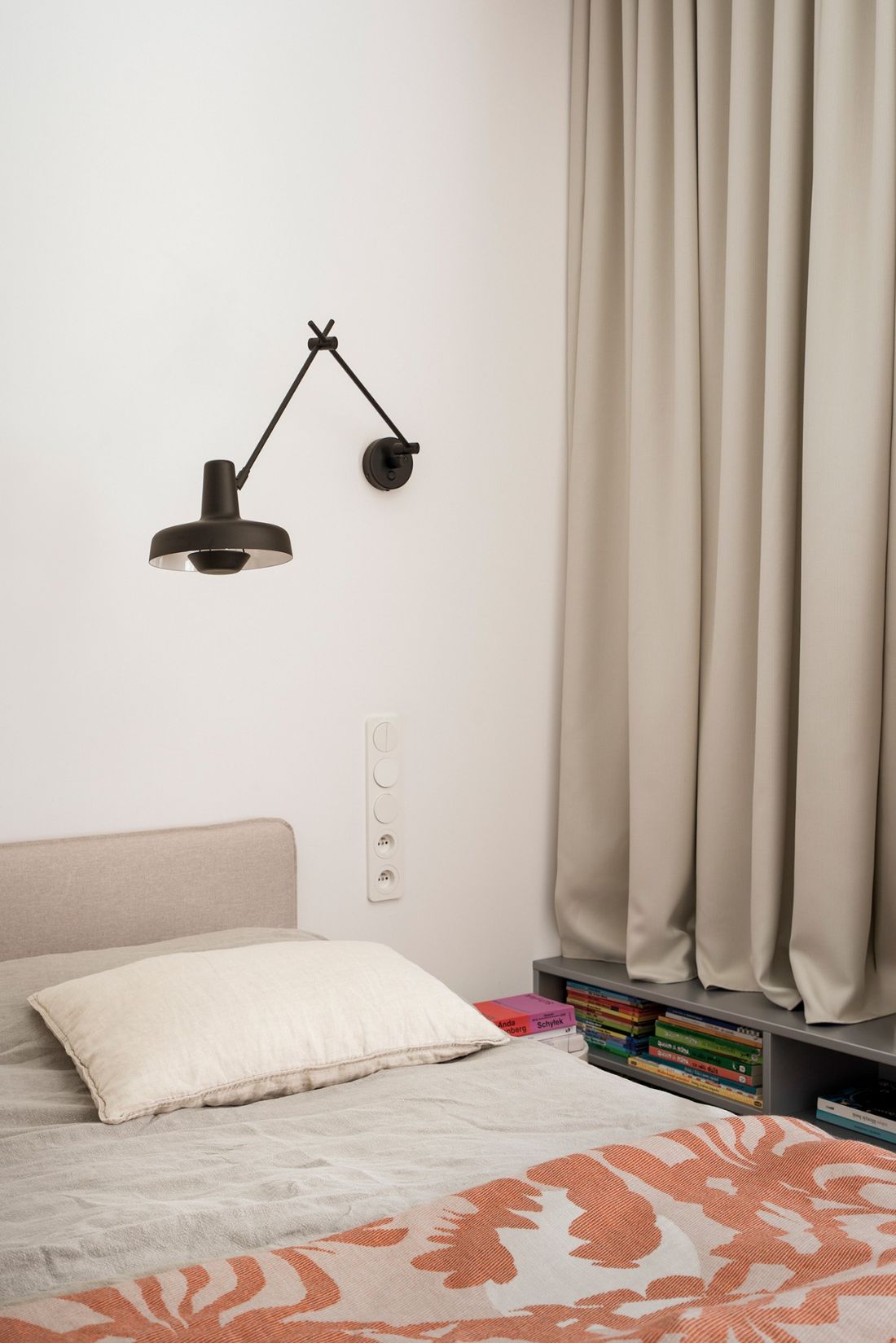
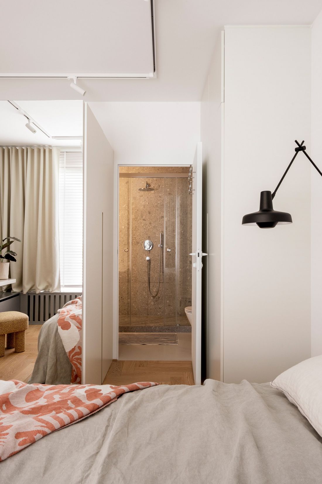
An open bookshelf has been set aside in the bedroom. Its location under the window allows for maximum use of the space.
Photo: Martyna Rudnicka
Eclecticism that evolves over time
Nearly three years of gradual decorating have resulted in an interior where modern architecture meets vintage furniture and accessories, collected over time. The design shows that eclecticism doesn’t have to mean stark contrasts and bold combinations — it can also manifest itself in a subtle selection of details, a variety of forms, and objects that hold personal significance for the residents. It is precisely these elements that break up the minimalist foundation, giving it a more individual, homey character. The result is an interior where modern simplicity goes hand in hand with warmth and authenticity, and the whole, rather than conforming to a single aesthetic, tells its own story.