

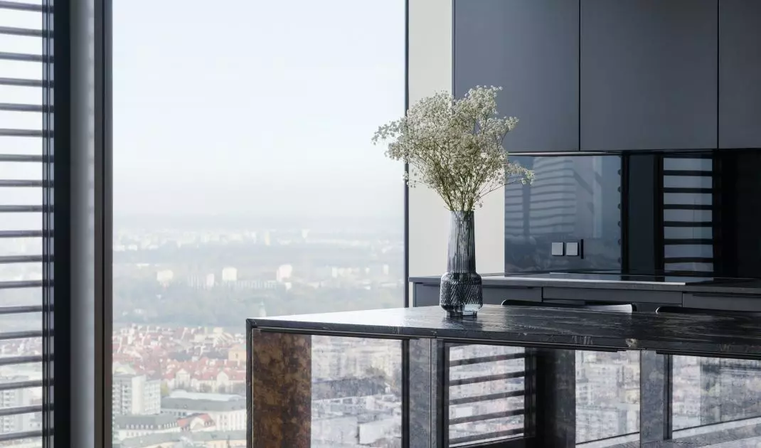
High above the streets of Warsaw, within the glass structure of the Cosmopolitan skyscraper, an interior has been created that does not attempt to compete with the surrounding panorama. Instead of bold decorations and an excess of forms, the space features fine materials, a restrained color palette, and carefully selected furnishings. In this 160-meter apartment designed by Matuszewski Studio, luxury is not a statement but a consequence of space, quality, and the deliberate restraint of resources.
Between Architecture and the Panorama
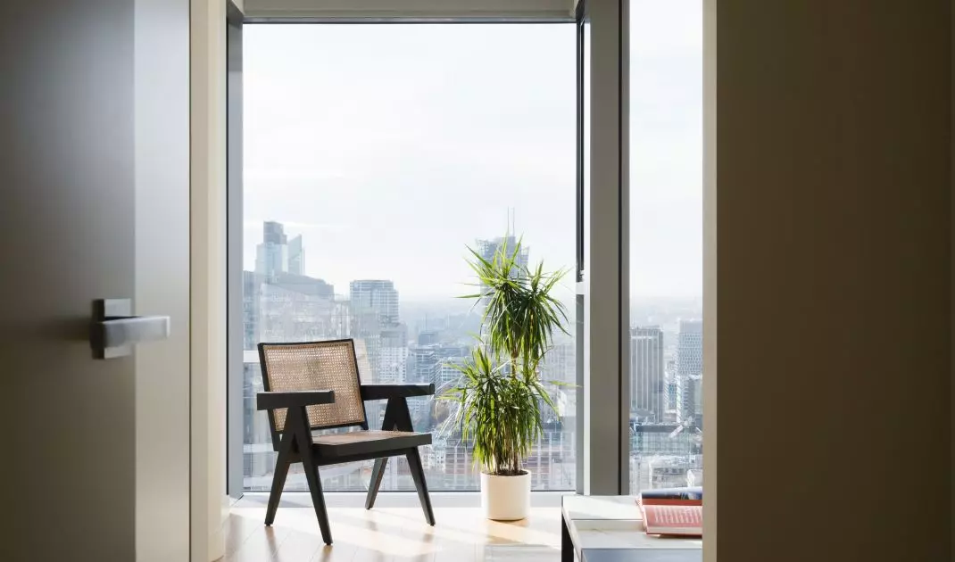
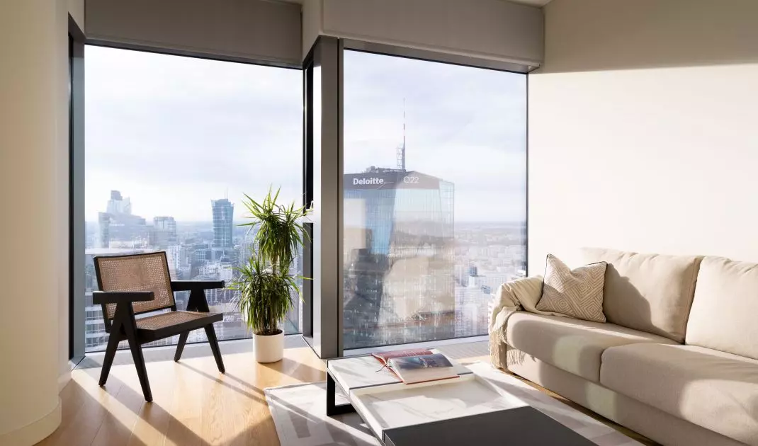
Apartments situated high above the city present a unique challenge to the designer. The expansive glass walls, shifting light, and ever-present landscape create a context that cannot be ignored during the design process. In this case, the Warsaw skyline is not merely an attractive view outside the window. It becomes an integral part of the interior, influencing how it is perceived at different times of the day. Hence, the starting point was not a specific style, but an attempt to find a balance between the building’s architecture, the urban surroundings, and the residents’ everyday needs. The designers at Matuszewski Studio opted for restraint, which allows them to highlight what is most important about this location without sacrificing the apartment’s coziness and individual character.
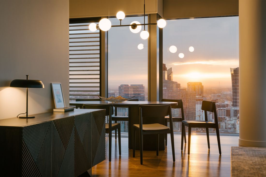
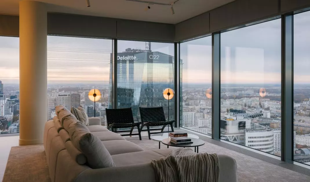
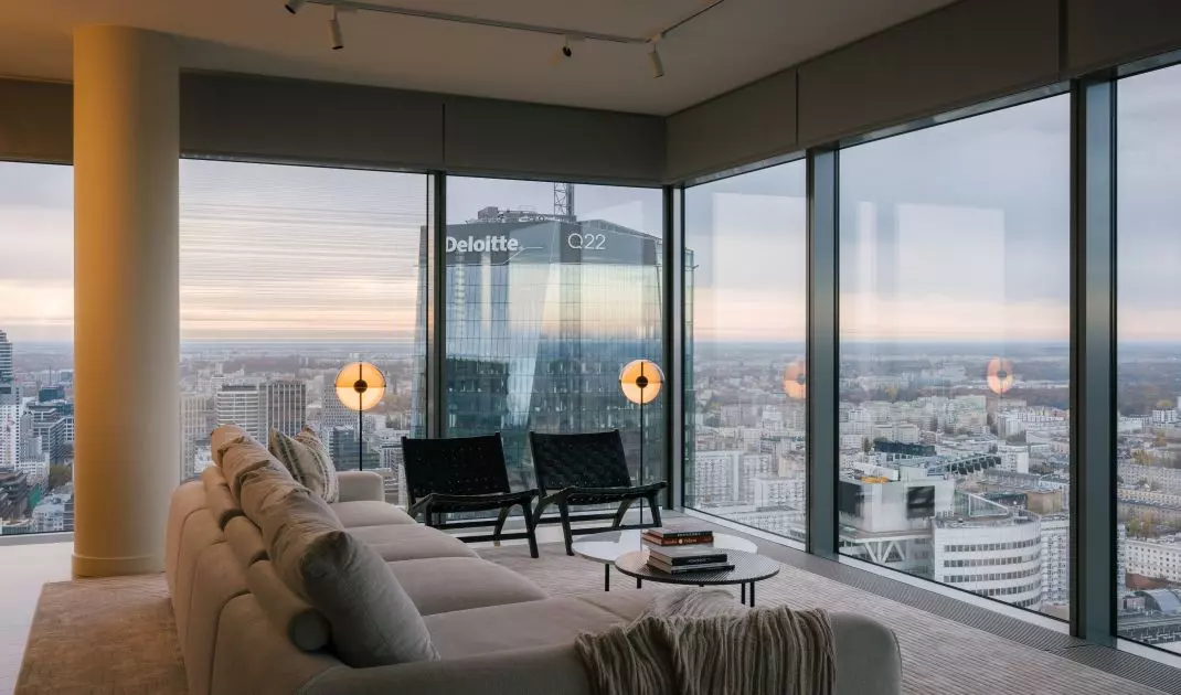
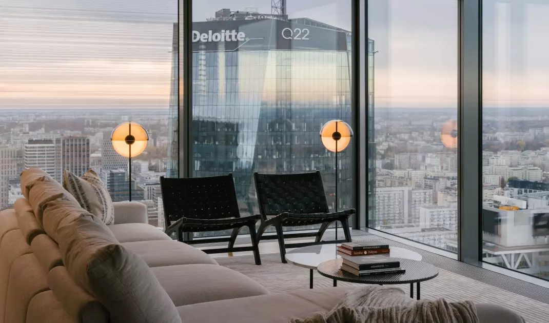
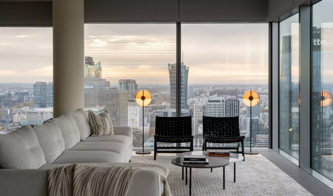
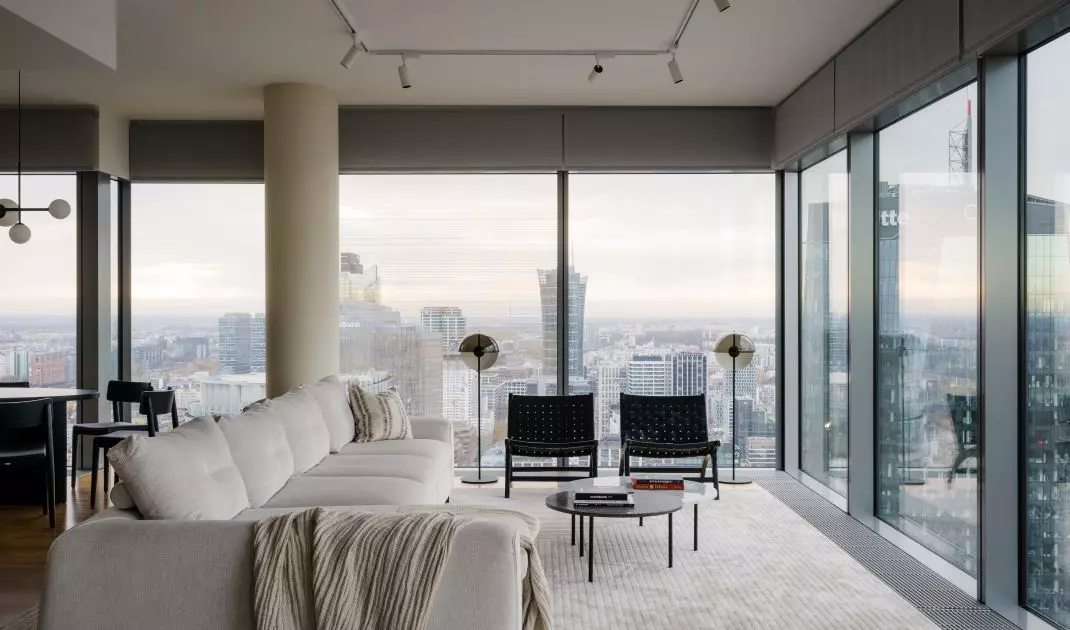
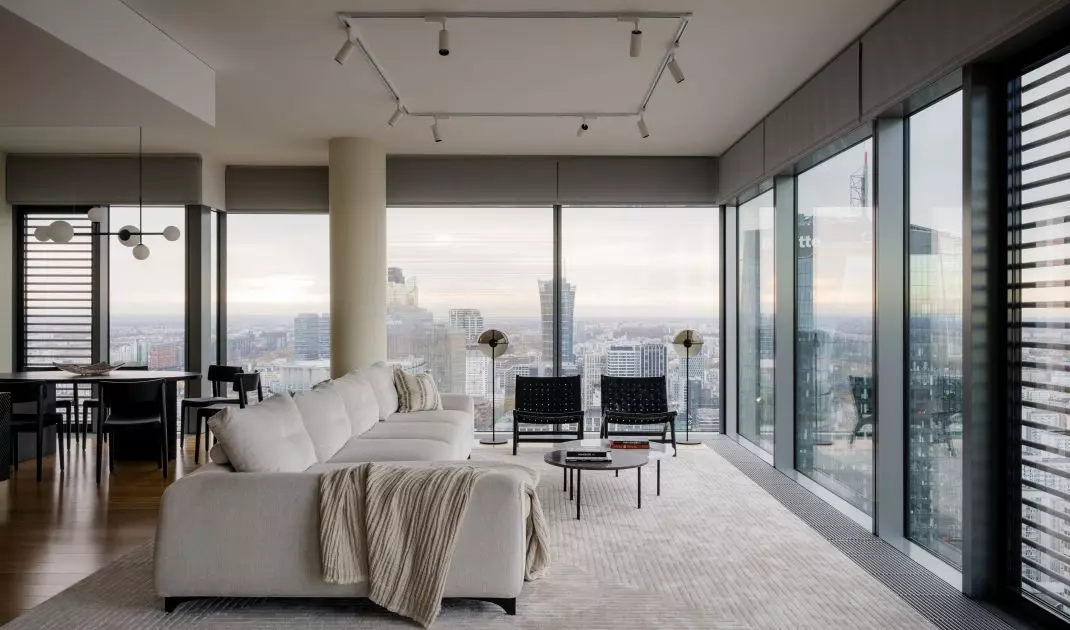
The apartment offers a view of downtown Warsaw.
Photo: Nate Cook
Minimalism that doesn’t sacrifice expressiveness
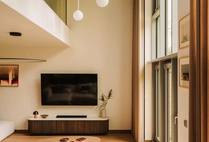
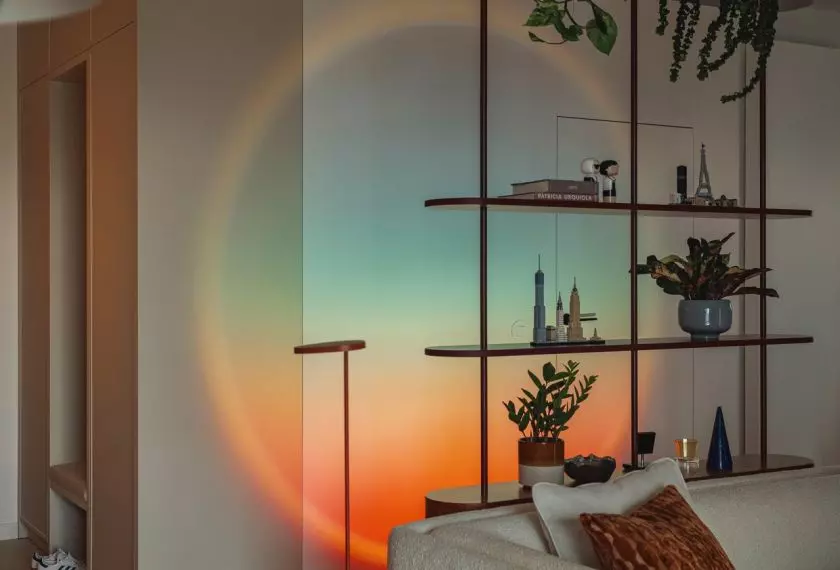
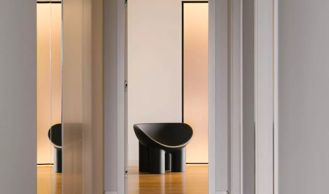
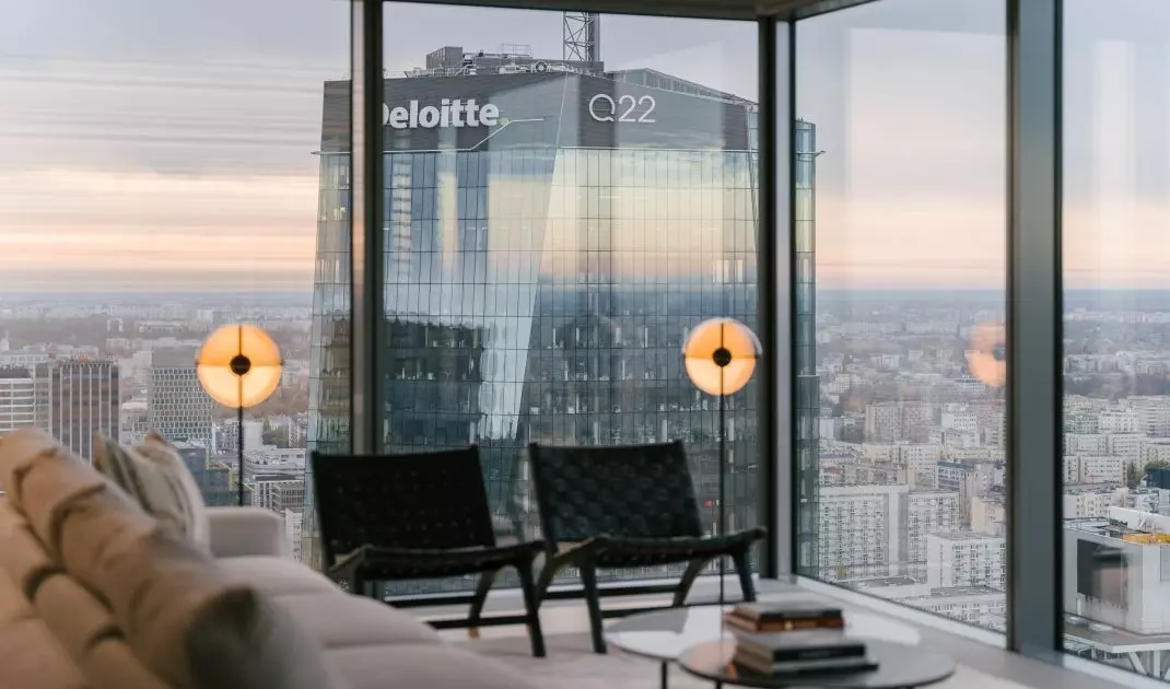
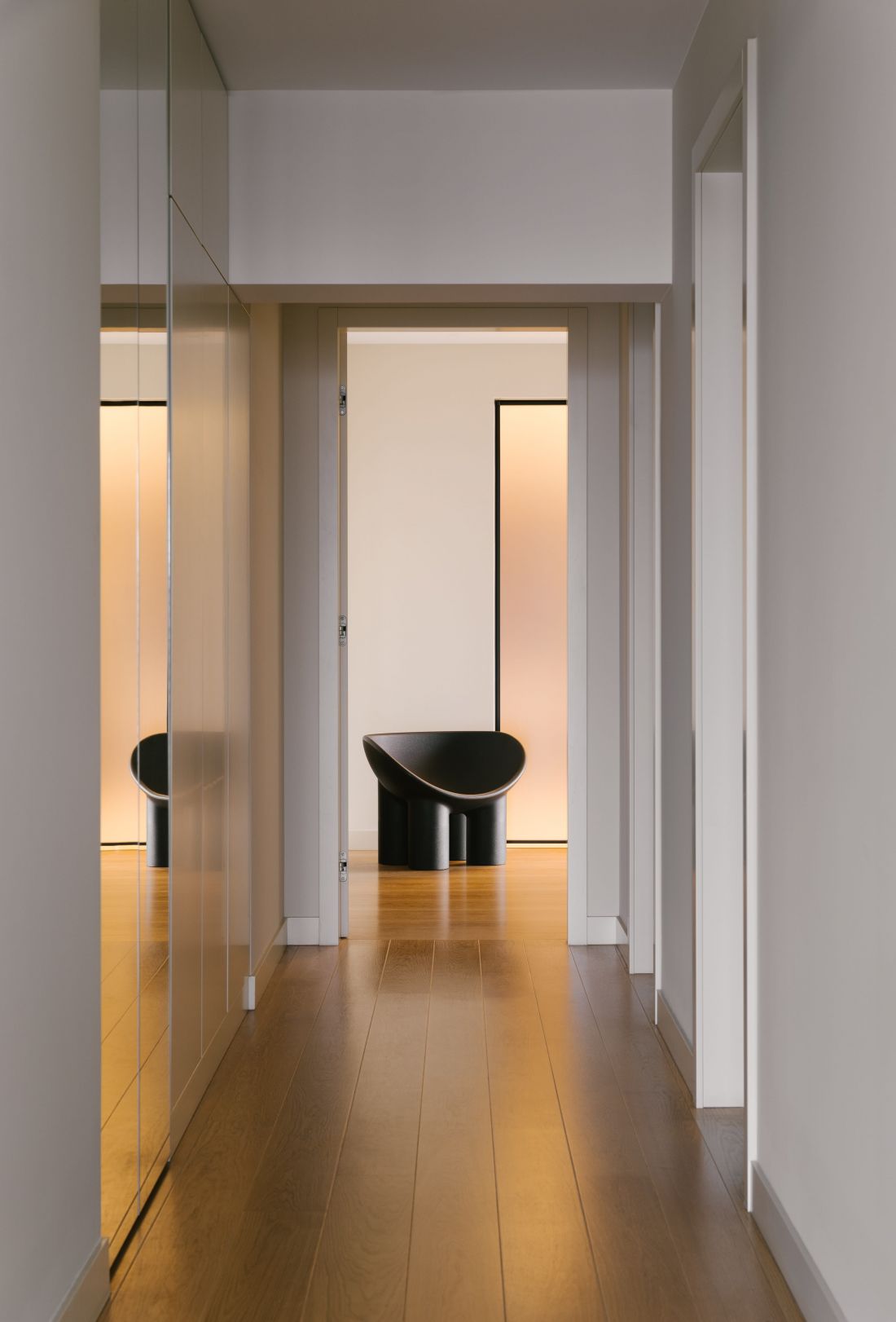
The apartment’s aesthetic is based on a limited color palette. Beiges, off-whites, deep browns, and graphite grays create a calm backdrop for varied textures. Wood adds warmth to the composition, dark surfaces lend it depth, and soft fabrics introduce a sense of visual lightness. Rather than defining the interior’s character through numerous decorations, the designers rely on proportions, materials, and details. The simple base is complemented by the furnishings. In the living room, a soft, light-colored sofa is paired with black armchairs featuring a lightweight design and small coffee tables. The contrast between the upholstered pieces and the slender furnishings helps maintain a balance between comfort and visual discipline. In the evening, the composition is enhanced by the light from the lamps, which highlights textures and lends the interior a more intimate character.
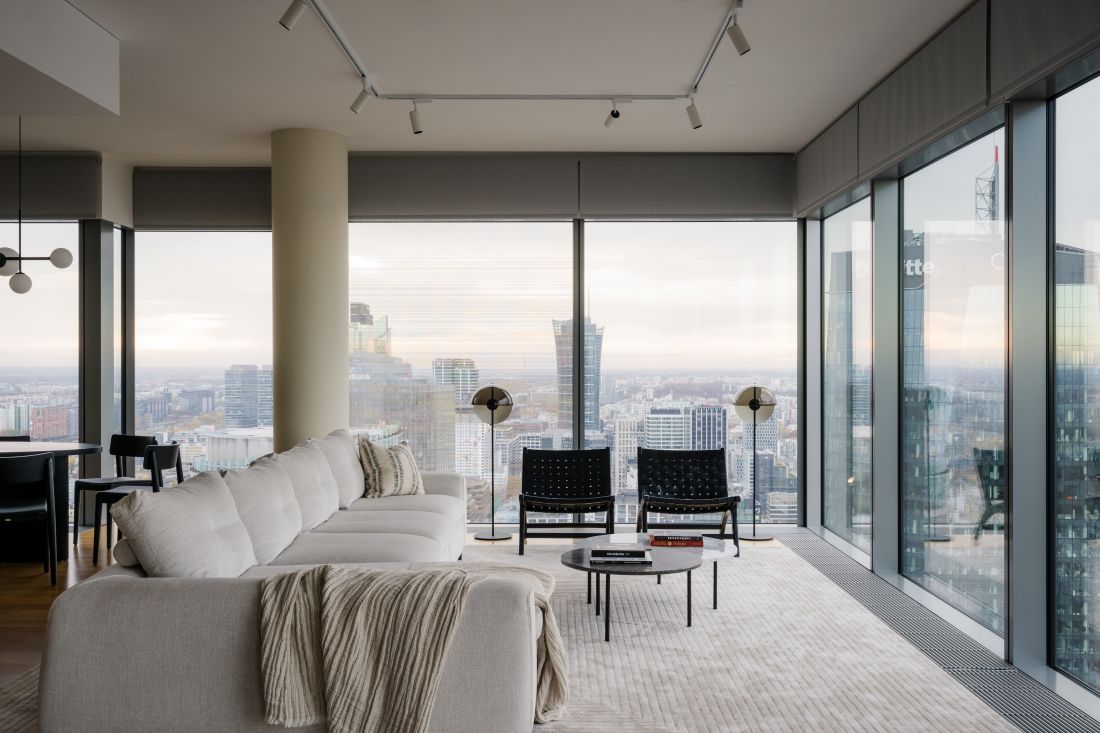
The monochromatic base blends seamlessly with the outdoor landscape.
Photo: Nate Cook
A geometric kitchen bathed in dark colors
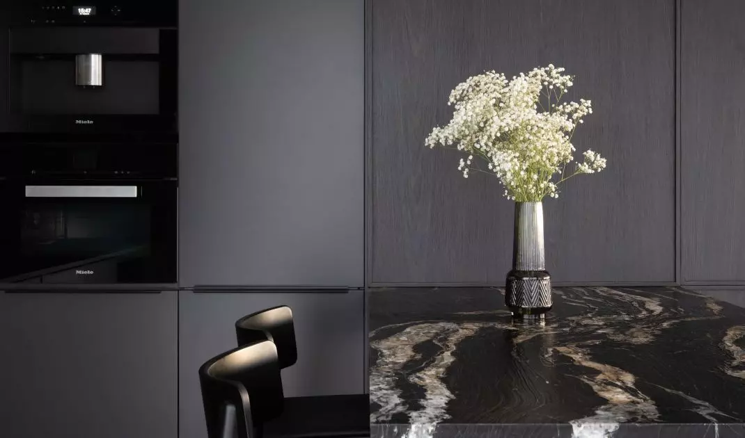
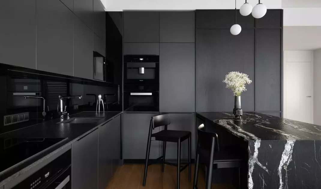
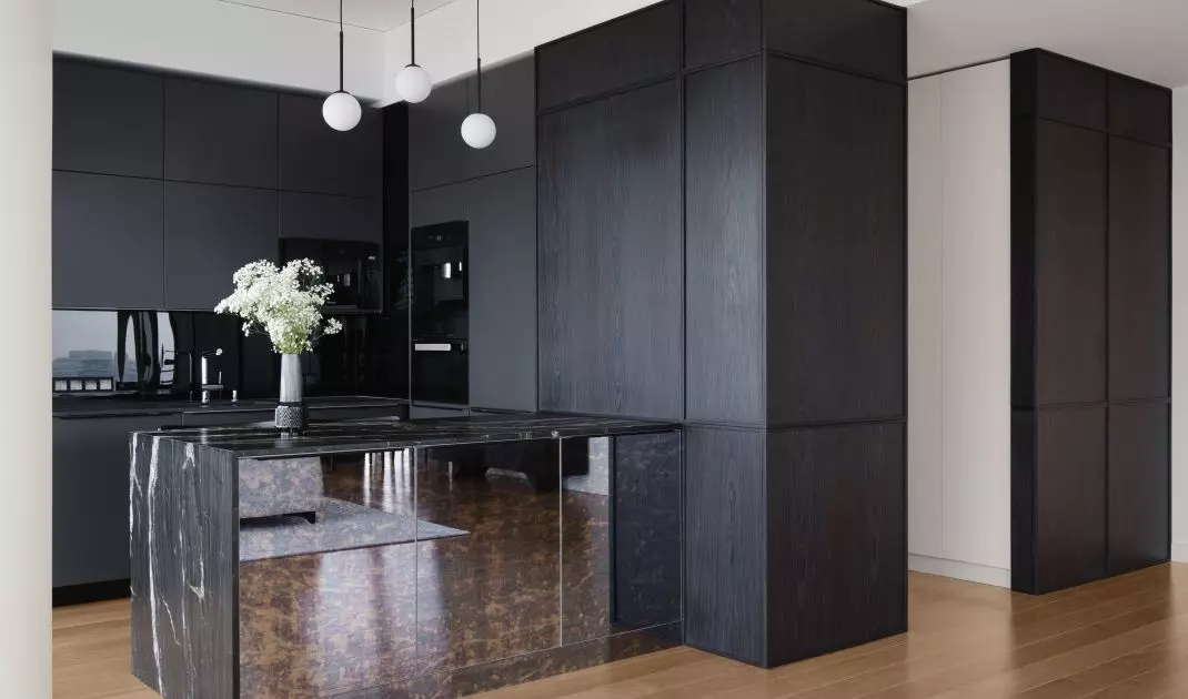
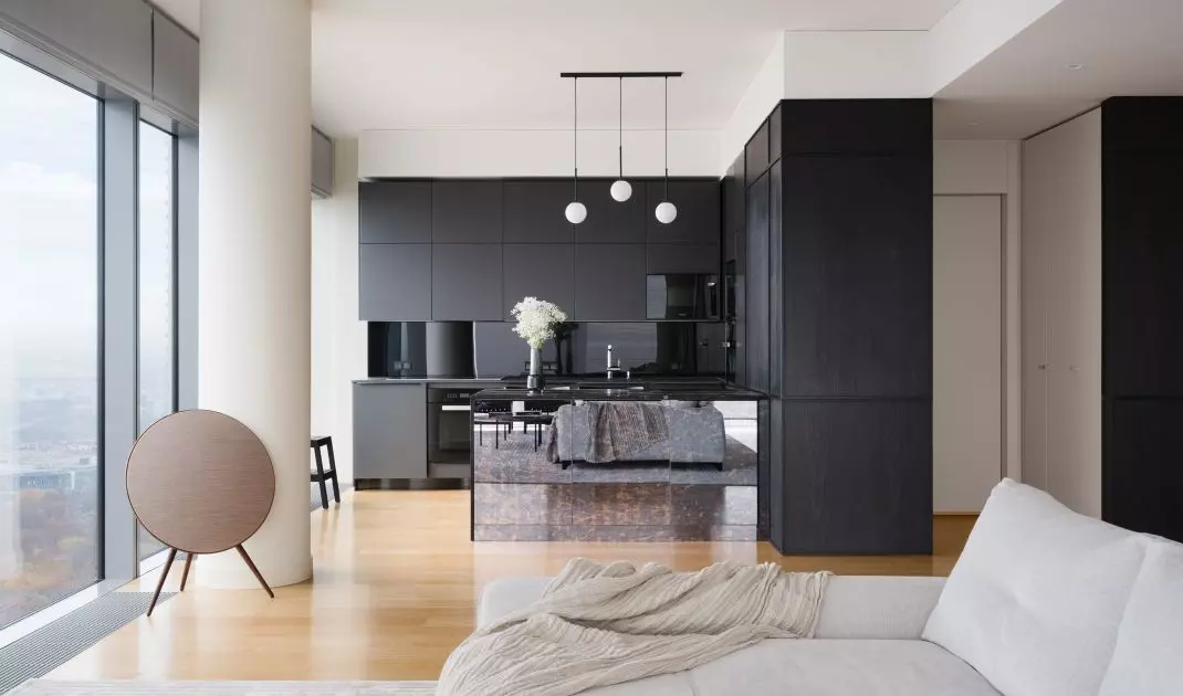
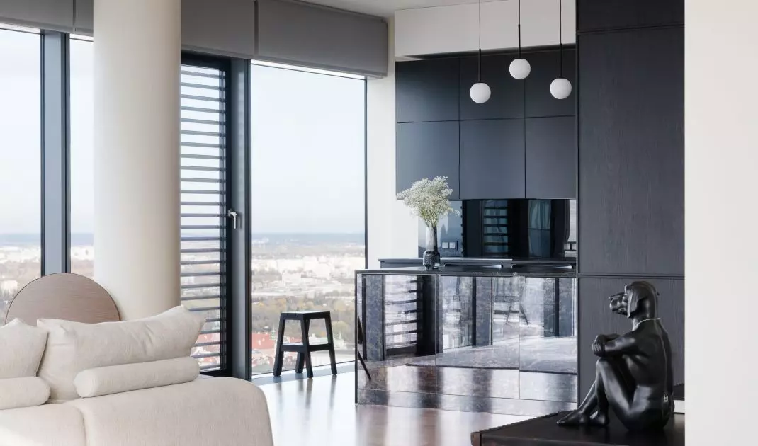
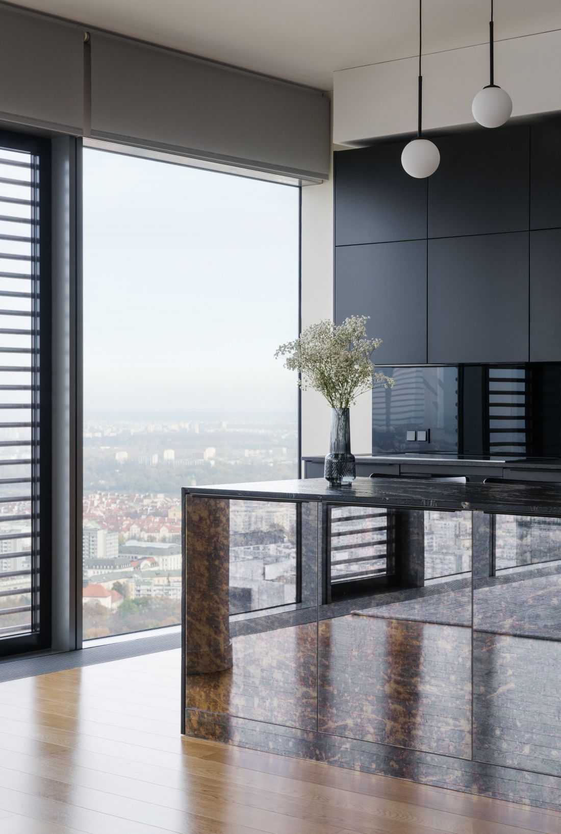
The kitchen also serves as a striking focal point. The dark, almost monochromatic cabinetry blends into the architecture, creating an orderly backdrop for the island with its decorative, stone-inspired surface. Its pattern breaks up the uniformity of the graphite-colored cabinet fronts without introducing an excess of color. The island’s geometric form and the material’s distinct pattern make it one of the most important elements of the composition. The open kitchen remains visually cohesive with the living room while retaining its own identity. This is an example of a design where functionality does not require sacrificing aesthetic consistency.
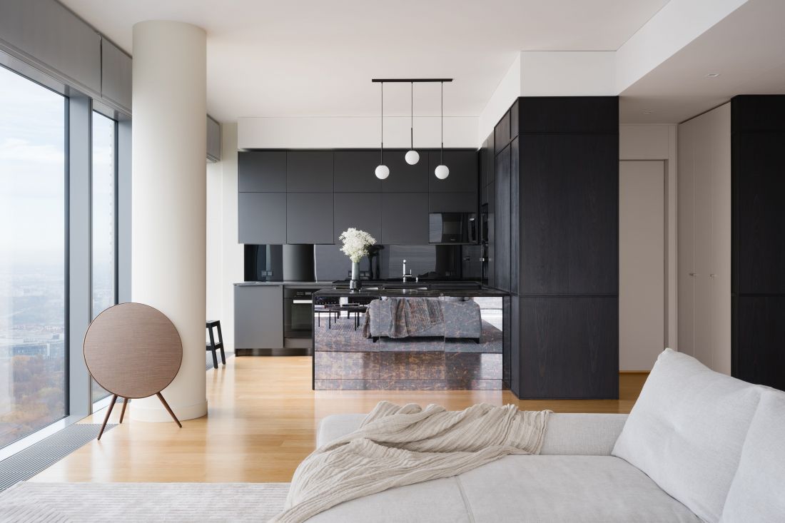
The dark kitchen stands out against the light-colored walls.
Photo: Nate Cook
Light as an Element of Composition
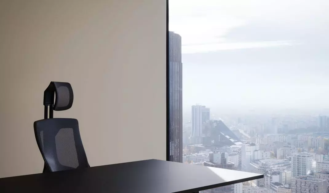
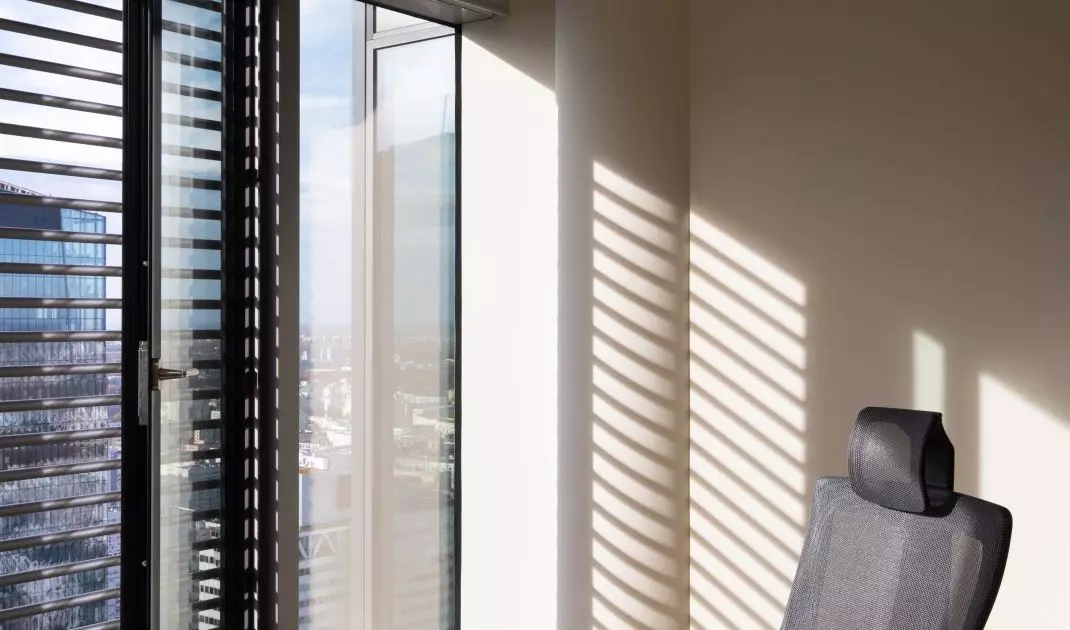
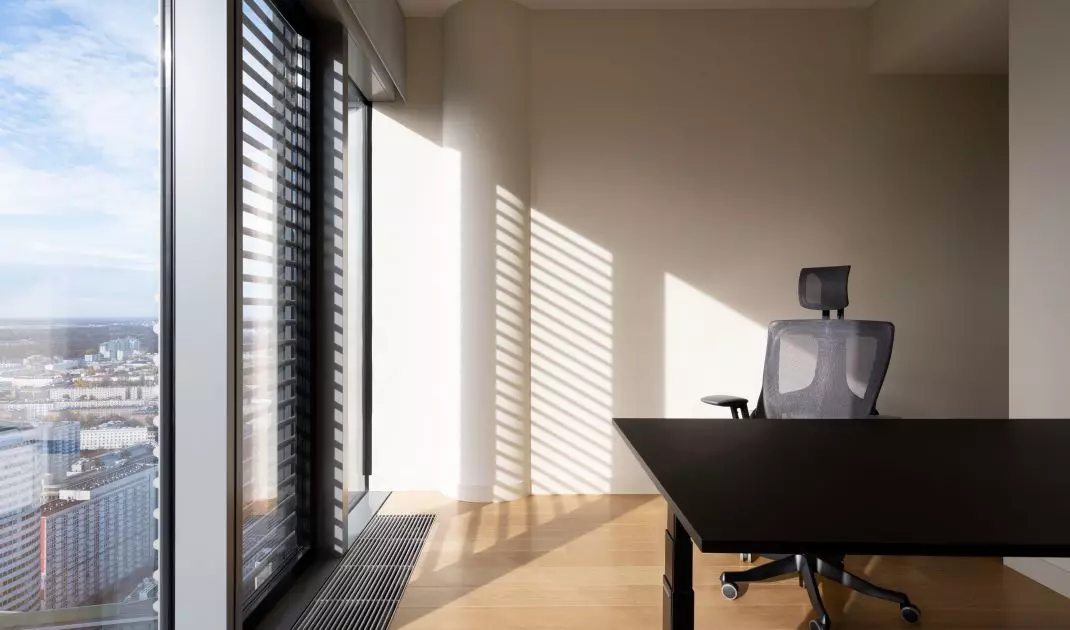
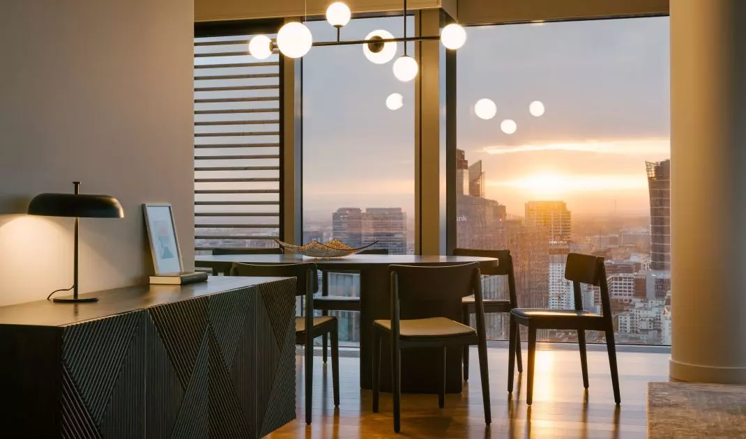
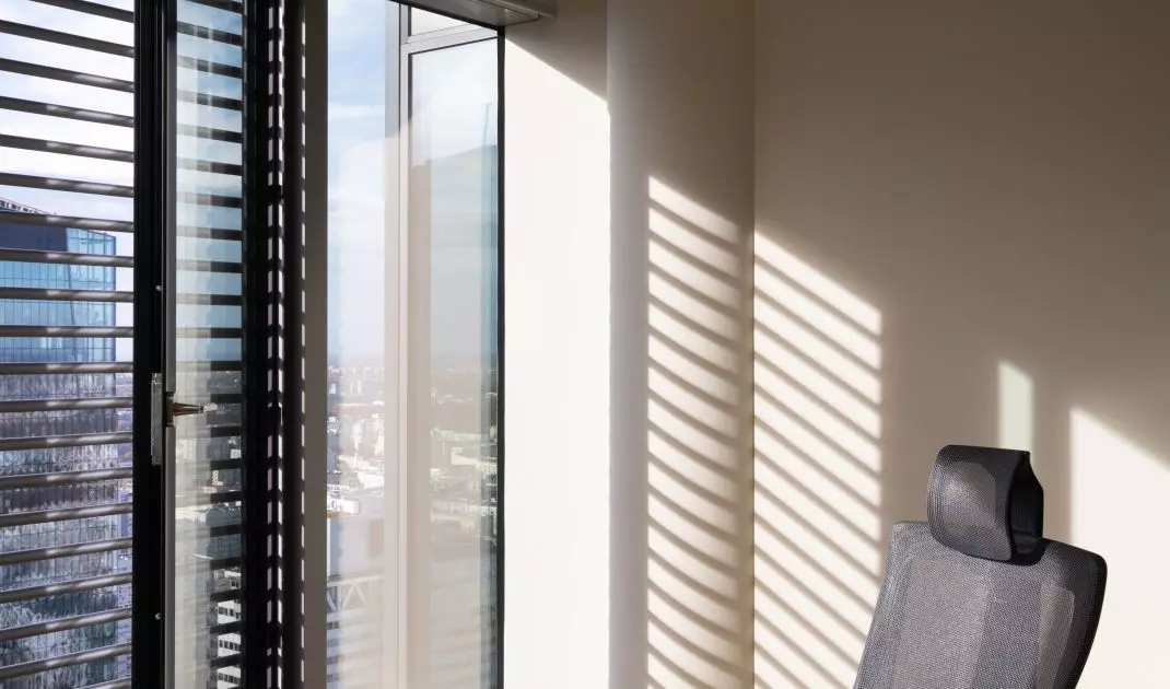
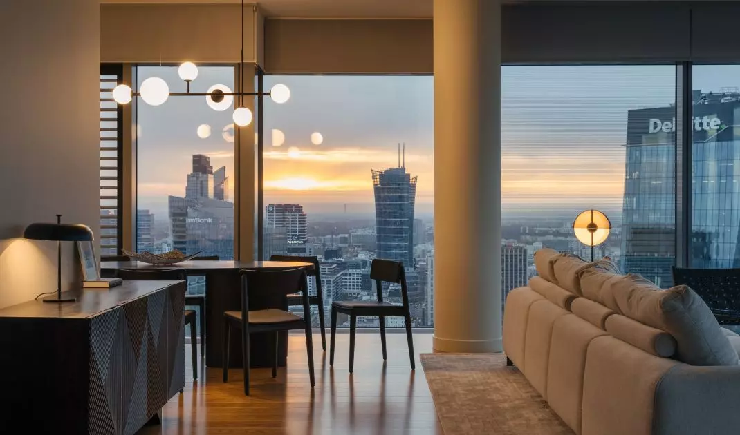
In this high-rise apartment, natural light constantly transforms the character of the interior. The cool morning rays highlight the minimalist use of materials and the graphite-colored surfaces, while the setting sun brings out the warm tones of the wood and beige fabrics. After dark, the focus shifts toward artificial lighting. The design incorporates various types of fixtures, tailored to the functions of each zone. In the living area, floor lamps create intimate pools of light against the backdrop of the panoramic view. A composition of light fixtures with milky shades hangs above the table, providing a delicate counterpoint to the dark furniture and geometric built-in elements. In the study , however , more technical solutions were employed to support concentration and comfortable work. The window curtains are also important , as they allow for controlling the amount of light and reducing its intensity without completely blocking the view from the interior. Thanks to this, the windows remain one of the most important architectural elements of the apartment, regardless of the time of day.
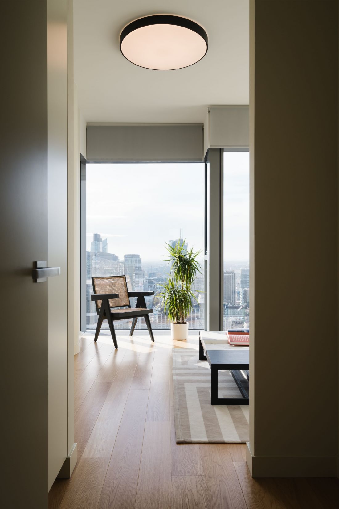
The light fixtures were selected to suit their respective functions.
Photo: Nate Cook
Privacy Designed Differently
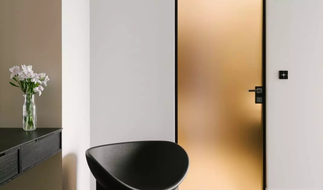
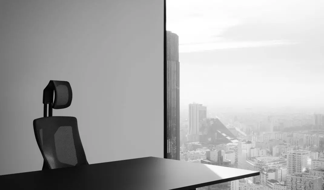
Although the open living area forms the heart of the apartment, the other rooms are not simply an extension of it. Each has been given its own character, reflecting its distinct function and the needs of its occupants. The bedroom is more atmospheric and serene. The dark, upholstered headboard contrasts with the light-colored bedding, and the wall behind the bed is covered with decorative wallpaper featuring a bird motif. Its golden-brown pattern adds a subtle decorative touch to the interior without overwhelming the other furnishings. The warm light from the wall sconces and soft textiles create an atmosphere conducive to rest. The study has a different character. Its furnishings are limited to the essentials: a desk, an ergonomic chair, and lighting that provides suitable conditions for work. Simple surfaces and a well-organized layout minimize visual distractions. In this part of the apartment, aesthetic restraint serves primarily as a tool to aid concentration.
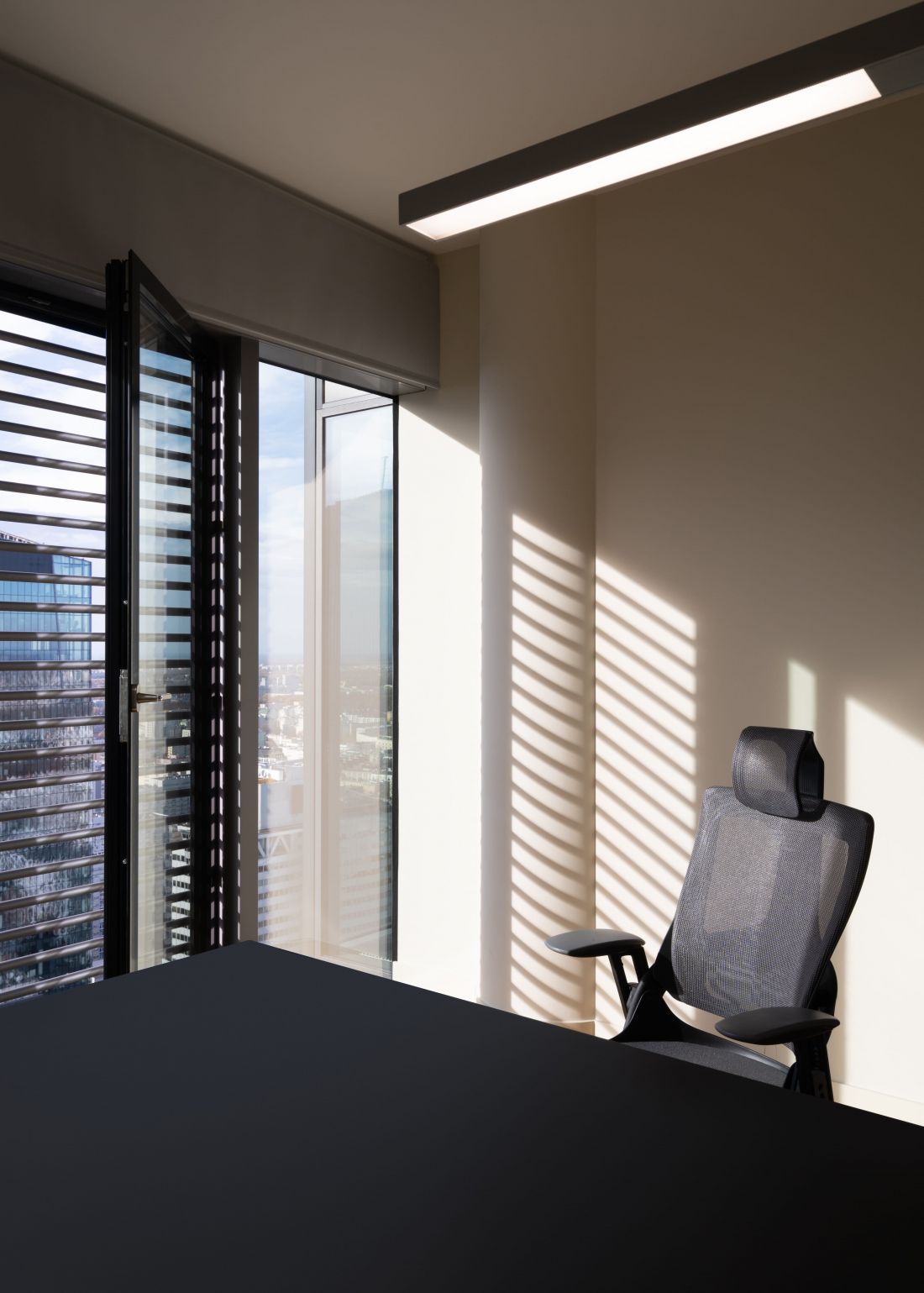
By limiting the design elements, the private area fosters a sense of calm.
Photo: Nate Cook
Bathroom: A Contrast of Textures and Refined Surfaces
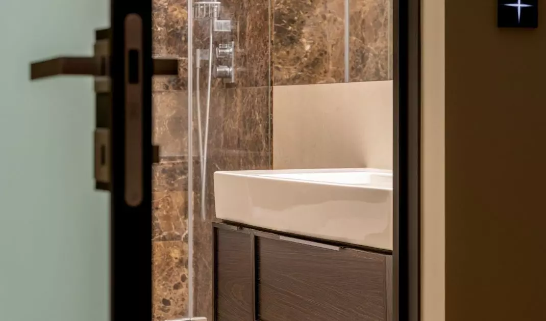
In the bathroom, the calm color palette gives way to the more pronounced texture of the materials. Walls finished with tiles featuring a dark brown stone pattern create a striking backdrop for light-colored surfaces, white ceramics, and the wooden vanity cabinet. The combination of dark wall tiles with a light-colored floor maintains a balance between decorative appeal and visual clarity. Large-format tiles minimize the number of joints, allowing the stone pattern to come through on a larger scale. The glass-enclosed shower area does not visually close off the room, while the simple forms of the ceramics and fixtures bring order to the composition. This interior has a more assertive character than the rest of the apartment, yet it still adheres to the same principle: a limited number of materials, precise combinations, and a deliberate use of contrast.
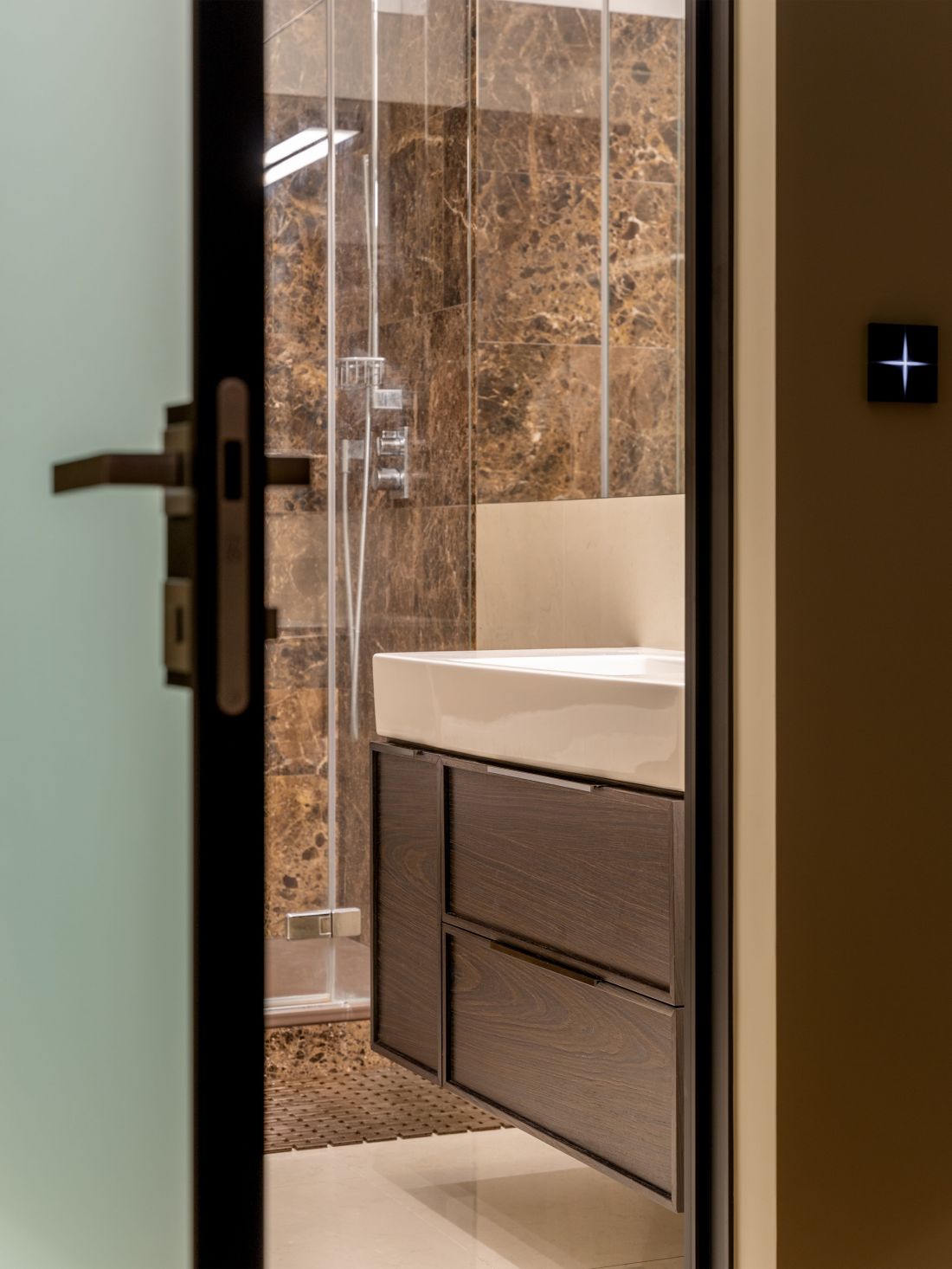
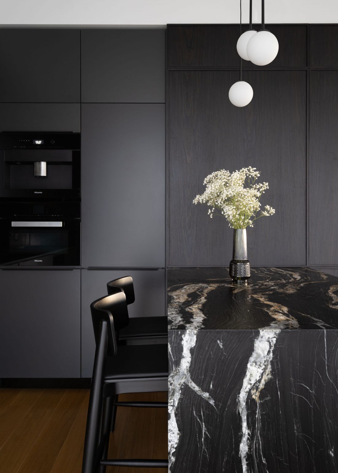
Stone and tiles with distinct patterns were used in the kitchen and bathroom.
Photo: Nate Cook
Individuality Instead of a Predefined Style
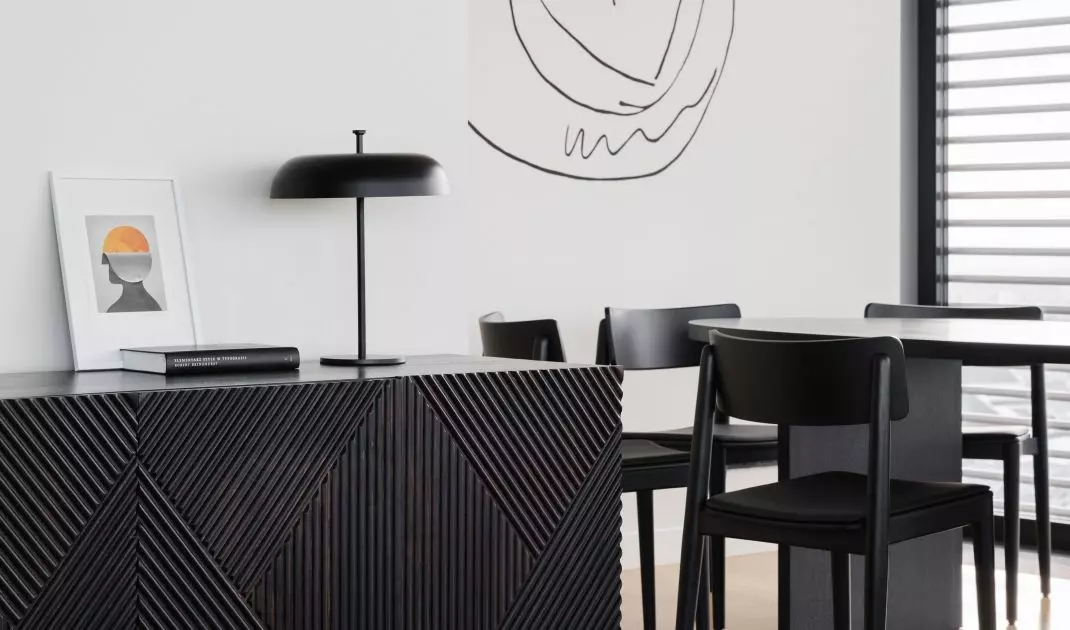
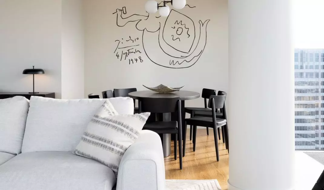
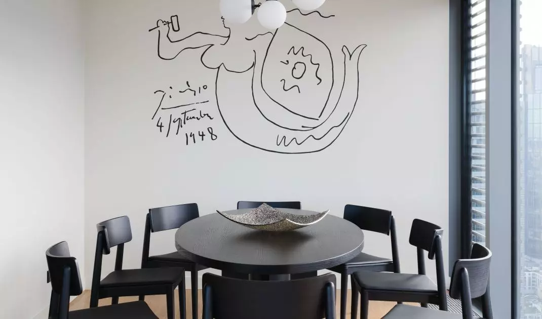
One of the apartment’s most distinctive elements is the drawing of the Warsaw Mermaid on the wall in the dining area. The motif references the famous drawing created by Pablo Picasso during his visit to postwar Warsaw in 1948. Introduced into the understated interior, it becomes not only a decoration but also a reference to the city’s history. Its presence is also significant from the perspective of the overall concept. In a minimalist space, a single, well-considered accent can be more expressive than an elaborate decorative composition. The drawing lends the dining room a sense of individuality while simultaneously anchoring the apartment in a specific place—not only geographically but also culturally.
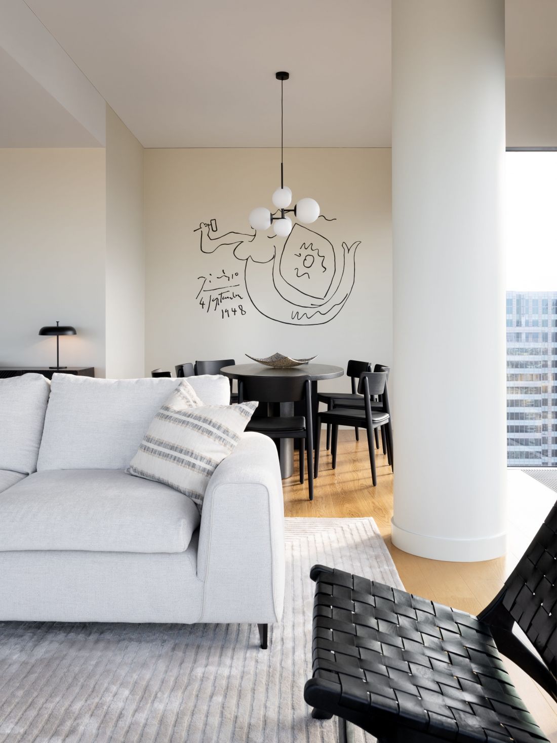
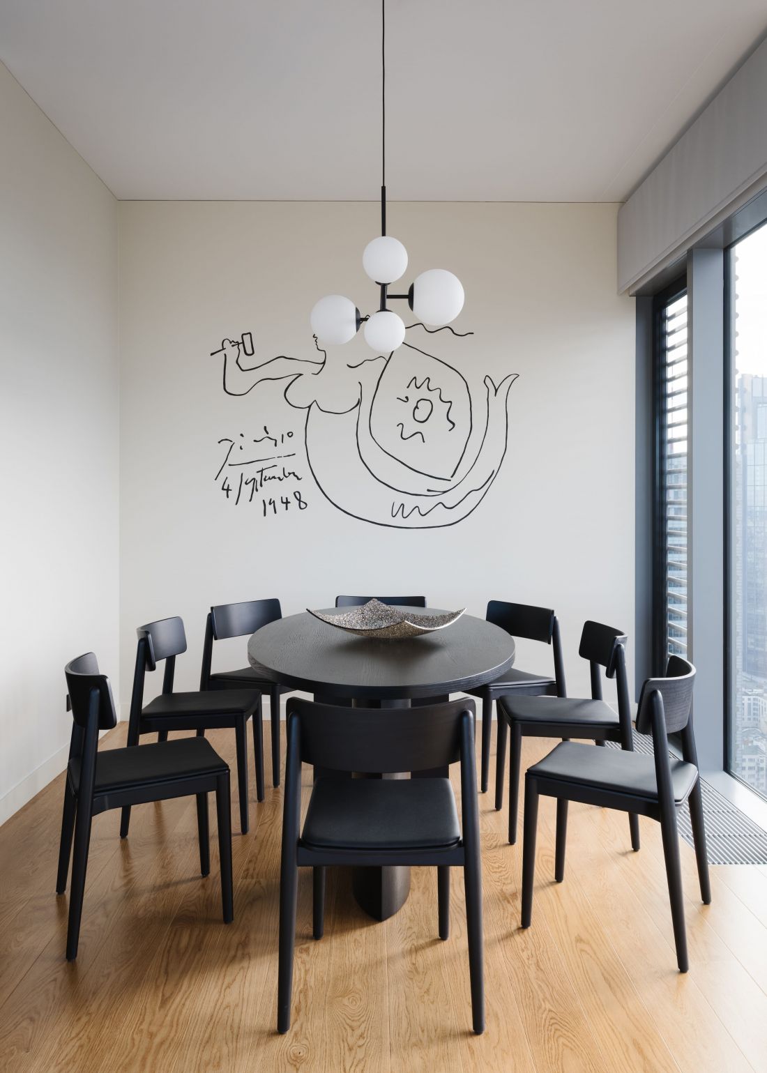
The artwork on the living room wall references a sketch by Pablo Picasso
Photo: Nate Cook
Luxury as the Quality of Everyday Life
This apartment in Warsaw’s Cosmopolitan shows that luxury can stem from space, light, and the quality of materials, rather than from visual opulence. The city skyline becomes a natural complement to the interior, and the minimalist composition allows one to focus on what matters most—comfort and everyday use. In this project by Matuszewski Studio, minimalism organizes the space without detracting from its individual character. It is an interior where the architecture engages in a dialogue with the city, creating a serene backdrop for the lives of its residents.