
Until recently, matcha was mainly associated with a cup of powdered green tea, known in Japanese ceremonies. Its intense, slightly sage hue had a soothing effect on the senses and became a symbol of attentiveness and harmony. Today, the matcha color is increasingly boldly moving beyond the kitchen and becoming an inspiration for interior designers around the world. The subtle, dim green is beginning to conquer apartments abroad, bringing calm, naturalness and freshness to them.
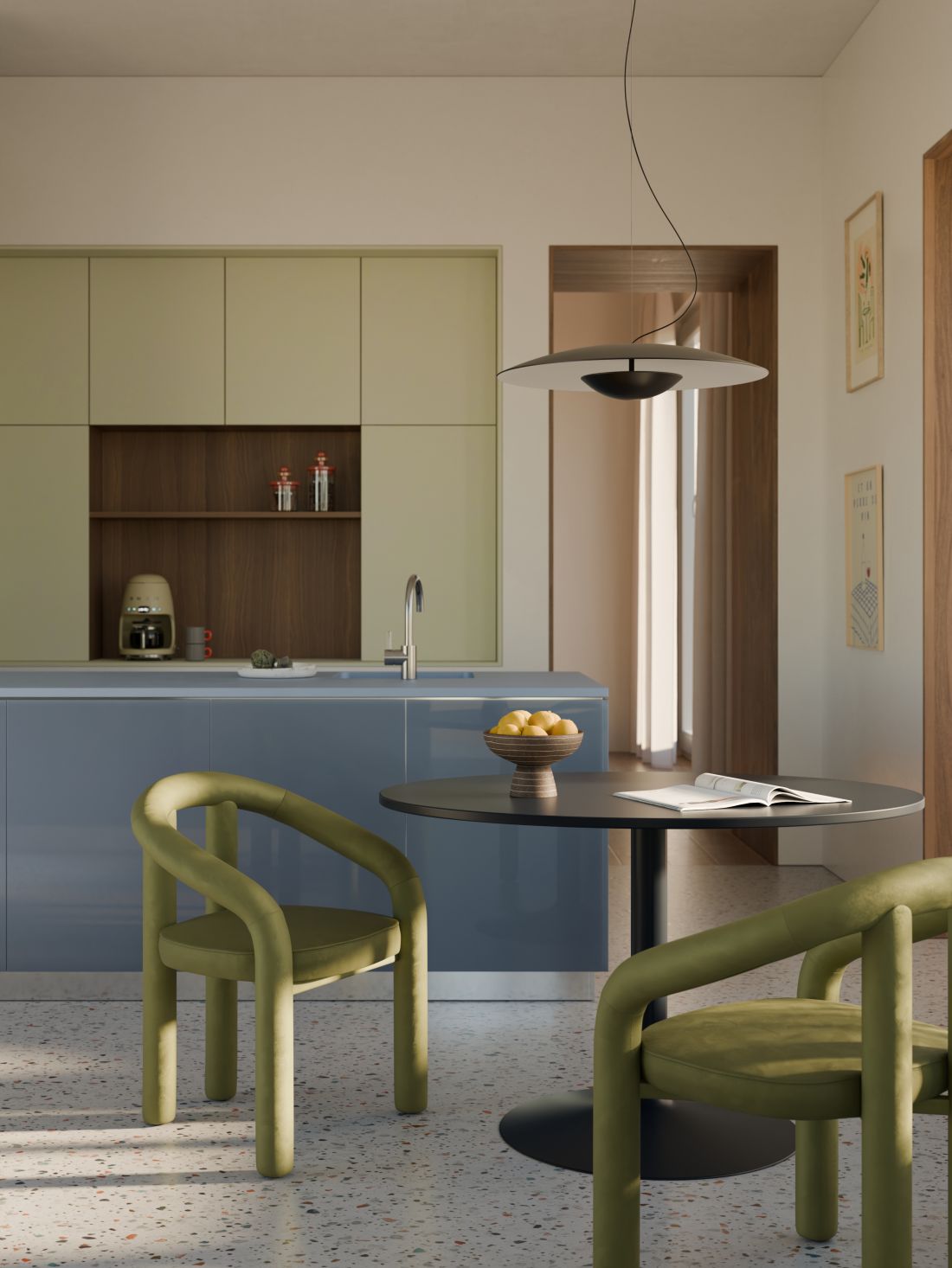
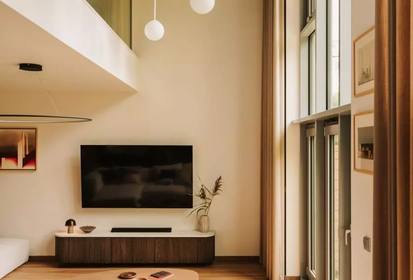
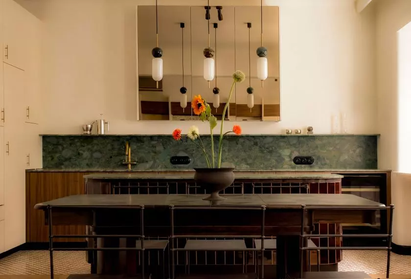
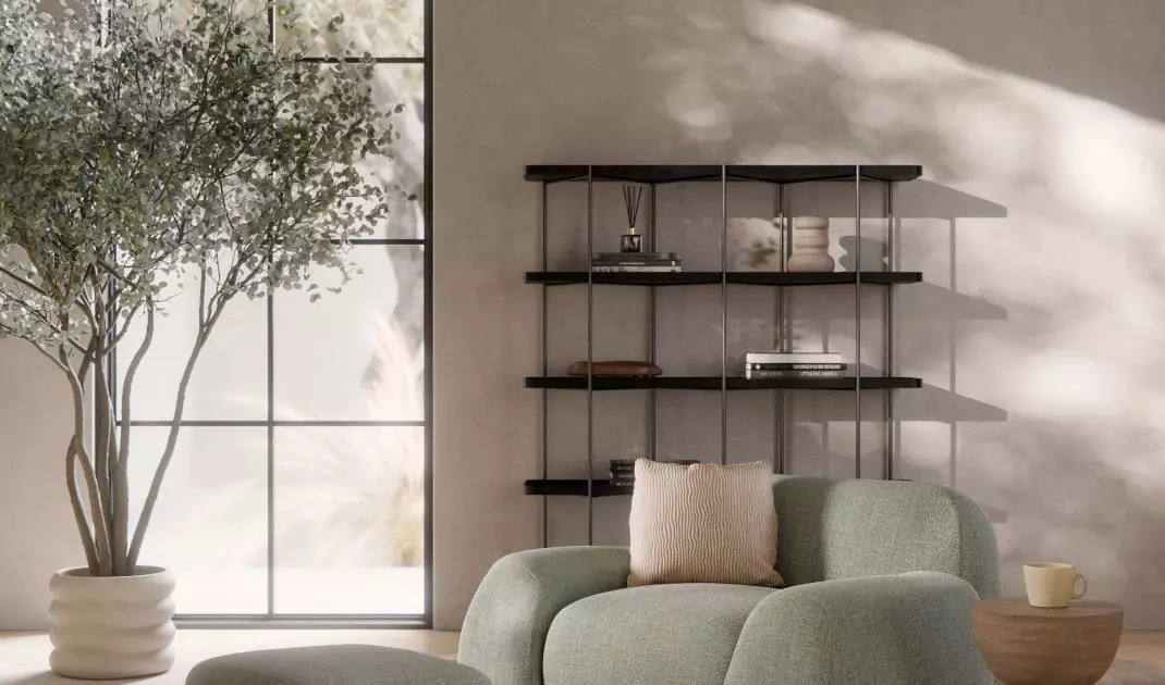
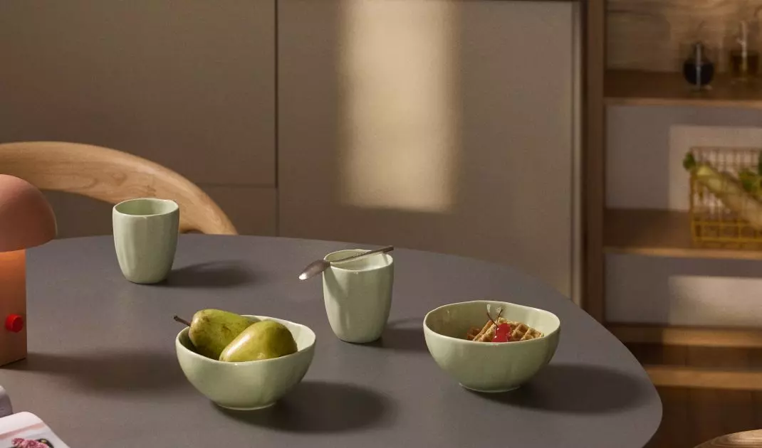
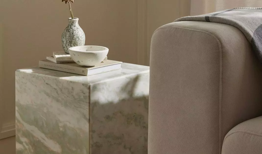
Increasingly, the growing trend of interiors inspired by shades of matcha can be seen in foreign interiors
© Westwing
But what exactly is this color?
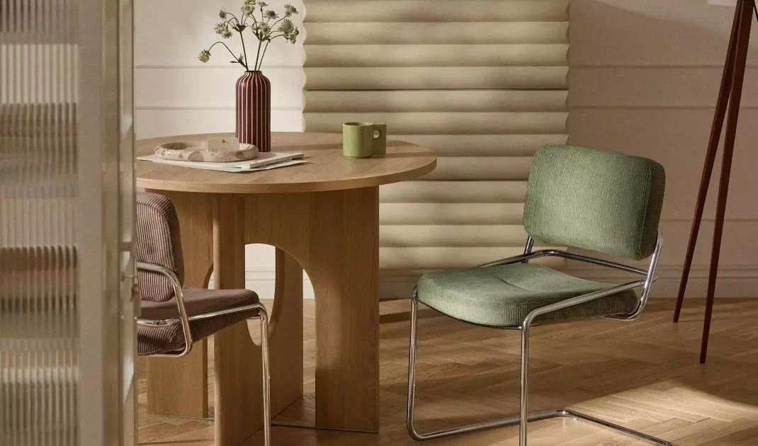
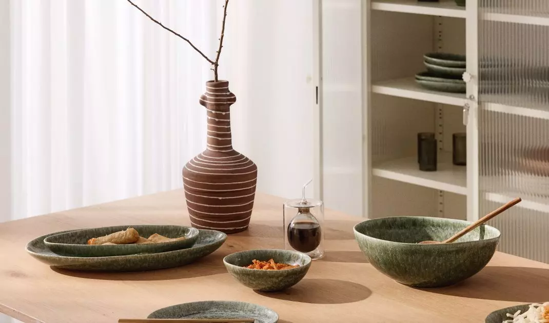
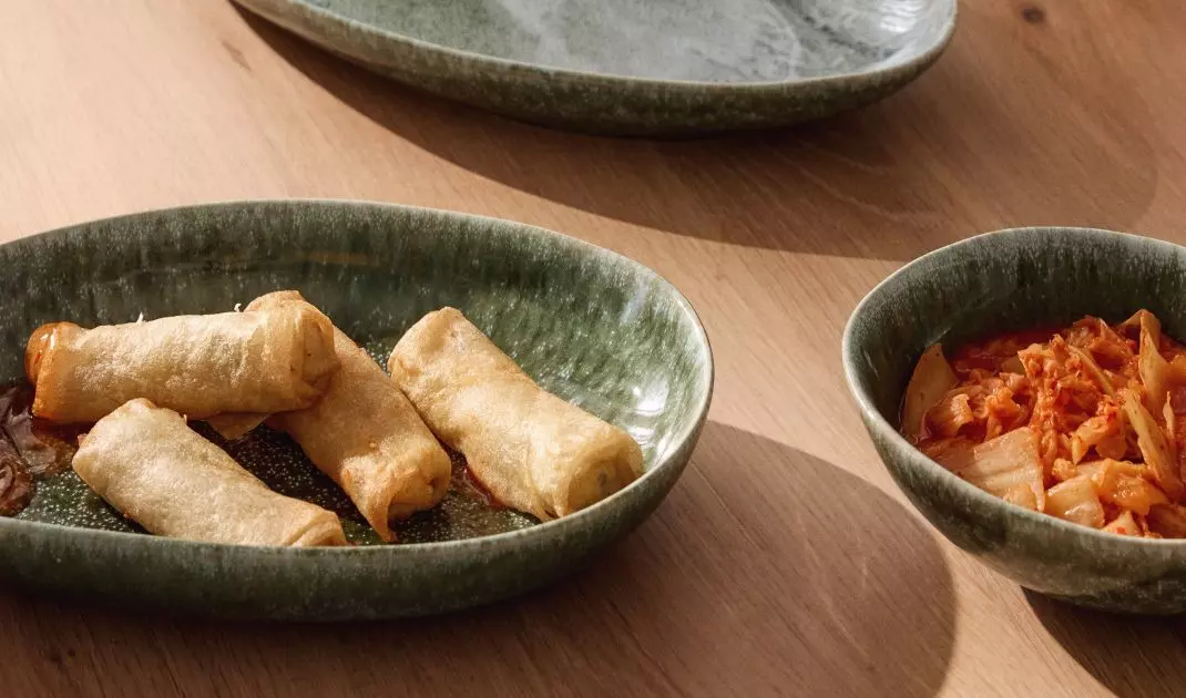
Matcha is a green bordering on pastel earth tones - more muted than the classic bottlegreen, yet more saturated than mint. This makes it perfect as a backdrop for natural materials and simple forms, creating spaces that don't tire, but promote regeneration. It's no wonder that the trend of "matcha interiors" is growing in strength and may soon become one of the most popular trends in interior design.
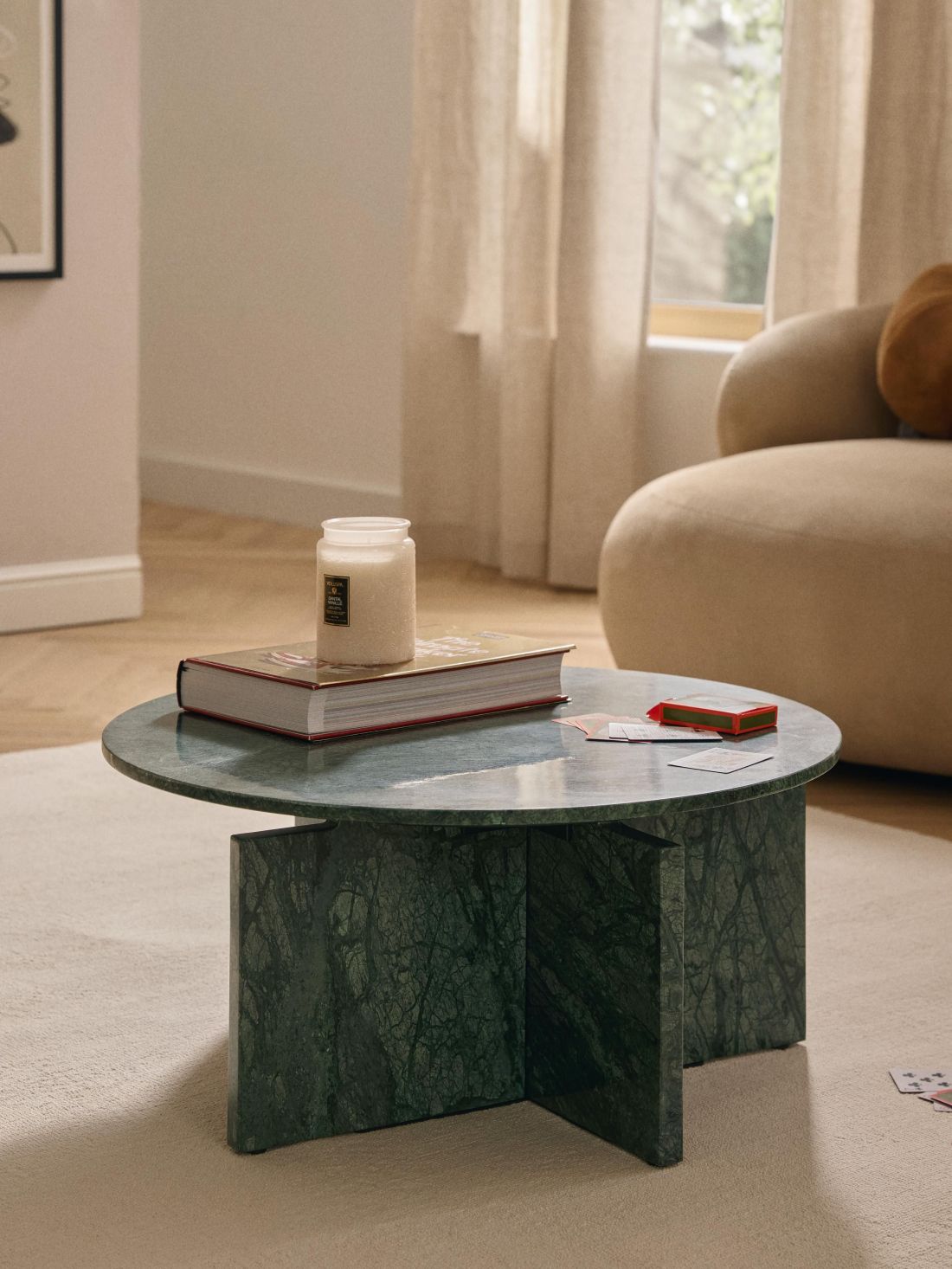
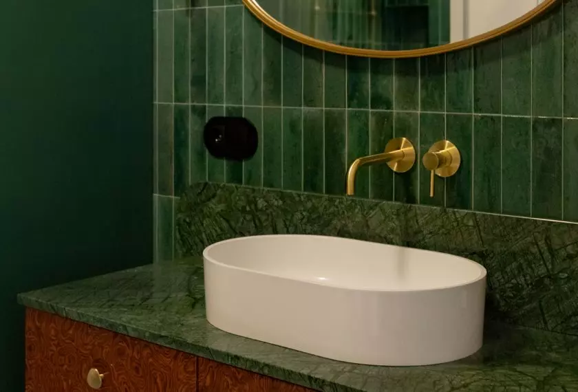
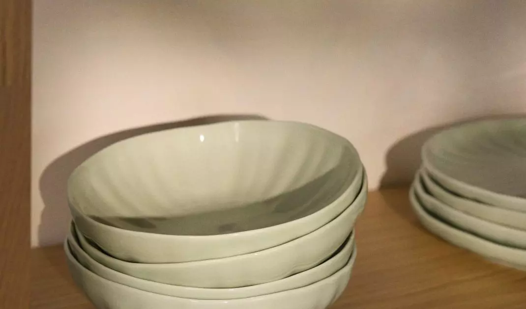
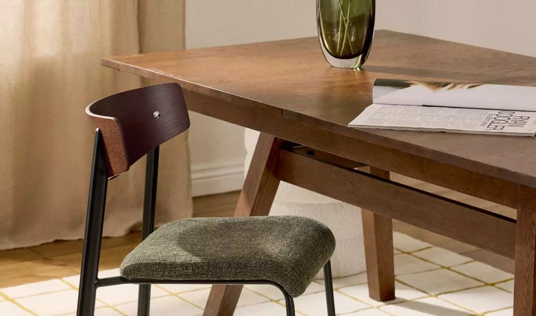
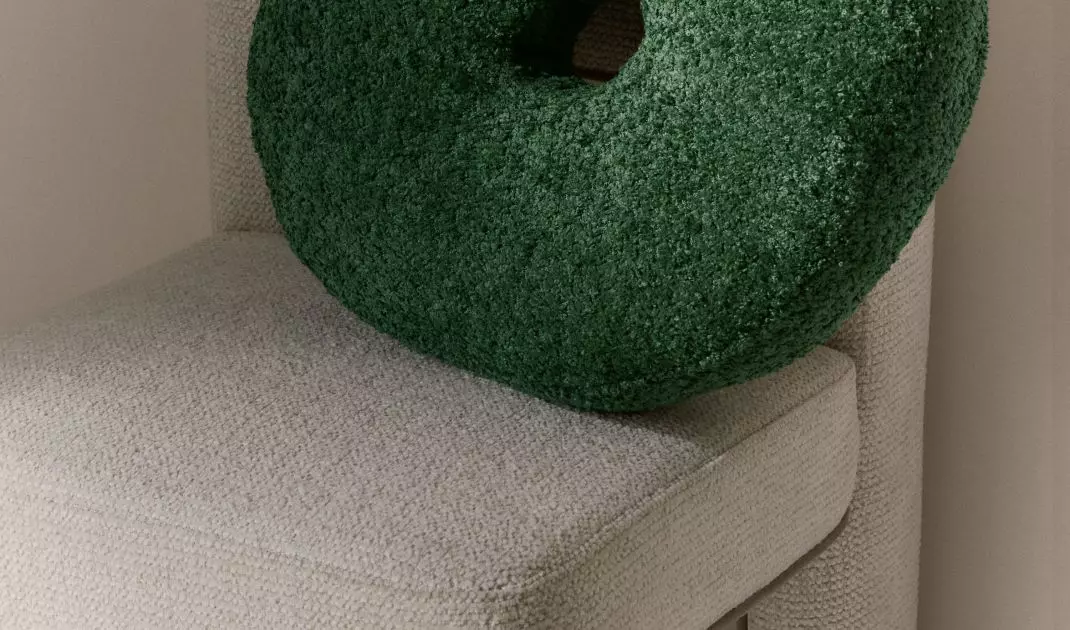
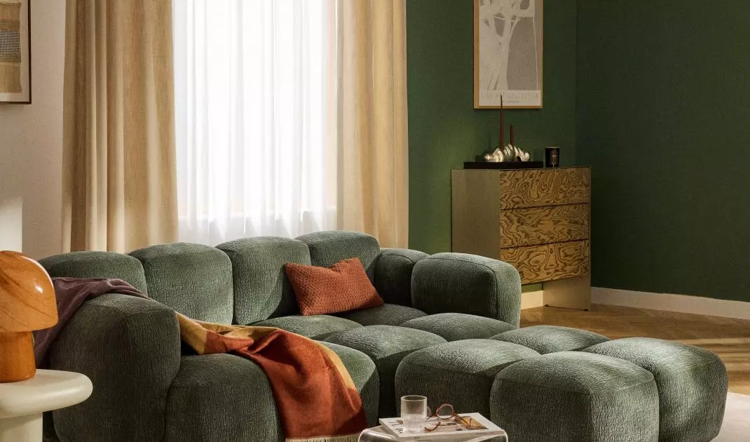
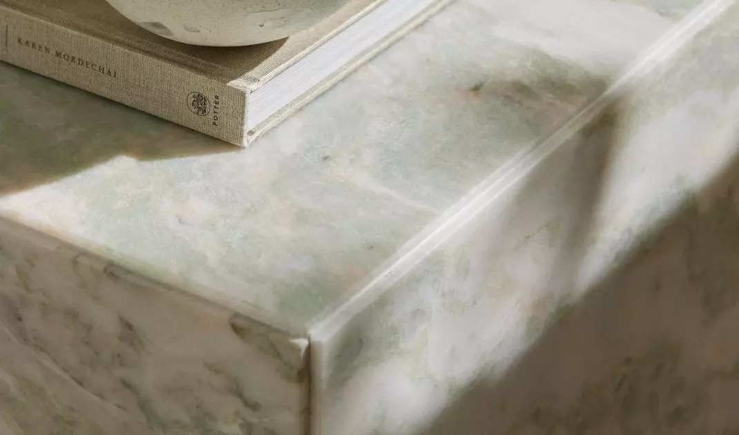
Green elements in the interior bring calm, relaxation and harmony, associating with nature
© Westwing
5 reasons why your home will love matcha style
1. peace and harmony at your fingertips
The matcha color is more than a shade of green - it's a way to create a space where you want to relax. When combined with wood, stone or linen fabrics, it creates an interior that soothes the senses from the first glance. More and more people are choosing to use it in living rooms, kitchens or bedrooms precisely to make everyday life more harmonious.
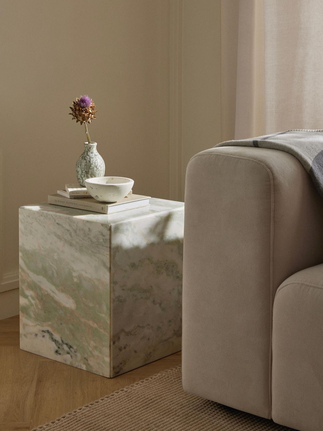
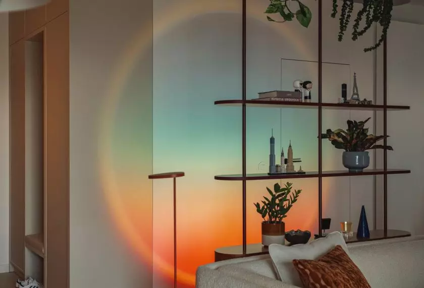
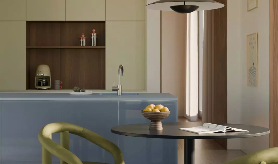
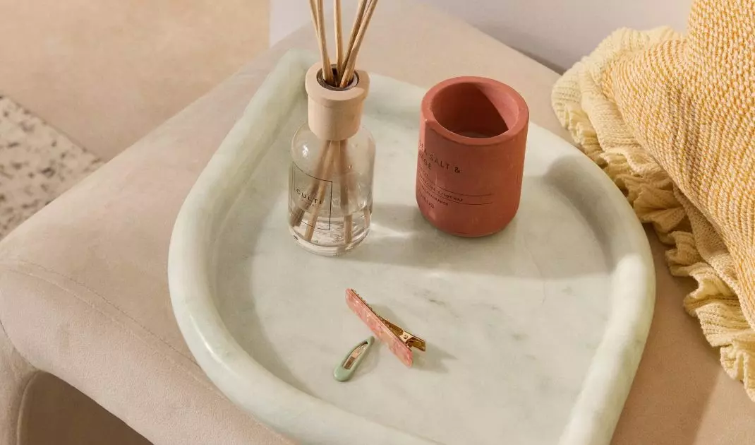
Even small accessories in this shade will make the interior take on a modern character
© Westwing
2. natural materials - the secret of coziness
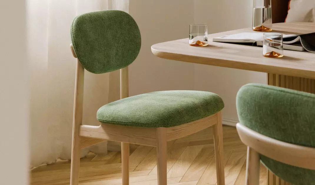
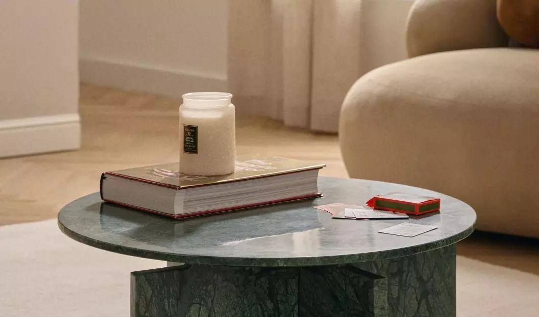
Matcha style does not exist without wood, stone, wicker or potted plants. These are what emphasize its character. Handmade accessories and natural textiles bring warmth and authenticity, making any interior take on a calm, balanced character.
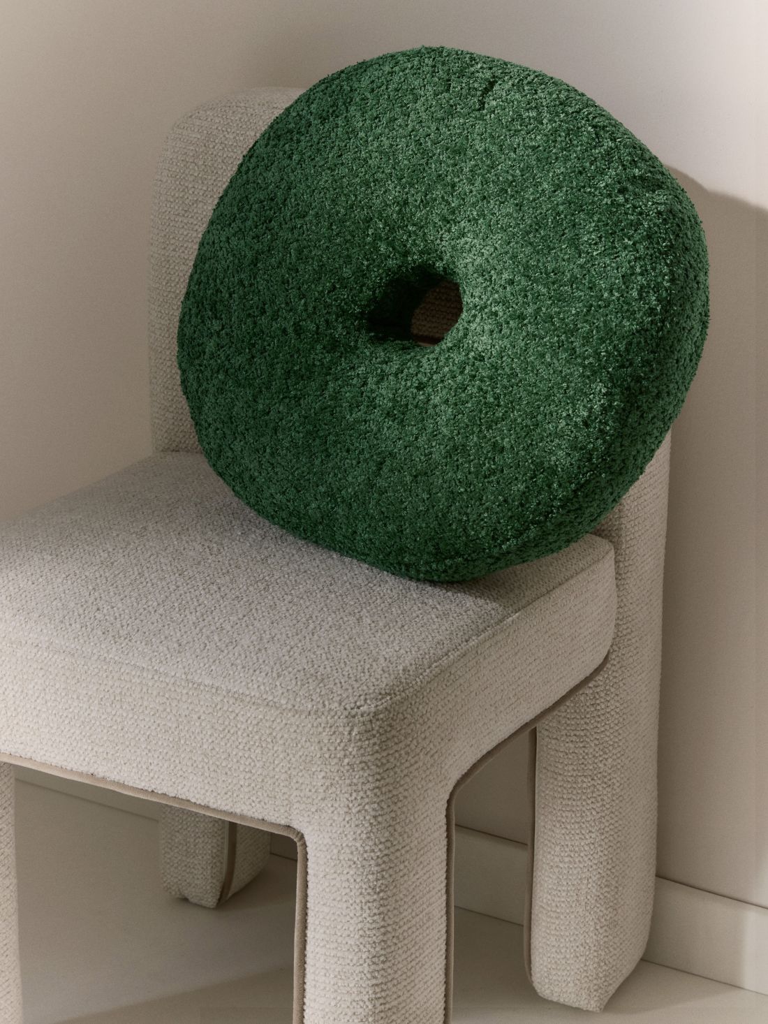
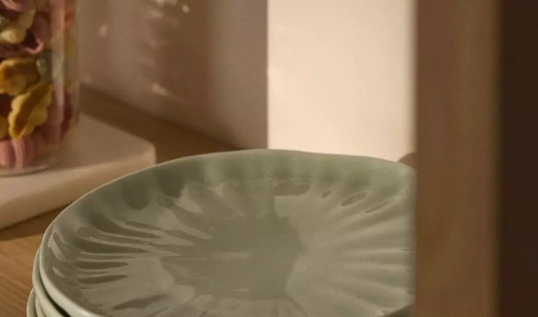
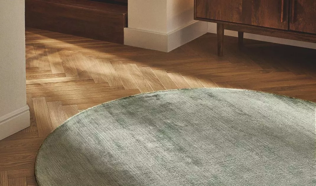
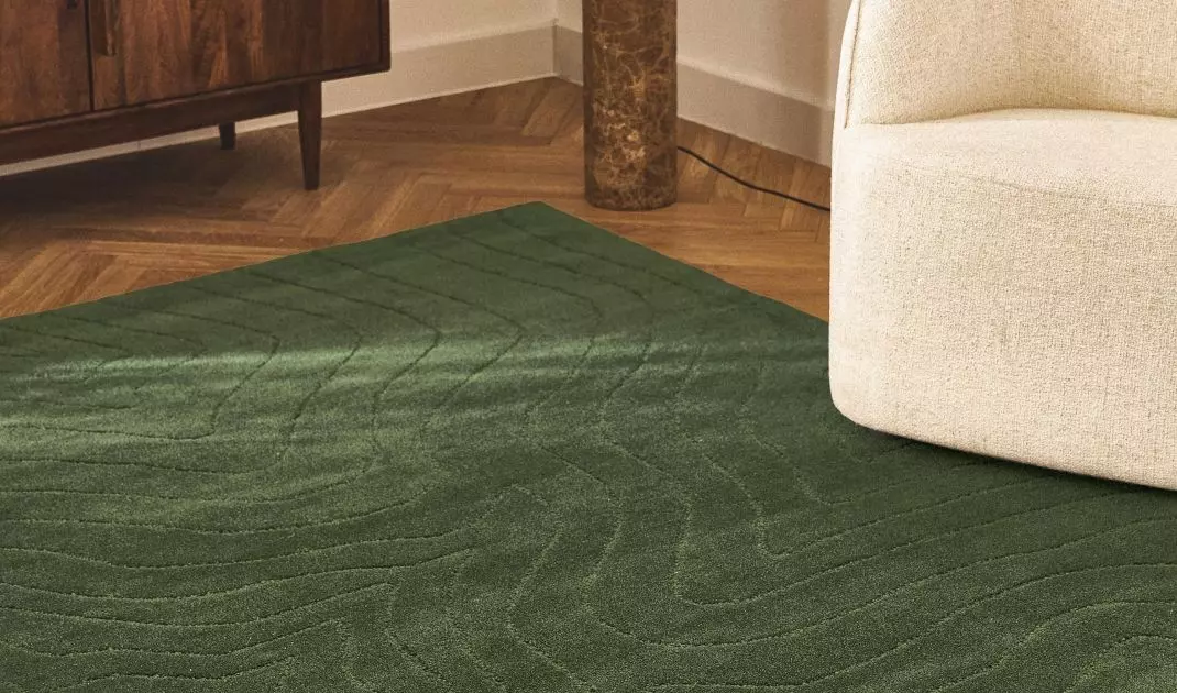
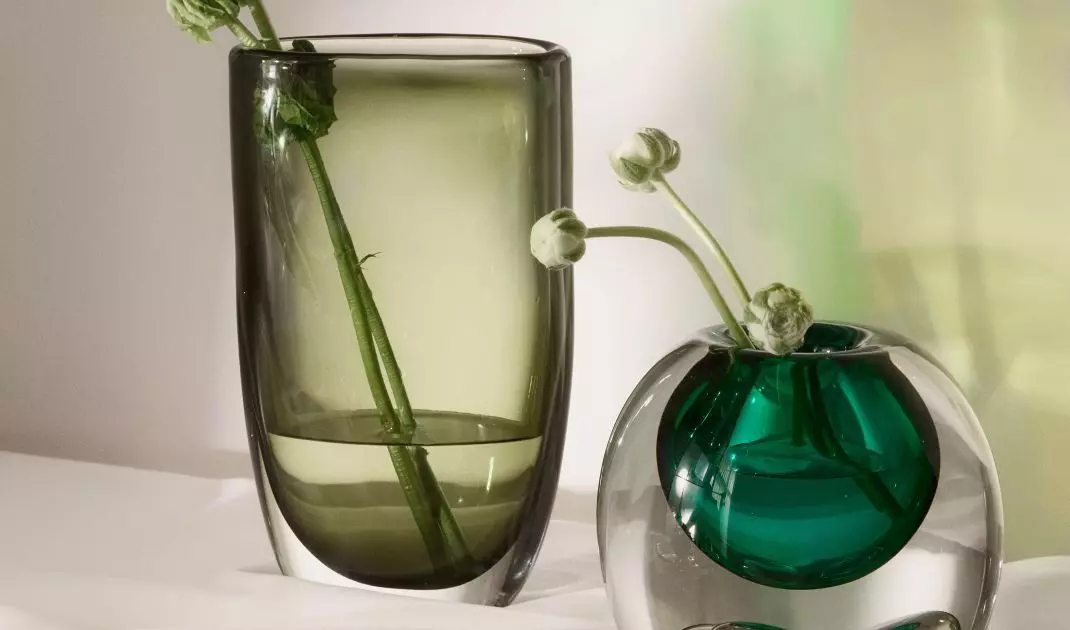
No need for expensive renovations to feel the matcha effect
© Westwing
3. minimalism that works on the senses
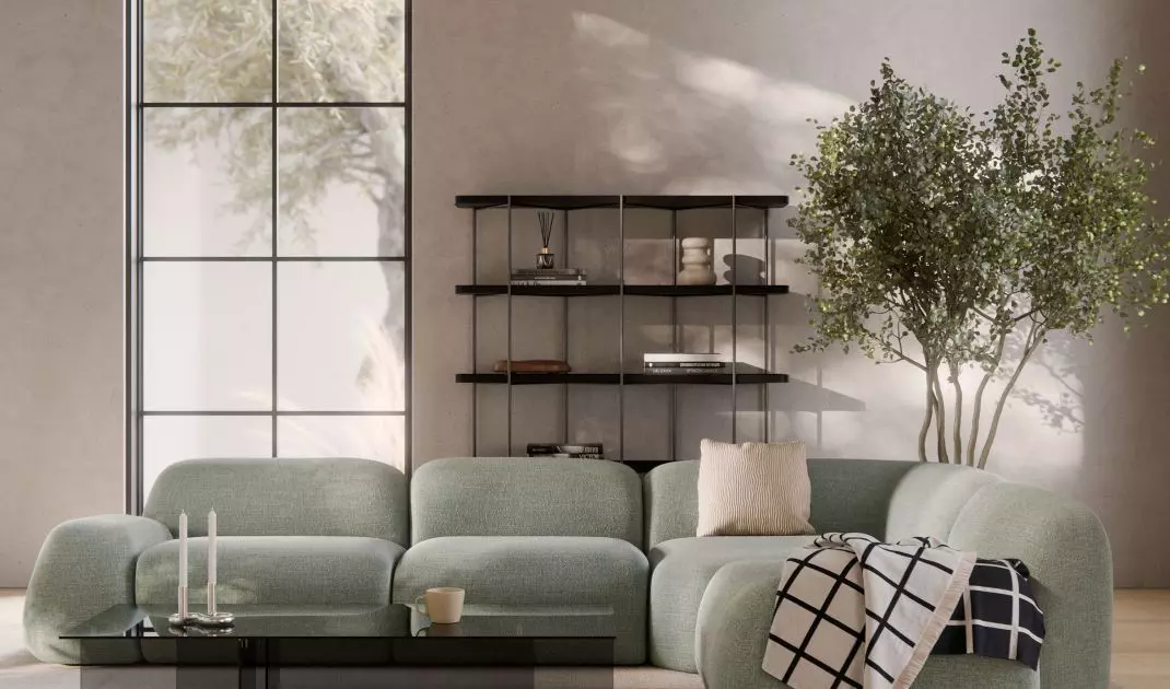
"Less is more". - this principle is perfectly reflected in matcha style. Simple furniture, open spaces and a limited number of decorations make the interiors breathe, and it's easier for homeowners to find peace in them. It's not coolness, but an orderly aesthetic that brings respite.
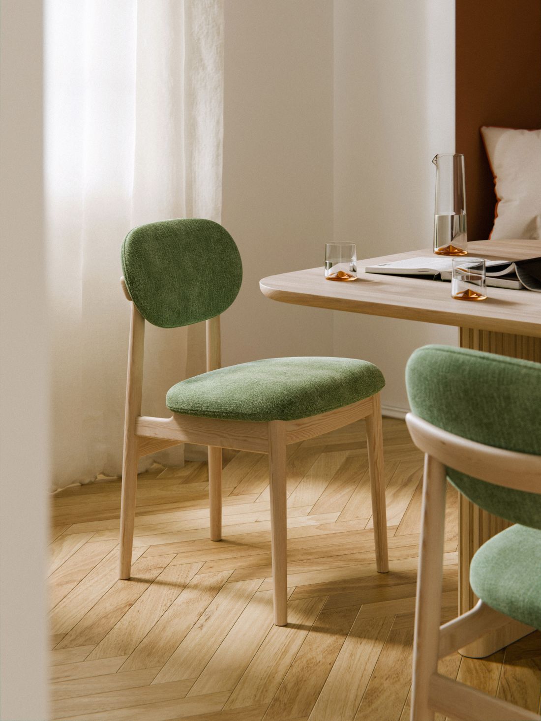
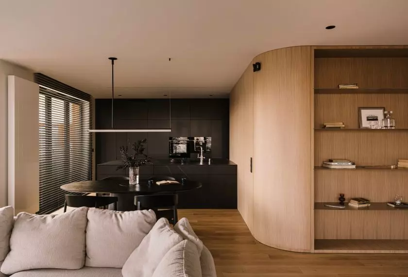
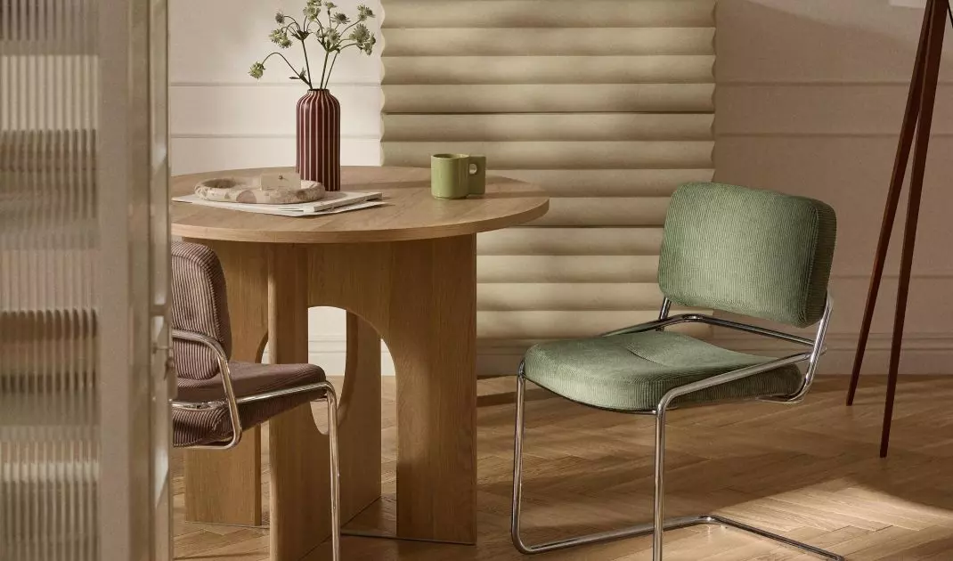
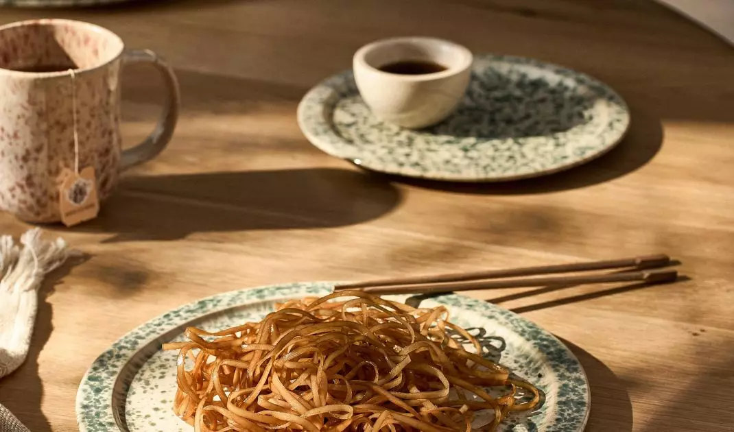
The matcha color combines what we are most looking for in an arrangement today - tranquility, naturalness and simple elegance
© Westwing
4. matcha fits into any room
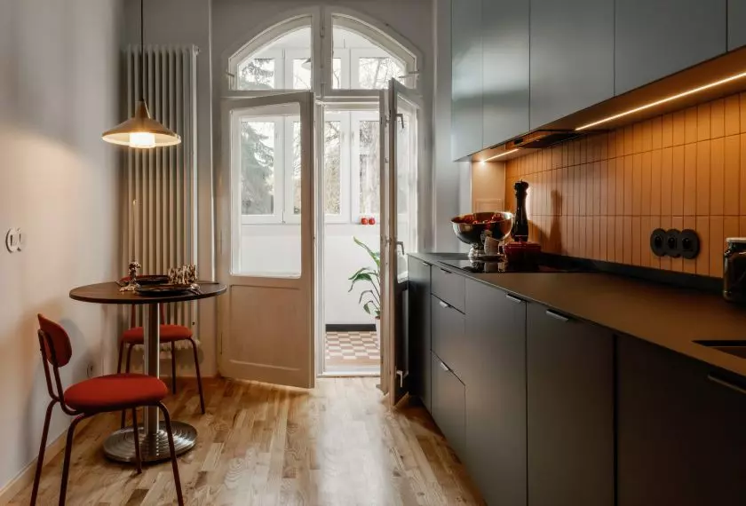
- Kitchen: matcha-colored cabinet fronts or small accessories will bring lightness.
- Bathroom: matcha-colored tiles and natural accessories will create a home spa.
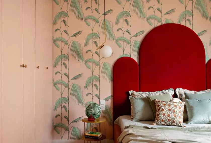
- Bedroom: walls, bedding or curtains in a green tone promote tranquility.
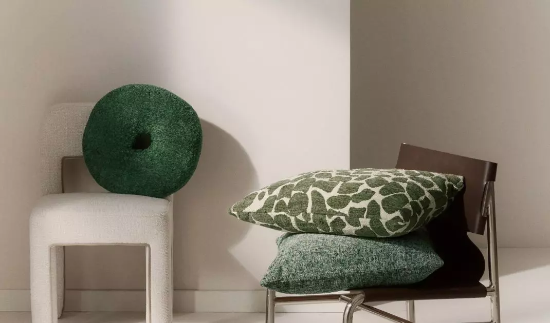
- Living room: carpet, pillows or curtains in matcha tone combined with wood create a space where you want to spend time.
5. a quick way to change without renovation
You don't have to do expensive renovations to feel the matcha effect. A few additions - curtains, textiles, ceramics or plants - can completely change the atmosphere of an interior. More and more people are choosing just such solutions to gradually introduce this trend into their homes.
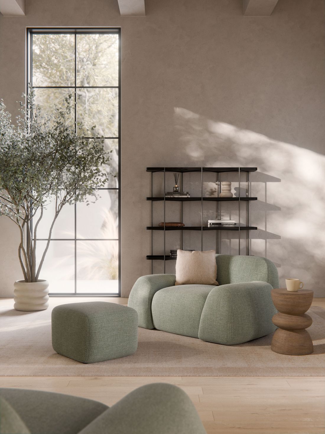
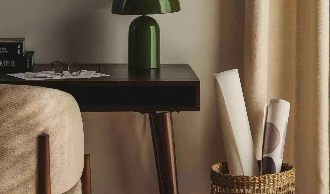
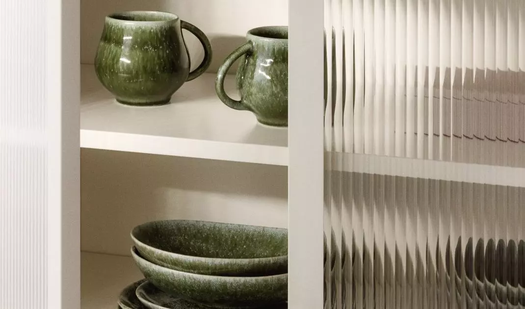
The matcha color is more than just a shade of green - it's a way to create a space where you want to relax
© Westwing
A trend that works on every sense
The matcha color combines what we most look for in an arrangement today - tranquility, naturalness and simple elegance. The inspiration taken from a cup of Japanese tea has transferred to walls, furniture and accessories, creating a new quality in contemporary design. It's a trend that is already on the rise, and could become one of the dominant trends in interior design in the coming months.