


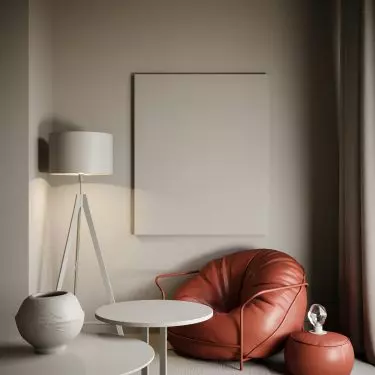
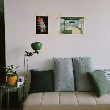
How to find a balance between minimalism and maximalism, when interior design magazines and portals shout at us with a whole palette of colors while promoting ubiquitous beiges and grays? With help comes the trend leading the way in the current year - Quiet Contrast.
Quiet Contrast in the interior
Photo: unsplash.com©
balance
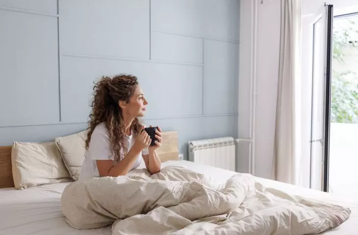
Increasingly, we are overwhelmed by the unlimited number of decorations and expressive shapes. We want to live in a space that is calm and cozy, but with character. Quiet Contrast is an extension of the japanese style, but with its own identity.
Quiet Contrast in the interior
Photo: Lennon Cheng/ Unsplash.com©
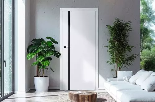
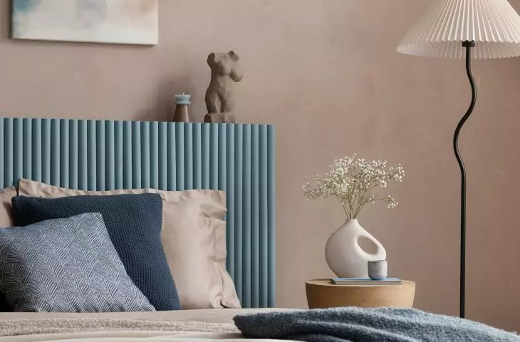
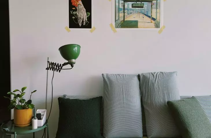
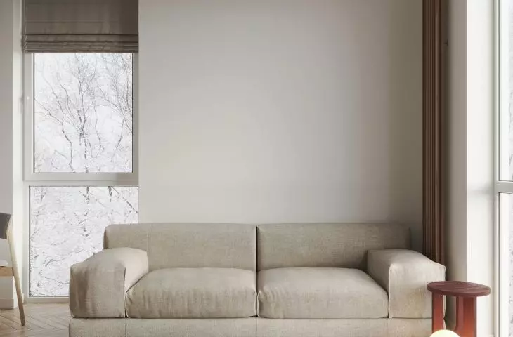
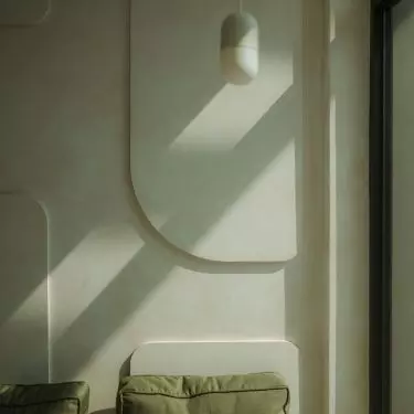
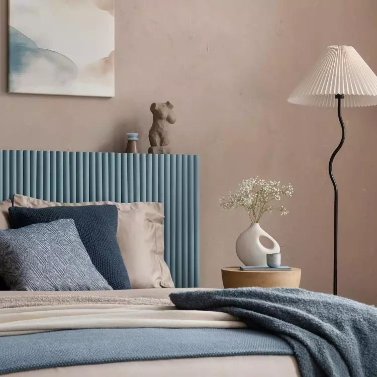
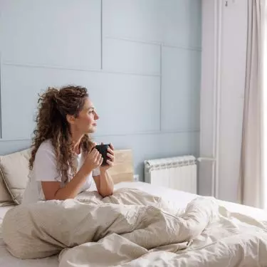
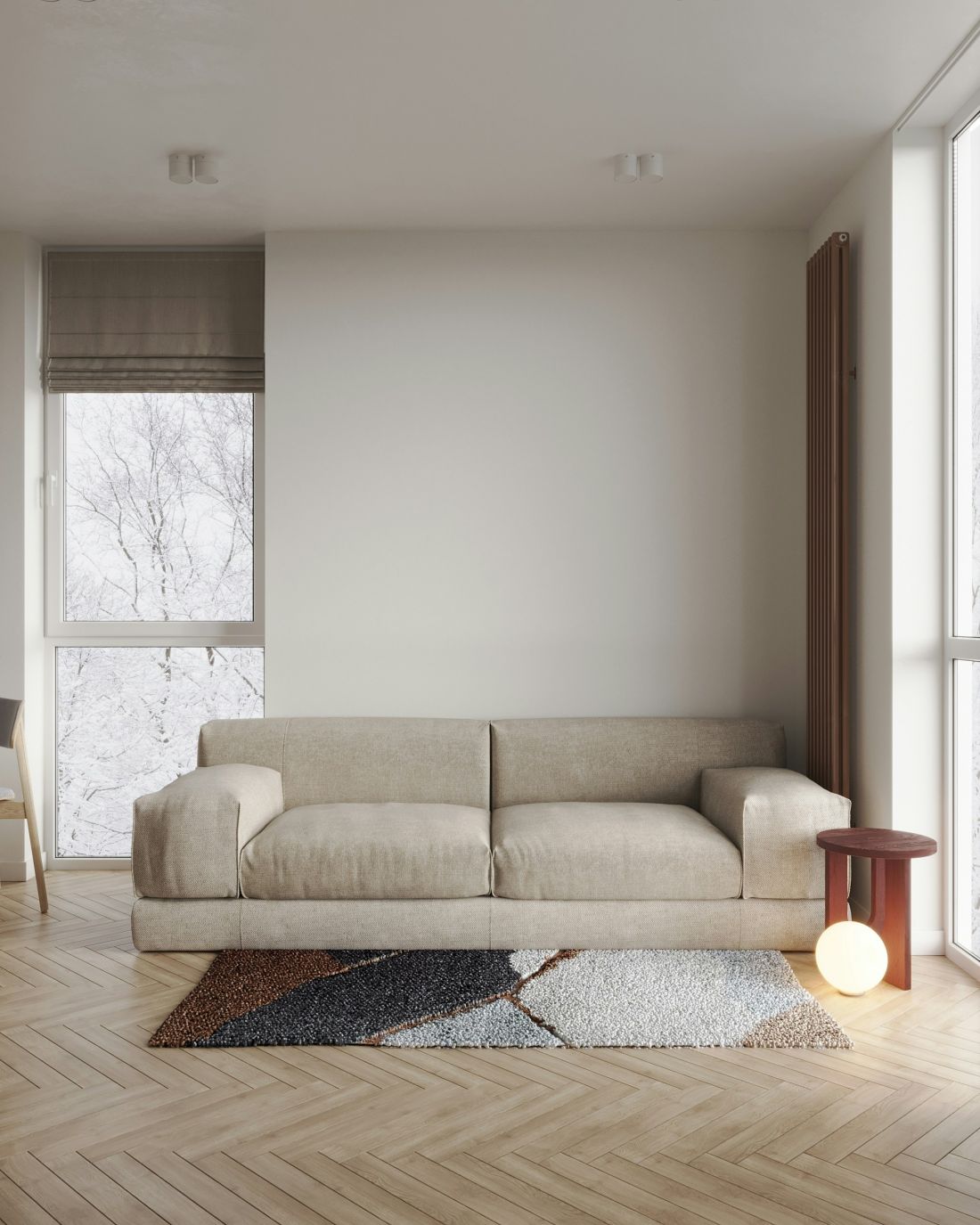
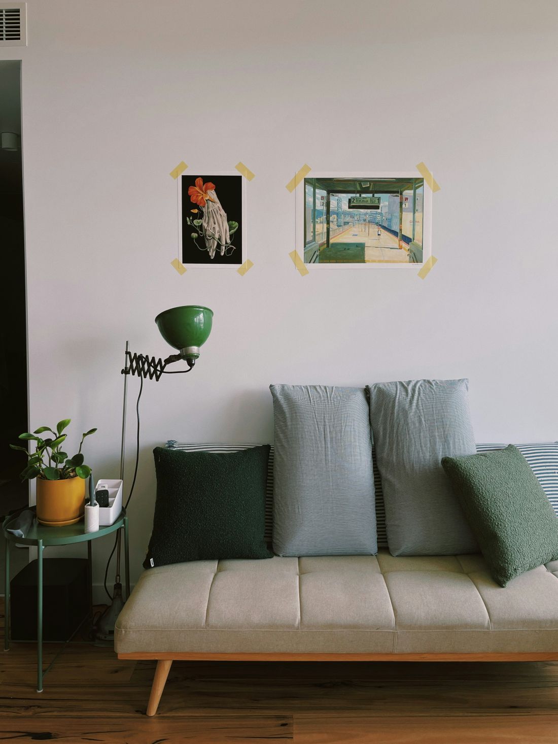
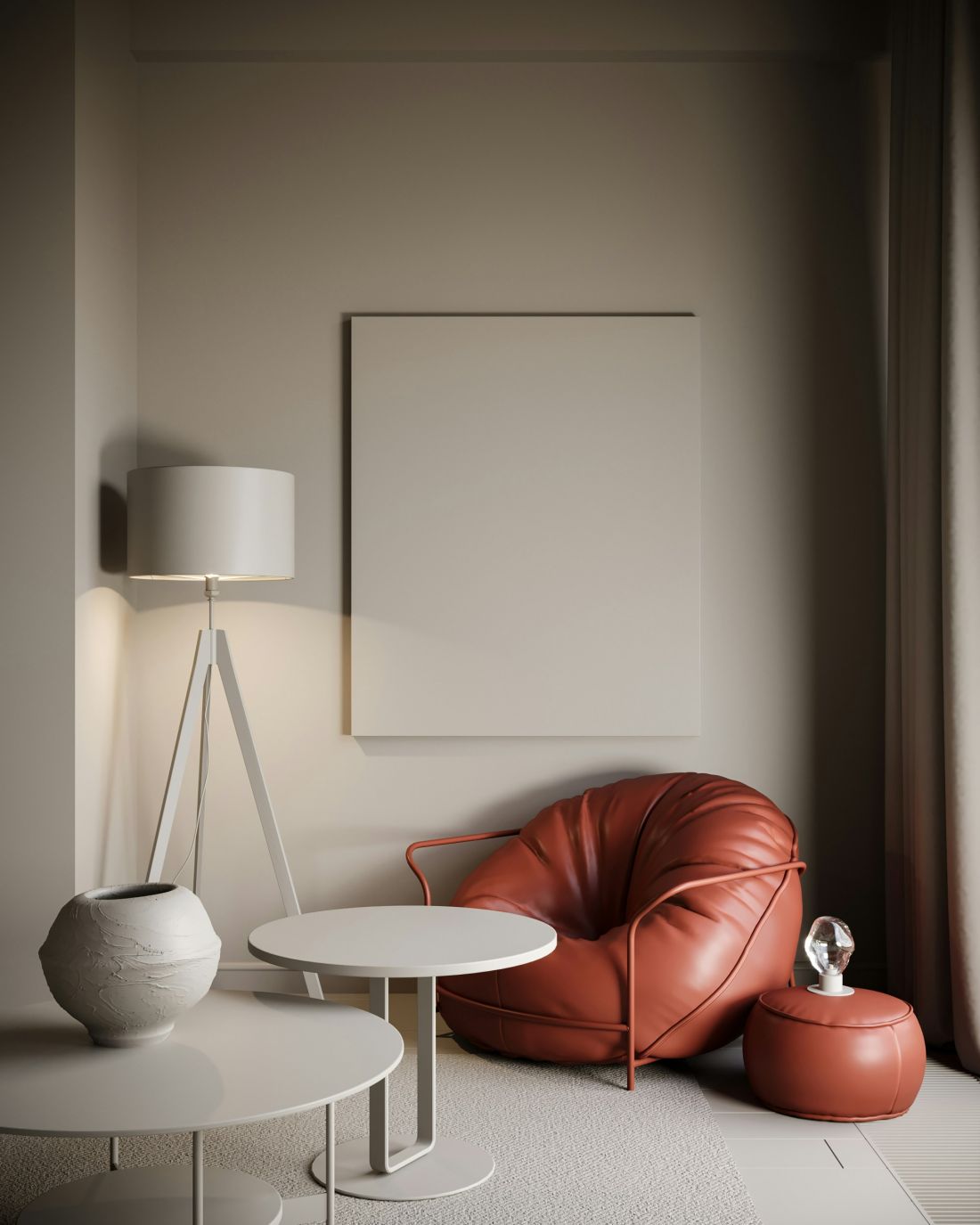
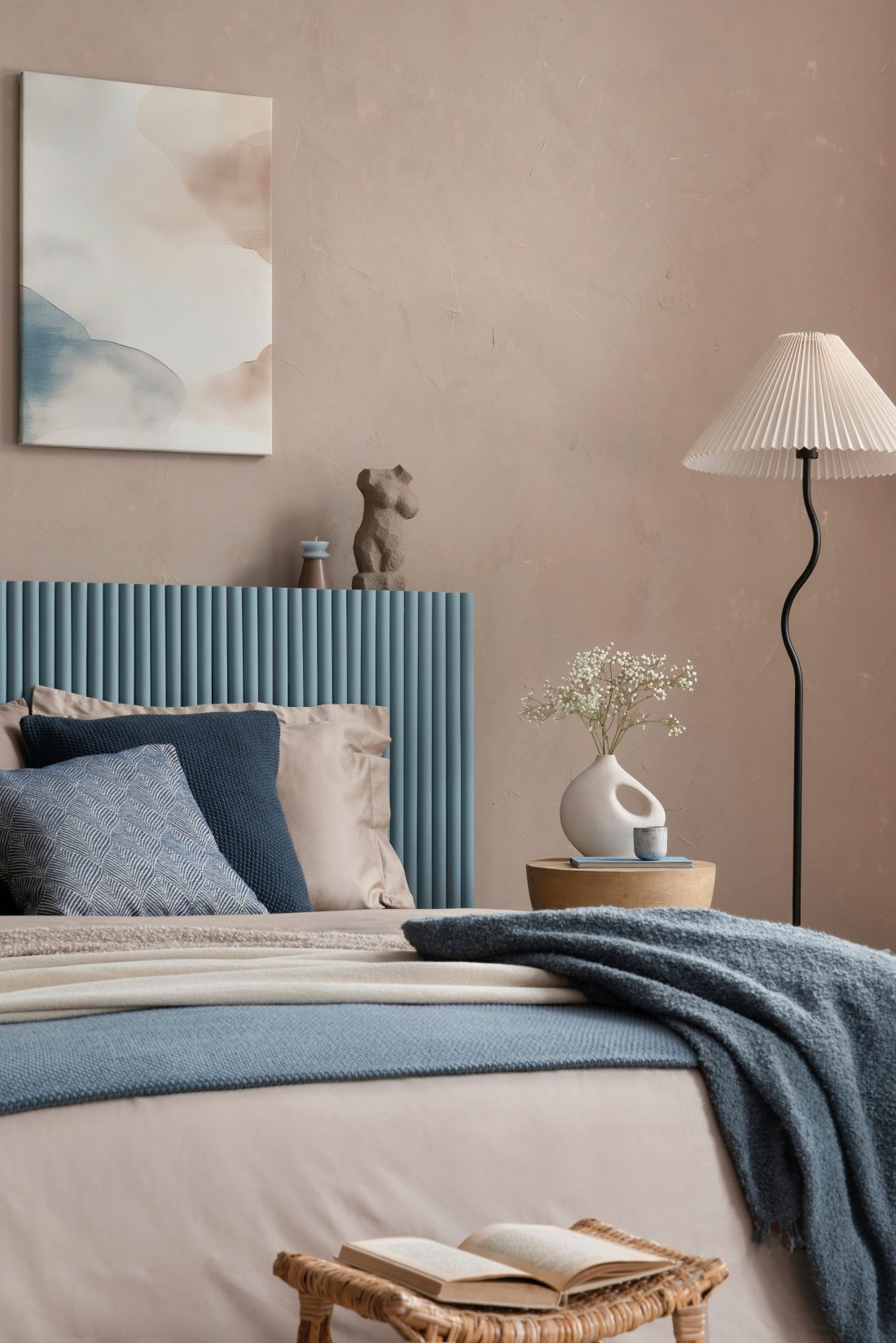
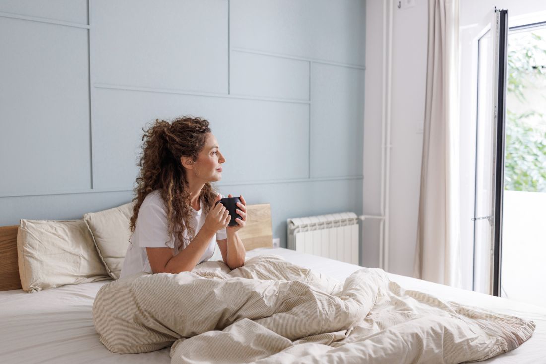
A key principle in design typical of Quiet Contrast is to rely on a bright color base and properly balance the other colors, forms and textures. Designers usually opt for muted walls in colors of broken white or beige. Strong contrasts and combinations of black and white are abandoned. The colors are to be saturated, but not overwhelming. In contrast to whites and beiges, navy blue, olive and muted shades of pink or blue are also often used.
Quiet Contrast in the interior
Photo: Bilal Mansuri/ Unsplash.com©
How to build a contrast that doesn't dominate?
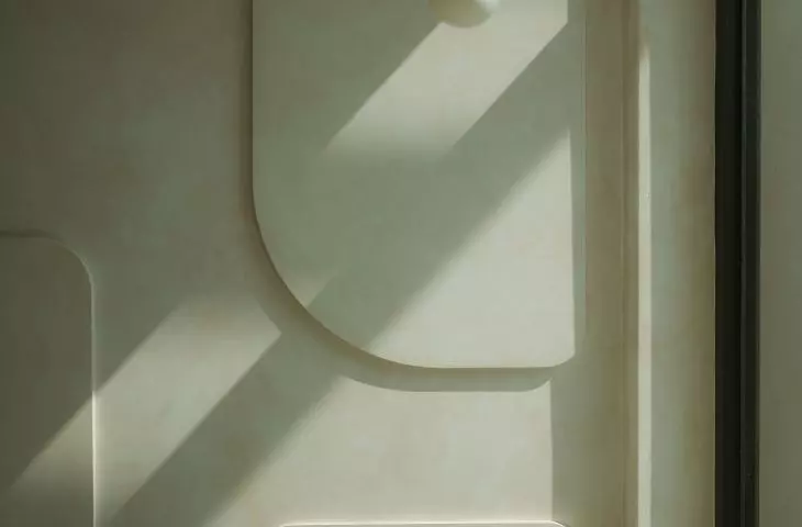
Quiet Contrast emphasizes straight lines and slightly rounded shapes that do not bring unnecessary chaos to the interior. There is no room for randomness. Every detail is carefully thought out so that everything works together.
Quiet Contrast in the interior
Photo: press materials/ Beckers©
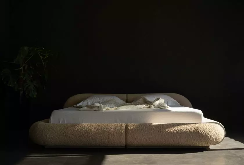
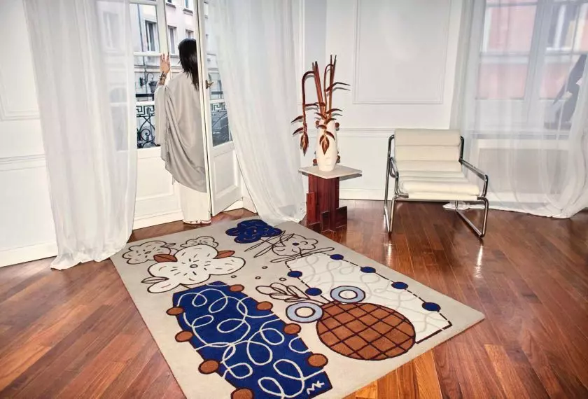
In addition to color combinations, the choice of textures and materials is important. The most common combinations are cashmere and leather, wool and metal or matte and gloss when it comes to surface finishes. It is extremely important not to disturb the proportions. The rule of thumb is that 80-90% of the arrangement should be calm and subdued, and the remaining 10-20% are colors and elements that create a clear contrast.
Quiet Contrast in the interior
Unsplash.com©
materials
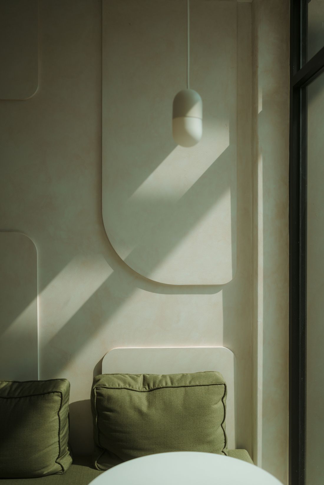
The furniture is simple, often wooden. Usually dark walnut, natural oak or veneer is used. Contrast is built on the principle of juxtaposing dark and light woods with different textures, for example, uniform, smooth wood and expressive grain. As for stone, mainly marble, limestone or quartzite are used here, which appear as a counterpoint to soft, tactile materials. Precious and natural fabrics such as linen, wool or cashmere add depth and elegance to the interior.
Quiet Contrast in the interior
Photo: press materials/ Beckers©
accessories
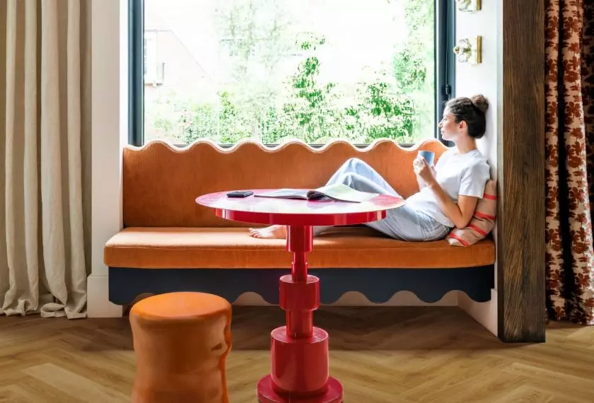
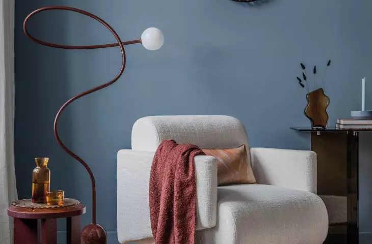
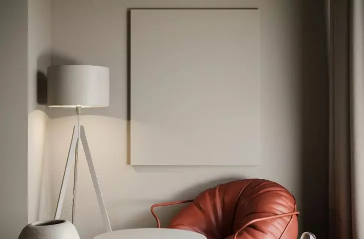
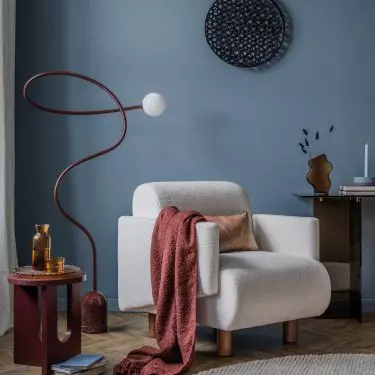
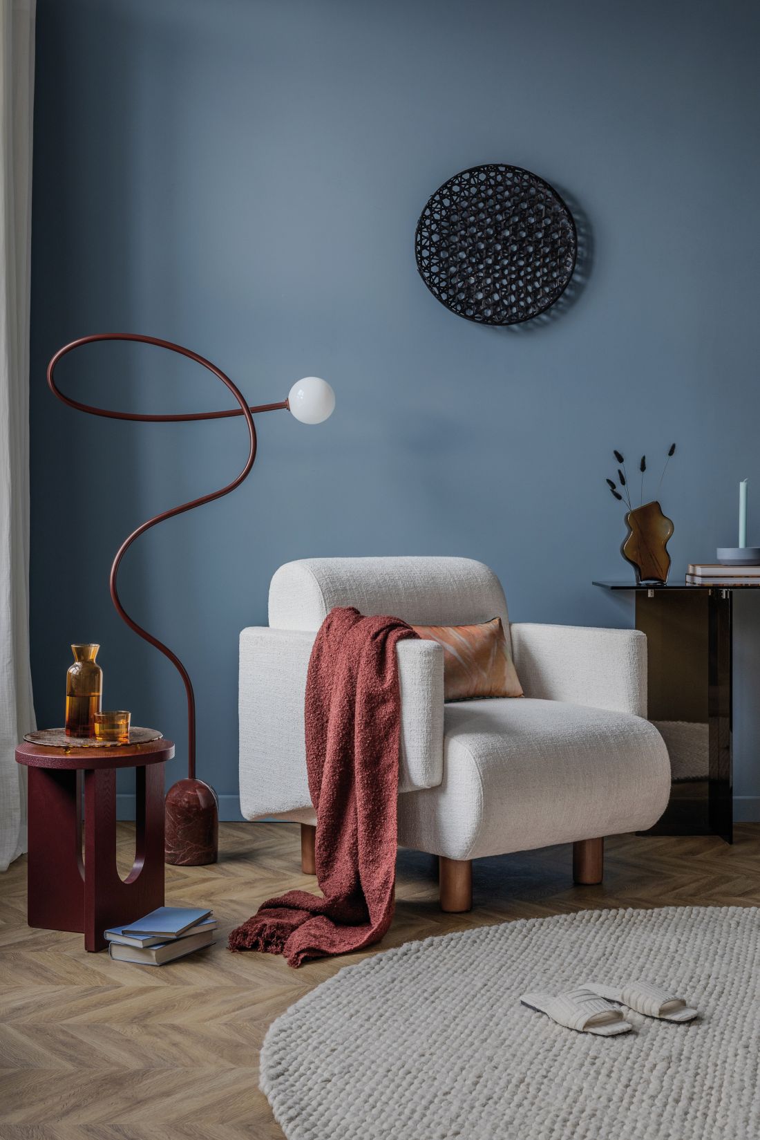
How to decorate a space so that it has character, but is not cluttered? Quiet Contrast suggests simple solutions to make the interior come alive. Gone are the flashy, overly eye-catching colors, and replaced with eye-pleasing accents. One large painting, an abstract sculpture or a designer armchair is enough to give the interior character. Tons of accessories or patterned decorations are definitely unnecessary here. A couch with an interesting texture, ceramics, recycled furniture or personalized items will always be a good choice.
Quiet Contrast in the interior
Photo: press materials/ Beckers©
Quiet Contrast is a trend that has brought the balance we need into design. With the right balance of colors and textures, we can create spaces full of harmony, yet characterful and expressive.