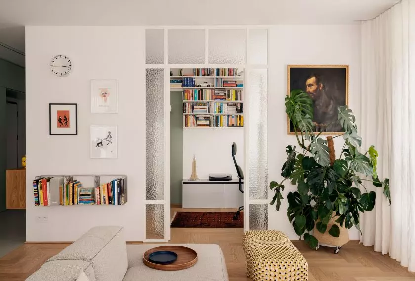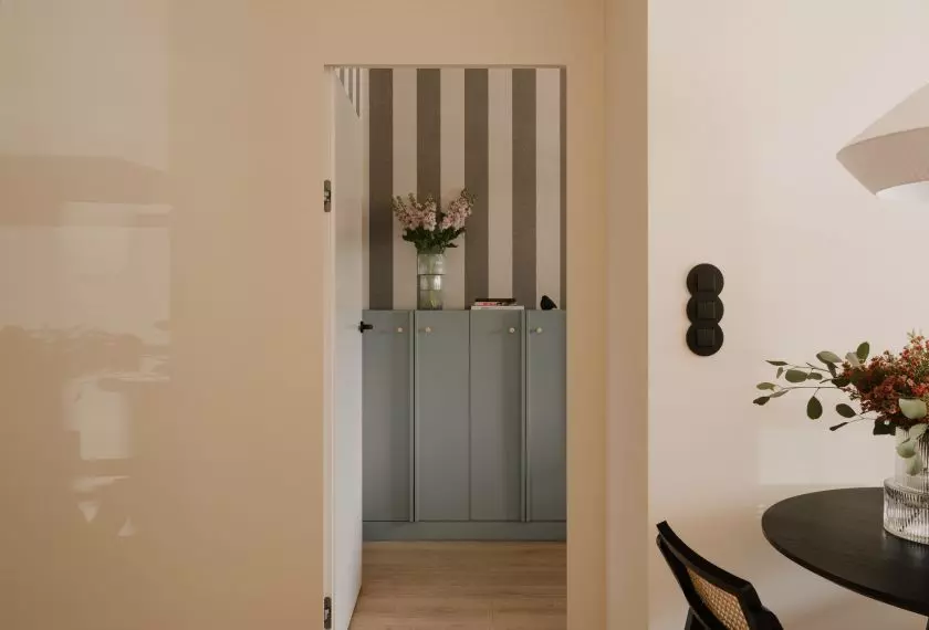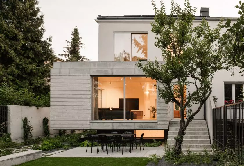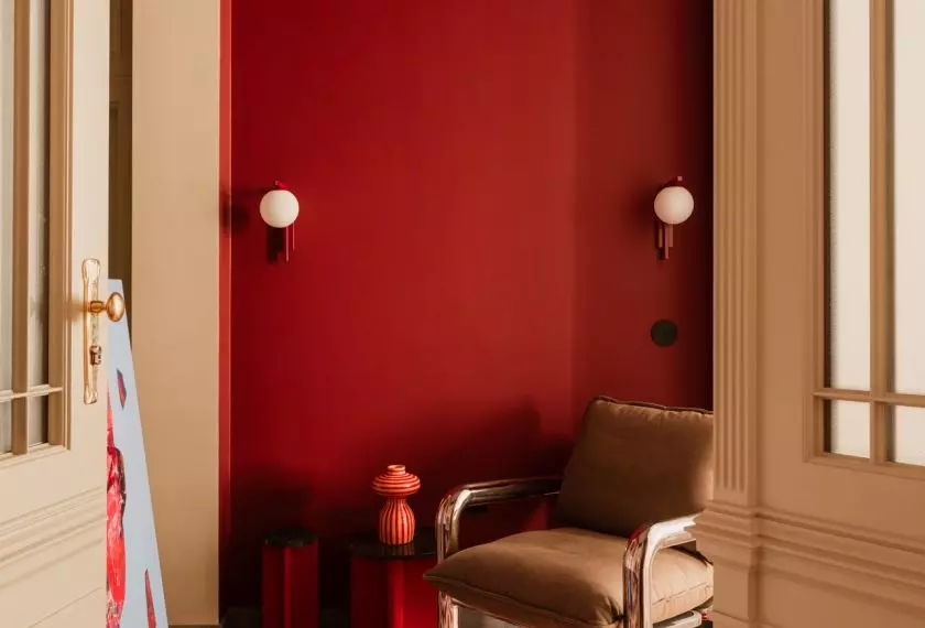


It was supposed to be energetic, colorful, and unique. For a family of four, their new apartment in Poznań was meant to be more than just a comfortable space to live and work — it was also to serve as an escape from the daily routine and, as the owners joked, from the Polish weather. Sandra Gałuszka from the Architektownia studio responded to this request with a bold combination of terracotta and petrol blue, as well as a play of arches, curves, and soft lines that run throughout the nearly 100-meter interior.
Color as a response to the residents’ needs
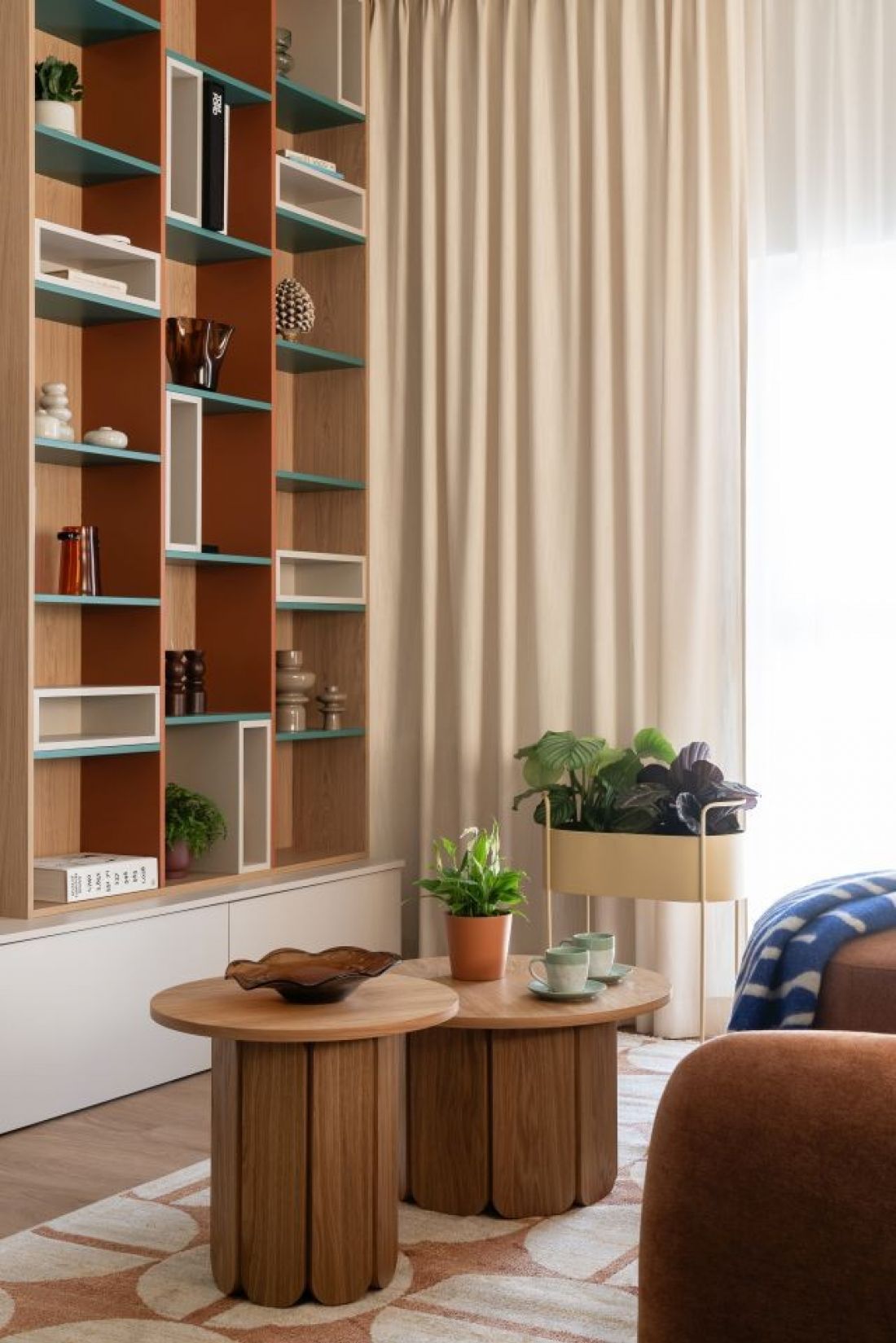
The apartment is located in a new development near Lake Malta. It is spacious, has a large terrace, and offers an additional surprise: another terrace on the building’s roof. Another key feature is the nearly three-meter-high ceilings, which are unusual for contemporary architecture . The architect decided not only to preserve the impression of height but also to emphasize it. This is achieved through tall built-in units and Ruke mirrors, which draw the eye upward. However, the starting point was not a specific aesthetic style. The designers analyzed in detail with the owners what kinds of interiors, colors, and objects truly appealed to them. From this conversation, a color palette emerged: terracotta and petrol blue — a deep, subtle shade of blue-green — paired with oak and a calm, beige base.
We wanted to ensure that color wasn’t just decoration here. First, we spent a long time talking with the clients about what they truly like and what inspires them, and only later did the color palette for the entire apartment emerge from those conversations. Thanks to this, these bold colors aren’t random — they’re very “them.”
— says architect Sandra Gałuszka from the Architektownia studio.
This interior was meant to be energizing. All the more so because its residents also spend a large part of their day here working remotely. So the home wasn’t meant to mirror the orderly rhythm of work. It was meant to be its opposite.
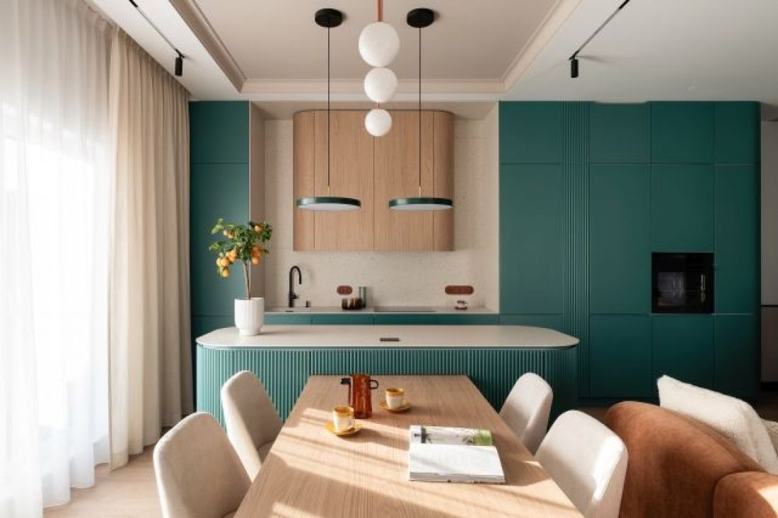
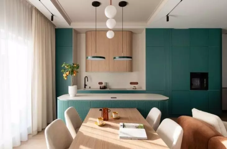
Blue dominates the kitchen, and vertical grooves add texture to the monolithic cabinetry.
Photo: Fotomohito
Straight lines meet arches
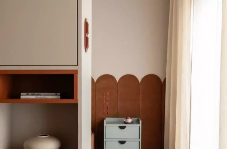
The apartment’s layout alone presented the designers with several constraints. Upon entering, the eye is drawn primarily to two sections of a relatively narrow hallway, which forms an L-shape and runs from the living area all the way to the master suite. In total, it covers about 15 m². It was impossible to shorten or significantly remodel it. The existing window layout also limited the possibility of enlarging the children’s rooms. So, rather than fighting the apartment’s geometry, the designers decided to soften it. This is how one of the most important motifs of the entire project emerged — the arch. It recurs in mirrors, furniture, upholstered headboards, the rounded corners of built-in cabinets, and in the distinctive forms of Karlik brand electrical fixtures. It introduces softness where the apartment’s floor plan itself imposes many long, straight lines.
The most difficult part wasn’t introducing the curved forms themselves, but consistently applying them throughout the entire apartment. I wanted them to appear in various scales and serve different functions, rather than looking like a random decorative motif. This required a lot of discipline, but it also provided plenty of room for creativity.
— says Sandra Gałuszka.
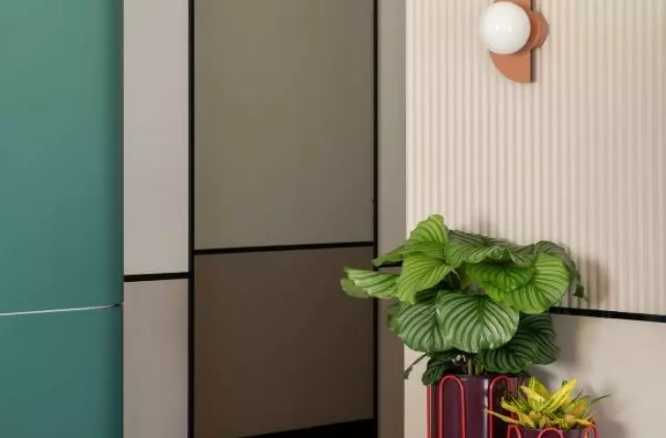
Even the hallway here isn’t just a passageway. The small, custom-designed, curved benches conceal drawers, allowing every section of the long hallway to be put to use. The doors were painted the same color as the walls to avoid creating additional divisions and reinforcing the tunnel-like effect.
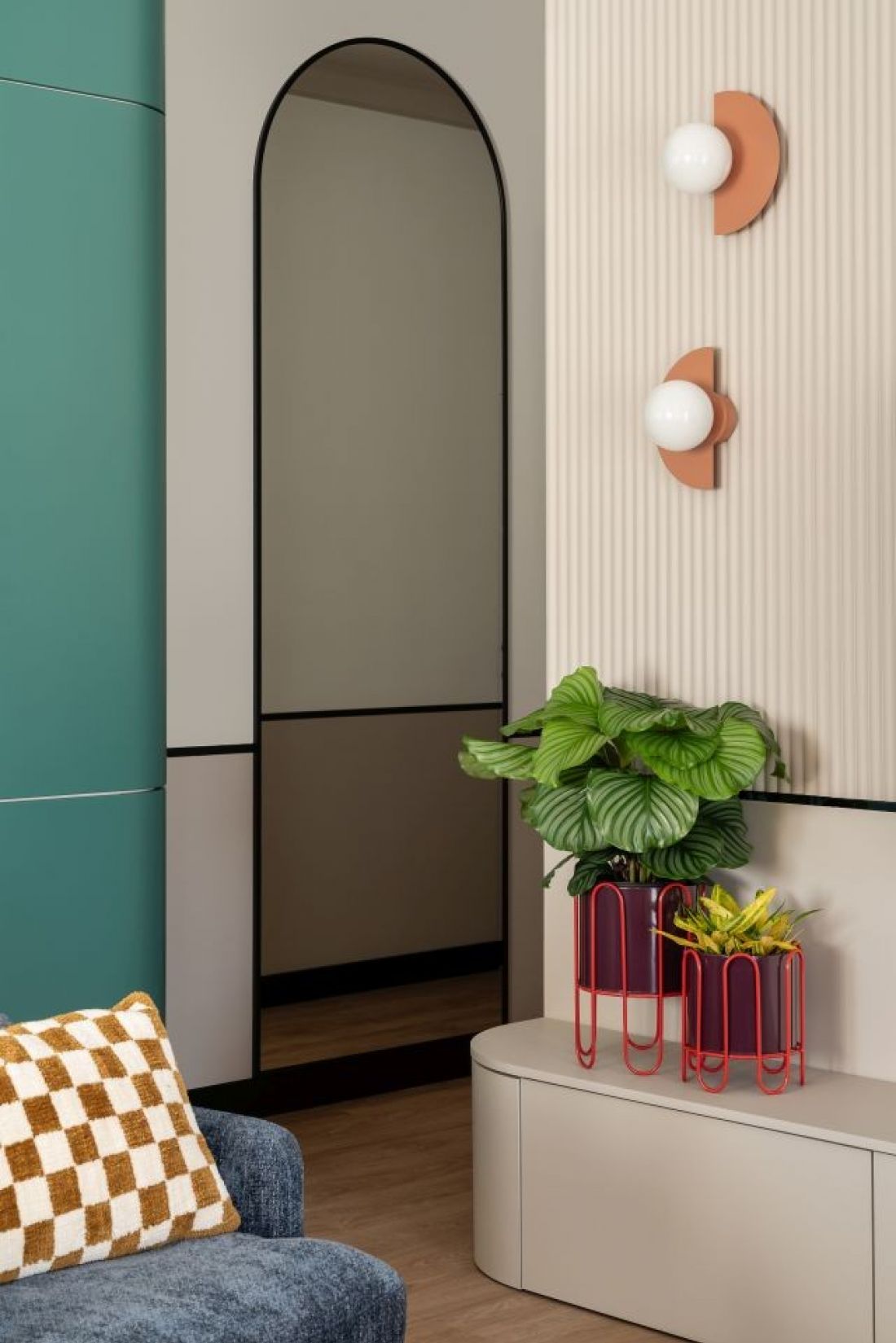
Arches appear in the passageways and built-in furniture.
Photo: Fotomohito
35 meters of shared living
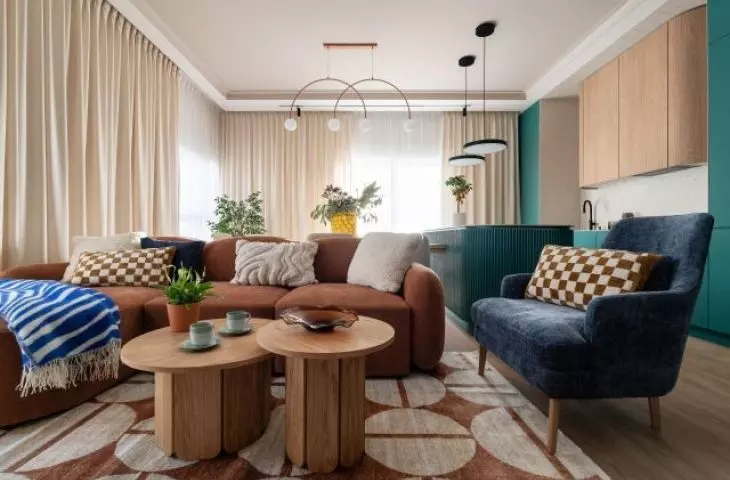
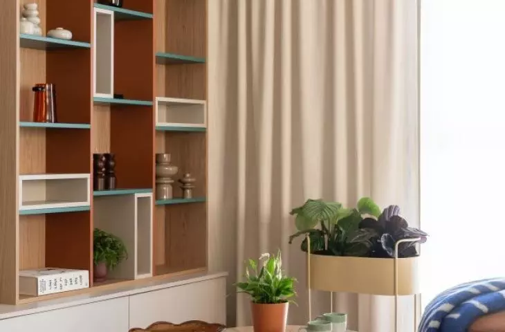
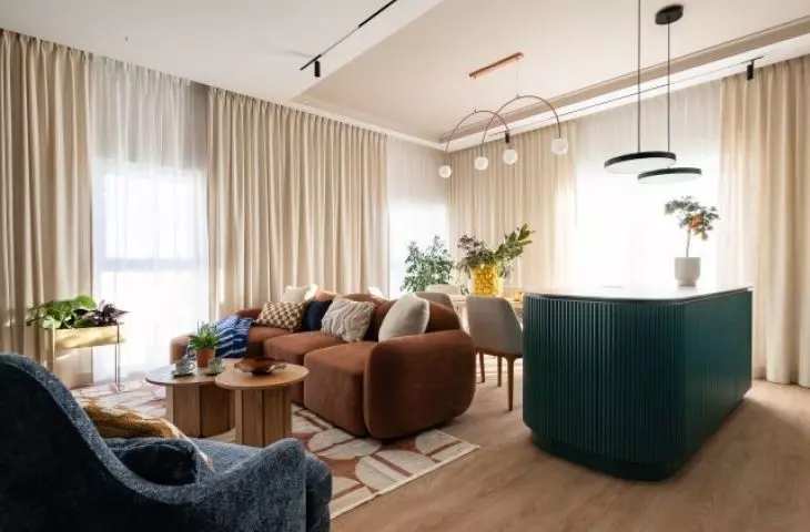
The hallway leads to the open area of the apartment. The living room and kitchen cover about 35 m², and this is where the character of the design is most evident. Petrol blue appears on the large kitchen cabinets and the striking island, while terracotta is featured on the soft sofa and smaller details. In between are wood, light-colored fabrics, and beiges that temper the intense colors. The grooved, rounded sides of the kitchen island echo the design language used throughout the apartment, but they’re not merely decorative — cabinetry is concealed within the curved edges, and drawers are hidden beneath the countertop. To avoid taking up space in the living room with an additional piece of furniture, a fold-out dining table was integrated into the island. It’s sufficient for the family’s daily needs and, when necessary, allows them to host a larger number of guests. The owners also wanted open shelves. That’s why a lightweight bookshelf stands on the other side of the living room. Its irregular rhythm, wooden structure, and colorful interior shelves create a composition—rather than a heavy, built-in unit—that can be filled over time with books, ceramics, plants, and personal items belonging to the household members.
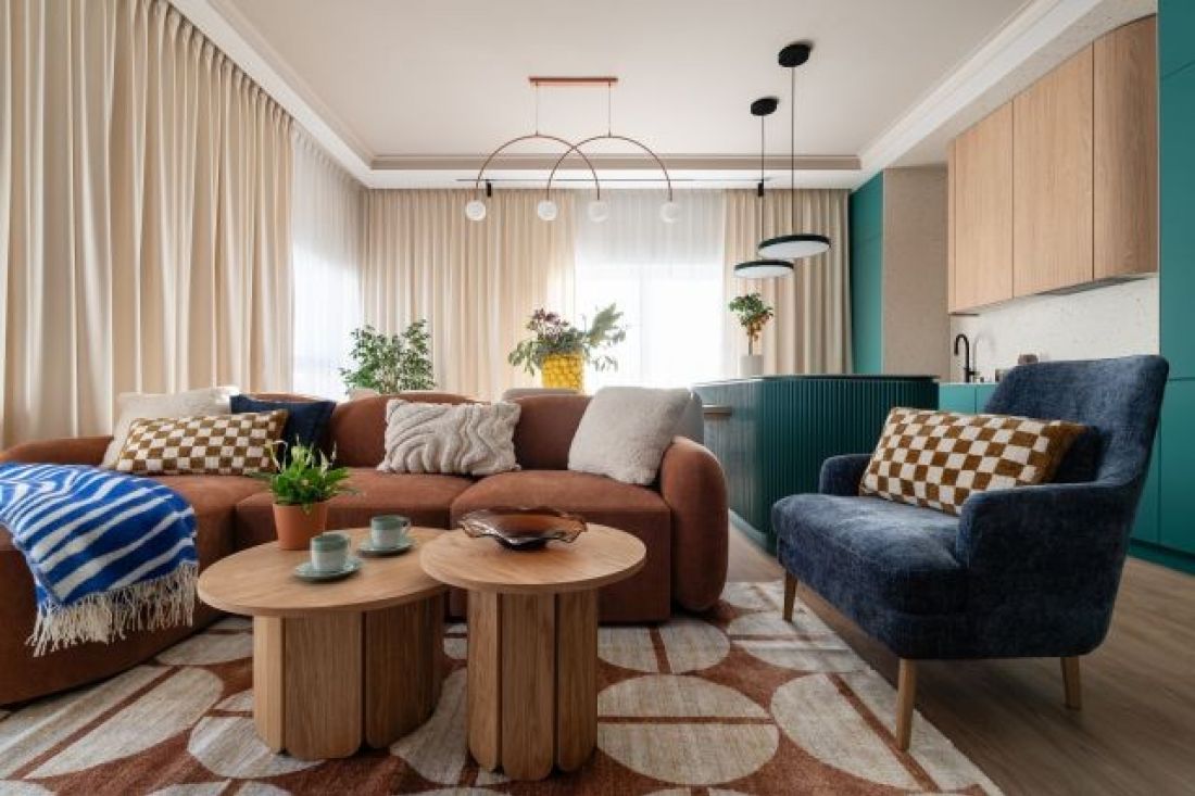
The blue color palette was paired with orange.
Photo: Fotomohito
Master Suite: A Room Within a Room
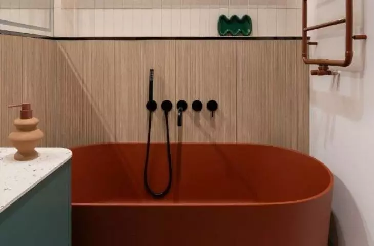
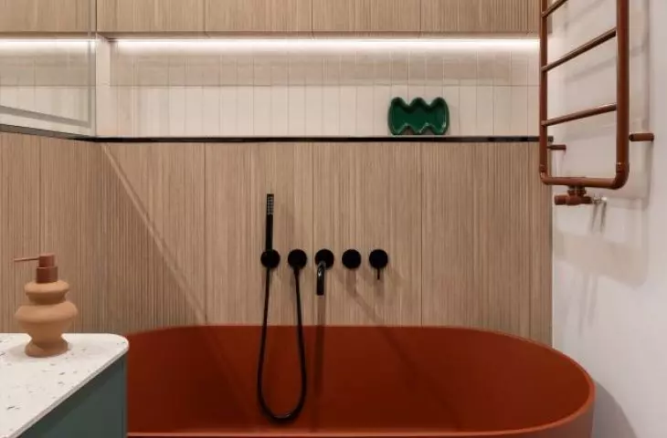
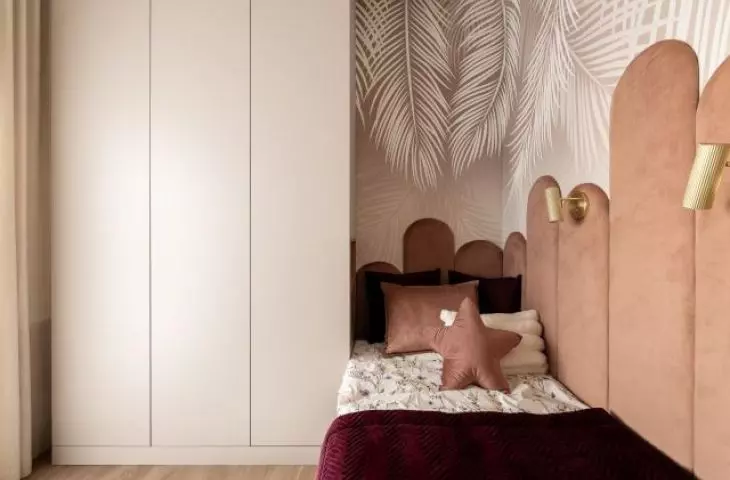
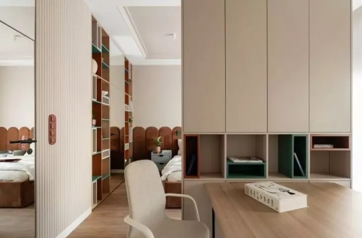
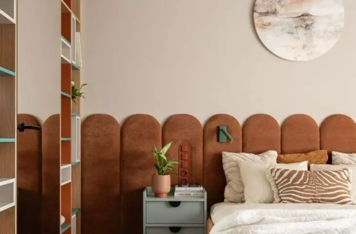
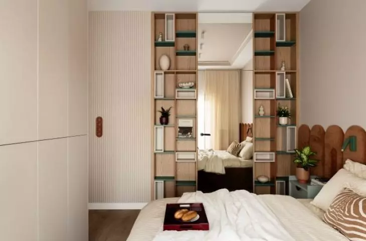
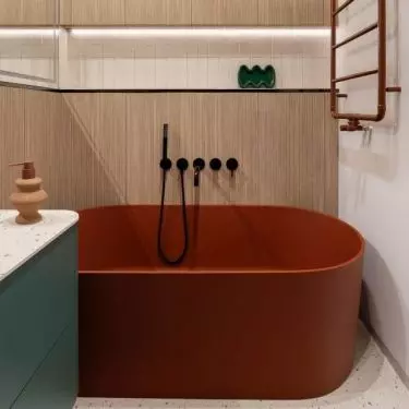
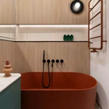
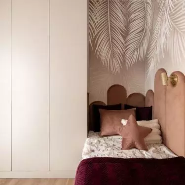
The most significant functional changes were made in the parents’ private area. An expansive master suite was created , featuring a bedroom, an en suite bathroom, a separate walk-in closet, and a home office. This space measures approximately 21 m². Soft lines reappear here as well. The bed is surrounded by a tall, upholstered headboard composed of rounded modules in a warm terracotta shade. It doesn’t end at the bed itself but continues along the wall. At the same time, the bedroom isn’t completely separated from the workspace. Between the bedroom and the office area , a double-sided built-in unit has been designed to serve as a symbolic boundary between the space’s functions. The cabinets open from both the bedroom and the office sides. The doors leading from the bedroom to the bathroom and walk-in closet feature mirrored surfaces. They reflect the interior, emphasize its height, and make the individual zones seem to blend together even more seamlessly. The color doesn’t disappear in the master bathroom. Petrol blue appears, among other places, on the Cielo toilet, alongside the warm tones of the freestanding tub and wood-effect, grooved paneling. The sink, bathtub, and black fixtures were selected from the Omnires collection. This room is more serene than the living area but still employs the same palette of colors and soft shapes.
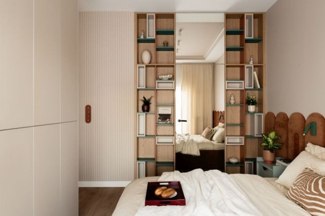
Warm colors dominate the bedroom. Open shelves and grooved surfaces are also featured here.
Photo: Fotomohito
Two Rooms, Two Stories
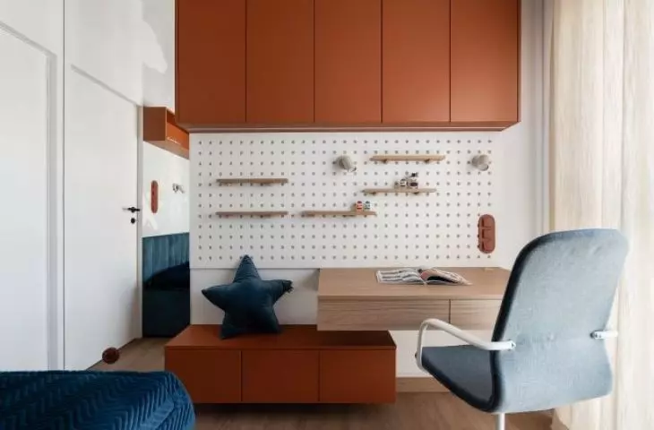
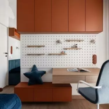
The children’s rooms were not subjected to the home’s color palette quite as strictly. Above all, they were meant to suit their occupants. This is worth noting because their layout and floor area are essentially identical. In the boy’s room , however, navy blue is paired with terracotta, maintaining a subtle connection to the rest of the apartment. Above the desk is a perforated panel whose layout can be customized using small shelves. This solution can therefore evolve along with the child’s interests. The furniture was also designed to make the most of the limited space. Next to the bed, within the tall built-in cabinet, an open niche was created to replace the classic nightstand. A similar solution was used in the girl’s room. Here, however, a completely different, much calmer color palette dominates.
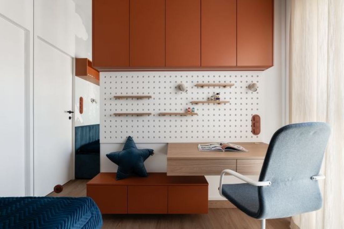
The shelves by the desk can be easily customized to suit your preferences.
Photo: Fotomohito
Small Bathroom, Every Centimeter Counts
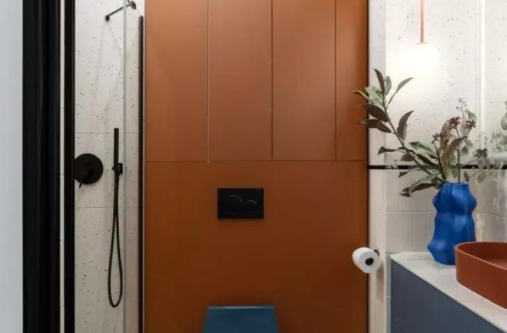
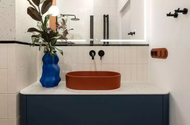
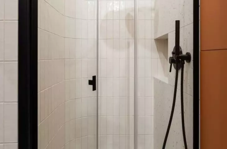
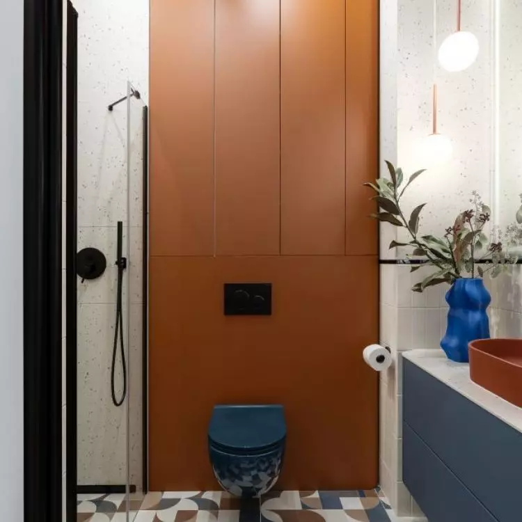
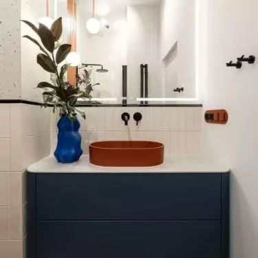
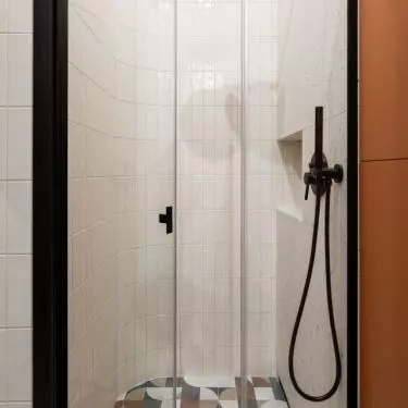
In the second, smaller bathroom, which is accessed directly from the hallway, there are quite a few eye-catching elements. These include the geometric Marazzi flooring, terracotta cabinetry, a Cielo toilet in petrol blue, black Omnires fixtures, and the rounded wall of the shower area lined with small, light-colored tiles. The shower, in particular, best illustrates how decoration in this apartment stems from function, and function from precise customization. The shower area is enclosed by glass panels from the Nes Black series, custom-made through Radaway’s “Na Miarę” service. The shower enclosure is 80 cm wide, and the swing doors can be opened both inward and outward. This is particularly important in a small space, where the way the door opens affects the convenience of using the entire room.
In a small bathroom, every element must be precisely tailored to the others. Here, it wasn’t enough to simply find a shower door of the right size. We had to select the length of the fixed panel and the opening mechanism so that the enclosure would be comfortable and wouldn’t interfere with the toilet.
— explains the designer.
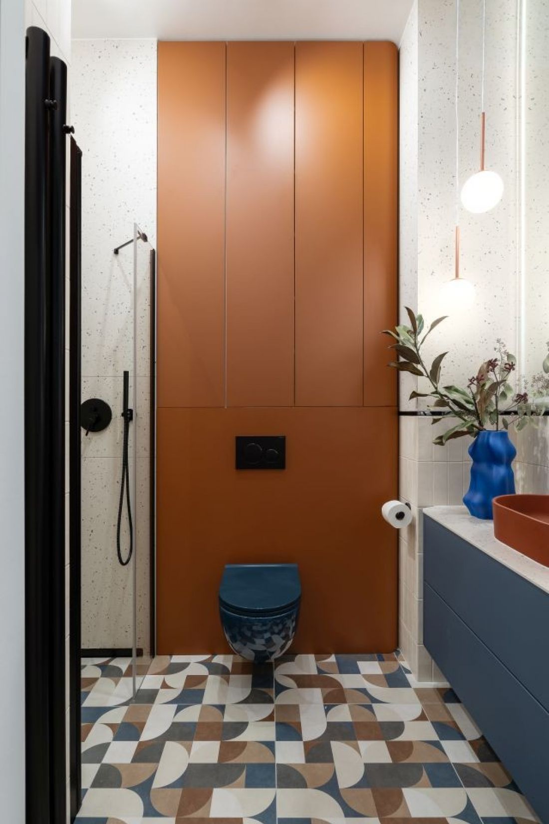
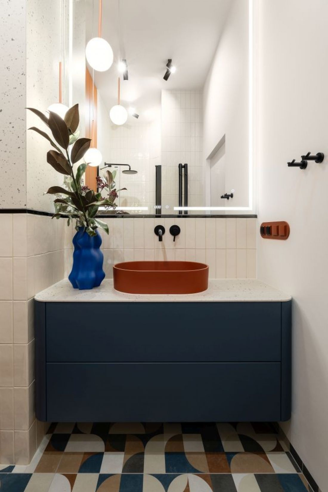
In a smaller bathroom, mosaic tiles adorn the floors, and the colors of the cabinetry complement the rest of the apartment.
Photo: Fotomohito
A color meant to last
It would be easy to describe this apartment as “colorful.” But color is only the beginning of the story here. Behind the intense terracotta and petrol blue lies a very precise system: repeating arches, grooved details, custom-designed cabinetry, light guided through tracks and hidden in LED backlights, and a consistent pairing of bold tones with wood and a calm beige. And the beginning of this story was very simple: a family of four wanted to come home to a place that would be the opposite of predictability— a place full of energy, where even on the grayest day, a little bit of their own sunshine awaits outside the window.