

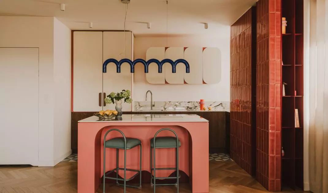
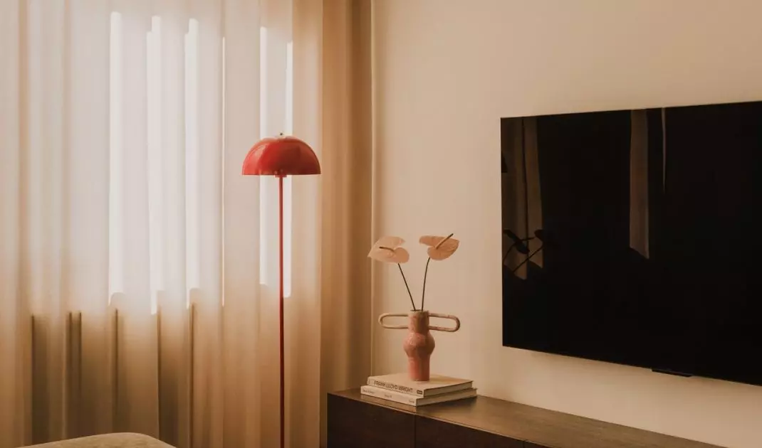
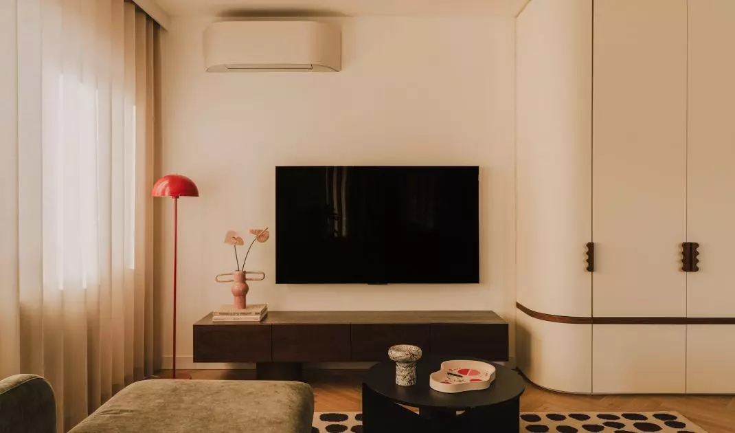
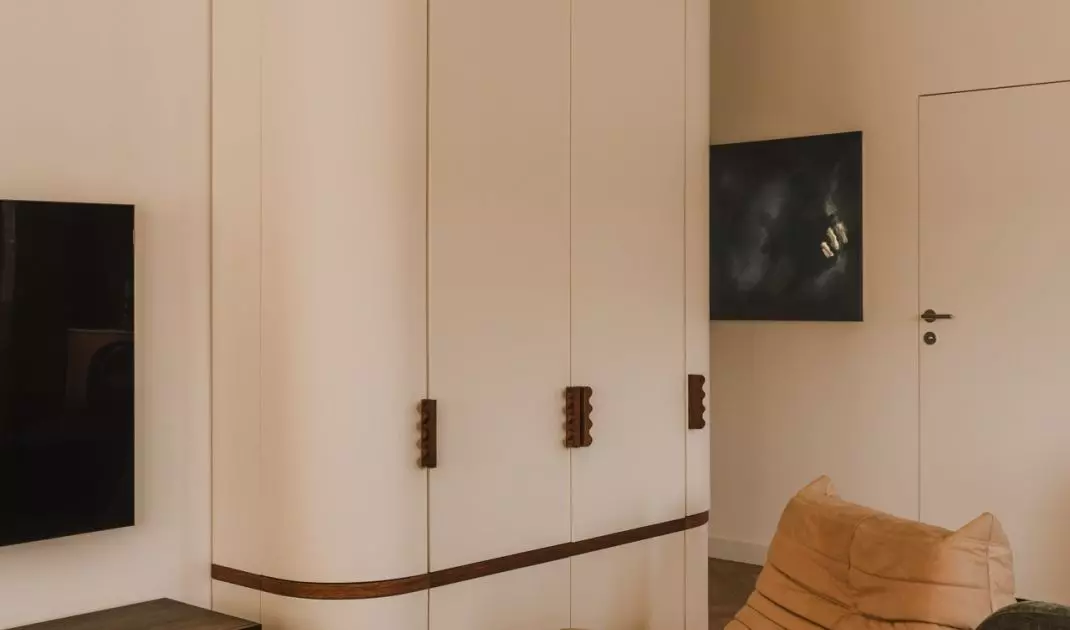
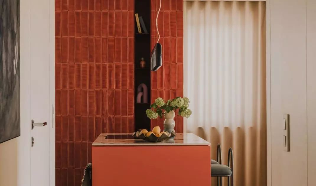
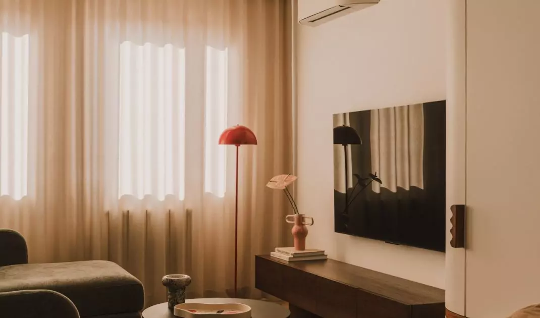
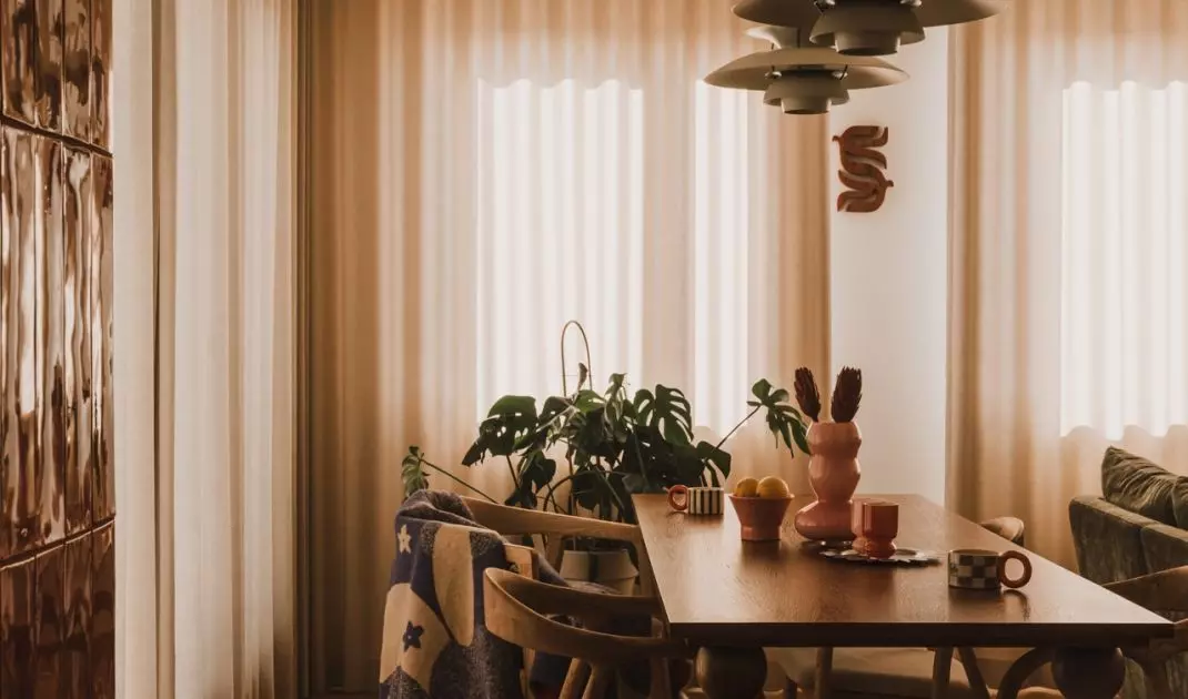
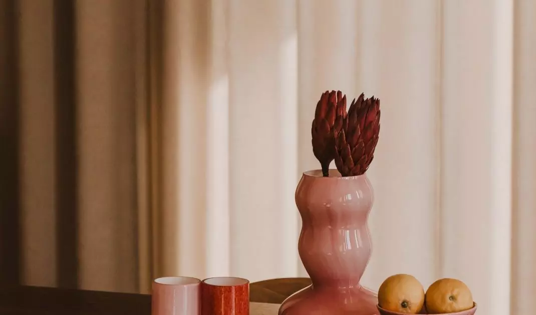
This isn’t the kind of apartment that’s meant to quietly fade into the background. A pink kitchen island, a cobalt-blue lamp, wavy lines, and bold patterns make it clear from the start that something unexpected is about to happen in this 73 m² space in Kraków’s Grzegórzki neighborhood. The designers from Kontraforma have created a space full of energy, yet they’ve kept it from becoming visually chaotic.
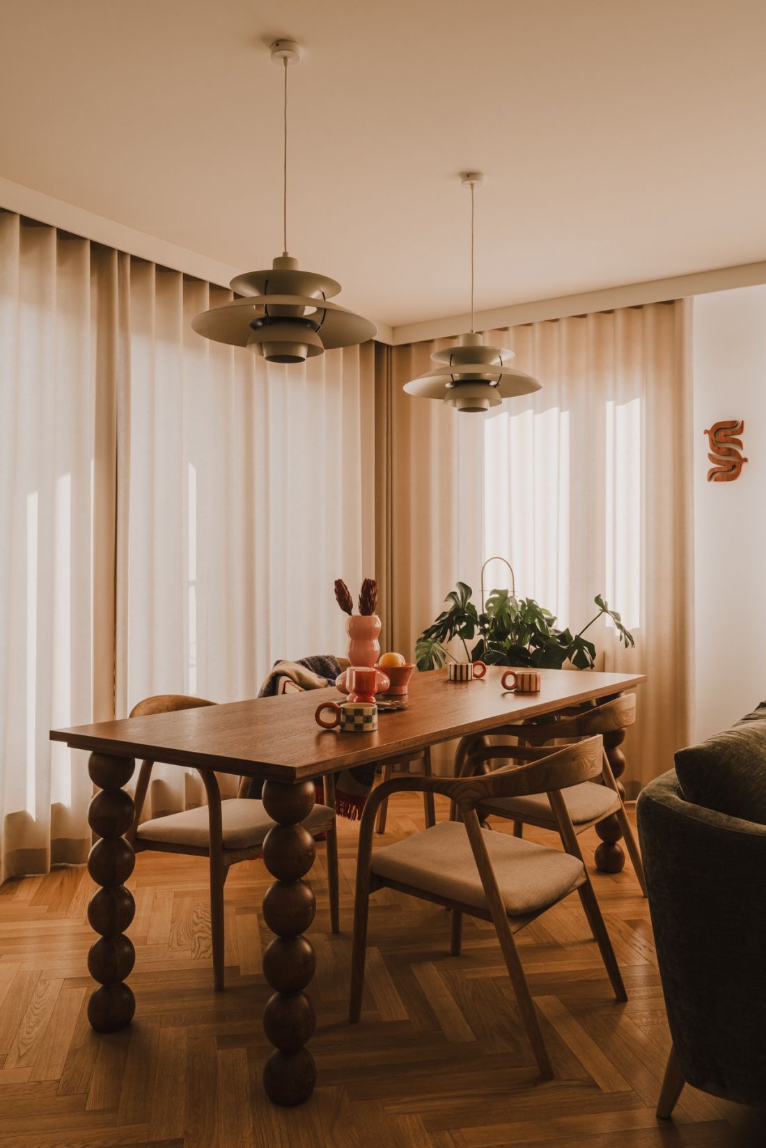
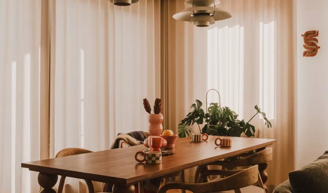
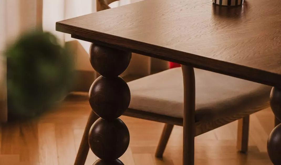
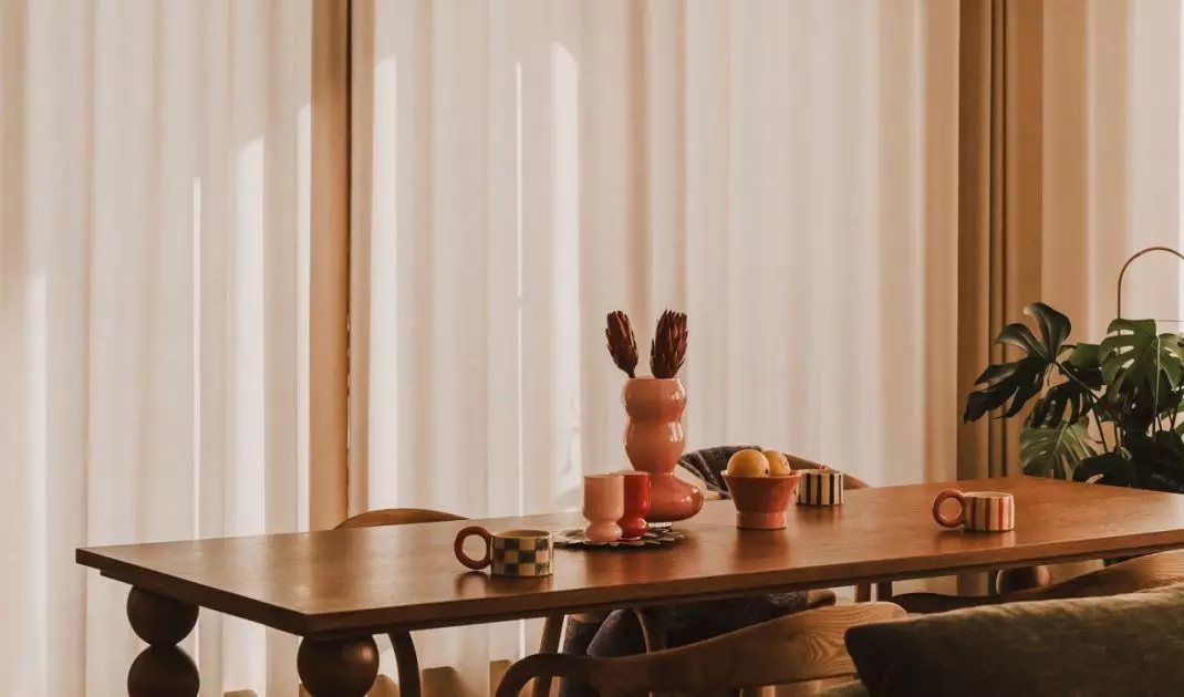
The spherical legs give the table a distinctive, almost sculptural form — ©Studio Archives
Courage begins with trust
From the very beginning, the owners knew they didn’t want yet another conservative apartment in shades of beige. They dreamed of a joyful space, saturated with color and far from cookie-cutter perfection. They ended up at a design studio that uses intense colors, unusual shapes, and playful details with equal ease. It quickly became clear that both sides shared a similar vision for the character of their future home. The initial concept was approved by the clients and became the basis for the project. Their trust allowed the designers to immediately create a cohesive narrative in which the furnishings, built-in elements, and subtle accents all speak the same language.
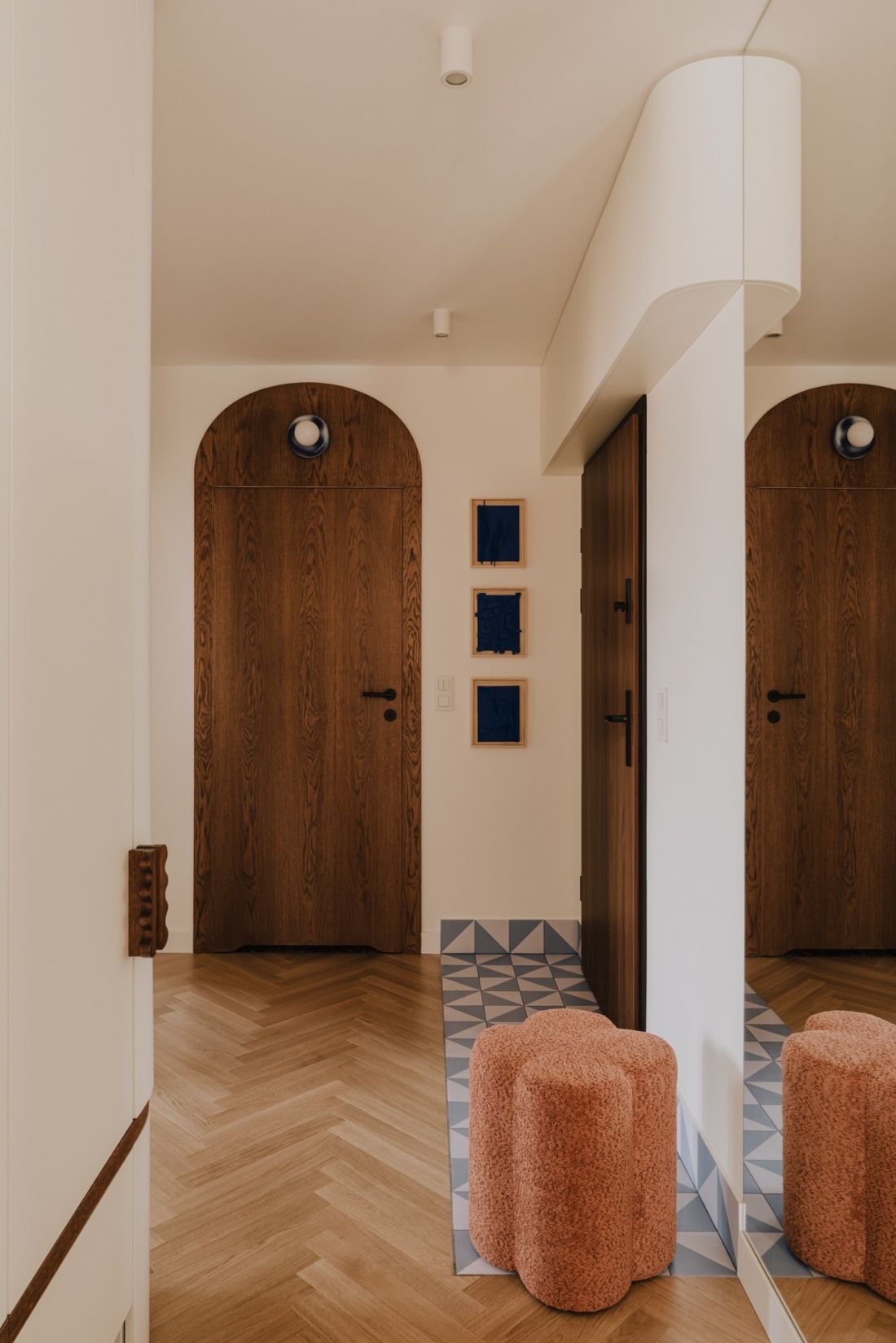
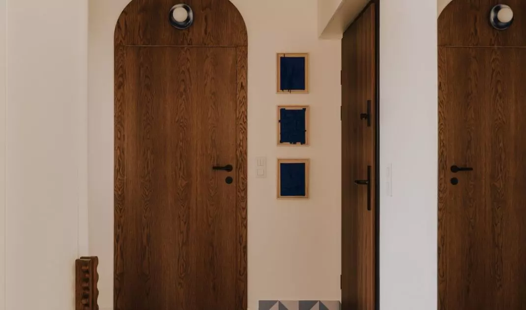
Arched doors and a geometric tile pattern foreshadow motifs that recur throughout the apartment — ©Studio Archives
Arches lead from the threshold
The character of the apartment is revealed right in the entryway. The geometric pattern of the floor extends onto the baseboard, so the floor doesn’t end at a predictable point but gently climbs up the walls. The arched door frame , meanwhile, foreshadows a motif that will reappear later in the furniture, lamps, and handles. The designers soften nearly every line that might otherwise remain completely straight. They round the corners of the furniture, create undulating edges, and transform ordinary handles into decorative elements. As a result, the custom-built cabinetry isn’t merely a neutral backdrop but helps define the character of the interior. The rounded shapes serve another function here: they bring order to a composition full of bold colors and patterns. The repeating rhythm of arches, waves, and circles ties the individual rooms together and ensures that bold design choices don’t look like a collection of random ideas.
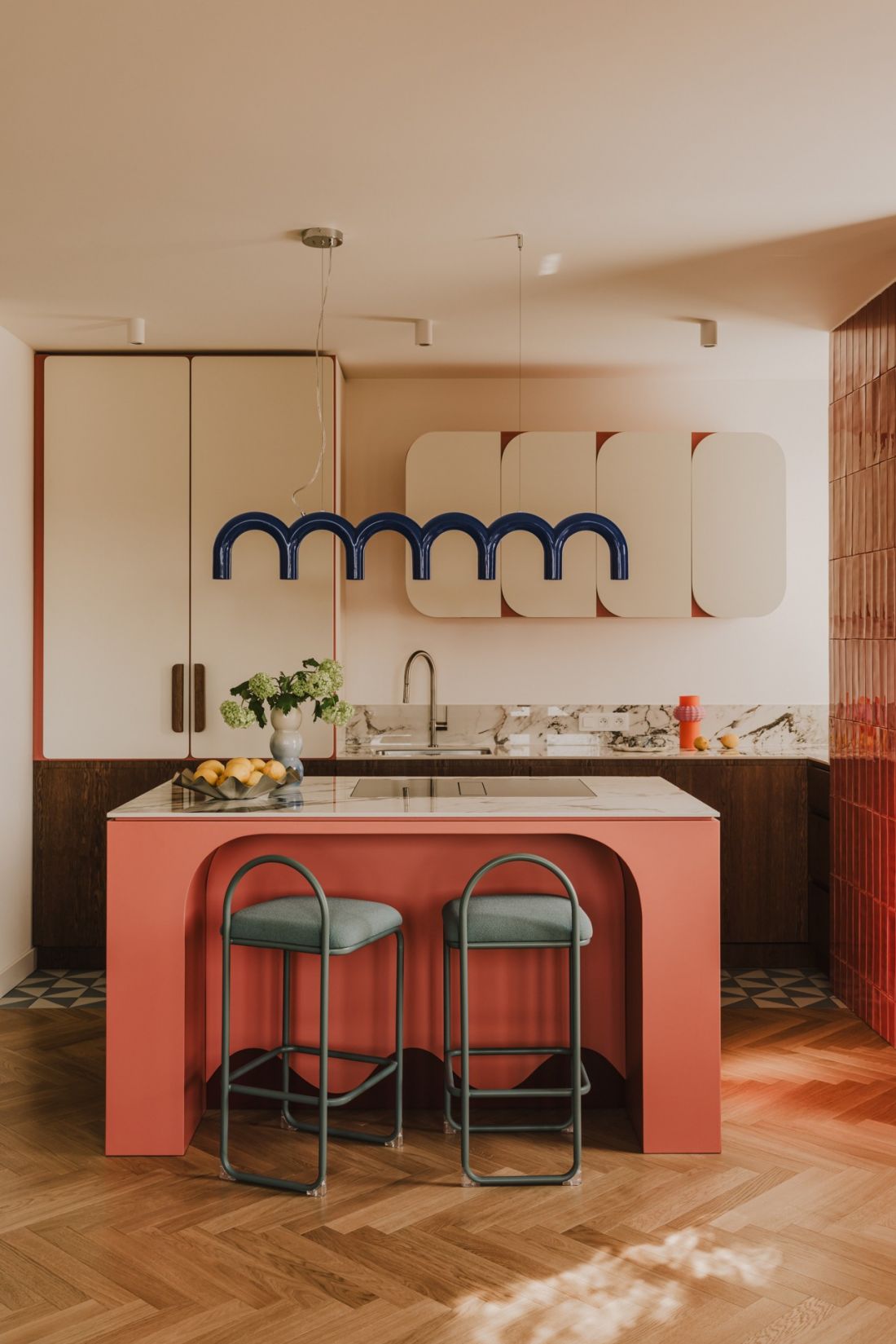
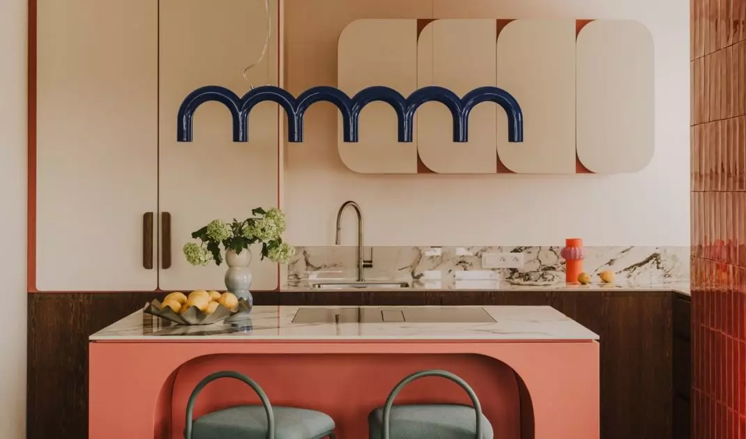
The pink island contrasts with the cobalt-blue lamp and kitchen cabinets — ©Studio Archives
A pink island at the heart of everyday life
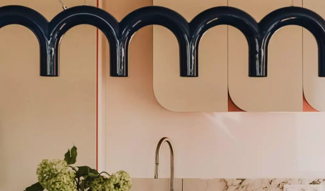
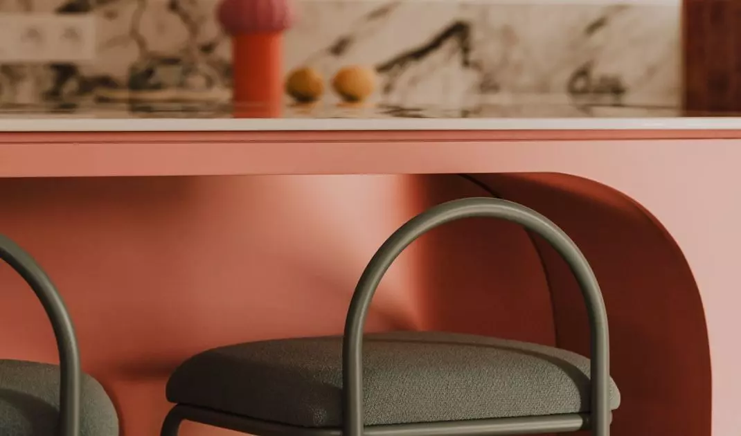
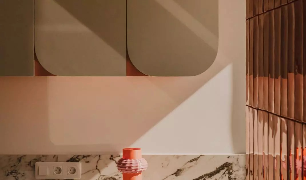
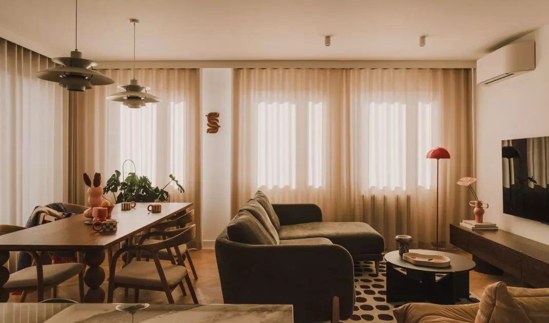
The living area is where the most energy is concentrated. At its center is a pink kitchen island —massive, yet light on the eye thanks to its deep, arched cutouts. Facing the living room, it serves as a breakfast table, and during gatherings, it becomes a spot where family members and guests naturally gather. Behind it are calmer cabinetry units combining dark wood with light, rounded fronts. Their overlapping surfaces resemble spread-out playing cards. The distinctive grain of the stone on the countertop and the whitewashed surfaces balance the warm pink and brick-red wall cladding. The individual colors are intense, but none tries to dominate the entire space. A cobalt-blue lamp composed of a series of arches hangs above the island . The same rhythm can be found in the backs of the bar stools, the handles, and the soft edges of the furniture. Repetition organizes the composition far more effectively than limiting the palette to just two or three safe shades. Further into the room , a table with spherical legs plays an important role . Its almost sculptural silhouette is juxtaposed with a more massive sofa. The contrast between weight and lightness ensures that the living room does not resemble a display of individual designer objects. All the elements come together to create a shared setting for everyday life—cooking, relaxing, and socializing.
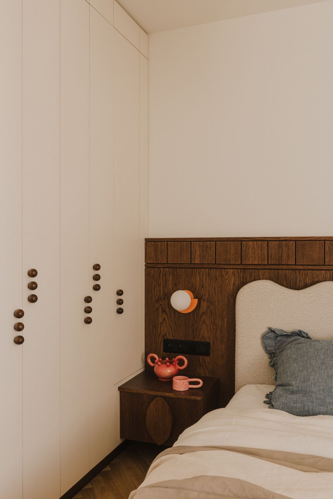
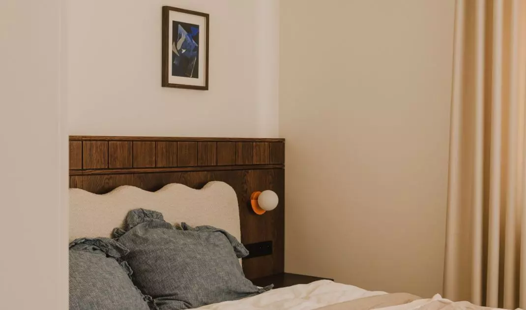
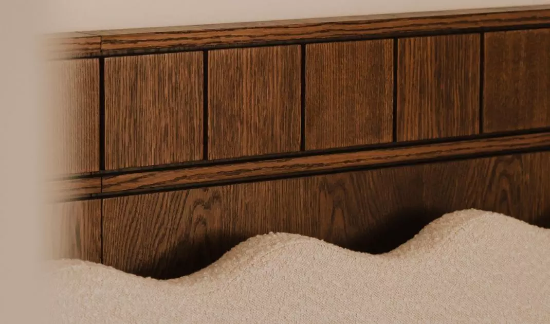
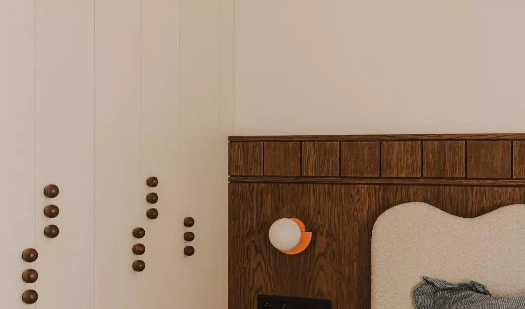
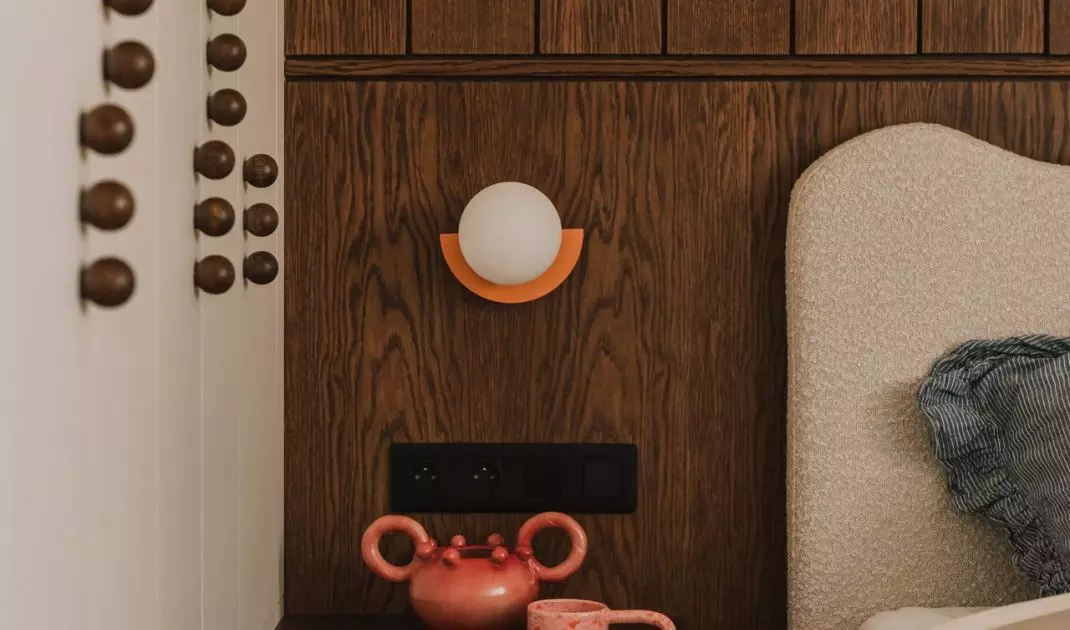
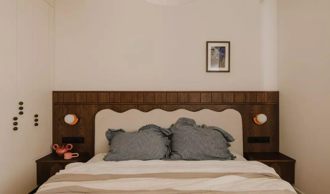
The dark wood in the bedroom is offset by an orange wall sconce and spherical handles — ©Studio Archives
The bedroom slows the pace
After the color-rich living area, the bedroom offers tranquility, yet remains true to the project’s core principles. It is dominated by a light, warm color palette paired with dark wood. The elaborate headboard spans nearly the entire wall and connects the veneered built-in furniture with a soft, undulating panel behind the bed. Small orange wall sconces add a bolder accent, while the rhythm of the spherical handles on the wardrobes serves as a reminder of the geometry present in the other rooms. Thanks to these details, the bedroom remains serene without becoming anonymous.
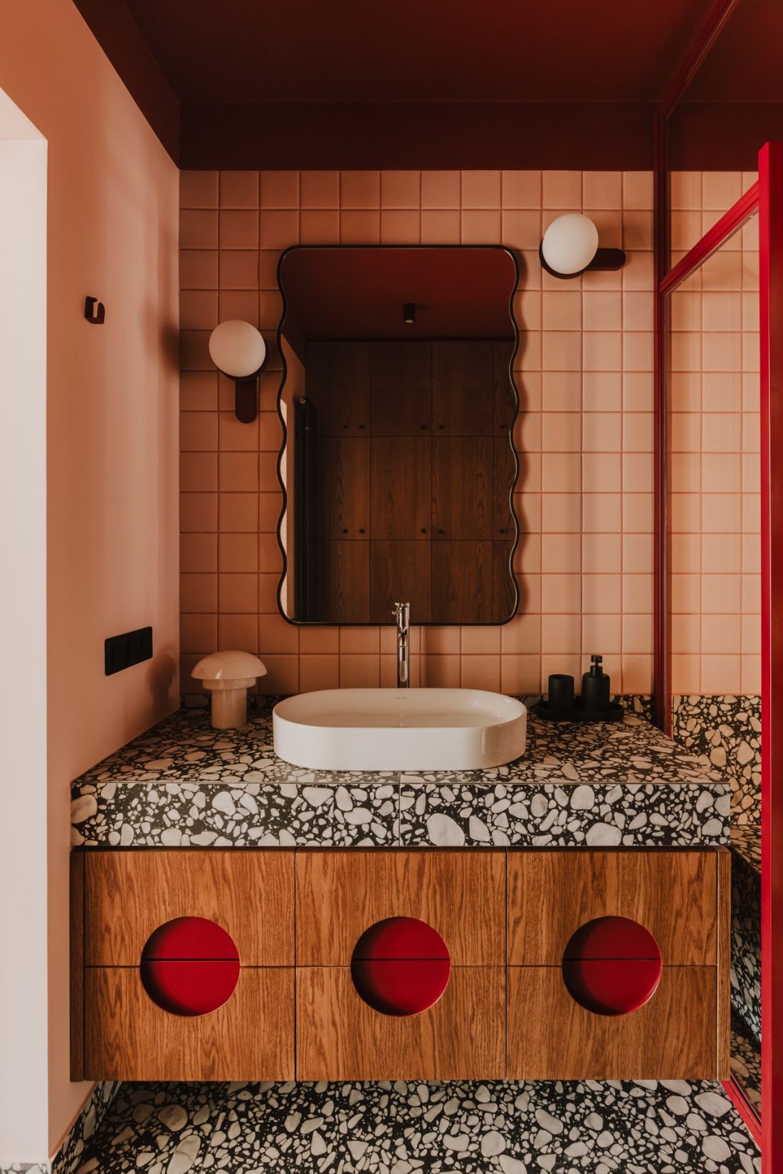
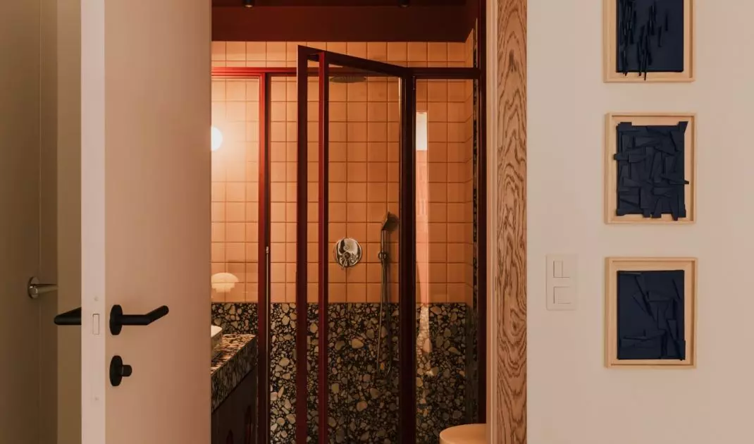
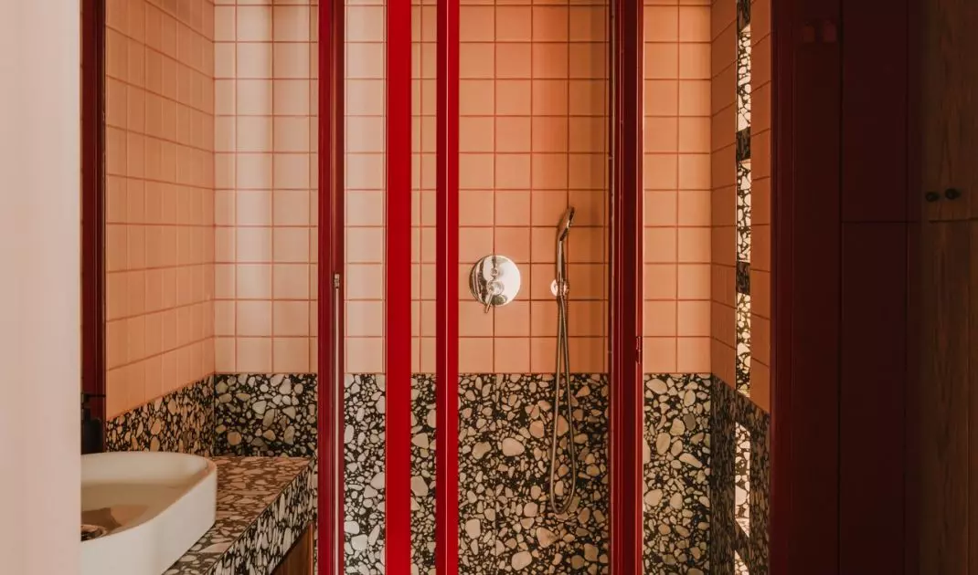
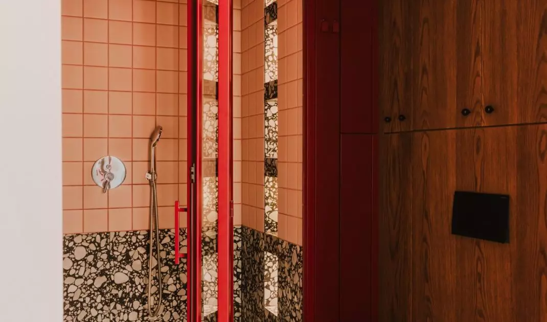
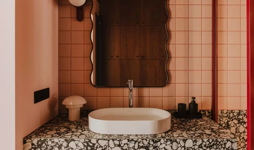
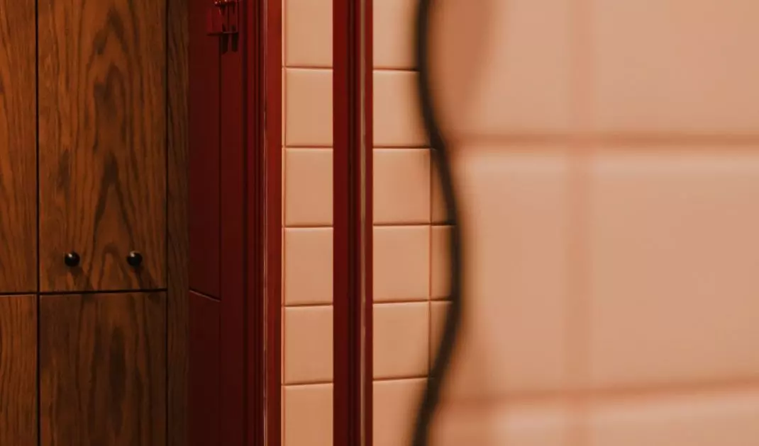
Pink tiles and red accents create the bathroom’s bold color scheme — ©Studio Archives
A pink bathroom with no holds barred
The boldest color combination awaits in the bathroom. Pink tiles create a striking backdrop for the mirror and other fixtures. Their color is echoed in the grout, walls, metal accents, and built-in cabinetry. This contrasts with the black-and-white, irregular pattern covering the floor, the lower part of the walls, and the vanity top. The look is completed by the vivid red frames of the shower enclosure. Here, too, the geometry isn’t entirely rigid. The edges of the mirror undulate, the wall sconces are arranged asymmetrically, and the vanity cabinet features large, round handles. Even more of these appear on the cabinetry above the toilet. The deliberately exaggerated number of these simple elements transforms an ordinary piece of furniture into a playful composition and demonstrates that a striking effect doesn’t always require expensive solutions. The apartment in Grzegórzki is bold, yet not haphazard. The intense colors are kept in check by a consistently repeated language of arches, waves, and circles. It is precisely this language that allows the pink island, the cobalt-blue lamp, the patterned floor, and the dark wood to coexist under one roof without feeling overwhelming. Kontraforma has created a home that isn’t afraid to attract attention, but above all, is designed to lift the spirits of its residents.