4 color rules that every interior enthusiast should know
Color is often the hardest part to choose when it comes to interior design. There are so many shades to choose from, and the great art is to be able to select them in the right proportions of hues and shades. Otherwise, they will not work together in harmony. The right choice of color scheme affects not only the aesthetic experience, but, more importantly, daily well-being and... health. Fortunately, there are several color rules you can use to make your interiors look great and match every time. We've listed them below. Read them to master color selection in interior design once and for all.

DOMAR Interior Gallery
© VERO WAJNERT
The 60-30-10 rule
The 60-30-10 rule gives the percentage combination of colors used in our arrangement. In this configuration you will use three colors. Here's how it works: first, choose one shade that will be your dominant hue and occupy about 60 percent of the room. This will usually be a neutral or muted shade that can take up a lot of space without feeling overwhelming. The second color, is usually a bit bolder and takes up about 30 percent Finally, a small accent - the most intense color, which and should make up the remaining 10 percent. If we have, for example, a favorite painting and the dominant color appears in it, then we can transfer it to the rest of the furnishings - for example, the sofa or armchairs.

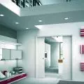
DOMAR Interior Gallery
© IWCHOME
Juxtaposition of warm and cool colors
Traditionally, colors such as red, orange and yellow are considered warm because they are more vibrant. Since warm colors tend to bring a friendly and optimistic feel to a room, they work best in entertaining spaces. Also think about using these shades in your dining room or kitchen. If you don't like colors associated with intense, sunny places, take inspiration from the earth, where there are plenty of shades of beige, browns, and grays. These harmonize with nature and will always bring a touch of tranquility to the interior.
On the other side of the spectrum are cool colors, namely blues, greens and purples, as well as gray. Choosing warm or cool colors will affect the energy of the space. Cool colors are more subdued. They work best in bedrooms and office spaces, where calming energy is appreciated.

When choosing a sofa, sideboard, armchair or closet, let's visit DOMAR Interiors Gallery in Wroclaw, which presents solutions from many excellent manufacturers.
© SWALEN/Gal
Be guided by nature
If we look at a forest, we have green, wood and possibly sky blue. Sometimes there are also meadows with colorful flowers. The moment we bet on one stronger color and apply it either in the form of accessories or the upholstery of the sofa, we will get an excellent effect - but on condition that the other colors are toned down.
It is worth noting that the "safe" choice will always be wood. If, for example, we compose a wooden floor, a navy blue wall and add a pink sofa in a pastel shade, the whole will give an exceptionally beautiful character. Such a combination is sure to attract our attention

In the bathroom we can afford to be more crazy - as this is a space where we stay less often and for a short time. Here we can create an interior, for example, in Arabic style, which will differ from the rest of the decor
© Sylwia Gulewicz-Wysocka
Complementary colors
Of all the color principles used by interior designers, the complementary color scheme is often considered the simplest. That's because this color scheme involves only two shades that are opposite each other on the color wheel, which means you get combinations such as blue and orange, yellow and purple or red and green.
Let's remember that the rooms where we spend more time should be a reflection of what we like - not what is fashionable. Let's not blindly follow emerging trends. It is important that our arrangement harmonizes with what we like best. Therefore, if we like a particular color, let's boldly opt for even the largest piece of furnishings in that shade.
For more information, visit the company's Galeria Wnętrz DOMAR page on thePdD portal.