


The days of global uncertainty and isolation do not resonate with minimalism. Amidst pandemic, austere, tightly edited spaces, only our fears and growing discomfort are reflected. The extended period of staying at home has prompted us to rethink our interior color scheme and paved the way for the great return of color! When everything around us seems to slow down and be monotonous, color adds energy, bringing everything around us to life. This should come as no surprise, knowing how much the presence of color can make a difference in our mood and mental health.

Bold purples are especially fashionable this season
© Anni Roenkae
The changing face of purple
Thecolor pur ple is increasingly popular in interior design. It looks especially good in elegant modern or glamorous interiors. However, this does not mean that it can not be used in other styles. Although you need to think it over carefully - how it will be used and what shade to choose. Not every purple looks the same. It can be the leading color in the interior, but you need to remember one rule. Do not overdo this color, as it can overwhelm the entire interior.
Why is it so attractive?
According to color psychology, lavender and lilac are known to promote healing and create a soothing environment for worried minds. They signify peace, renewal and joyful pursuits and make you feel blissful and carefree.
We've heard about light purples before, which were a hit in previous seasons, but now light lavender and lilac are slowly giving way to bolder purples like berry, dark fuchsia and dusty orchid.

Accessories in the form of neon, will create a retro atmosphere in our interior
© Freepik.com
Purple revival of the 80s
In many experimental design concepts we see pastel purple. It acts as a background that has its own character, however. This color is a playmate in many bold furniture settings. To bridge the gap between reality and fantasy often arrangements are supported by the introduction of neon accents.
Strong accents
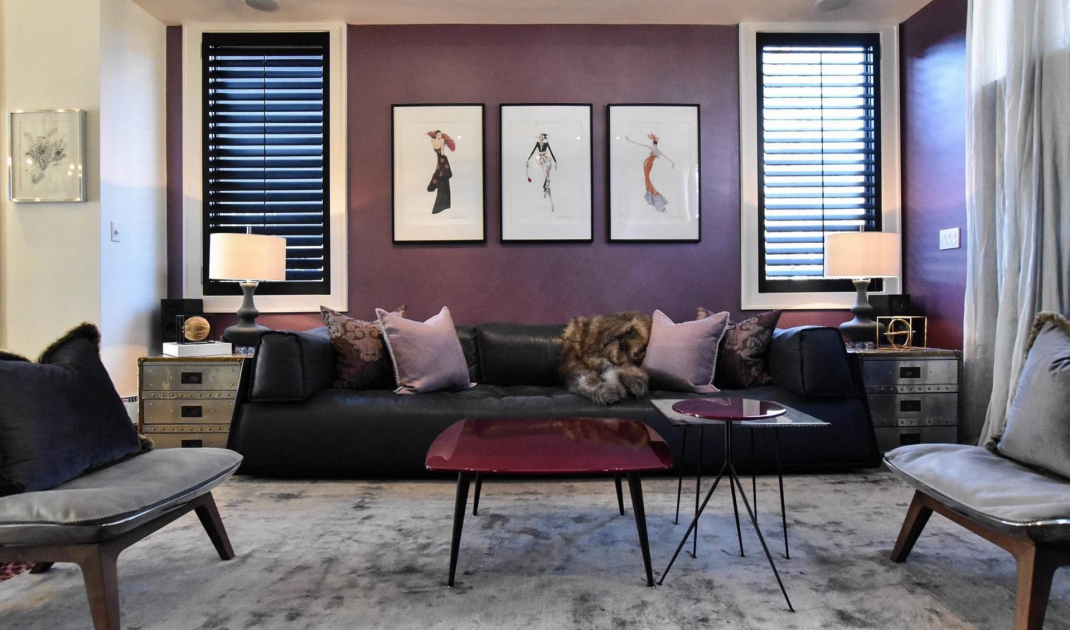
In a modern living room we can freely use purple accessories and decorations like curtains, pillows and blankets. Purple color also looks great on furniture. Strong purple armchairs and sofa on a light background - white, gray or beige - are impressive and add chic and elegance to the interior. This is especially important in the aforementioned living room and other home interiors.

Bright purple in a bold color combination - with strong green and turquoise
© Joybird Furniture/houzz.com
In which room can we use purple?
A light pur ple would work well in the bathroom and bedroom. Some purples stand up and shout, desperately seeking attention This shade, on the contrary, whispers and attracts the eye with its magnetism. It is so versatile that it is also easily suitable for other interiors like the living room, kitchen, study or children's room.
Plum-purple or purple-red color look very good in the living room or kitchen. The latter is quite unusual, but in combination with white or gold it looks really impressive.
Dark pur ple is most often used in living rooms - there is also no contraindication to using it in other interiors. It has a decidedly regal tone, confident in its dignified grace and charm Let's remember to combine it with light colors and provide a good source of light so that the room does not seem smaller.